Yes, I have heard the complaints about the architecture here. I have noticed how everything looks the same and how it gets repetitive after a while. I am aware that the campus is all gray and white which means that when the skies turn gray and the ground turns white, it will be completely colorless. And yes, I have been here in the winter. It’s windy and it’s cold. But despite these occasional complaints about the architecture of the University at Albany’s uptown campus, I still love it for many reasons.
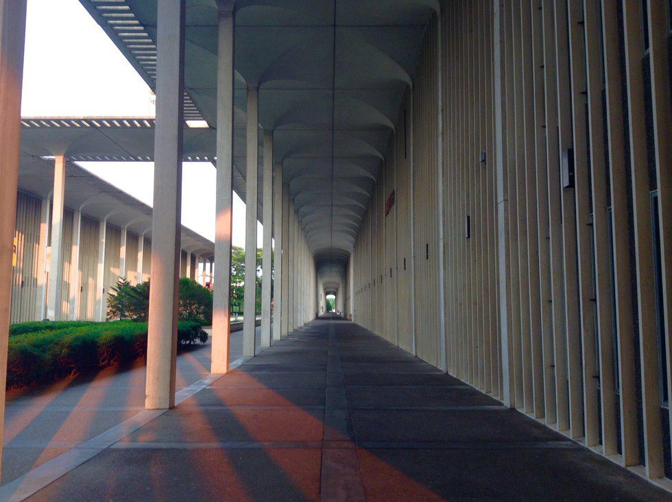
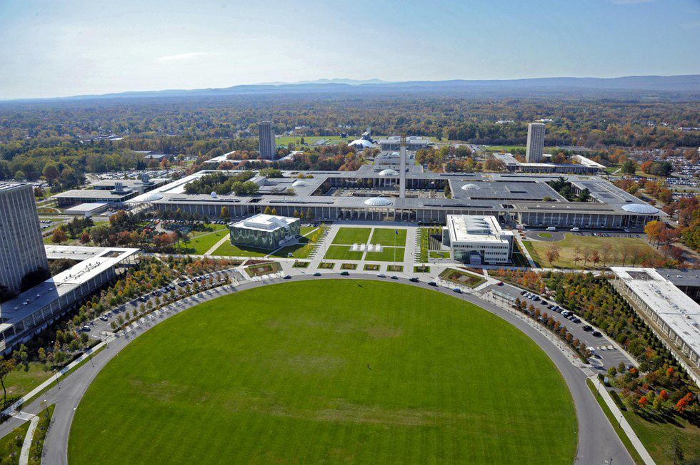
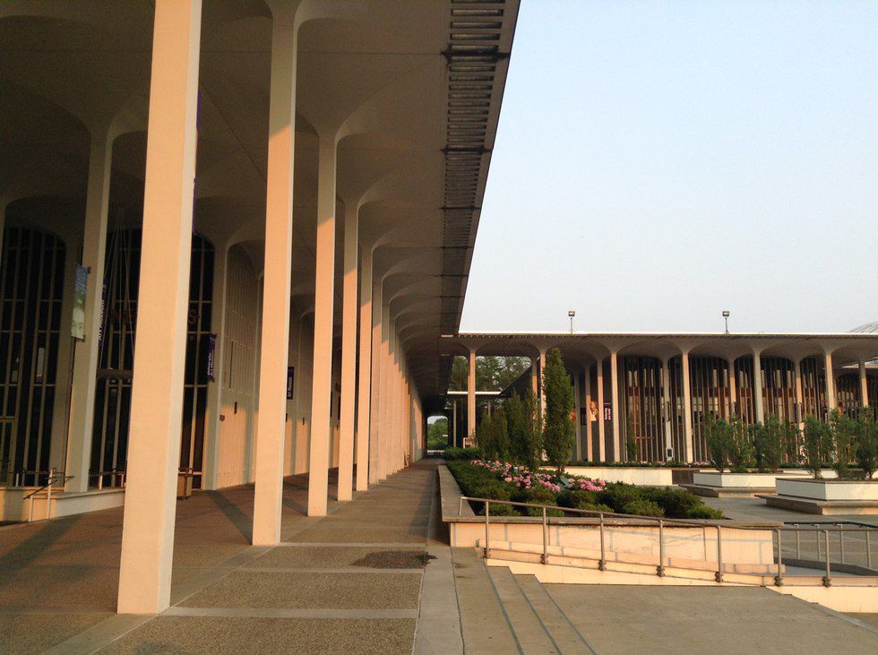
For those of you who haven’t been on campus, it is certainly as far from the typical collegiate ivy-covered brick building look as you can get. The uptown campus, designed by Edward Durell Stone and built in the mid-1960’s, is almost completely symmetrical, made of concrete, has 1,248 columns, dramatic colonnades, and all thirteen buildings on the academic podium are connected under a single roof.
Edward Durell Stone designed the campus as an example of postmodern architecture, emphasizing repeating patterns and creation of a unique sense of space. But there is a function to the form as well. To me, the design symbolizes information connectivity.
While walking around the inside of the podium, you can clearly discern one building from the other by noticing the space that separates them. Furthermore, each building corresponds to a certain division of information, with labels such as “Physics,” “Fine Arts,” and “Humanities” on the exterior walls. In these ways, the buildings are all separated and classified differently. But looking at the campus from an aerial view, you cannot discern buildings - they are all connected underneath one giant overarching roof. This design seems to symbolize how all types of different knowledge and information can be connected into one grand and beautiful structure.
I am of the opinion that it important not to just learn a lot about one specific division of information, but to expand and diversify your knowledge. Having high diversity and large quantity in the things you learn will allow you to see patterns and connections between very different divisions of information.
Understanding this information connectivity creates a holistic understanding of the workings of the world. It allows you to see how there are certain structures, systems, and models used to understand one division of information that mirrors those from a very different one, exemplifying how everything in the universe is structurally connected.
The design of UAlbany’s uptown campus visualizes this connectivity in a very physical way. It takes all of these different schools and divisions of information and connects them all to each other under one roof, into one structure.
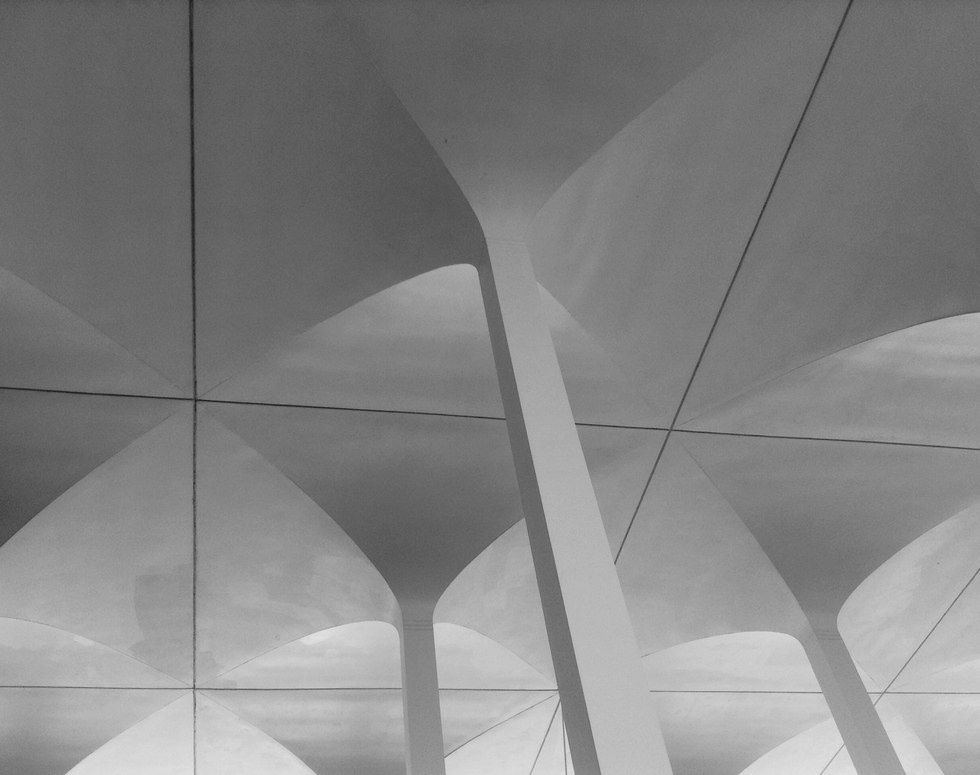
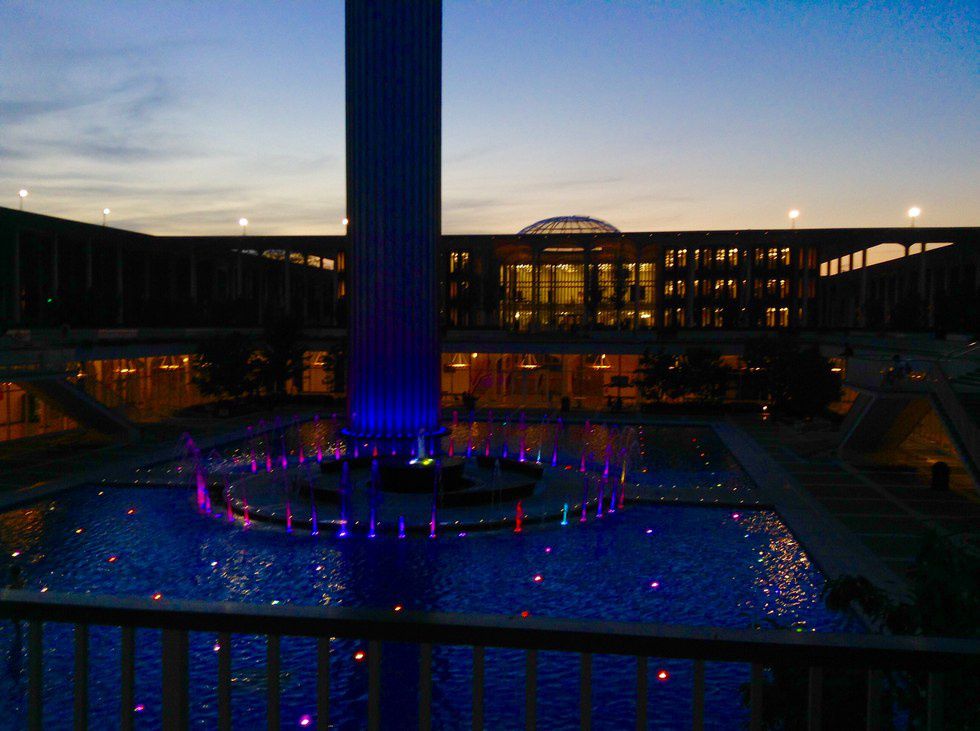
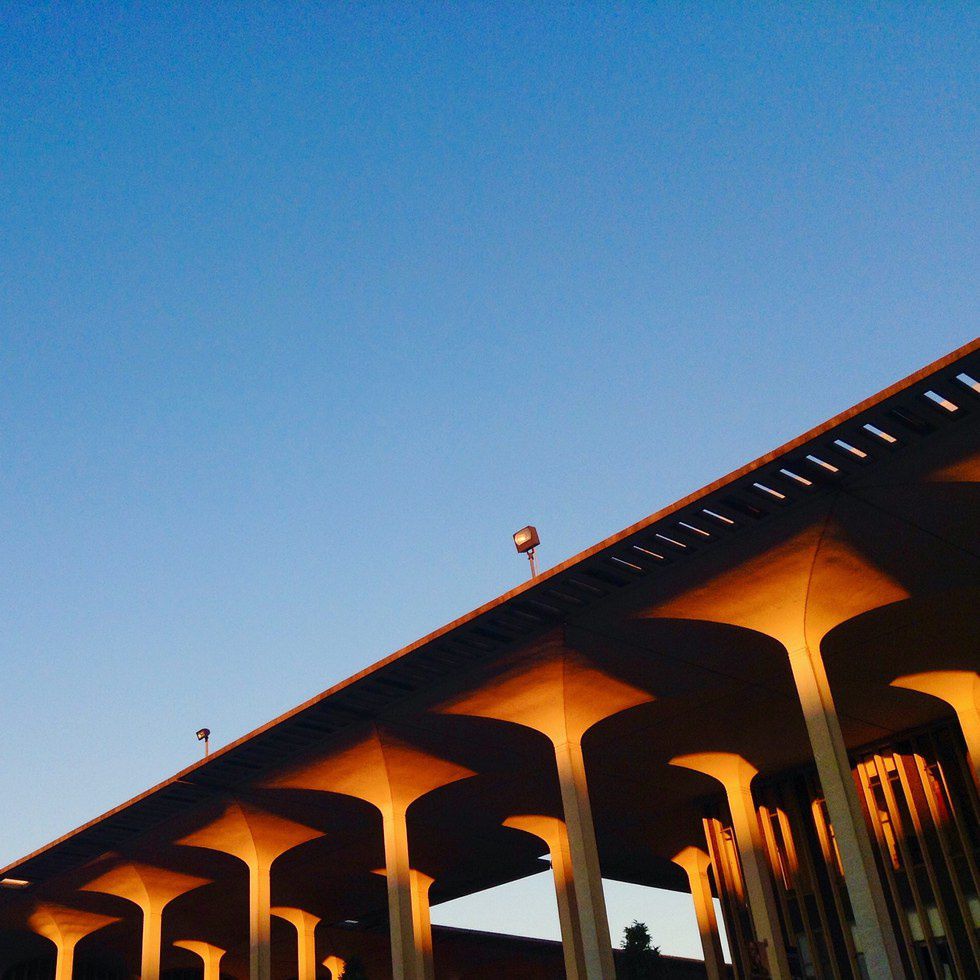
Secondly, the design of the campus also parallels forms found in nature. Each one of the 1,248 columns opens up at the top into small arches that resemble branches. Walking under the podium is not unlike walking through a forest with trees that open up into branches at the top to form a single canopy. The courtyards and gardens in the podium are like coming upon clearings in the woods, and the fountain in the middle is not too much unlike a beach on a lake, with people reading, relaxing, and even tanning on all warm and sunny days.
The symmetry of the design is one that places enormous emphasis on the life within it. In a symmetrical and colorless structure, the people are the ones who create motion, music, variety, and color within the confines of the colossal concrete campus.
The starkness and uniformity acts as a canvas for the trees and flowers planted throughout it. The campus is designed in a way that catches the light in the most beautiful way at sunset, painting the tops of the columns orange, and snatching it up and displaying it like an art installation on its expansive concrete walls. The shape of the campus mirrors forms found in nature and makes the campus an ecosystem—where people move through by specializing their skills, expanding their minds, and constructing their view of the world.
Ultimately, I think the design of UAlbany’s uptown campus is beautiful. Not only does it embody the interconnectedness of information, but it mirrors forms found in nature. The architecture is symmetrical, balanced, and graceful, but ultimately places the most emphasis on the person moving through it - the observer, the colorful and complex work of art displayed on a blank wall.


