On the University of Washington Tacoma home page, there is a scrolling list of articles, one of them titled "Something to Offer." The article is a heartwarming, uplifting success story of a graduating University of Washington Tacoma student who rose above hardships, medical conditions, and a faulty education system. However, the way the photo for the article was treated calls into question of the transparency of the university.
On the University of Washington Tacoma home page, the scrolling list of articles comes across in a banner style, changing with photos, an attention grabber, and a title for the article with a link embedded to take you to the article page. On the current home page the photo is of Augustine Canales, of which whom the article is about, teaching in a classroom filled with computers. Some of which are on and readers can see what is on the monitors, along with what's written on the board.
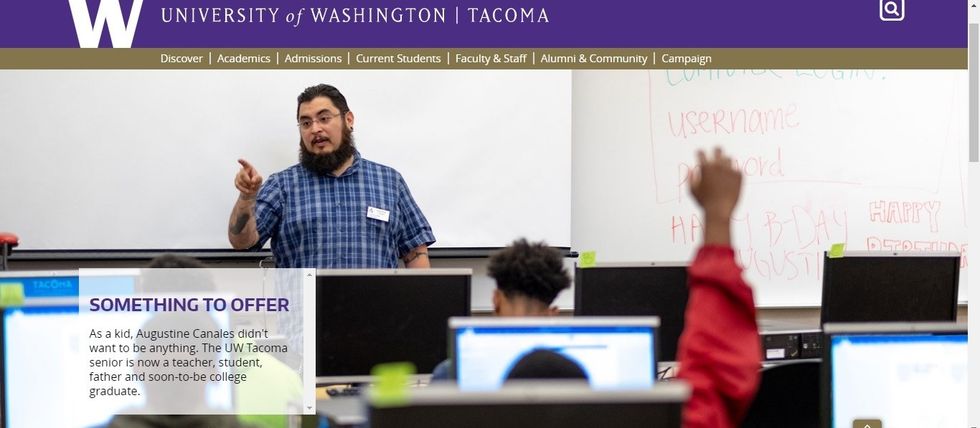
The article's photo is engaging and shows Canales at work doing what he loves and shows student engagement. However when you click on the article, the photo tells a different story.
In the photo presented in the article once it's opened, it shows Canales still at work, doing what he loves, still with student engagement. But there are a few differences that can be seen if one is paying attention.
If we look at the photos side by side, it is easier to compare the differences.


When we look at the photos side by side, we can see in the original photo that above the "Happy B-Day" is a word that is hard to read. It could say "fake" but it's not clear enough to make out. We can see a username and password, and the biggest thing we can notice is a student watching videos of Fortnite in the lower right hand corner.
One thing of particular interest is if we take a closer look at the student in the lower left hand corner. They have a word document pulled up.

Now if we look at the edited photo, the two screens look awfully similar to each other.
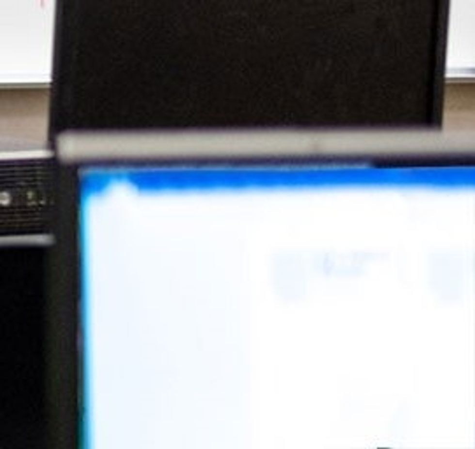
It appears that in the edited photo that the copied what was on the students document and pasted it to the screen that had the Fortnite game.
So what is the big deal?
The big deal is that on the home page we get one image, and when we open the article we get another. It is not only inconsistent, but it calls into question of editing. The main thing with editing is that if you're going to put up a photo and it is going to be edited, make sure that both of the photos are edited in the exact same way. Now, editing can be used to protect identity and certain information, so erasing the username and password information is reasonable. However, this photo raised one question for me.
Why edit the photo to begin with? Why alter the moment in Canales' teaching when that is one of the main points of the article?
Now, if the photo editor had edited both photos, probably nobody would have noticed. However, if they had left the photo alone readers might have said "Hey, there's a guy watching someone play Fortnite" and then moved on to read the article, possibly even forgetting that the student was watching the video.
In the future if the university is going to have their photos edited, they should either edit all the photos and double check to make sure that they are edited before posting it, or leave the photos alone and let them speak for themselves.


