The Red Cup. When hearing those words, the coffee lovers of the world think of the annual Starbucks Red Cup. It was 1997 when this all originally started so almost twenty years ago in 2017. Starbucks had a mere 1,400 stores and was beginning expansion into the first two countries outside of the United States and Canada. The Creative team made a decision, to create cups that would bring about a holiday excitement and cheer. The First year of red cups was known as "Give in to the Rhythm." Now here we are many moons later, just as obsessed about those Starbucks red cups. So here are some of my favorite Red Cups from the last few years so that you ready for the newest release of Starbucks Red Cups - beware last year's cup makes a whole lot more sense now.
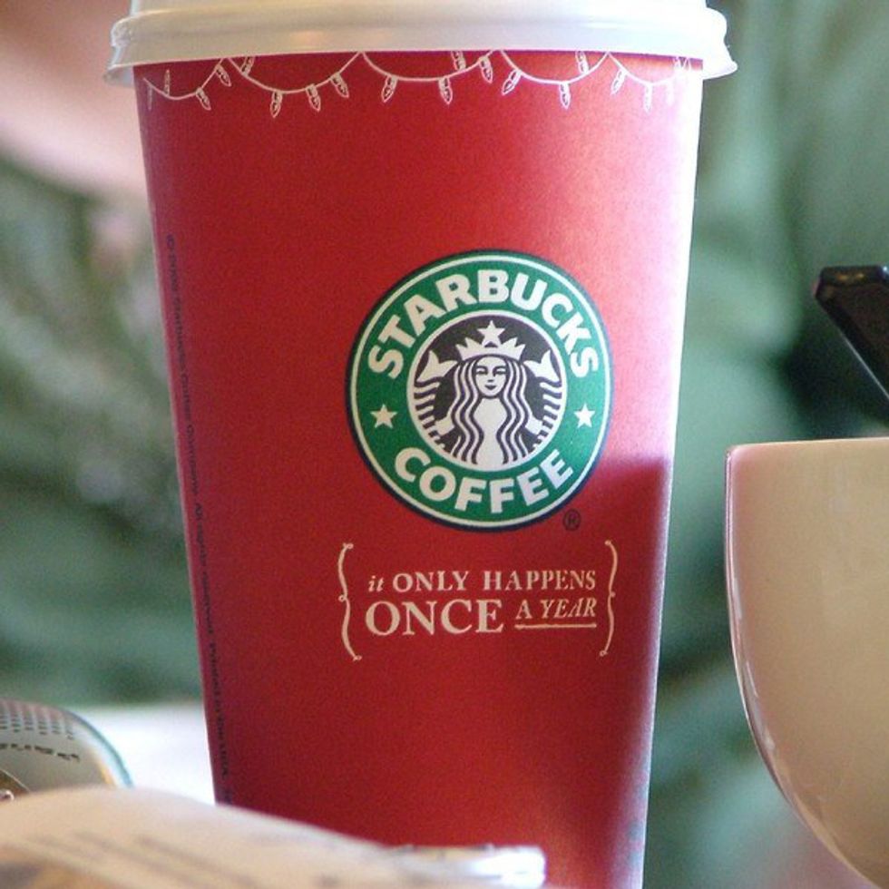
2005:
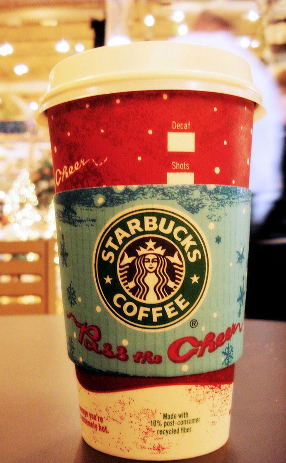
2007:
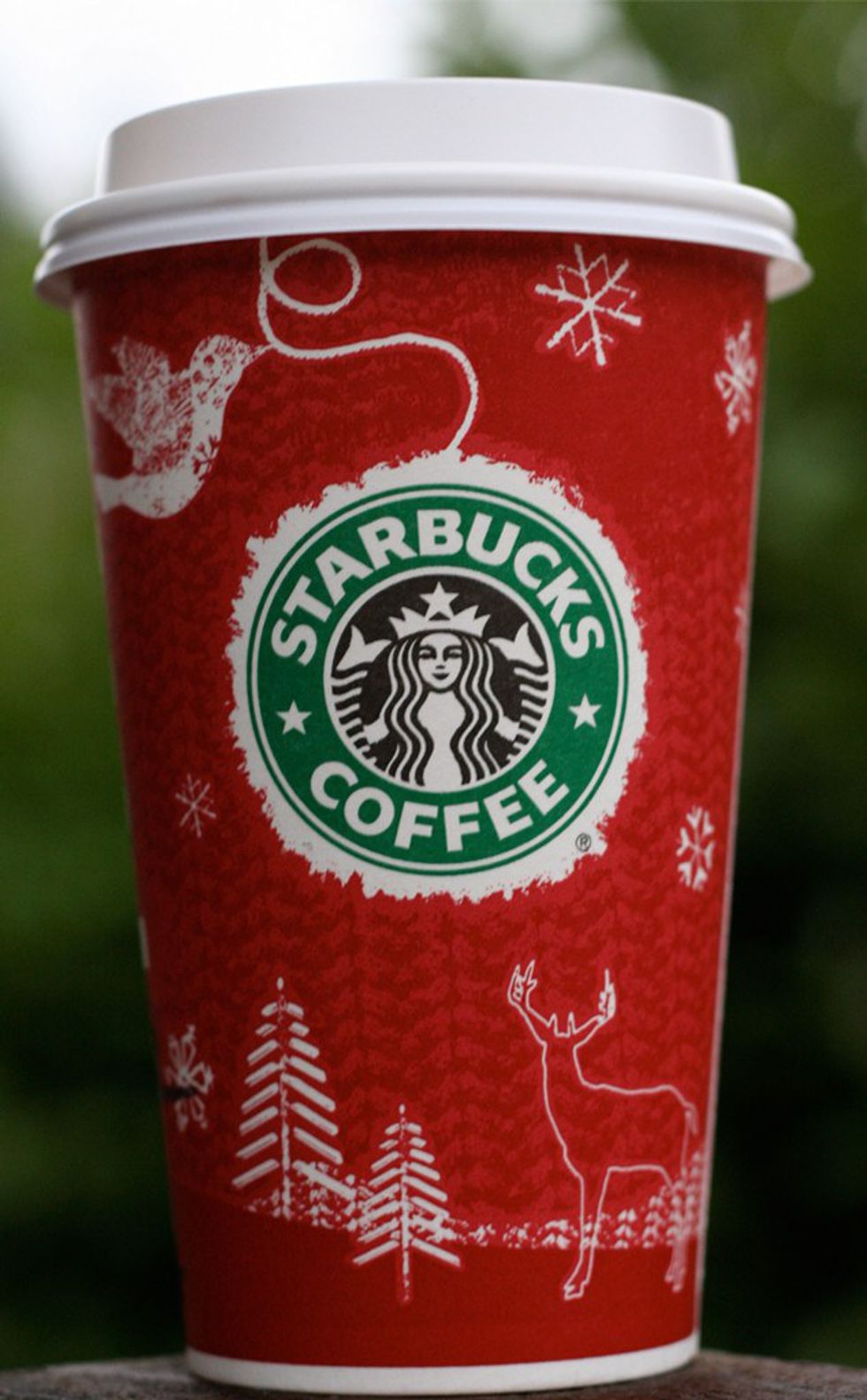
2008:
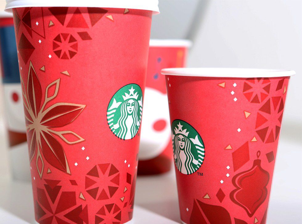
2013:
And then... we get to 2015. You may start to question my judgement right about now. Is not the 2015 Red Cup, well, plain red? My answer is quite simple. It is plain red (with an ombre twist), but so much more thought when into it. This cup was created to allow customers to doodle on the cups like they had been for years anyway.
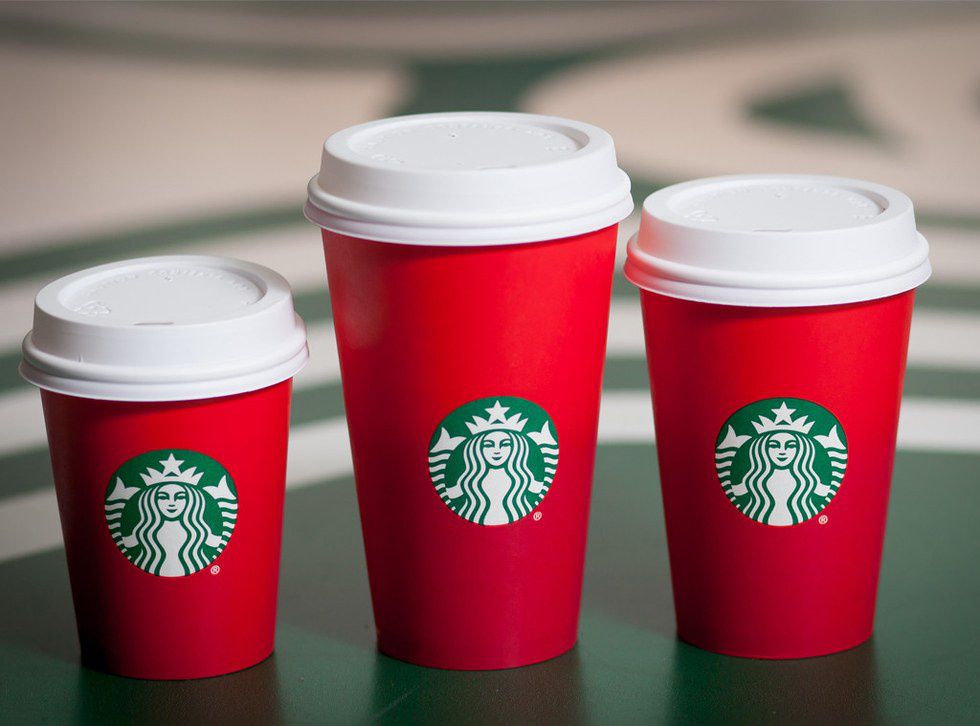
(Notice that ombre look now??)
So then we get to 2016... and why it was so important that the 2015 cup was a plain red......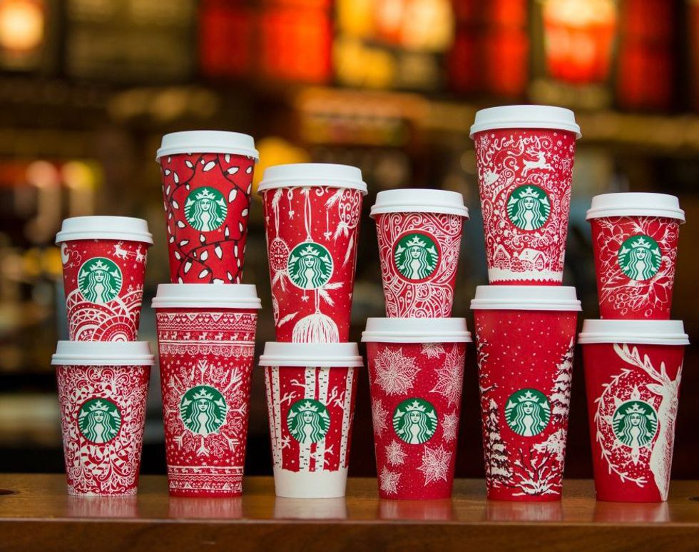
All of these cups, well they are doodles from 2015 that Starbucks chose from customers. If that is not a pretty creative cup, then what is?
So which of these cups are your favorite? It is always a hard choice...but now I wonder, what does the 2017 Red Cup look like?