Creating a character can be a fun and stressful time. There are so many factors to consider - what they look like, how they act, and what their past was like. Try not to get overwhelmed, though. I like to start at a character's design. That way, I have a blank slate to work with. Here are some tips I like to keep in mind when I create a new character, hopefully they will be helpful to you too!
1. Keep it simple. I know it’s tempting to try and put your all into a design at first. However, try to hold yourself back. A character with too many details and colors can be very off-putting and be too much for the eye. It’s best to keep things simple. Take, for instance, two of the most recognizable characters in the world – Mickey Mouse and Sonic the Hedgehog.
Two very different characters made by very different companies. What do these two have in common besides being freak anthropomorphic rodents? Well for one thing, they both have a limited color palette. They are only three to four colors max. They’re not boggled down by unnecessary patterns or blotches. Their limited colors allow them to be more memorable in the audiences’ mind. They also are made up mostly of circles, giving them a simple but rounded structure that's pleasing to the eye.
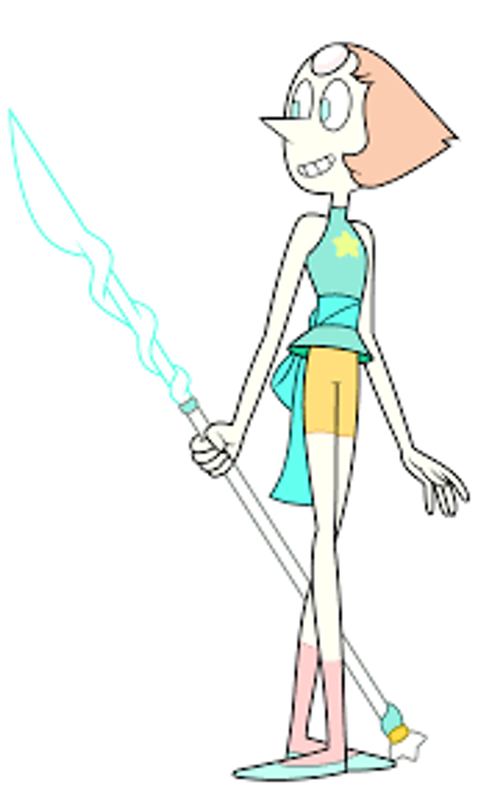
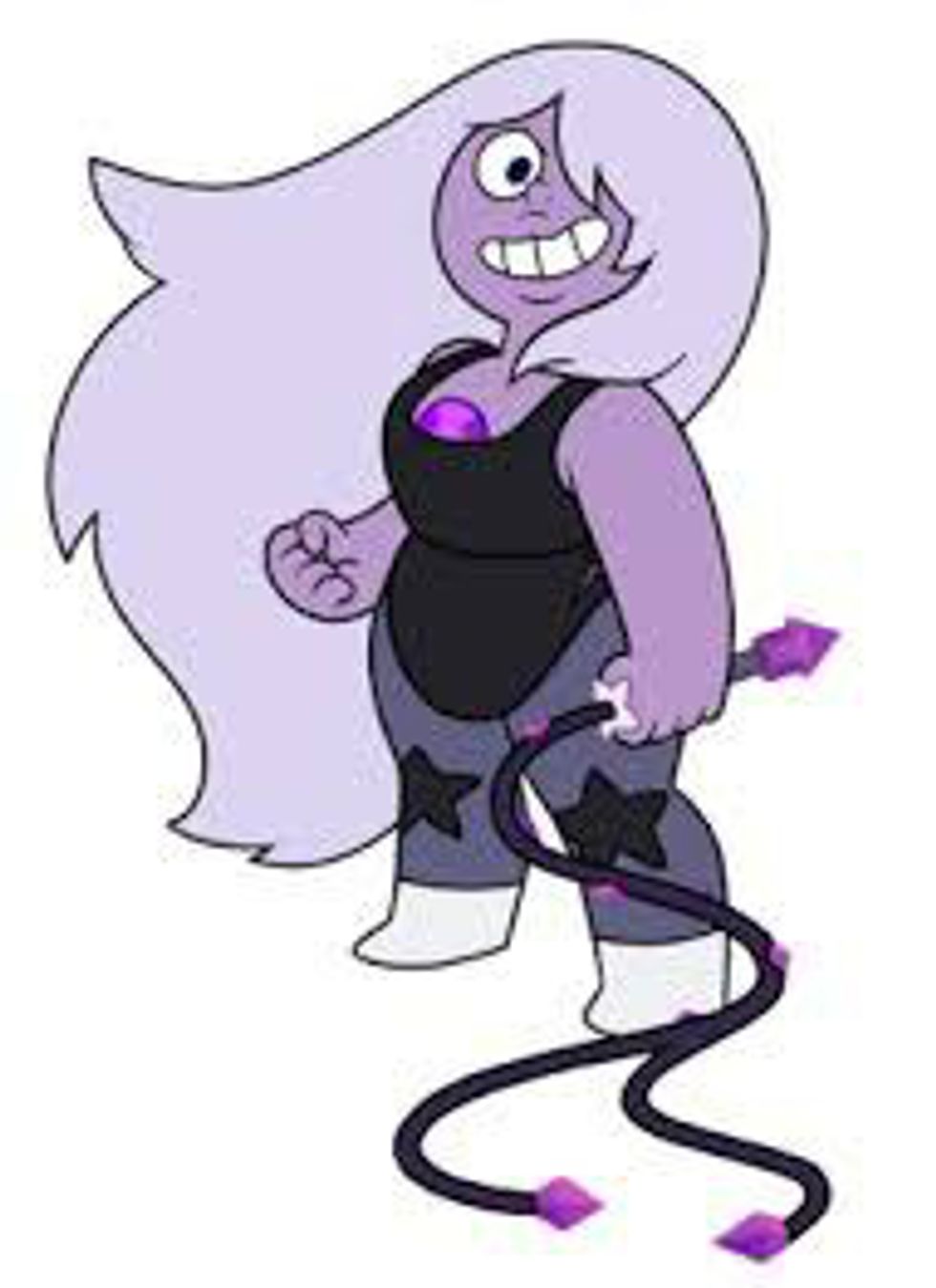
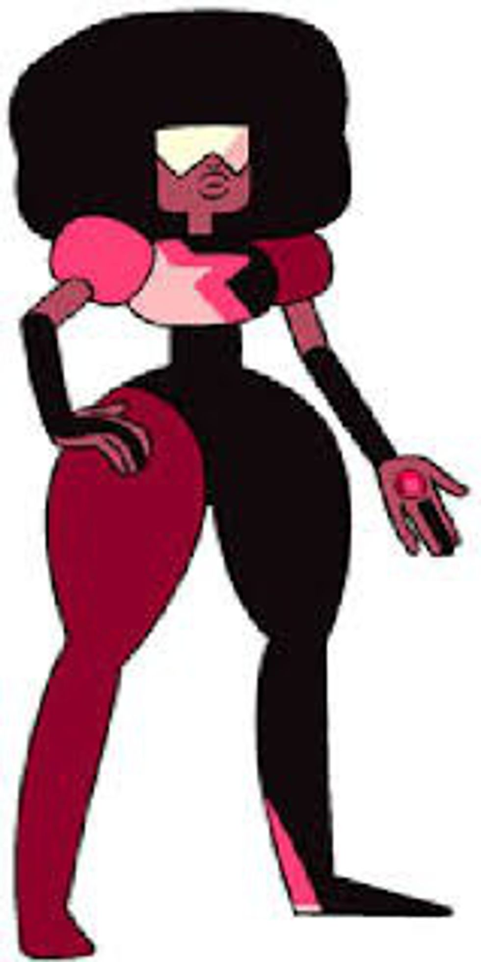
2. Start from a base. A fun thing to do if you’re having trouble with a design is to think of a theme to start as your base. For instance, take the characters Pearl, Amethyst, and Garnet from "Steven Universe."
Obviously, a lot of their designs are taken from their respective gems. However, they are based off of different shapes: Pearl a triangle, Amethyst a circle, and Garnet a square. Now, not only do they have a well-known base to start from, but the abundance of the shapes in their designs give them a sense of harmony. There are lots of other fun themes to serve as inspiration for a character. How about the four seasons? Or types of trees? Or constellations?
3. Go against the norm. So let’s say you’ve followed the first two tips and have made a red fox character with a nice simple design and based off of autumn colors. Great! What’s their personality like? Since they are a fox, are they sneaky and sly? If so, why not change it up a little? Make them very blunt and honest. Make them unable to tell a lie if their life depended on it. There are so many stereotypes in the world that would be so typical to see in a character, so have fun inverting these stereotypes! Disney’s "Zootopia" had a lot of fun with this, by showing characters such as a fat cheetah and a domineering sheep. It doesn’t have to stop at animals though. Imagine a big, brawny man. You would immediately think he’d have a job as a construction worker or a wrestler, right? Well, how about he be a librarian or a ballet dancer instead? Going against people’s expectations can seem simple but can be so rewarding in making your character memorable.
4. Observe from real life. I know every art teacher and their mother has told this to you, but it’s true! There’s so much out there that can be integrated into a character’s design. You might have found a great outfit or hairstyle that matches your character perfectly. Or you can find patterns in the trees that would make a cool tattoo for your character. It’s all about taking what you see and finding ways to implement it in your drawings.
5. Don't be afraid to grow! Last of all is never be afraid to make changes. Your character's design isn’t going to stay stagnant – and frankly, it shouldn’t! Just like you, your character will grow and mature throughout the years. Take a look at this timeline of Bugs Bunny – would you really want first generation Bugs on your TV nowadays?
Your character will pick up new outfits and styles until you find one that fits exactly right. Don’t be so sure that your first attempt at your character will be perfect! It’s all about growing and learning.


