Art is a diverse field, one that holds many forms to express creativity. As we observe art today, there are many ways that it is open for interpretation. From color to structure, each element of a piece plays into how it connects with the public. This allows the general public to find connection with each piece they experience; however, as they experience art, there are specific concepts that allow this to be possible. These concepts are color scheme, material, parallelism, and structure
Color scheme is the range of colors used to design a piece of media.These color patterns are used to create appeal and accompany the aesthetic of the piece. Basic color schemes use two colors that look appealing with one another; however, more advanced color schemes use more with analogous color schemes, colors that appear next to each other on the color wheel, that may have accents. These concepts create the image and help develop the style of the artist; however, as color has the ability to develop style, another element plays a major role: material.
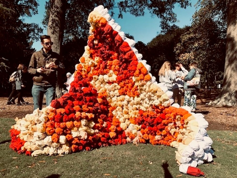
Material is the type of source used to create the finished product. It can be in the form of metals, papers, fabrics, or even plastic. Each source has its own sense of formulation creating a different feel and significance to the piece. For example, fabrics, being softer, can create a more homey interior while metals can create a rigid structure. This idea allows for both designers and artists to express themselves through means of sourcing. As sourcing plays an important role in obtaining materials, it creates the movement and structure of the piece which allows for the public to experience the different textures, movement, and development of the creation. Pictured below is a Wave Crest created by NC State Art and Design Students at Gregg Museum along with a short questionnaire on their creation.

Wave Crest is a structure created from scrap fabrics by Tucker Bomgarter (pictured), Chelsea Leland, Kristina Rosalie, Jennifer Dowden, and Gabriel McGee. It was designed to give the perception of color and how the angles of light can benefit architectural pieces. A few questions were asked to the group on their design of their piece.
Q: What is the purpose of the design?
A: To emit a homey feeling where people feel like they are at peace and can connect with others and their surroundings.
Q; Why did you choose to use the sources used in this creation?
A: We observed others using harder materials (i.e. metals and plastic) and realized that one material, fabric, that is around us everyday wasn't being used. Fabric, as it varies in texture, would allow us to not only experiment with color, but with texture as well.The structure and movement of the piece also play into the choice of source which helped develop the sense of an interior and home-like feeling.
Q: What us the purpose of the color scheme?
A: To contrast the direct light with a bright, non-linear colors and show the perception of angles . It plays with the concept of colors creating a warm, home-like atmosphere with the curves and movement of the piece.
Q: How do the design and artistic elements play in with the shape of your creation?
A: It creates a way for people to see and feel the structure from different viewpoints. Also, it allows for the colors to emit the beauty of the structure as well as its colors and theme.
As this creation is a good example of how color scheme and material can affect the meaning of a piece, it is a beautiful one to look at. It creates a way for people to experience the fall-like palette and see how material can emit emotions and movement within a piece;however, though color scheme and material play major roles in the piece structure does as well.
Structure is the arrangement of interconnected resources that build the backbone of a architectural design.It involves the systems employed to keep the creation held in place. As each creation has it's own shape, inner structure can be made from various material such as plastic, metal, and fabric. Depending on the stability and movement the piece requires, the solidity and strength of the source determines those details. Some structures, such as buildings, require mores stiffer structures for safety while others can be more flexible. Flexibility versus the stiffness of a structure can emit different meanings. As those qualities can emit that, one concept can as well: parallelism.
Parallelism is the process of computation on landscapes to map out the images of how one infrastructure relates with another. This process requires one to evaluate the and they are on and see how buildings, natural structures, and roads affect the perception of a creation. This leads to the ability to interpret creations for multiple viewpoints. As this can seem like a difficult concept, another group at Gregg Art Museum worked with this concept.

Home Within The Hill is a piece created from cardboard tubes with a homey-like blankets and pillows inside it. It sits right on the hill above Gregg Art Museum and plays with the concepts of structure, color scheme, and parallelism. It was created by Louisa, Laura, Katie and Harrison who were interviewed on their creation.
Q: What is the purpose of the design?
A: To obstruct the normal pathway of the normal pathway of the hill and provide a means of connection for others. It also was created for people to sit in, so they could enjoy the beauty of their surroundings.
Q: The structure contrasts the direction of the hill. How does this add to the piece? And what was the reasoning behind it?
A: It was created with the concept of parallelism. The piece was meant to mirror both the direction of the hill and the structural design of the building in front of it. As many people use the hill as a means to cross to Gregg, it was used as a way to get others to connect and understand perception.
Q: What is the way you want the design to be perceived?
A: It can be perceived from any angle, but the one with the blanket is preferred. It, overall, was made to make people think and observe their surroundings.
Q: Why did you pick the colors you used?
A: Since the setting is on a hill, a neutral setting with pops of color emits the sense of nature. It was set that way, so it seemed natural and not out of place. It also provides an opposing scenery to that of Hillsborough Street and parallels Gregg Museum with it's rigid, shapely structures.
This project, as it plays with the ideas of parallelism and structure, shows the importance of the two techniques as they help one understand their surroundings. As they both help emit a certain perspective, it creates a way for an artist or architect to develop a different sector of their style. Style, as it can be diverse and growing, is the way these structures come to life. And through that life, the public is able to experience the beauty of color and design.
Feel free to visit the Gregg Art Museum and these projects at 1903 Hillsborough Street, Raleigh NC 27607! Much thanks to the groups pictured for your time and information!


