You may have heard about the "Ugliest color in the world." Pantone 448 C has been deemed the ugliest color. Everyone seems to find "Opaque Couche" disgusting. So Australia came up with a brilliant anti-marketing tool using the most negatively viewed color on the planet. The Australian government researched what color was the most repugnant and used this color on tobacco products. They are trying to minimize the attraction of tobacco products and eventually reduce the demand for the product altogether. The use of this drab, dirty, dark brownish-green is spreading as the UK, Ireland and France have all passed "plain-packaging" laws. All tobacco products will soon wear the Opaque Couche packaging. This anti-marketing scheme got me thinking about how color impacts how we buy and generally perceive products. First, I wanted to learn how basic colors impact our perception of things and how we react to the presence of certain colors.
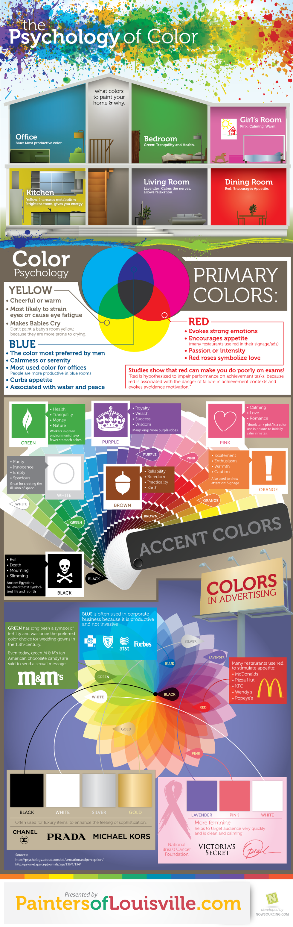
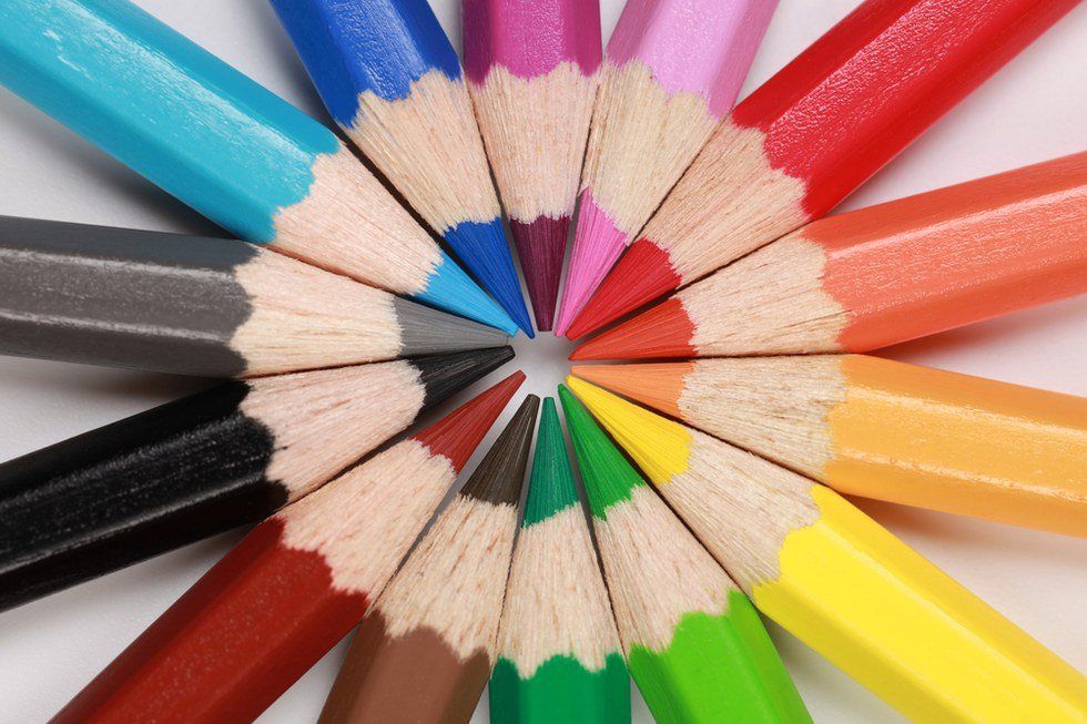
Black
Even though we view black as a neutral color, it also holds powerful meaning, it can hold sinister meaning, or even sophisticated or glamorous meaning.
White
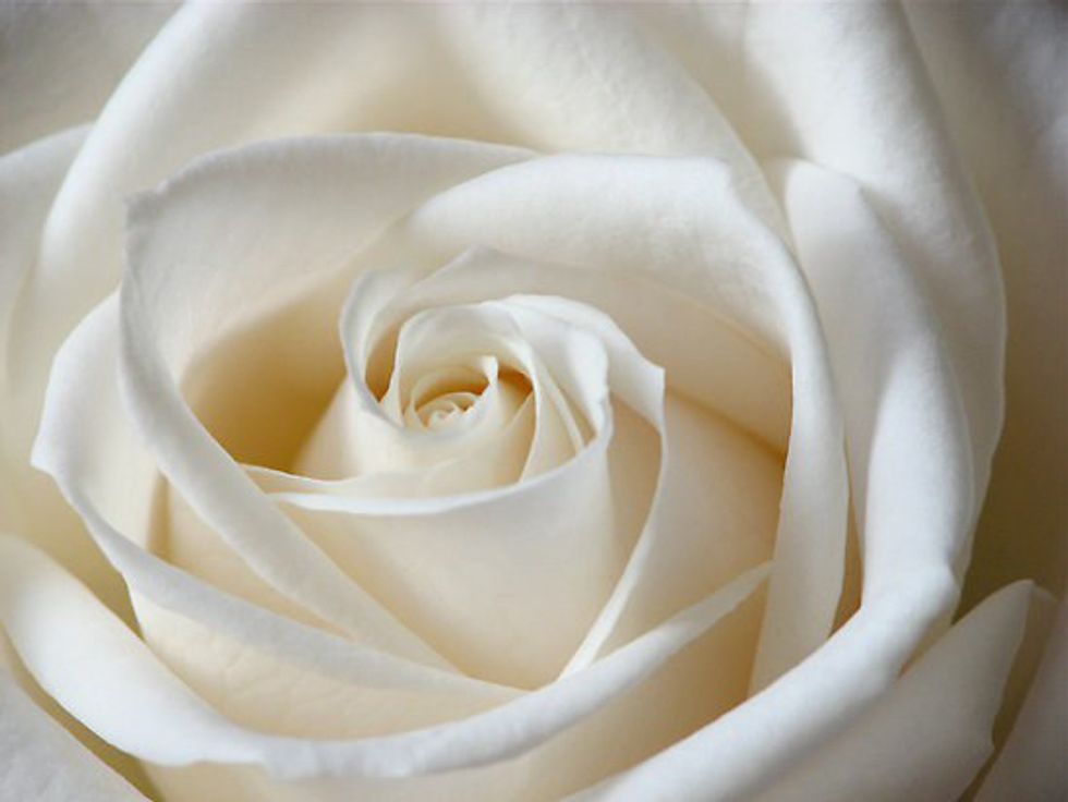
White is associated with purity and innocence. It also an accent and a neutral color. It represents goodness, purity and cleanliness, and is used quite often in minimalist design and web design.
Grey
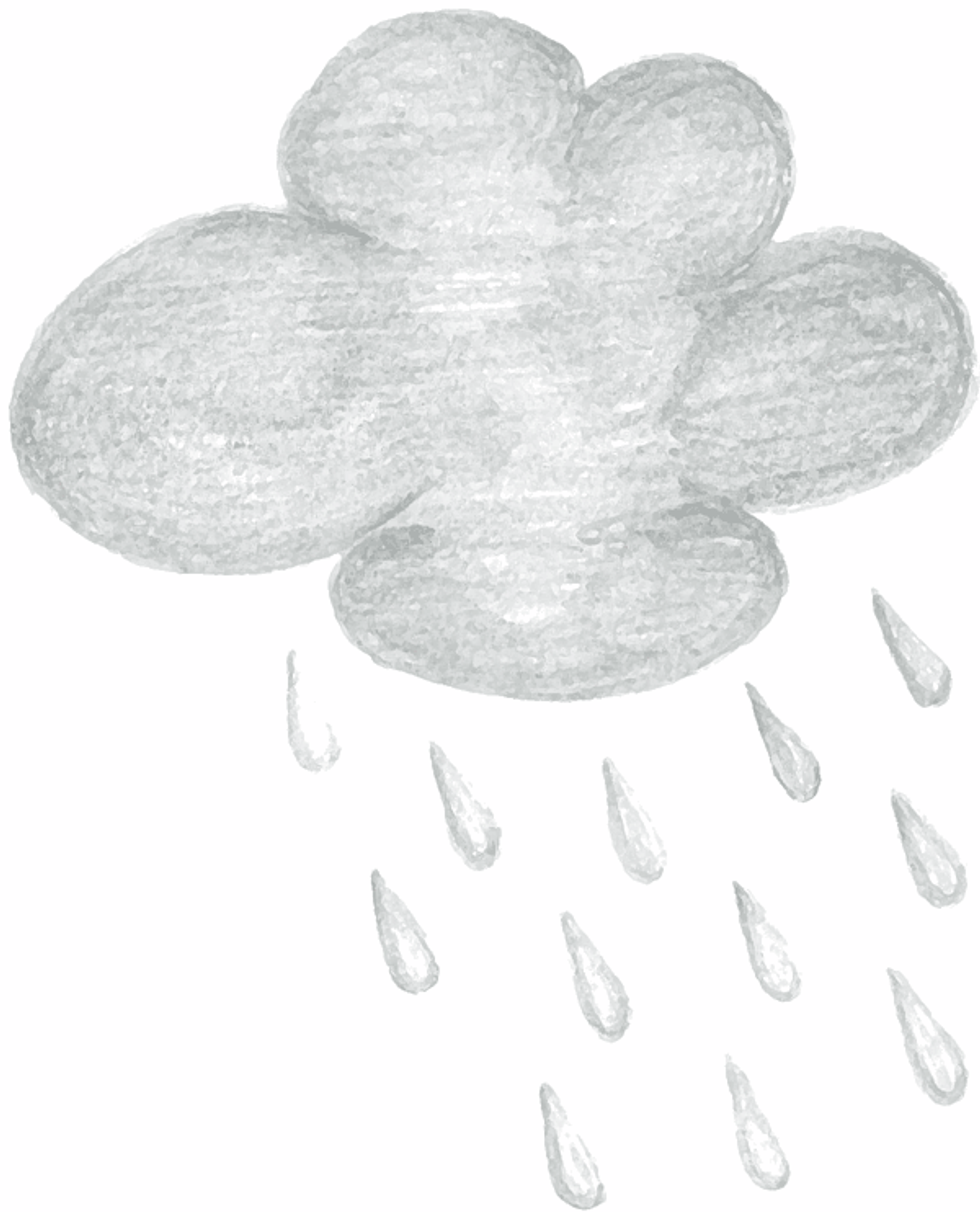
They only color that holds no specific meaning. It is often used as a neutral color and can represent depression or or lack of confidence.
Red

Red is the most emotionally stimulating color. It stimulates faster breathing and the heartbeat and is an appetite stimulant. Red can symbolism blood and evil, but also love and the heart. Recent studies show that people wearing red or standing in front of a red background are viewed as more attractive. Scientists label it the ultimate color of attraction, which explains why fast food corporations use it frequently to advertise their products and incite appetite.
Blue
Blue is red's opposite. Studies show the brain releases calming chemicals when you look at the color blue. Blue is a very popular color, but some shades can be cold, sterile and depressing. Other shades can actually promote productivity, some studies even show that weight lifters can lift heavier weights in blue gyms.
Green

Green symbolizes nature and is the easiest color on the eye. It's also reported to improve vision. Green is a refreshing, calming color. Hospitals often use the color green to relax patients, and theatres and studios use "green rooms" for actors, host, and news anchors to relax them before and after appearing on set. Dark green is a masculine, conservative color and implies wealth. It's also a lucky color, as in four leaf clovers.
Yellow

Yellow is a cheerful color that draws attention a strong contrasting color. While it is considered an optimistic color, people often lose their tempers around the color. Yellow is the most difficult color for the eye to take in, so it can cause headaches or be overpowering if overused/prolonged exposure occurs. But yellow is thought to enhance concentration and speed up metabolism.
Purple
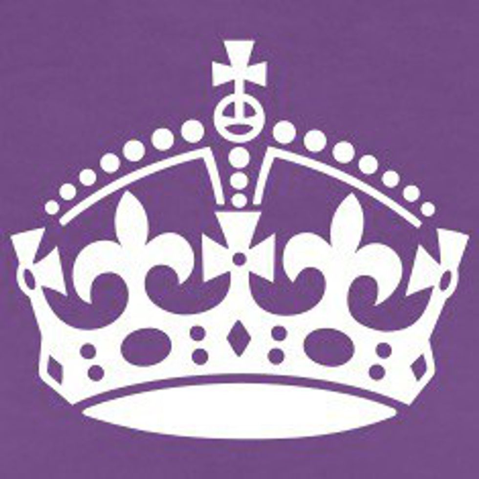
Purple is a royal color and denotes luxury, wealth and sophistication. It's also feminine and romantic. But because purple is rare in nature, it can appear artificial. Most web designers and marketing designers stay away from purple because it can appear be vibrating especially with the wrong contrasting color.
Brown

Brown is a solid reliable color. It is the color of the earth and various shades produce different emotional responses. Light brown can produce genuineness, while dark brown can also be considered sad or wistful, though in general it is a masculine color.
So colors can do and mean a lot more than most people originally think. But what exactly does that mean for marketing and the ugliest color on earth. Well if you look at Pantone 448 C, it's a mix of green and yellow and brown. So while it should be relaxing, it's also vey intense because of the yellow and sad because of the brown. And I'd say that relaxation with the sadness and intensity would just make things depressing.
And the most attractive color is red. Twizzlers, Coke, McDonalds, Jif peanut butter, Lucky Charms, etc. So many food and products we buy use the color red to entice us.

And there is a whole science behind how you should paint your house or what color shirt you should wear on a first date. Each color contains its own mini psychology. Check out this chart to see how colors impact everyday life.