Sometimes you can't always get the right lighting to have your picture turn out the way you'd want it to.
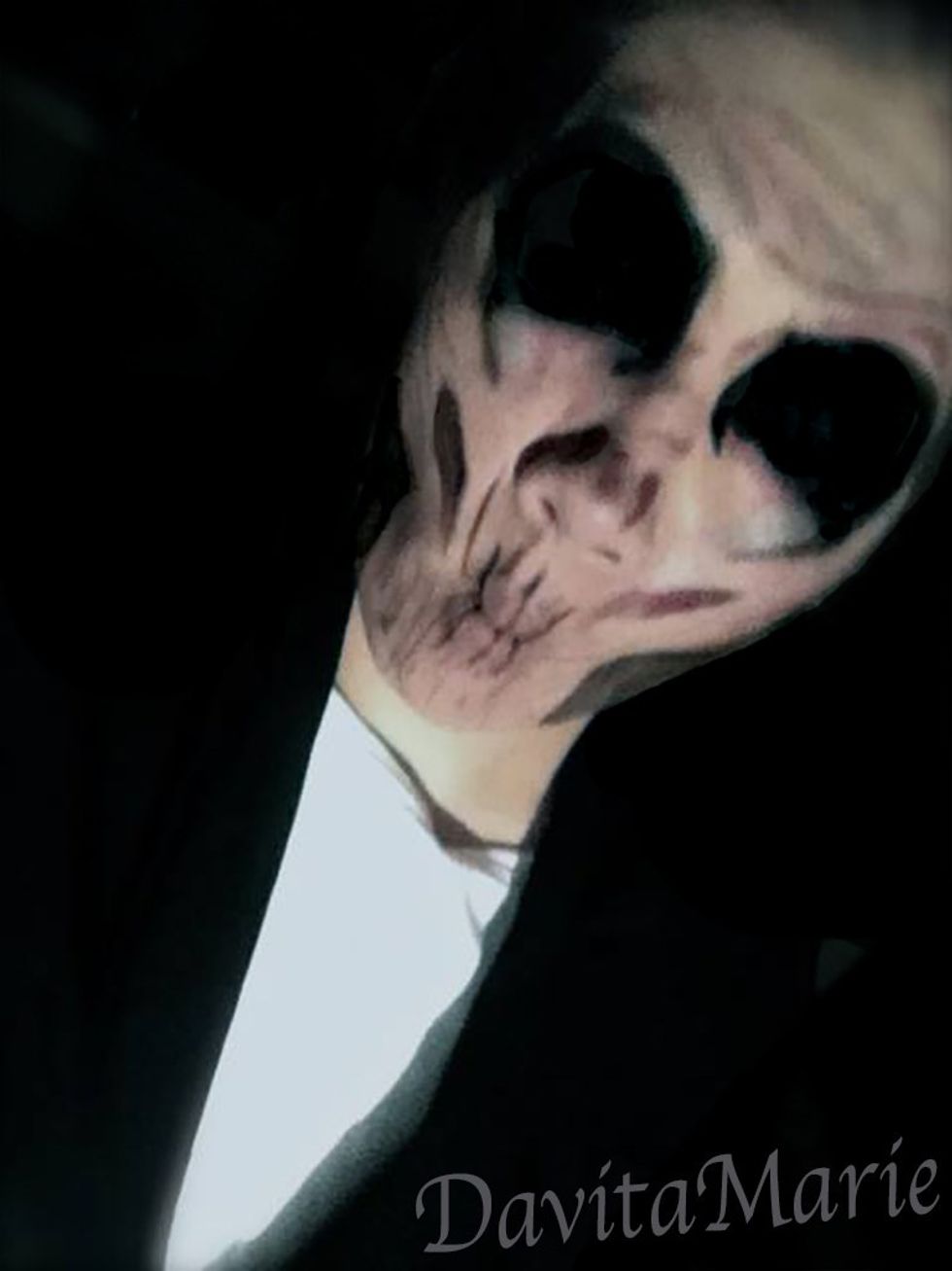
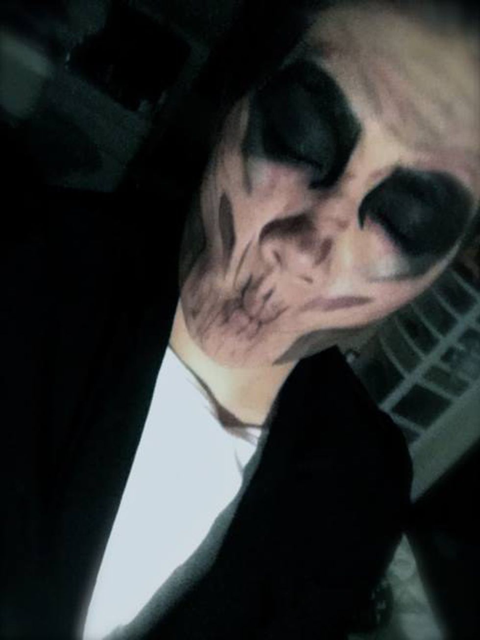
For this picture of The Silence (From Doctor Who), I wanted the background to be completely black to be able to bring out the face painting more than it would with the background technically being there.
As you can see from the before and after, with a little light adjustment, the painting is more clear and to me looks more professional.
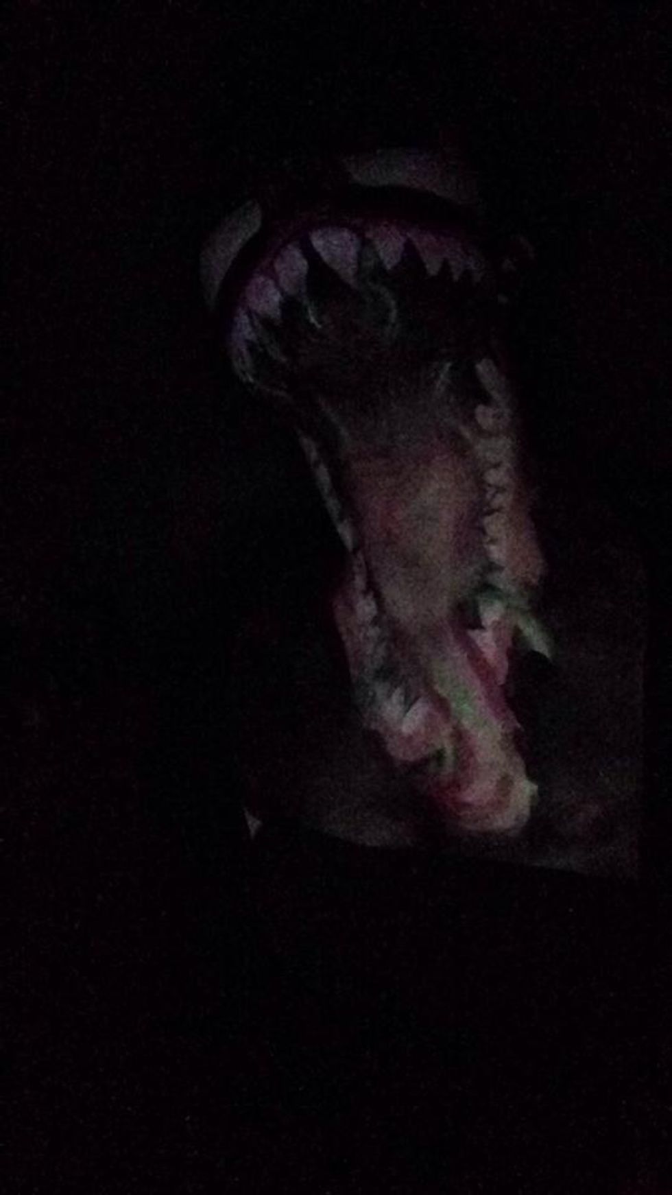
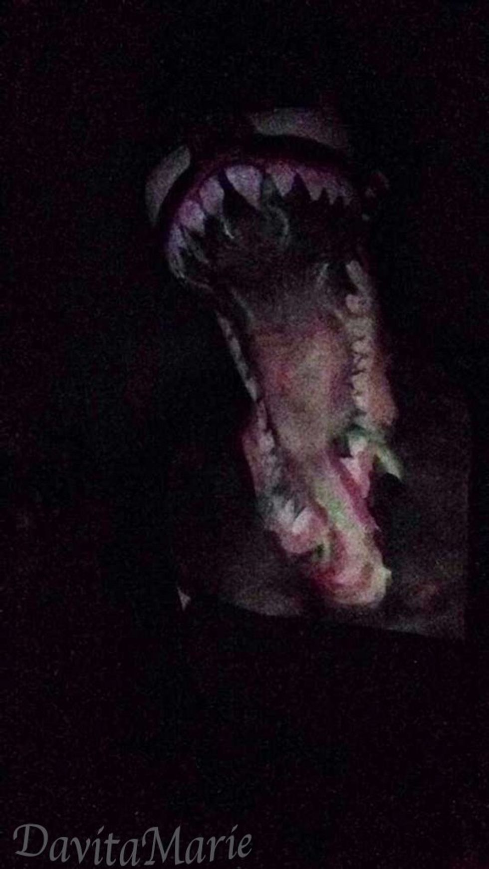
For this picture of Venom on the other hand, I had every single light in my room turned off and I used the front flash on Snapchat on my phone to get the face painting to show up. But, as you can see from the first picture, it's kind of hard to tell where all the features are in detail.
Where the first picture you can still make out that it is Venom, it's just not very easy to see all the details. The edited picture though, you can see the eyes and teeth a lot clearer.


