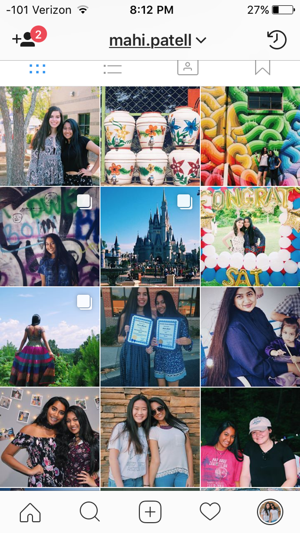
VSCO is by far one of the most life-changing photo editing apps for Instagram users worldwide. It has an amazing variety of free filters, unique editing tools and extra filters you can pay for. It is a social media site combined to create a virtual portfolio to show off all your beautiful pictures. Sound too good to be true? It is. While VSCO is absolutely amazing, its platform and constant updates make it hard for people to grasp. The layout is confusing and navigating the app can be tough, but once you get the hang of it, there's so much you can do! As an amateur photographer, VSCO has enabled me to broaden the aesthetic of my Instagram page and greatly increase the quality of pictures I share.
Here are some of my edited shots below!
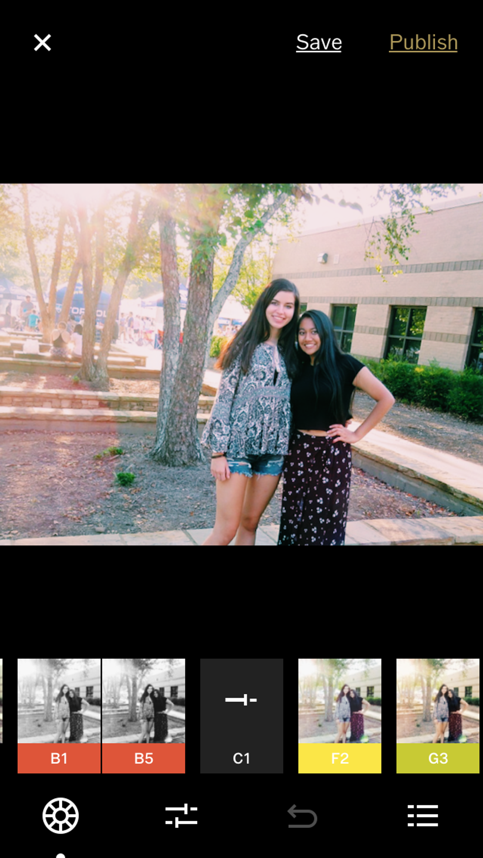
The main thing to remember about VSCO is that the filters are all about what aesthetic you want to create. Once you pick a filter, your Instagram pictures should not stray from it much to create a cohesive theme. Most filters are flattering to the lighting of the image, but some can make it darker or brighter. My personal Instagram follows the C1 theme (shown below), however for some of my darker pictures with heavier shadows, I like to use the A1-5.
To get to the filters, click on the picture and then click on the button with the toggles and lines. Once you have picked a filter, click on the same button to get to shadows and tints.
Each symbol has a caption which is helps to figure out the "job" of each button. When I edit my pictures, I usually like them to be bright and detailed without a grain.
To do this, I slightly shift the exposure to either diminish the shadows or increase them depending on the lighting in the picture. I almost always increase the contrast to increase the difference between light and dark. You can choose to straighten, crop or skew based on the symmetry of the photograph. If the picture is leaning more towards the right, skew on the X-axis to the left to create a greater balance. This also makes your subject the main focus and looks especially stunning in the small squares of your Instagram feed.
As you scroll through, sharpen and clarity are features I don't normally use because I take most of my pictures with an already high-quality camera. Saturation can be increased to brighten the picture, but be careful, you do not want to over-do it and end up looking orange. Temperature and tint really produce the same effect, so pick one and edit using that. Using both is not effective or efficient. The skin tone feature will be your savior when editing those sunburned-from-the-beach pictures. After the vignette feature, which I utilize to increase the effect of shadows, but I usually skip the features that follow. If you do wish to use them, most of them only enhance the smaller elements of the picture such as the grain and the shadow.
While there is a lot to keep in mind when editing a picture, it is all worth it when you have a beautiful final product. With VSCO, you can truly see the difference in quality when observing the before and after products.


