Instagram is an integral part of any girl's social media line-up, so you want to have the best photo possible. One huge part of that photo is how you edit it. Editing apps like HUJI and VSCO are super popular these days, but I'm here to teach you what the tabs on the editing section actually do and how to work them in your favor, professional photographer style.
Chose the best photo.

photo by Emily Barbus
Emily Barbus
In order to have a good edit, you have to first have a good photo. Grab one that has a clear subject, like you and a friend, and one that isn't too dark or light (under or overexposed). Once you have that, you're ready to start editing. For this tutorial, I'll be using VSCO.
This photo of me and my friend is just OK; we can make it a lot better.
White balance and exposure.
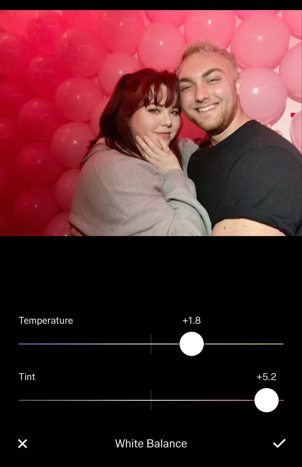
photo by Emily Barbus
Emily Barbus
This first two tabs you need to focus on first are White Balance and exposure. These will help get certain parts of the photo to stand out and fix and small lighting issues you may have. Be careful not to overexpose your photo, because details can then be washed out, and that can't be fixed with the contrast tool.
White balance helps you with either fixing certain tones in the photo or manipulating them toward a certain color theme. With my photo, I want the pink tones to stand out, so I made the photo a lot warmer by moving the dots toward the pink and yellow side of the spectrum.
Contrast and Tone.
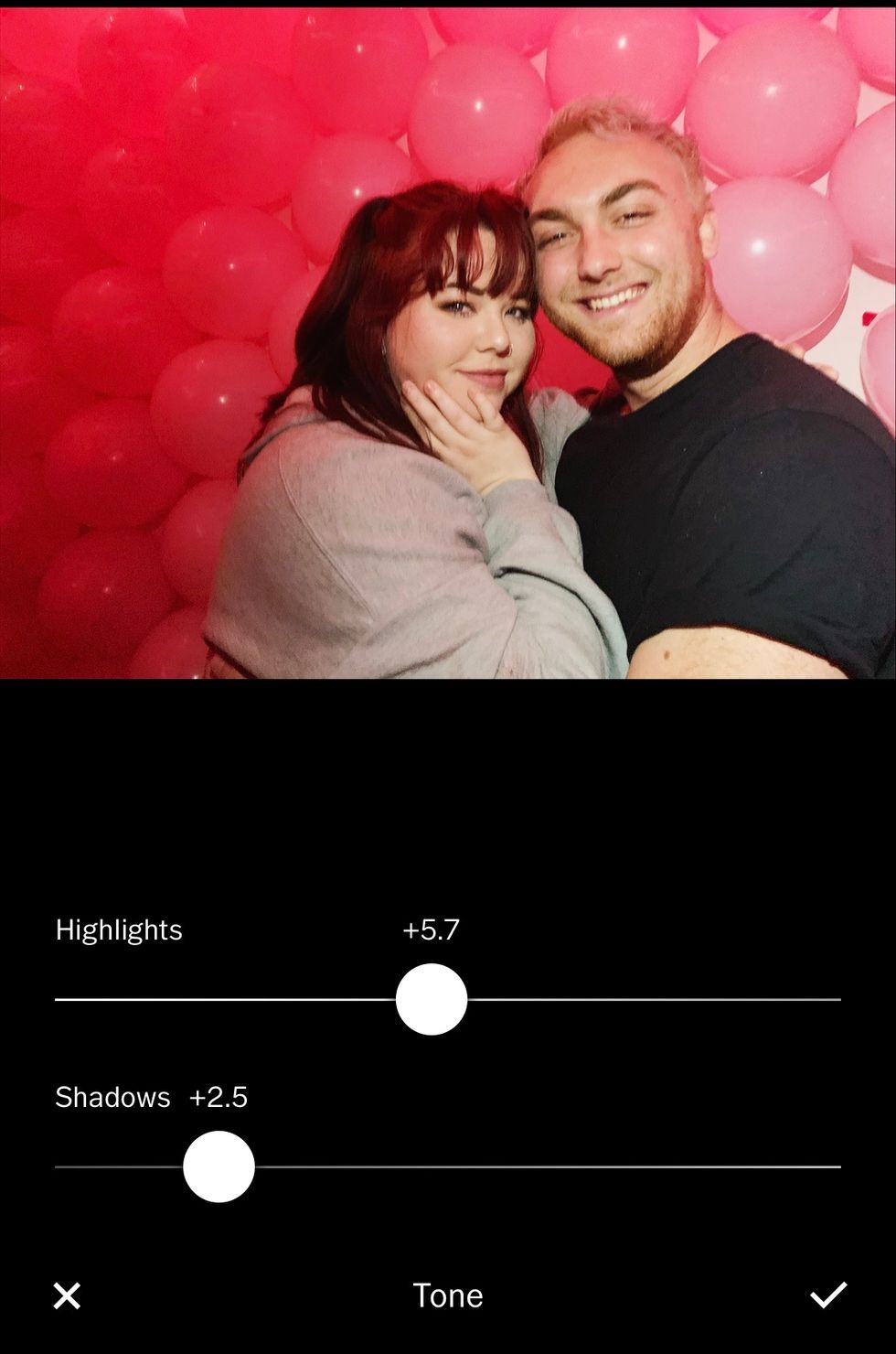
photo by Emily Barbus
Emily Barbus
My photo is a little blurry, but I think that's the appeal of the photo. However, I can make the details of our faces more prominent with the contrast tab. Be careful with contrast, though--if you use it too much, you can wipe out details on the light and dark parts of your photo.
Then, I work with tone. Since this photo was taken with flash, a lot of highlights are on our faces. I want to make our skin tones look more even, so I took away a lot of highlights and took away some shadows as well. Increasing shadows on this tab can make a photo look more "faded" without actually taking away the integrity of the photo.
Saturation and Skin Tone.

photo by Emily Barbus
Emily Barbus
Be extra careful with these tools; saturation can make a photo go from good to tacky in a second. Use it sparingly, and only if you want the colors in your photo to stand out. I used it a *tiny* bit to make the balloons in the background more pronounced.
Skin Tone can also be tricky because if you have colors in your photo that are similar to that of skin (like the balloons in my photo) it can be difficult to change the skin tone without changing the color of the whole photo.
The pic above is an example of how saturation can ruin a photo.
Split Tone.

photo by Emily Barbus
Emily Barbus
This tool is where you can go ham. Do you have a specific color theme on your Instagram that you're trying to stick to? Split tones will be your best friend. Here, you can change the highlight and shadows to any tint you prefer.
I added a slight red tint to my shadows and a slight blue tint to my highlights to make me and my friend stand out from the background.
Finishing Touches.
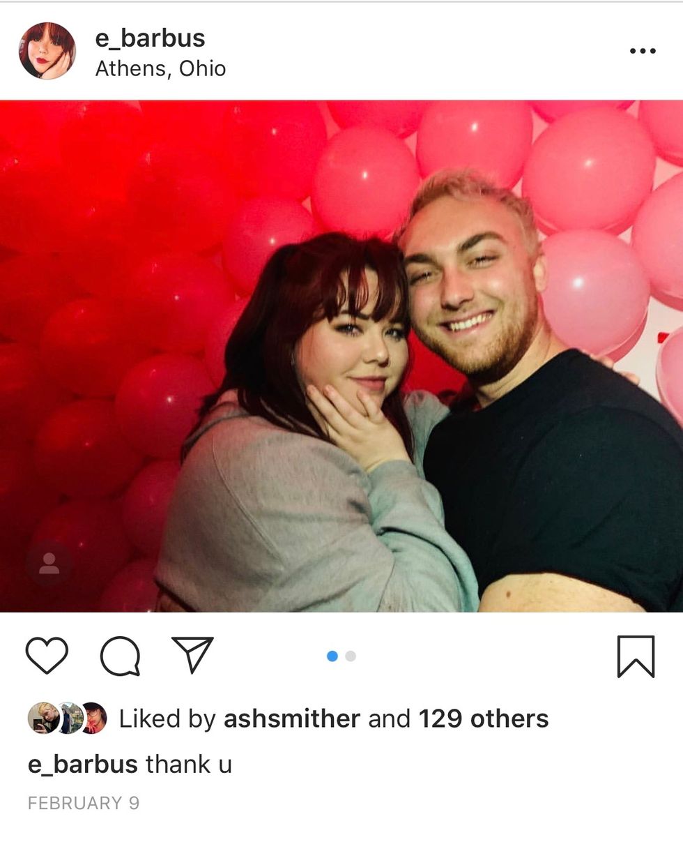
photo by Emily Barbus
Emily Barbus
After all of that, you can mess around with any of the other tabs on VSCO, like grain if you want to give your photo a vintage vibe, or vignette if you're feeling dramatic. After that, your photo is picture perfect and ready for Instagram!
P.S. A balloon wall is an amazing thing to add to a college party; it's great for photos and a way to have a theme! The pink balloons behind us were in celebration of Ariana Grande's album release.






 The minimum wage is not a living wage.
StableDiffusion
 influential nations
StableDiffusion


