Not a designer, that's okay! But do you work with one? I always believe that you should learn about other professions when you can so that you can interact and work with them more effectively. My first advice is to ask questions, but sometimes it's uncomfortable when you don't understand the language. Here are some possibly confusing 2-D design principles/phrases that designers may use and consider when working on a project....
1. Harmony
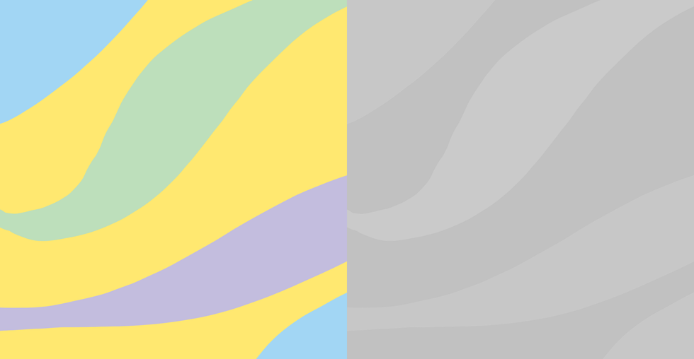
When people hear the word "harmony," they probably think of a song, or maybe two things living in "perfect harmony" or balance. In design, harmonious colors are colors that, if put in a black and white filter, would be around the same shade of grey. This means they have the same intensity and therefore look "harmonious" together.
2. Movement
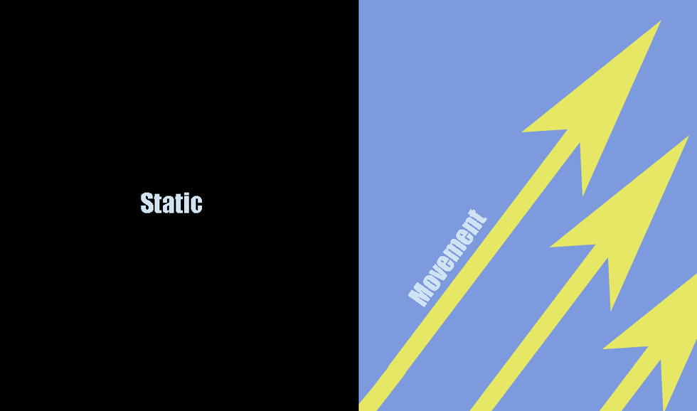
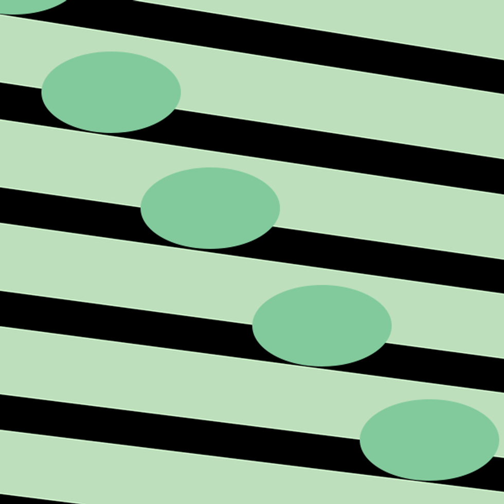
In design, movement doesn't have to mean animation or actual moving parts- it's the movement of your eye across the page, screen, or whatever medium is being used. An easy way to create movement is diagonals. If there isn't much "movement" in a design, it is called static.
3. Rhythm
This is another music term that can be used for design. A similar term used in animation and storytelling is "beats." With rhythm, you are controlling the timing of a person's movement through the piece. That can be a little confusing to understand, so the easiest way to think about it is how you actual get rhythm in a piece. Repetition is often used to create rhythm, so that your eye evenly goes from one object to the next, to the next.
4. Hierarchy
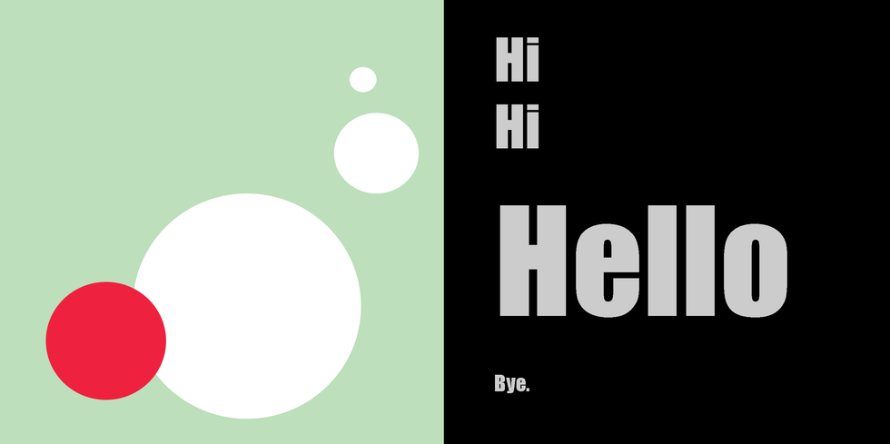
Having a hierarchy is making sure that the most important element is seen first, the second important seen second, etc. Think of the title of an article being bigger and bolder than the rest of the content, then a subtitle, then the text of a paragraph. That's hierarchy. In a design, it can be established with size, color, layout, etc..
5. Rule of Thirds
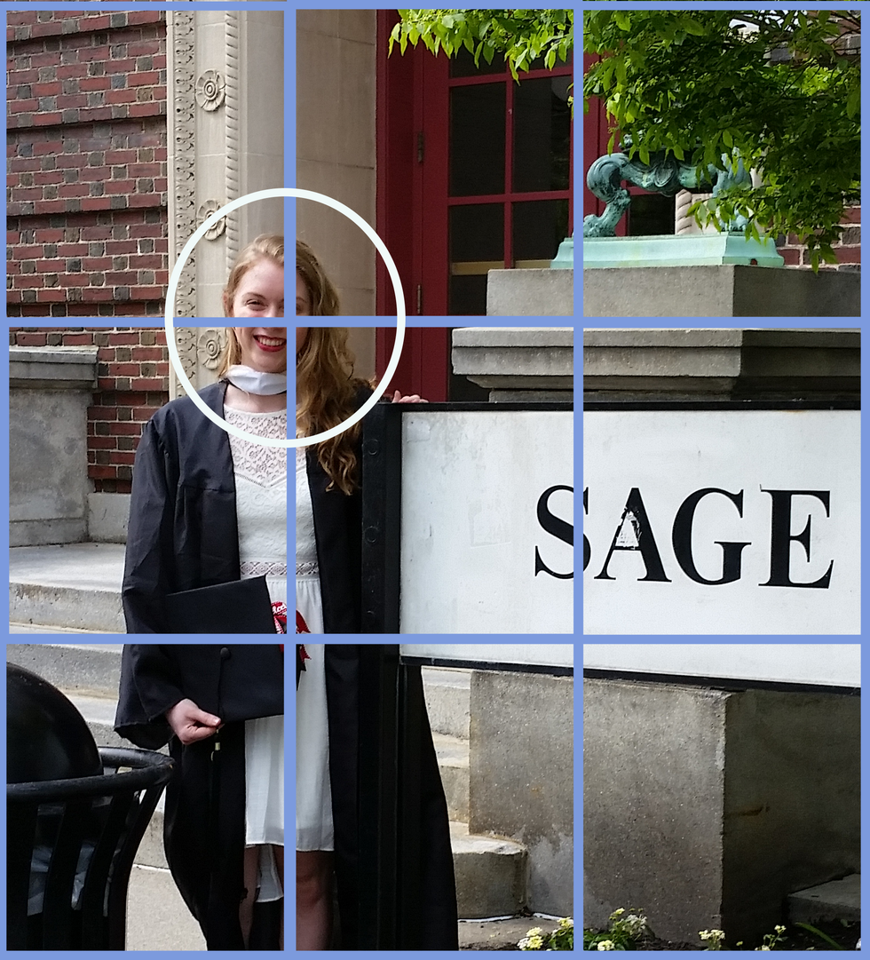
This is an easy way to make sure your design has an interesting layout that will catch the viewers eye. Just imagine a 3x3 grid on the image/illustration and make sure your main focal points, or the most important things, are on the intersections of the lines, or corners of the squares from your grid.
6. Negative space vs. Positive Space
This is somewhat related to having a good hierarchy and movement around the design. Positive space in a design is your points of interest- somewhere where you are getting information of some sort. Negative space is the "breathing room" in the design that is helping to display that information. Negative space doesn't have to be just white, it just has to not demand a lot of attention.

7. A Negative vs. A Positive
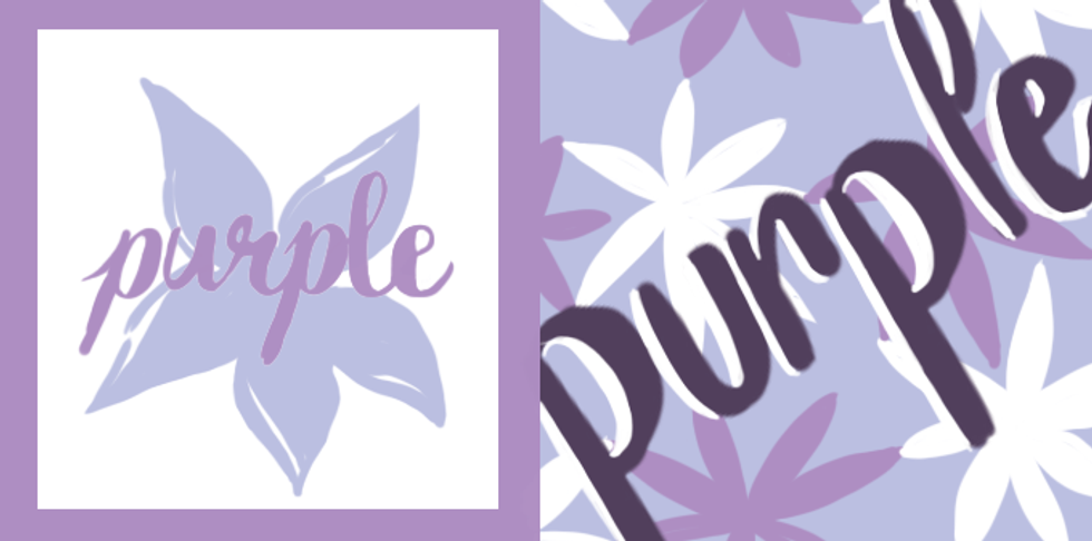
A negative or a positive of an image is different than talking about negative and positive space. A positive is where the image you want is a color, while a negative is where everything BUT the image you want is the color. This is generally used in logos, screen-printing, etc..
8. Tension
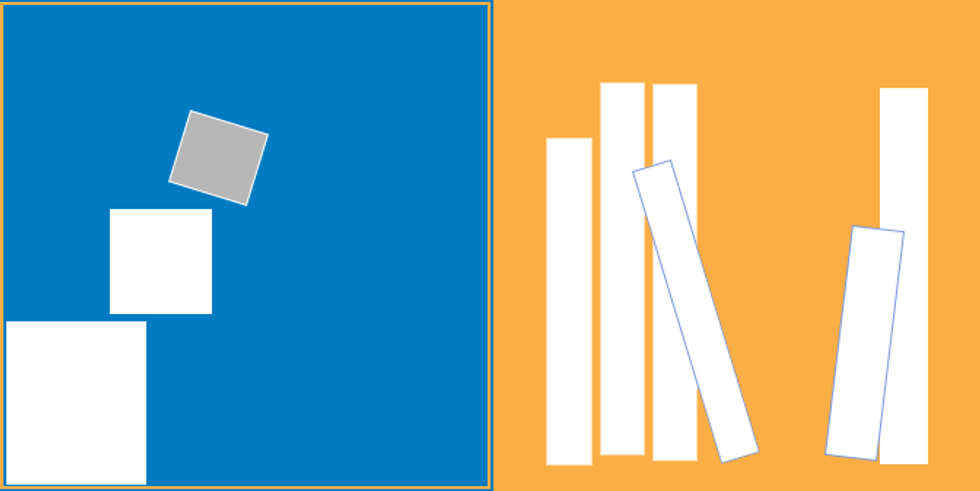
Tension makes a piece uncomfortable- it can be two pieces that are very close but not touching, something too close to the edge, an angle that seems precarious. There are a lot of different ways to create tension when you want it, and to alleviate it when you don't. Think about if you want the viewer to feel uncomfortable- will that engage or interest your audience, or scare them away?
9. Closed vs. Open Composition
So a closed composition is contained within the frame of the design, while an open composition implies that the image goes on, This doesn't have to be a picture of a landscape or an actual place that goes on, just an image that is only showing you part of the "world" or space it's in. To make things open, you can let objects be cut off by the page, to imply the rest of the object is out of frame; this often helps alleviate tension too. However, closed isn't a bad thing! It just depends on the design.
10. Implied Line
Implied line is when images or shapes are laid out in a way that you eyes follow an invisible "line," hence implied line. It's not an actual line or stroke, just an arrangement that mimics one.

Are you a designer and have phrases that you wish people understood? Or are you a non-designer who is confused about a phrase? Comment and share!

