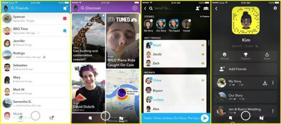
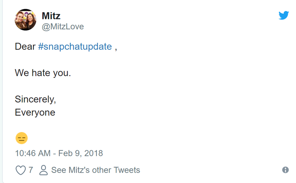
Snapchat made a dire mistake changing almost everything about the app, especially when no one asked them to. Team Snapchat is hoping that everyone is upset with the design because we are unfamiliar with the design.
The problem with this way of thinking is that we are not upset with the unfamiliarity (well, maybe a little)—we are upset with the terrible layout and design problems caused by the new update. It really is the worst. There is even a petition with over 80,000 signatures, trying to get the old update back. Here are eight reasons why the Snapchat update is so terrible:
1. Everything is cluttered
By combining everything from your friends, the friends page looks extremely cluttered and disorganized—completely opposite from the old, clean-cut Snapchat. Everything is squished.
The discover section is worse. You can only see four stories from companies at a time; again, clutter, but this page is too spread-out with too much scrolling.
2. The discover section
I got my news from Snapchat. This will no longer be the case because I can't find the The New York Times, NBC, or CNN. All the other fun stories I enjoyed watching are hard to find. I guess I'll just start using Twitter more. Thanks Snapchat. 😒
3. The location of people's stories
The old Snapchat had friends' stories on a separate page, in chronological order. This was nice because it kept messages separate from everything else. This update has people's snap stories replacde their bitmojis. It's hard to see who has a story out.
On top of that, if more than one friend has a story out, the stories are a continuous chain, making it hard to tell where someone's story stops, where someone's story begins, and whose story it is in the first place.
4. Chronological posting is no longer a thing
Instead of seeing the most recent stories or Snapchat that you've gotten, the people you are going to see is based on a popularity algorithm. So far, for me, it has been pretty wrong.
5. Bitmojis are emphasized more
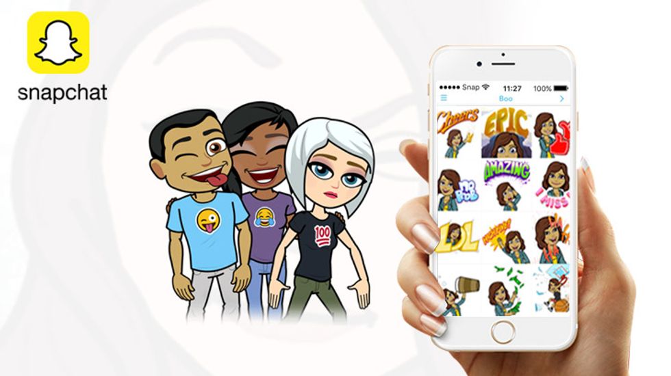
Bitmojis are not helpful. They rarely look like the person they are supposed to. In no way does putting the face of someone's bitmoji near their snap name help anyone. Plus, they can be a little creepy.
6. Less emphasis on streaks and best friends.
This fire and streak numbers are still there, but they are much smaller. Same with the emojis that signify best friends or the hourglass that means your snapstreak is about to end or the birthday cake that tells you it's someone's birthday. I personally liked looking at those.
I loved seeing the yellow heart, red heart, and double heart front and center. And with the hourglass or birthday cake so small, I am going to forget to send a birthday snap or streak snap.
7. The readability of who you are sending your snap to
The best friend section is broken into two columns. The first mistake about this is going from left to right (#1 friend is on the top right, #2 friend is on the top left). This makes it a group, instead of a ranking. The sections for recents and friends are the same, but they just look worse.
8. Finding your local snap stories
As a college student, one of my favorite stories to watch was Iowa State campus's story, as I could see familiar locations and faces and update myself on campus events. As much as I have searched, I can't seem to find the stories just for local places. It might still be there, but I can't find it and that's as terrible of a design as you can get.
If you are one of the lucky people whose Snapchat did not update, save yourself and don't update it. While Snapchat may have had good intentions, separating its pages into a friends section, the camera, and a (terrible) discovery section makes the app much worse.


