Let me preface this by saying: if it's not broke, don't fix it.
So, Snapchat. You love it or hate it. You use it to see what your ex is up to throughout his day and you have a 250-day streak with your best friend. Your Bitmoji is an online, 3D you. Life is perfect.
Until it isn't.
Within the past week, the Snapchat app (either by force or by choice) has rolled out a brand new, totally redesigned look that has sent most users reeling.
The backlash has been intense, with hundreds of thousands of signatures on petitions to revert back to the previous design.
So what's the gist of this new update? What's prompting everyone to go crazy with complaints?
Well, in simple terms, it's a hot and confusing mess.
First and foremost, your stories and new Snaps are now all in one window, as seen below.
It's so unorganized. A new story, previously just chilling on the Stories page if not yet viewed, is now just highlighted with a light blue circle. A notification is shown by either a blue or red icon, depending on if it's a chat or a Snap.
Oh, and the new notifications and stories page issue gets better. It's not CHRONOLOGICAL!
I do not understand why social media apps are trying so hard to do away with chronological order. What noob wants to view people's updates out of order?
Then, the second major issue is the atrociously redesigned Discover page. This is where Snapchat wants you to view the stories of people more important and more famous than you. For example, this is where you will continue to see Kourtney Kardashian's workouts and take the "Which Olympic Snowboarder Are You?" quiz, proudly sponsored by NBC.
Celebs and your friends no longer share one window for updated stories, making users much less likely to even check the Discover page now. It's basically a cesspool of ads and tabloids.
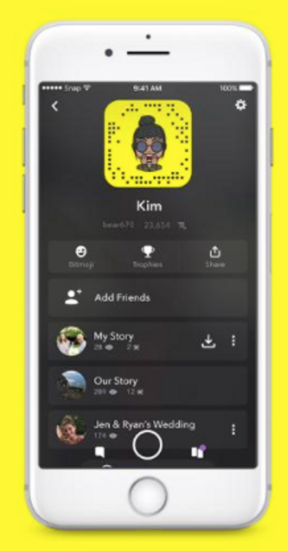
Then, another new slide has been created whenever you want to view your own story. Just like before, your story was always on the same slide as everyone else's stories and Discover. Kiss those days goodbye:
LOOK AT THAT! How confusing, am I right? You have a million different story options now and way too many functions on one slide.Sending a Snap is now a heavy conundrum as well. Look at those little rectangles. Finding your friends is so difficult, compared to before when it was just a simple list format.
And then, in a move no one saw coming, Bitmojis became UGLY. Really, really weird and ugly. Mine, who used to be my pride and joy in her Marc Jacobs looks, is now deactivated and in Bitmoji Heaven.
I mean, really. Too much loss here.
My own update was FORCED upon my phone as I was innocently having lunch at Chick-Fil-A just this past Friday. I've noticed a decrease in story views by about 15-20 figures, either because people have deleted the app, literally do not know how to use it, or simply don't want to attempt figuring it out.
I can't say I blame anyone for either option.
I myself am considering deactivating and subsequently deleting the app for good. We have Instagram stories, y'all. They're cuter and we'll be just fine. Even before the horrendous Snap update, many people were heading to Instagram anyway. As of November 2017, Instagram hit a record 300,000,000 daily users on their stories, which is twice the amount of Snapchat's daily users.
There is a silver lining, though. The public reaction.
Twitter has been lit aflame with angry Snapchatters tweeting left and right, while the App Store saw the app's rating go from a 4.8 to a current 2.0, which... ouch.


