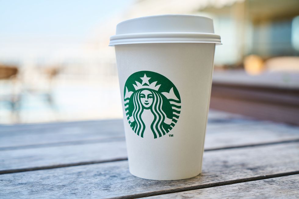
The green and white-haired Siren seen on every street corner in New York City began as a bare-chested, two-tailed deviant. With her hair down to her collarbones, a crown on her head, and both hands suggestively holding a section of her tail, the Starbucks Siren has come a long way since the birth of the company in 1971.
Their logo is hard to miss. It’s on cups, napkins, pastry bags, and the green apron every barista wears. The first Siren logo was designed by Terry Heckler. Originally called Starbucks Coffee Tea and Spices Company, the founders of Starbucks were inspired by the classic novel, “Moby Dick.” Starbuck was the name of the first mate that dreamed of going home to be with his family but was obliged to follow his captain [i]. Running with the name, Heckler took to maritime books and he found an Old Norse woodcut of a siren. And just as the sirens of lore, the figure called to him.
The Siren is often confused with a mermaid. In traditional Greek lore, sirens were beautiful half-women and fish that would seduce men and lead them to their death. But the Starbucks Siren is Norse, and when looking for something that showed the company's relationship to water- being based in Seattle and the long distance the coffee travels over water - they found her. Yet, the Siren is a Melusine, meaning a siren with two tales. According to Slate, this was to solve the question of how fish women could have sex with sailors[ii].
At the Clifton Park Starbucks, the neon Siren hangs right next to the door. It glows at all hours and its watchful eyes stare right at the baristas behind the counter. She watches as beverages are prepared and coffee is brewed in her name.
Morgan Corbett works the early shift most mornings. At 4:30 a.m. she’s unlocking the doors and booking it to the back in the dark to silence the alarm. The siren comes on with a simple switch. “I like her, she’s like a cool chick," Corbett said, planning out her floor for the morning as the shift manager on duty. To Corbett, the new logo is far more pleasant to work under, it's far less creepy and scary to her now than it use to be.
The logo underwent a change in 1987 with a color palette switch from brown and white to green, white, and black. The company had also undergone a name change, dropping the tea and spices, simplifying down to Starbucks Coffee. Now long wavy hair covers the Sirens breasts, her navel and crown are still present, and the figure was holding her tales up high. This change came after Howard Shultz bought the company in 1986. Higher-ups found her to be a little too provocative. Shultz stepped down as CEO of the company in the December of 2016.
The Clifton Park store manager, use to proudly wear her old logo shirt around the store until she found a customer staring at her chest one day. Confused, she thought “Really dude?” before realizing the customer was staring at the naked Siren. She knew delivery trucks weren’t allowed to print the logo on them because of the Siren’s exposed chest, so they simply put the name of the company on them.
“Okay so the Siren means to me, in the beginning, they made the Siren to make it as enticing in appearance as coffee is to people,” she said, laughing motioning towards her own chest. Nowadays, the manager doesn’t see the need for the Siren. She believes that the Starbucks name in itself is better.
Next to her, sat Brandon Jones holding the store mouse pad with the Siren’s face on it, marveling at the fact that even people who don’t go to Starbucks would be able to immediately recognize the Siren and automatically know a coffee shop was coming up.
In 1992, the Siren changed again. She was now cut off at the waist, her two tails following the circular curve of the logo they trapped her in. She remained covered and her navel was excluded from this version. This also happens to be the same year Starbucks became a publicly traded company [iii].
In the most recent logo change, in 2011, the Siren received another face-lift. The words “Starbucks coffee” were removed and the Siren now takes up the whole logo. The only original pieces left of her are the split tale, the long wave-like hair, and the crown.
A secret about the Siren is that she has a design flaw, which she was purposely given. When giving the Siren this lift, the Lippincott design team found she didn’t work. The problem was that her face was perfectly symmetrical and it made her look inhuman.
To Connie Birdsall, imperfection was important and she believed it added more humanity to her. For the team, that meant making her less symmetrical. In the end, they designed the Siren’s nose to dip lower on the right side. That slight change made her feel more human and “less like a perfectly cut mask,” [iv] according to fastcodesign.
Alex Gandlin, a former Latin teacher and current barista trainer, believes the infamous Siren has lost the meaning she was originally meant to evoke, a sense of adventure, exotic spices, and coffee. For Grandlin, it goes beyond the fresh coffee and pastries. "It's about all the stuff we make fun of behind the bar from the training and in the stuff we read from corporate: the idea of the third place, the inclusivity, the compassion, the friendliness we try to show everyone who steps up to the POS (point of sale),” Grandlin said. For Grandlin that’s what the Siren means. It’s creating the much-hounded upon aspect of the “third place” from the Starbucks training videos, a place that is neither home nor work where people are welcome and comfortable.
The Starbucks Siren has no formal name. She is simply referred to as “the Siren” by Starbucks partners and customers. For a siren with no name, she is the face of a company with more than 27 thousand stores [v]. Her face is plastered on buildings and signs around the world making her, likely, one of the m[i] https://en.wikipedia.org/wiki/List_of_Moby-Dick_ch...
[ii] http://www.slate.com/culture/2018/03/annihilations...
[iii] https://www.logodesignlove.com/starbucks-logo-evol...
[iv] https://www.fastcodesign.com/90157014/the-starbuck...
[v] https://www.statista.com/statistics/266465/number-of-starbucks-stores-worldwide/


