While I don’t expect politicians to be experts on user interface design or branding, they should invest in people that can best represent their brand. It doesn’t take a degree in marketing to know that catchy slogans and memorable logos can help improve the sales of a product, in this case, the presidency. Let’s stay true to form with most mainstream media and pretend Bernie Sanders doesn’t exist as we compare the websites of two frontrunners in the campaign, Hillary and Trump.
Typography Lesson: fonts can be divided into two categories based upon their design. Serif fonts have the little “feet” at the tops and bottoms of letter (i.e. Times New Roman, Garamond, Georgia) Sans-serif (sans = without) fonts do not have the “feet” like the font of this (i.e. Comic Sans, Helvetica, Arial, Verdana.)
Logo
Recommended for you
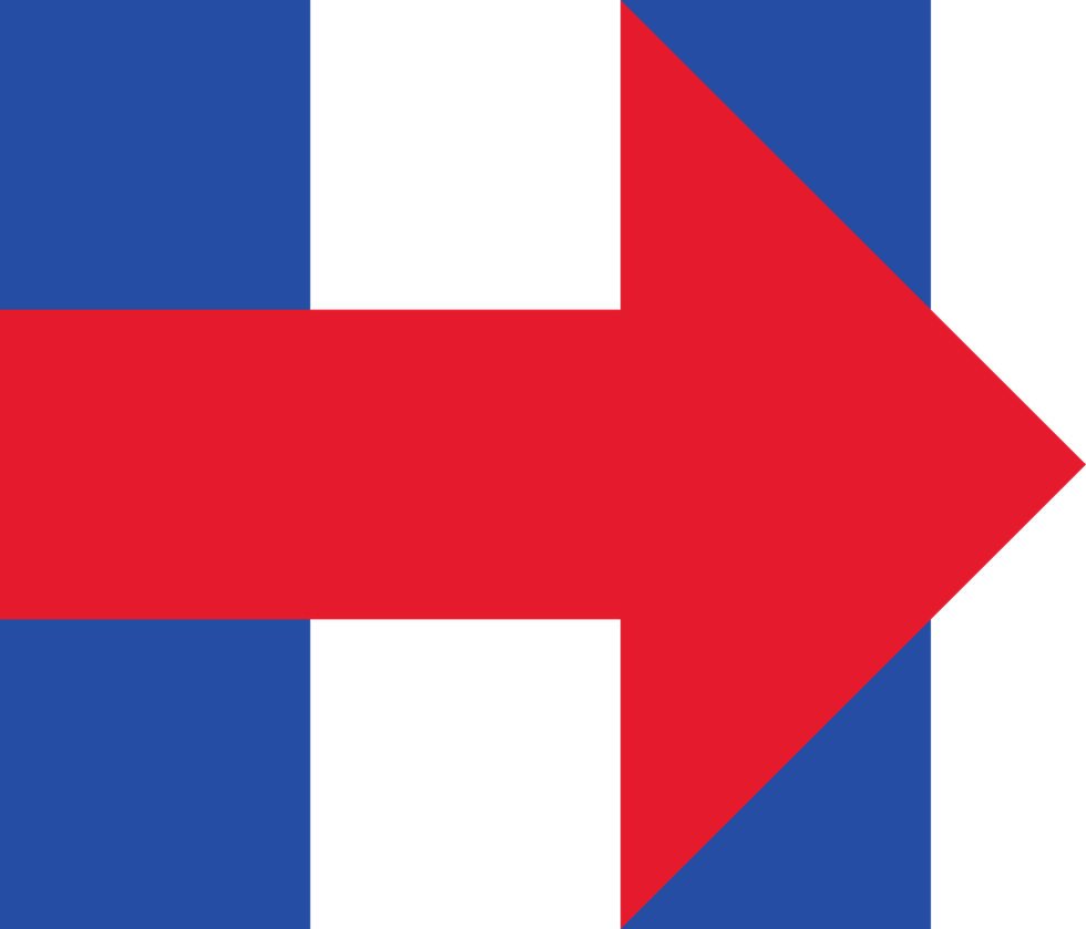
Hillary’s logo is a navy capital letter H with a red arrow in the middle pointing to the right. This is an appropriate signage because it’s completely uncontestable. It’s a letter H. Who doesn’t like the letter H? The arrow pointing forward suggests progress, evokes associations with Fed-Ex, a beloved package delivery company, and adds interest to the design. It’s a satisfying, symmetrical composition that can be adapted in many colors and scaled easily for advertisements, bulletin boards, and digital media.
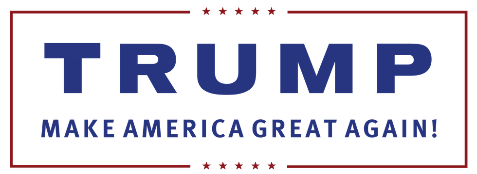
Trump’s logo is his name in a bold sans-serif font. The “Trump” brand existed long before he had sights on the presidency. This is good for publicity, but can be bad for marketing. Unlike the letter H, Trump is a highly contestable figure. Therefore, this logo is associated with a controversial brand. Though his logo is also scalable and color-independent, he is constrained by using his full name whereas Hillary has the option to go full name or the single letter.
Slogan
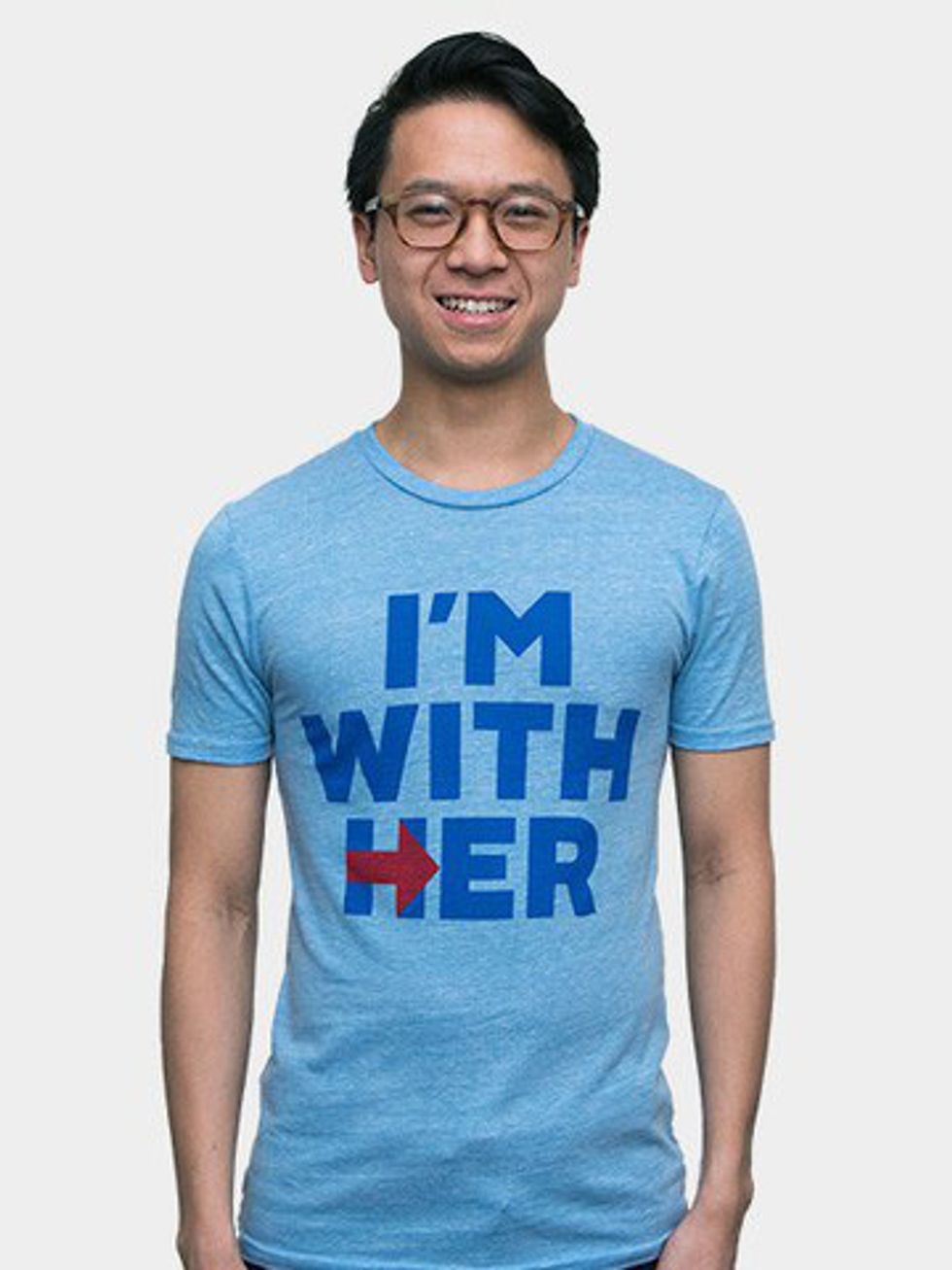
“Make America Great Again” is obviously the frontrunner for a slogan. While one could see Hillary’s “I’m with her” and immediately agree or disagree, any true American can’t argue with the idea of making America great again. What are you, some kind of communist? Who doesn’t want America to be great? Its message is about as positive and vague as Obama’s “Hope” or “Change,” and he won so there’s probably a correlation.
Design
Hillary’s site is predominantly white with red, black, and several shades of blue acting as accents. It features the same sans-serif font as her logo, large lettering, and lots of images. It is designed with millennials in mind: clean and modern drawing from other popular websites like Buzzfeed. The text and content occupy the majority of space on the page. Trump’s site is off white with the upper portion of the screen dominated by dark blue and red. It uses a serif font generally, but buttons and headings match his logo. It has a more traditional style with larger amounts of negative space surrounding information and uses simplified icon headings. The issue with judging these is that Hillary is more actively campaigning for the youth vote, and makes a website that would be familiar to millennials, like me. Donald Trump’s primary concern is getting the majority of the Republican vote and not necessarily seeking millennials with the same vigor. Both candidates tie since each displayed quality design work.
See for yourself. Visit Hillary's site here, and Donald Trump's site here.
Shop


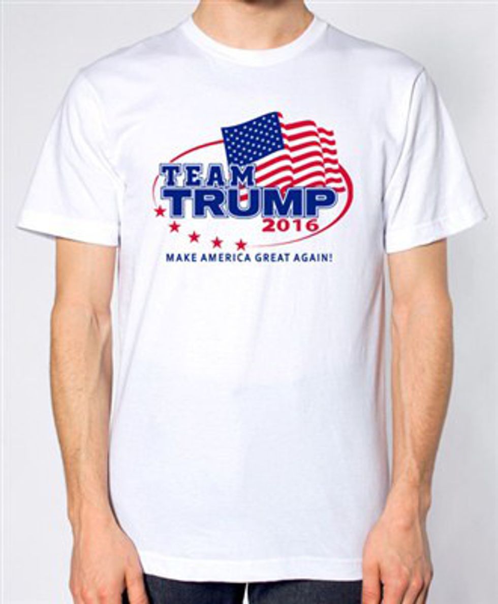
With few exceptions, the Trump merchandise all had the same “TRUMP: Make America Great Again” logo plastered on different colored backgrounds. Hillary offered more variance among designs and product, though all of her clothing was at a higher price point. They each had similar departments (apparel, headwear etc.), but Trump had available “Rally Packs” to accommodate groups of people and more traditional swag items one might receive at a football game while Hillary’s outlier was homeware and decorations. Overall, the Trump merchandise was ubiquitous of many campaigns with designs that complement the “I voted” sticker they hand out on Election Day, and Hillary’s products were created to be more aesthetically appealing.
Content
At the risk of accidentally covering an important issue, I looked into the news feeds for both sites. Trump’s recent news contains mostly articles focused on legitimizing his run for the presidency and his endorsements. Hillary’s recent news contains articles, in both English and Spanish, focused on delegitimizing his run for the presidency and his plans in office. While both have additional news regarding their platforms, it is plain to see that this election is about Donald Trump.
Elections have grown more polarized, and every season the rift between the Democrats and Republicans increases. This race has been reduced to #NeverHillary and #NeverTrump, two camps who are certain that their candidate is qualified to be president simply because they hate the other. At some point, we decided that reinforcing our own ideas was more important than civilized discourse and that the presidency should go to whoever alienates fewer people. We, as a society, reward the behaviors that contribute to dividing our nation along party lines.
People say they’ll move to Canada if someone is elected, ignore our political process because it does not benefit their party, and shut down the government to avoid compromising. This is the political equivalent of throwing a tantrum. We cannot progress when each camp vilifies the constituents of their opponent because it eliminates the possibility for understanding. You don’t get to win every time, even if you believe you are right and even if you actually are. You stick it out and work with others to improve the nation despite your loss because that’s what adults should do.
Winner
So who do you vote for based on their website? No one. Don’t base your decisions solely on what people say about themselves or their opponents, and be aware of how they are trying to get your vote. Find articles you disagree with and people who challenge your beliefs. Look at the world through their eyes, and consider for a moment what they see. If you come back on the same side of the argument, that’s okay. If you don’t, that’s okay too. Political opinions are just opinions. They’re allowed to change, and so are you.


