Ring the bells! Light the lanterns! Rouse the soldiers! Finals week is upon us!
For those of you who have read some of my work in the past, you have seen some of my weird comparisons. This is another one, albeit a much more interesting one. Finals week is easily the most infamous period of the school year. Filled with terror, horror and outright disgusting, all with the goal of regurgitating the semester's knowledge like a cow chewing on cud.
Much like this horror scene, sometimes auto designers come up with the strangest ideas, possibly with the hope of being able to apply at least a smidgen of their knowledge of Baroque art. Here are seven of the most hideous cars to match the vile experience of finals week.
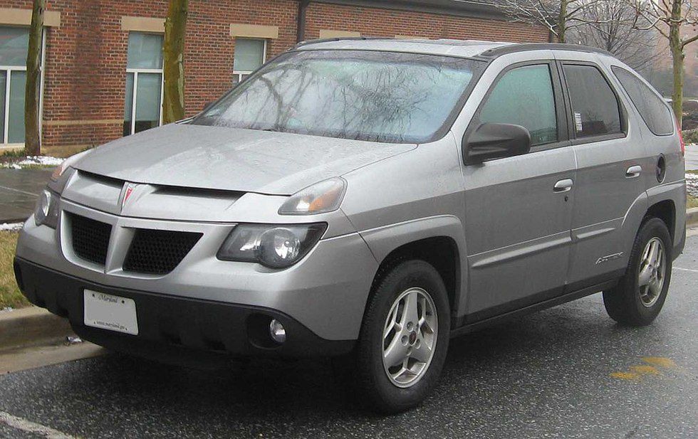
Pontiac Aztek
It's a given the Pontiac Aztek is on this list. You could even say it's cliche. The butt of every car design joke - of which there might be five - the Aztek is not only known for its role in Breaking Bad, but also as the vehicle that kicked off the crossover revolution. It also looks about as pleasant as cauliflower-ear.
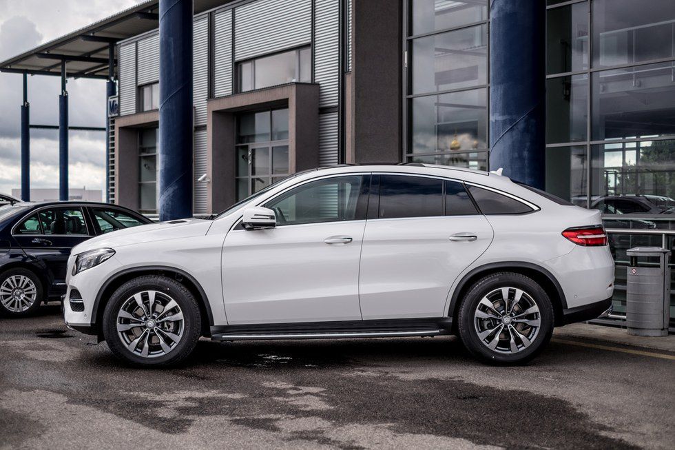
Mercedes GLE Coupe
This segment, pioneered by BMW and Acura, has never ceased to confuse the industry. At the moment, these fastback style SUVs are selling quite well, but if the GLE and its counterparts were released at the same time as the Aztek, they sure would have collapsed. The problem is, the idea sounds great on paper: apply the style and dynamics of a two door sports car with the utility and heft of a four door offroader in one package. Unfortunately, the reality is they effectively cancel each other out. The GLE Coupe is definitely not a taut two door, and it is certainly not a genuine SUV. This Mercedes has a deeper identity crisis than a child who was told by the playground bully that Santa isn't real.
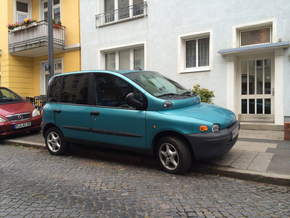
Fiat Multipla
Many of us thought it couldn't get worse after the Aztek. "They learned their lesson" we all told ourselves, but we couldn't have been more wrong. The Fiat Multipla, like a slobbering golden retriever puppy, seemed to chase down the sad Pontiac hoping to help. It tore up the entire neighborhood all along the way. At least we couldn't buy this one in the US.
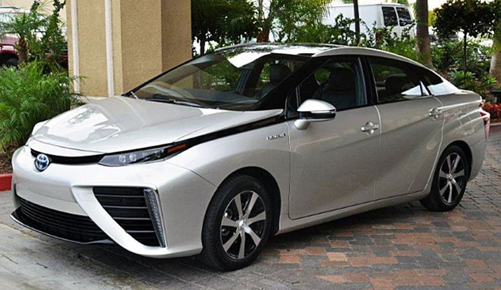
Toyota Mirai
Toyota's strange, alien-like design language is... indescribable? Unique? Ugly? Beauty is in the eyes of the beholder, but with all sorts of strange creases, gaping grilles and alien-like tail lights, I'm not sure how Toyota's design team happened to approve this for production. To give the brand credit, this is their hydrogen fuel cell car - an alternative energy source worth developing for the transportation industry.
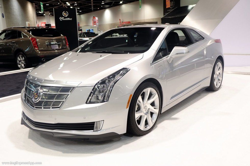
Cadillac ELR
To be honest, if the ELR was alone in its segment, it probably wouldn't be on this list. The problem is, when this electric car was released, it had to compete against the Tesla Model S and the Fisker Karma - electrified transportation with real utility and style. Although the Fisker ended up failing, in comparison, the ELR looks like what the 1990s thought the 2000s would look like. Cadillac came so close to having a truly awesome product. If it wasn't for the competition, this luxury Chevy Volt coupe may have taken off, but it didn't help that the ELR was priced outrageously and that Tesla essentially wiped everybody's memory of this shiny silver jacket.
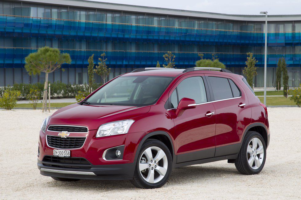
Chevy Trax
Seriously? This is an industry wide issue. Lower the suspension two inches, remove the plastic body trip and I present to you the Chevy Sonic - an ordinary hatchback. For whatever reason, most Americans refuse to buy anything that rides lower than six inches, no matter how poorly that car handles in the vast majority of what it will be used for. In its current jacked-up form, the Trax looks like an SUV that was squeezed and left in the dryer for too long.
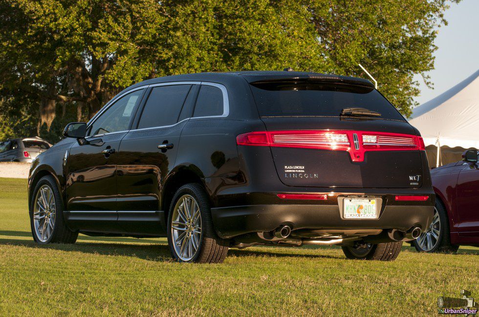
Lincoln MKT
The first time I saw one of these, I immediately thought "hearse". Is that the impression Lincoln wanted to give car buyers? That the brand is dead inside and only a shell of its former self? Maybe I'm being a bit harsh, but based off of appearance, who was the MKT's target buyer? Thankfully, Lincoln's new design language is much more sleek.




 The minimum wage is not a living wage.
StableDiffusion
 influential nations
StableDiffusion


