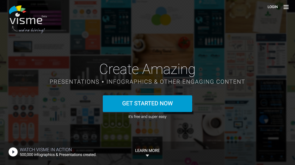
Visme is a browser-based online platform joining the ranks of quick-editing modern graphic tools such as Canva and PicMonkey. In a world where social networks and digital marketing has become a time consuming project, platforms like Visme help make producing modern, quality content like presentations, infographics, web content and even reports a much faster task.
What makes Visme and others stand out is the small learning curve it takes to use these platforms. With features such as included free clip art, templates and photos, as well as simple drag and drop functionality and intuitive menus, even your mom’s mom can learn how to use this puppy.
But does Visme stand up to its competition? Read on to find out as I review Visme’s Complete subscription account.
Features and Functions
Editing
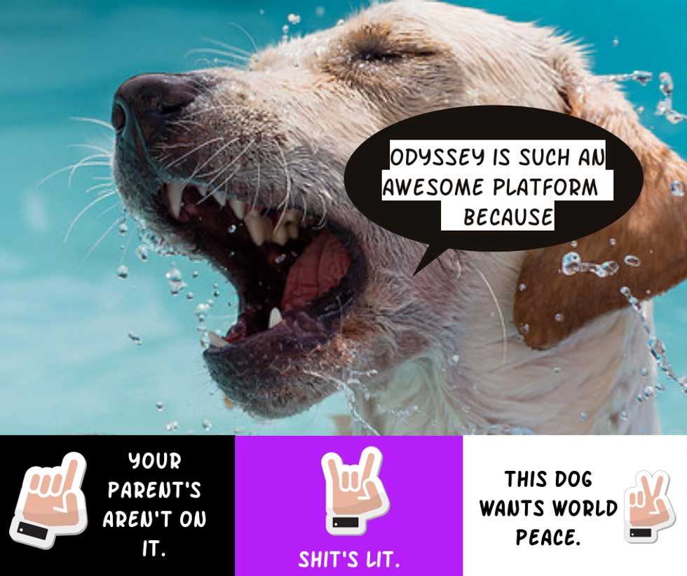
Speaking of puppies, let’s dive into an example of some of Visme’s abilities. If you have any previous experience with other browser-based quick graphic tools, you’ll recognize a few of the features right away when you start using Visme.
In the above example I used to test features, I decided to make a very serious social media post to share about Odyssey.
Visme has a floating left-hand menu where you can access most of the things you’ll need to edit your graphic. The left menu allows you to edit your background, text, clip art, photos, graphs and statistical data, video, music and blocks of HTML. Phew.
Right there Visme has already reached more functions than both PicMonkey and Canva, which don’t incorporate the last three things.
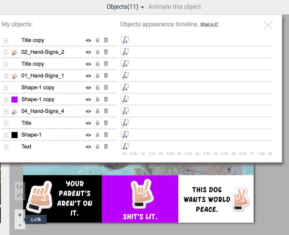
One of the features I really love about Visme’s platform is an useful objects view on the top menu of the browser, where you can see all individual objects within your graphic, drag and drop their order, view or not view them, lock or unlock them and rename objects. There is also a timeline display for when you want to animate objects (say for a presentation). This view and functionality is really comparable to another level of editing, such as Pixlr's browser-based platform, GIMP, or Adobe where you see your layers individually displayed for you.
Although in other similar level platforms you can often edit whether an object appears in the foreground or background of other objects, Visme makes doing so much more simple. Work smarter not harder, right?
Organization
Like Canva, you have the ability to organize your individual graphics into project folders, which certainly helps keep things better organized. Although Visme does offer a team option on their Complete subscription to their platform, they not have any way to create a branding portfolio like Canva does, and no templates for the various graphic types your team members can use. Considering that many brands and organizations use these quick editing tools to enable creating content faster and easier for any team member to do, I feel like this is an edge that is missing. How else do you get millennials to do all your work for you, after all?
Free Stuff* To Use In Your Content
As I've stated, what makes a platform such as Visme so useful is how quick it is to create your content, yet have it still be high quality. This happens because of your access to the free content provided by Visme (and by free content, I mean the content that you are technically paying for since you are buying a subscription).
Though there is a free account on Visme this is limited, which is to be expected. A Visme logo and a smaller selection of clip art and other assets means that most likely any serious organization or social media guru will be using either the Standard or Complete subscription. The free subscription option does allow you to get a sense of the platform before committing any of your budget to it, and there are few tools out there I would try if they didn't offer this.
The Complete subscription includes a decent amount of free clip art and assets, as well as a search tool for photographs which is extremely useful. That means I can score even more adorable photos of puppies like above. Or kittens, if that's your thing.
All these preloaded assets means you and your team get to spend less time creating simple, yet time-consuming pieces within a graphic, which saves you money. Managing and scheduling social media posts, blog articles, and presentations become that much faster to do. This ultimately leads your ROI to be greater as well. Even your graphics department can appreciate that.
User Experience and Interface
Visme's interface and platform is easy to use and intuitive. I've compared it here often to Canva, and that is because they are quite similar in capability and design.
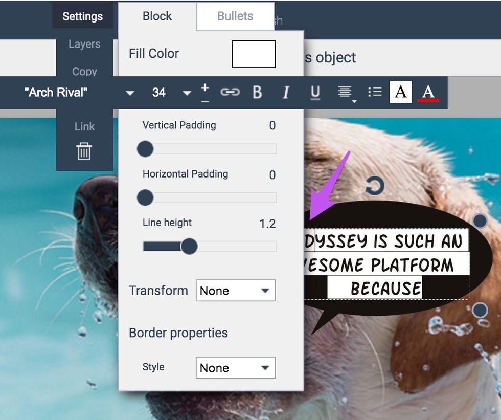
But like any graphics platform you can try out there, they all have the occasional hiccups. As the screenshot above illustrates, there are times when menus would overlap each other. This also happens in Canva for me sometimes, as well.
That being said, Canva does have a much more beautiful interface to work with than Visme does as far as looks go, though this alone doesn't make them any better. What does make Visme slightly less appealing than Canva is they come preloaded with far more templates for often used content types that makes working within the platform effortless. They also continue to add more when their team thinks it will be useful to their user base, as well as have a magic resize button feature for premium accounts that will create a copy of your current graphic as the remainder of the popular social network sizes. So, when you make a graphic for Instagram, for example, you don't have to repeat that over again for Facebook or Twitter. Sure, I could easily Google or look at notes for the dimensions of these things, but the point is I don't want to and really shouldn't have to.
After all, true Millennials don't take the hard road trudging through 6 hours of editing for the sake of a really long story to tell our grandchildren about content creation in "the good old days". We use technology to find a faster, easier way to do the same task. That's why you're reading this. I said it before in this review--and truly I (mostly) jest--but it really should be our generation's motto: Work smarter, not harder.
Pricing
Likewise, the plans for Visme are so very reasonable. As someone who has often been creating content for personal use or for a small non-profit, price can be a really tough aspect in many of the available digital tools out there. Such tools are usually scaled for "small business" or big organizations. I put small business in quotes, because I believe there are different levels one could argue. There is the official term of small business like what they teach you in college, and the majority out there are truly in this category. Then there is the truly small scale: individuals who sell their passions from their house, do consulting work on the side, run small services such as personal fitness, or non-profits who run a very small team and budget. I believe it's tools which require less skill and time such as Visme that really shine with these small groups.
Offering a Standard plan at a mere $7/month means even poor kids like me can afford that. In the past, I also volunteered as a Marketing Coordinator for around 2 years for a small non-profit. This introduction plan, which includes all premium assets and no Visme logos, is low enough I would have donated the cost to the charity to use the platform. Their Premium plan is only $16/month, which isn't a huge leap, either.
Canva, on the other hand, while they do offer some nice features like Branding Kits to ensure a consistency among all content, as well as far more templates, their premium plan does costs $12/month without including all the assets in their platform. Some you'll still have to pay for individually, or hunt down some royalty-free asset sites to upload yourself.
So Is Visme Worth A Try?
Absolutely, but maybe try the Free subscription first to see how it works for your team. Sometimes, certain features are needed in certain teams over others. Two of the things I like the most is the additional presentation and report features Visme seems to do really well which aren't as elaborated in Canva (and non-existent in PicMonkey).
And although Canva did recently upgrade their object editing tool (for the better) to be locked up to the top where you can more easily access position and options, I prefer Visme's Object tool far more. You don't need to click on an object in order to move it. As anyone who has ever accidentally put an object in the background of their graphic can testify, it can be a real pain getting it to the foreground again in Canva.
All in all, Visme is a great, inexpensive platform that is definitely worth checking out to see if it will be a good fit for your content marketing team.


