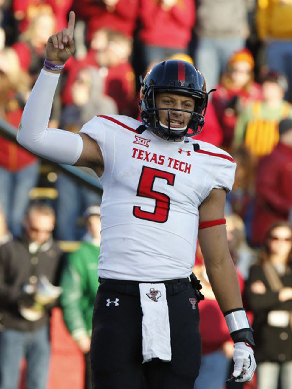
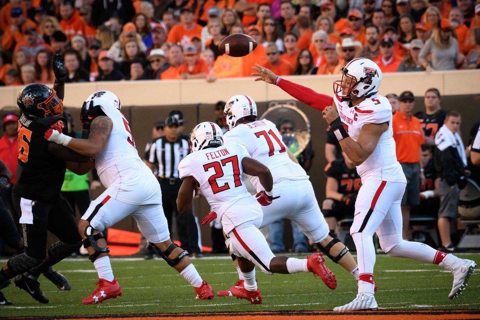
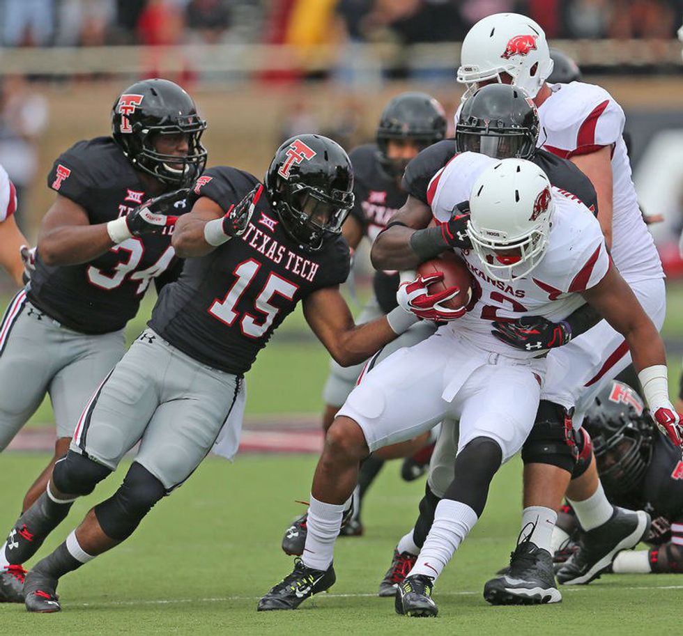
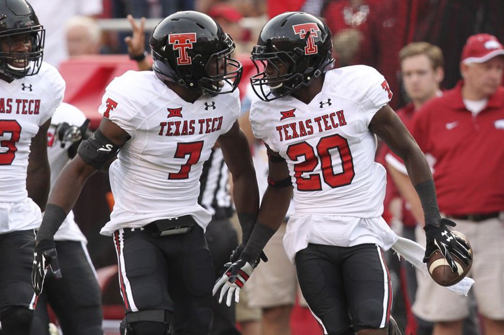
It might be the offseason, but that does not stop football debates in the Big 12. Oklahoma and their in-state rival, Oklahoma State, are poised to enter 2017 as the top teams in the conference. West Virginia's success will likely depend on the play of transfer QB Will Grier. Texas has a new coaching staff, and only time will tell how much improvement occurs in Austin. Likewise, Baylor finds themselves starting 2017 with a clean slate, but much uncertainty concerning on-field performance. Kansas State will challenge both Oklahoma schools for the Big 12 title. Texas Tech is now without their superstar Patrick Mahomes. TCU will be better than they were in 2016, but by how much? Kansas and Iowa State are improving, but both are still catching dust. The questions about 2017 standings bring about endless debates, and for now there is no point in arguing about it. Instead, let's argue about who looks the best on the field. Here are the Big 12 uniform rankings, which takes into consideration a team's entire wardrobe:
PART ONE OF THREE
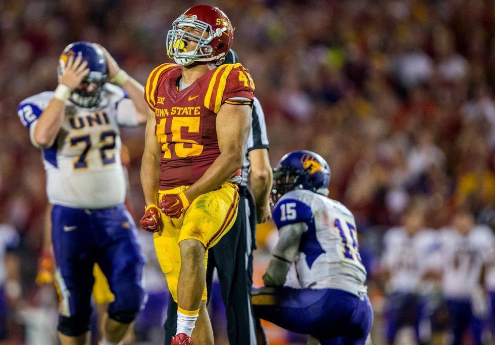
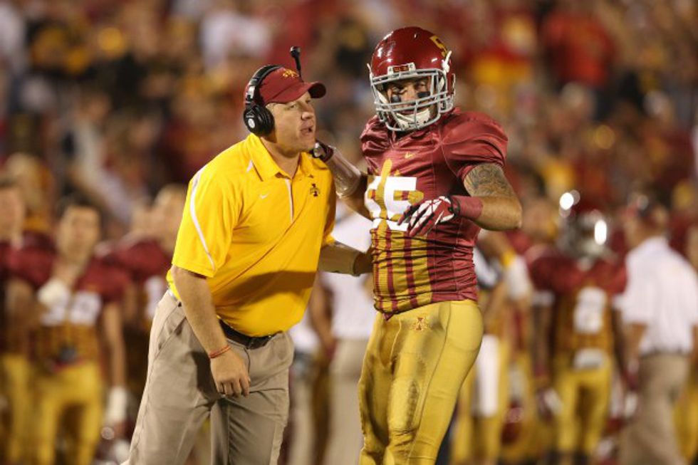
10. Iowa State
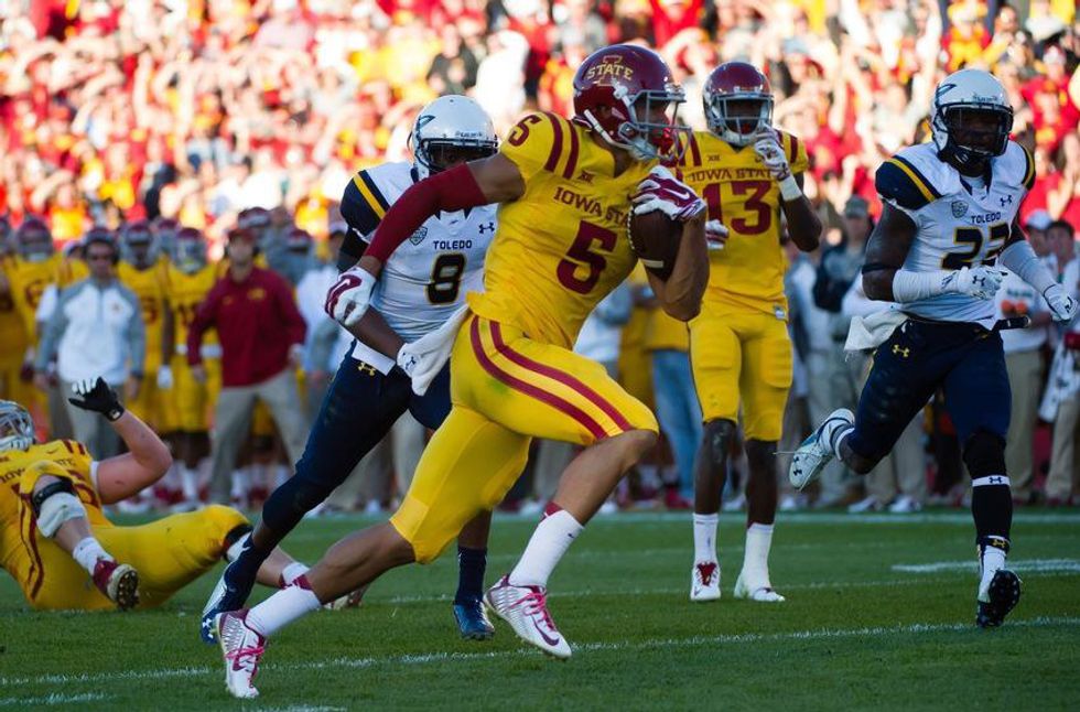
It's hard to put a team in the bottom spot on this list because none of the teams have a horrible overall uniform scheme. However, I'm not a huge fan of the cardinal and gold color combination:
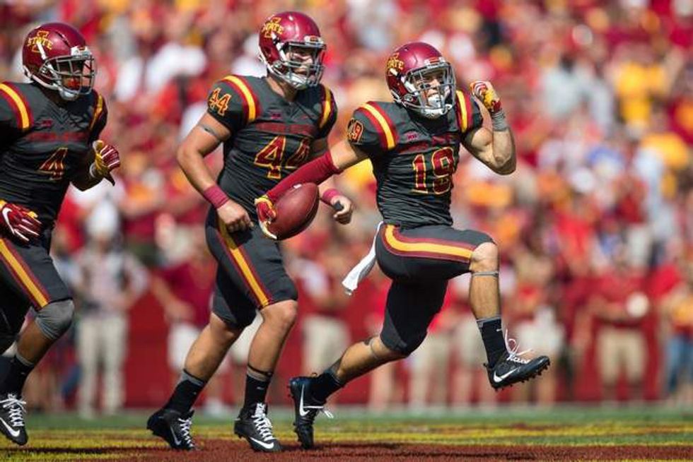
ISU's alternate grays, worn with the cardinal helmet vs San Jose State in 2016, are a pretty good look:
The matte cardinal helmets are always a great option:
When expanding your uniform possibilities, things can go well...
...or not so well:
When teams wear throwback uniforms, it is usually a big success or a monumental eyesore. Put me down for the latter with these:
Overall, the Cyclones don't have spectacular uniforms. The traditional home and away looks are solid, but not great. The good news is that improvement has been made with the white helmet, and as long as they never wear the gold uniforms or throwbacks any time soon, ISU will be in good shape.
9. Kansas
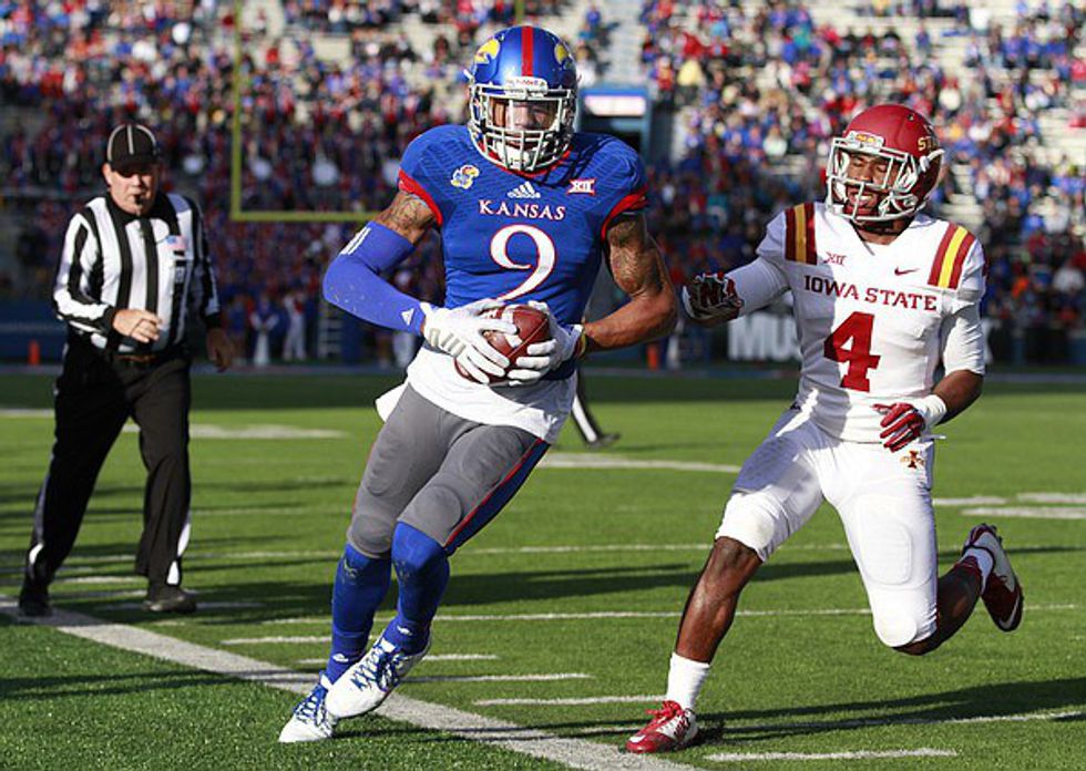
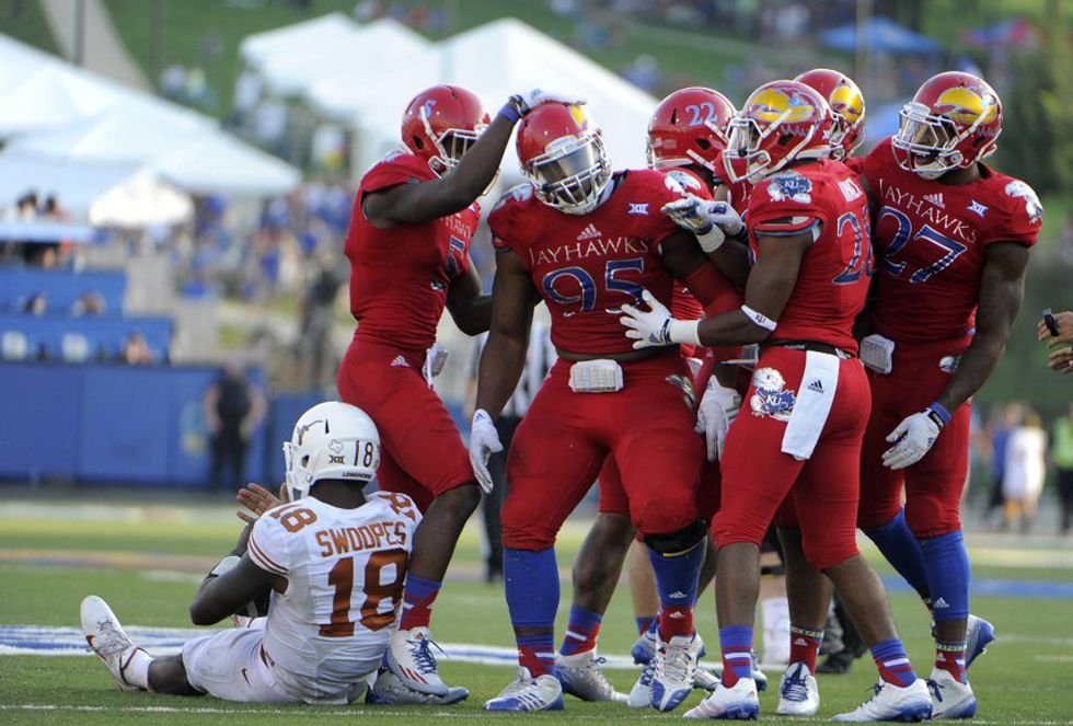
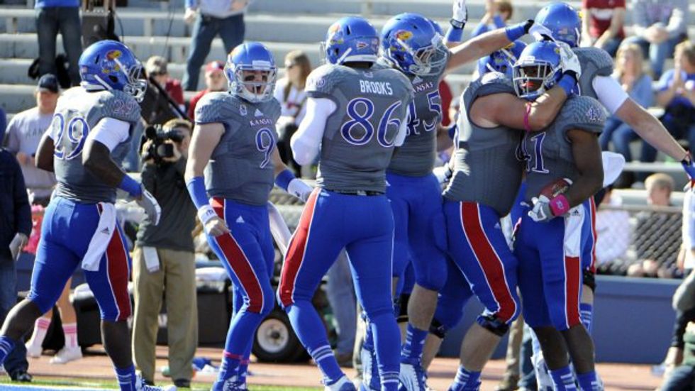
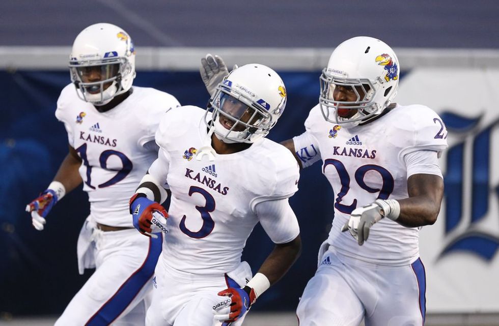
Hear me out on this. The Jayhawks have a great color scheme - blue and crimson pair nicely. Their recent update in uniforms is a big plus. Yet there is one thing I cannot get past...they are sponsored by Adidas. Something about that brand just doesn't look right on most football uniforms. It would've been bearable, but bringing the oversized logo makes it all worse:
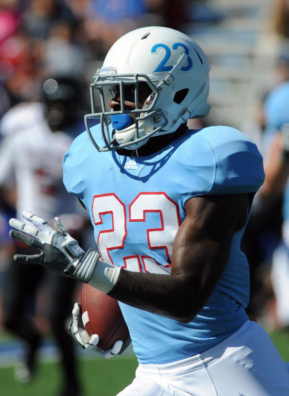
The 50th anniversary powder blue throwbacks were okay:
On the flip side, the alternate "Rock Chalk" uniforms worn vs Oklahoma State in 2016 looked good:
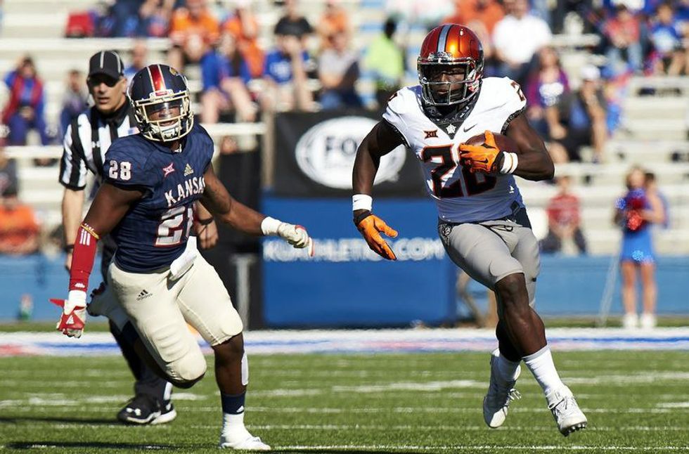
The gray on blue combo is one of the better looks, but it could be improved by either thinning the red stripe on the pant leg or removing it completely:
Lastly, the all white uniform is a good choice for road games:
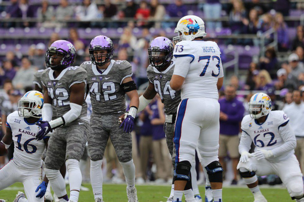
The Jayhawks have a lot to offer. The blue/blue/gray and blue/gray/gray (not pictured in this list) are solid combos. Yet others - all blue, red/gray/gray, blue/red/gray - are the opposite of appealing. Kansas' traditional home look of blue/blue/white is average at best. The one thing I could think of to make their wardrobe a lot better: switch to Nike. Please.
8. West Virginia
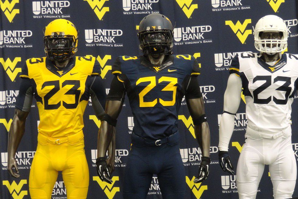
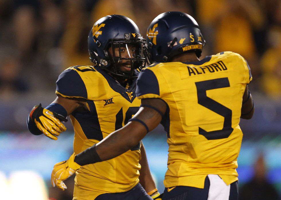
Morgantown is blessed to have a school with good official colors. Blue and old gold look great together, and WVU makes it work. What's more, the Mountaineers have a great logo. The only reason they are not further up on this list is the number font on the jerseys. I mean, look at it:
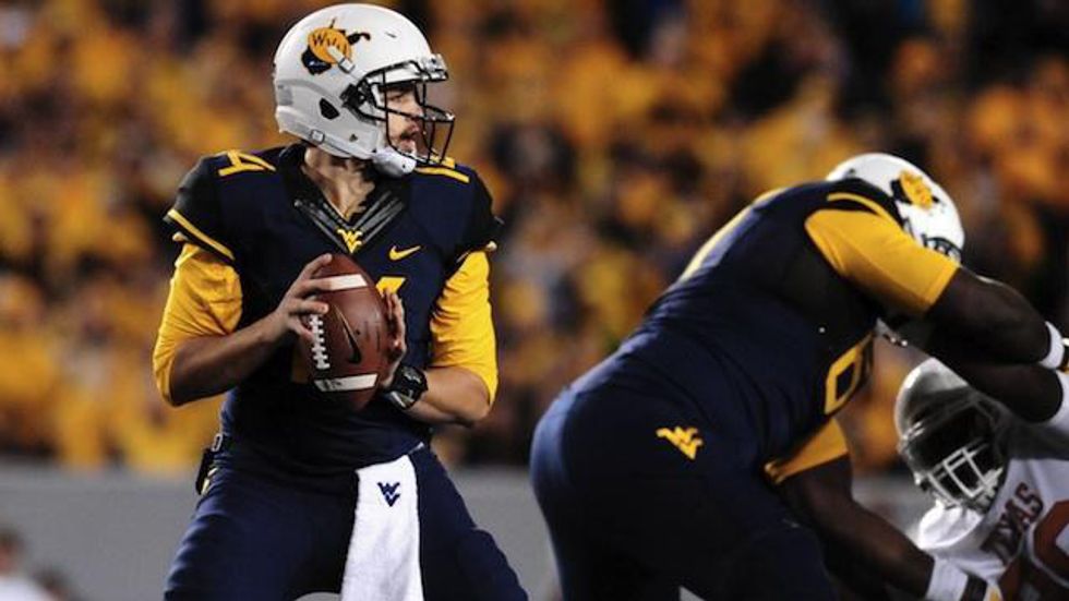
If they fix that one detail, there's no doubt West Virginia cracks the top five in this list, if not top three. Just about all uniform combinations are solid, and the throwback helmets used in recent seasons add some extra flair:
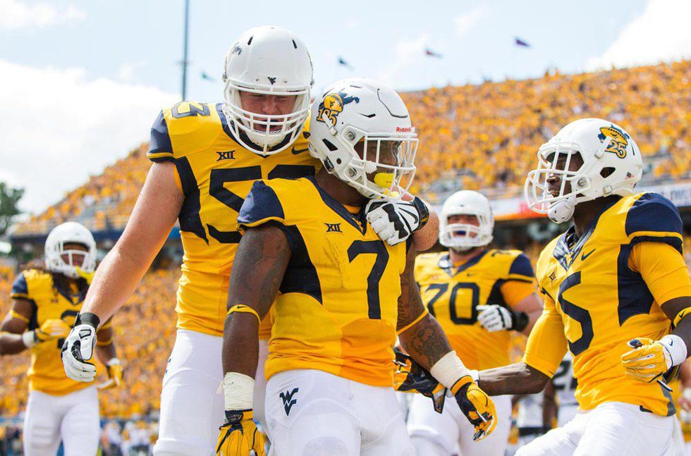
The 125th anniversary helmets that WVU wore in the 2016 season opener vs Missouri were absolutely gorgeous, and the overall uniform combo in that game is the Mountaineers' best for a day game:
Another good look is the blue/gold/blue:
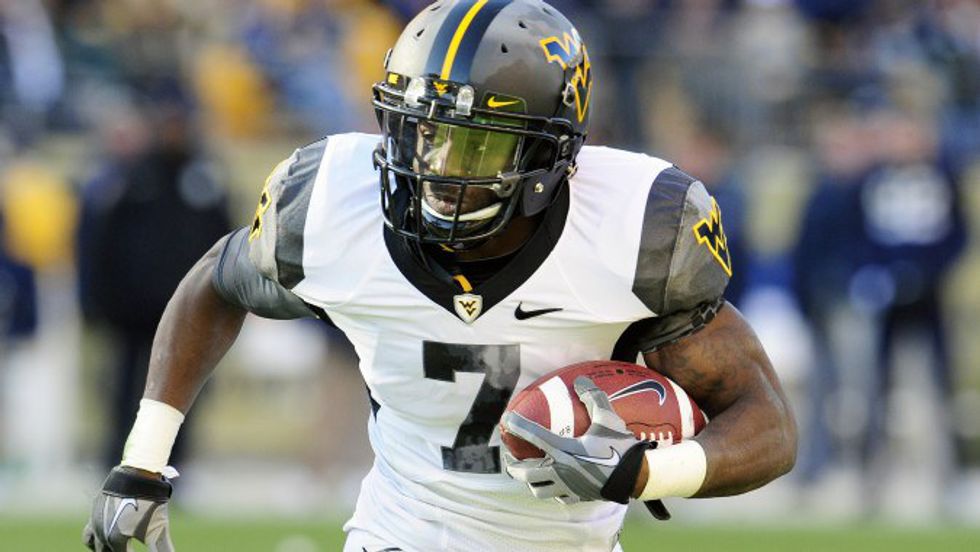
If only West Virginia could bring back this amazing 2010 Nike Pro Combat uniform:
WVU looks good in just about everything. The number font on the current jerseys need to be changed, but outside of that the only thing I dislike is the gold helmet.
7. Texas Tech
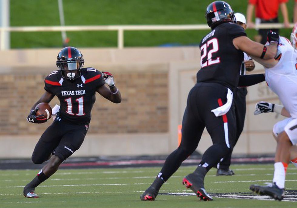
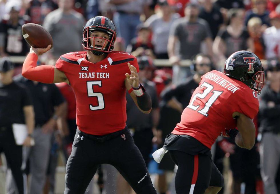
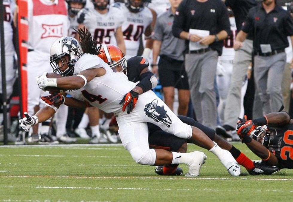
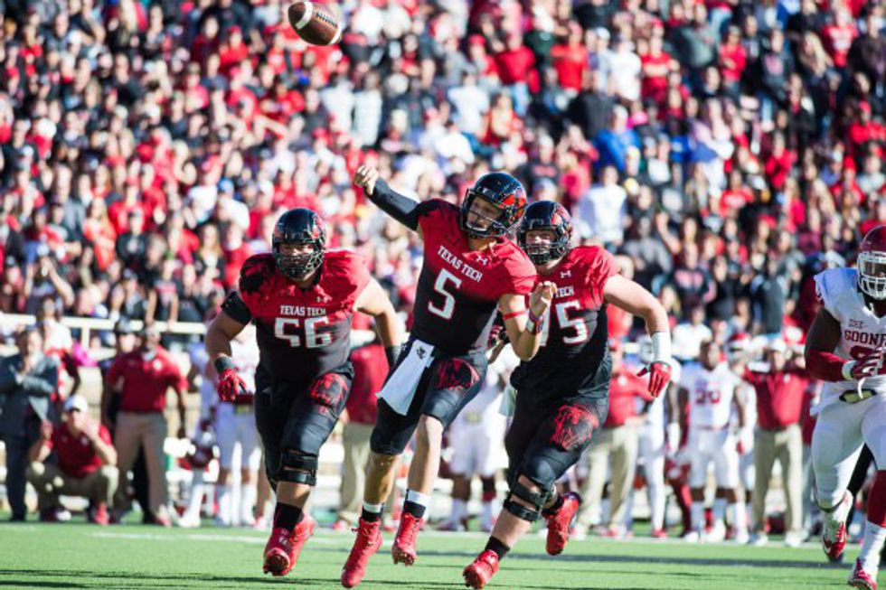
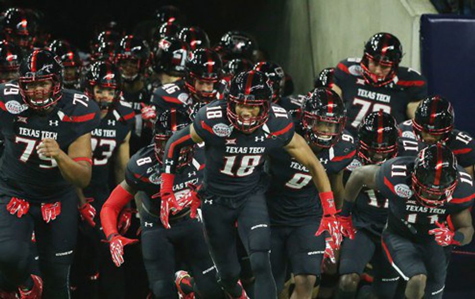
The Red Raiders have a wide variety of uniform combinations, including some strange alternates. The base uniform scheme of black and scarlet is a very good one:
The icy white alternates are the second best whiteout unis in the Big 12:
When Tech decided to bring out throwbacks, all of college football rejoiced. The home throwback looks great:
The away throwback is even better:
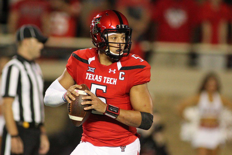
The Red Raiders' scarlet uniforms look great, especially with black pants:
TT even went as far as wearing a scarlet helmet with the scarlet jersey, and the look was beautiful:
So why are they only 7th on this list? Well...
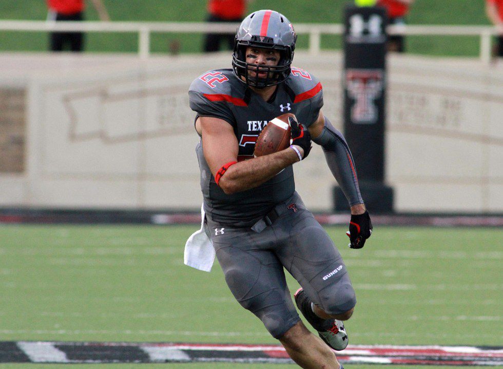
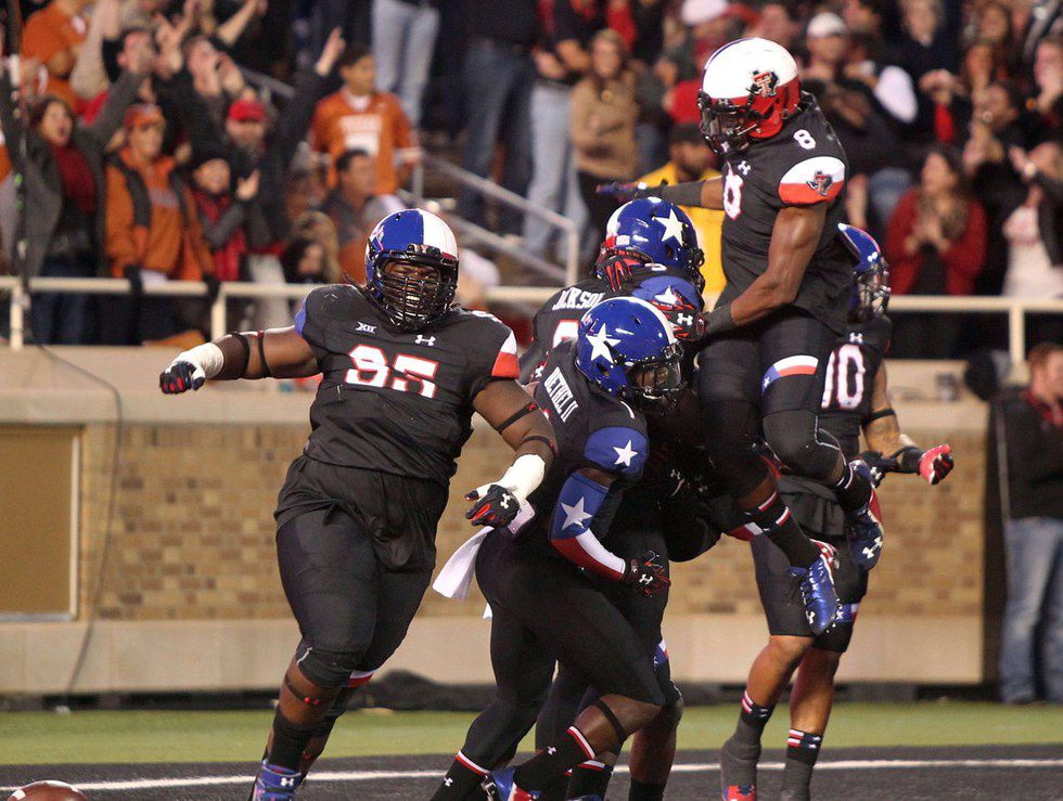
The gray uniforms are really a hit-or-miss look, and they don't do much for me. The Lone Star Pride uniforms are a really cool concept that didn't exactly pan out. The White Ombre look is just weird, but it's not even close to the disaster Lubbock calls the Red Ombre. Aside from these last four uniforms, Tech has a great wardrobe. Since I don't want to leave you with ugly uniforms, here is the Red Raiders' all black combo with chrome touch-up on the facemasks worn vs LSU in their bowl game two seasons ago:
6. TCU
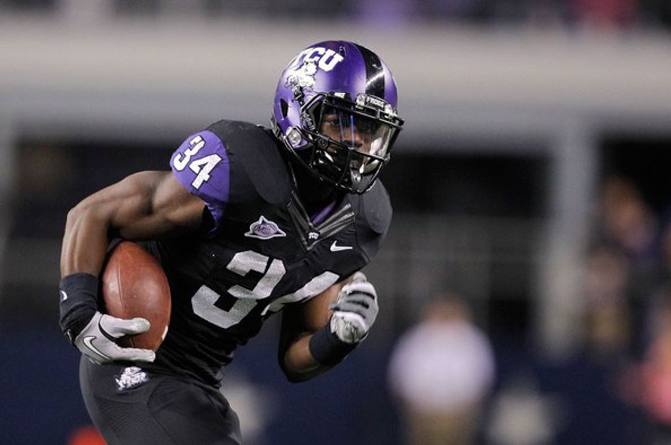
The Horned Frogs school colors are white, purple, and black. Great color scheme, right? Yes, until you watch them play on TV. Don't get me wrong - TCU has some pretty good uniforms. But sometimes I struggle to discern what is purple and what is black, and their new threads are somewhat iffy. Starting with the traditional home uniform, TCU rocks the purple/black/black:
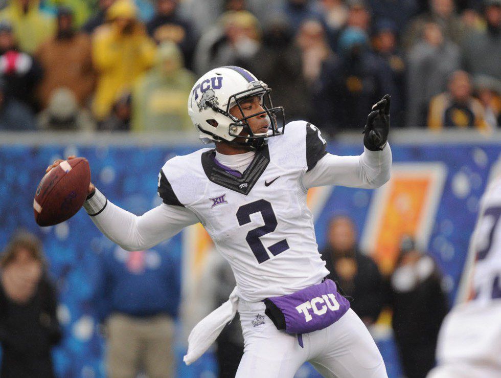
The Horned Frogs look good in just about all away uniform combinations, and the all white alternate is arguably the best:
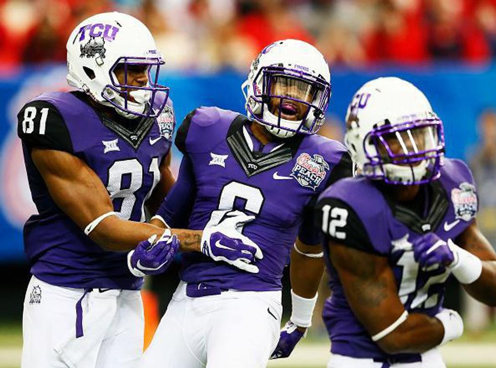
The Peach bowl uniforms worn a couple years ago looked fantastic, and they should definitely wear this combo more often:
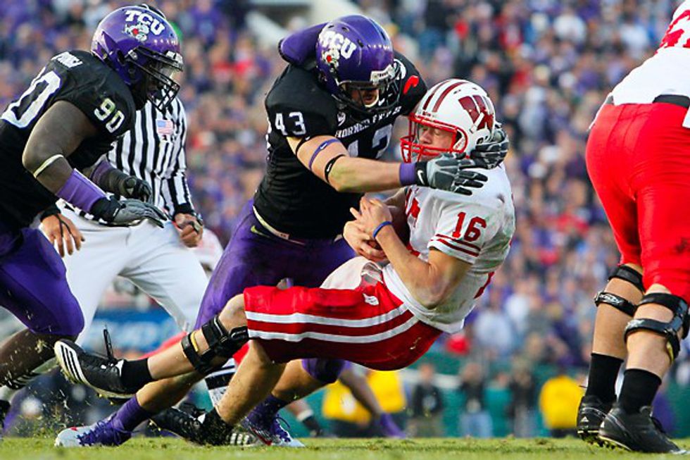
In TCU's magical undefeated run at the turn of the decade, they won an epic Rose Bowl clash in style - the rose on the helmet perfectly fit a classic look:
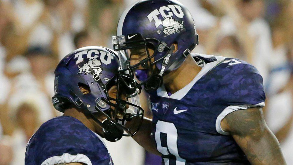
Here is where things get a little dicey. The Frogskin uniforms recently added into the mix are the opposite of traditional, and I am not a big fan. The purple alternate is not horrible:
But this is just atrocious:
The gray does not look good by any means unless it is paired with gray pants and the purple chrome helmet:
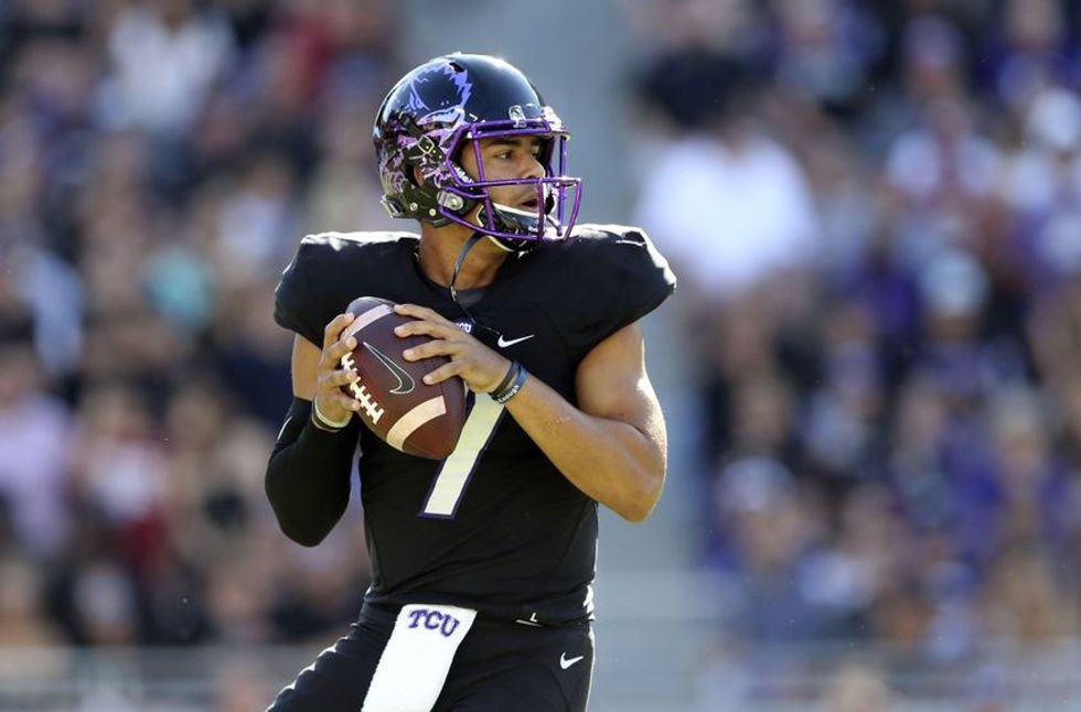
...and even then, it is hard to like the overall look. The purple chrome helmet is the Horned Frogs' best dome, but another good one was added this past season:
The black helmet with the chrome purple frog outline is different, but a great look. The only issue with them is that half the time viewers couldn't see the chrome part at all.
TCU has some serious fire in their wardrobe. The chrome purple helmet works beautifully with just about everything, and the Horned Frogs know how to utilize the color white in their uniform combinations. The new frogskin unis are the only things holding them back.


