A personal website is one of the most powerful tools that you can use to market yourself and create your own strong, personal brand - something which creates trust. It will act as a calling card where everyone can learn about you and even contact and engage you for some business.
Now that you have decided to create a personal website, you may still not be sure whether it will be visually appealing, focused on you or what elements and content it should contain not. Don't forget to make sure your website is hosted on a fast server.
So, how should you go about this? How do you find great inspiration in the form of best personal website examples?
One way is by to get ideas from what others have done and drawing some inspirations from them so that you can then get your creative juices flowing. To help you with this task, we have gathered 15 best examples of personal websites that can inspire you.
Raf Delorez
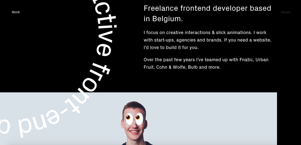
Raf Delorez
Raf Derolez's website has a modern and elegant design while at the same time it tries to give as much information as possible. On this site, visitors can easily tell of his witty personality which is revealed through the use of geometric overlays and distinctive fonts.
Tobias Van Schneider
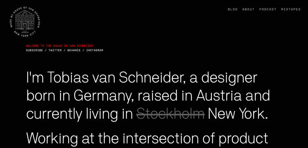
An influential person in design who has worked in a huge number of top brands, such as Spotify, Red Bull, BMW, NASA, Google, Ralph Lauren and many more, his personal website is epic, an example of minimalism put to work to great effect.
Simon Sinek
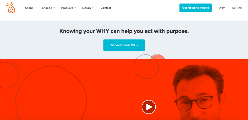
Simon Sinek has properly utilized the whitespace that is on the homepage. The site's design is very minimal and easily readable. The CTA is positioned at the top of the page while the rest of the content is well-distributed on the site's page. He has also blended the colors on the site perfectly.
Ellen S Riley
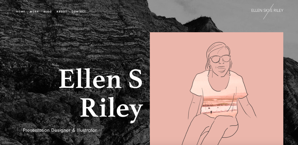
The first thing that you will notice about this website is the excellent design skill of the owner. Ellen has managed to showcase her creativity in an informative and fun way. It is a website that will keep you smiling as you browse through its content and you can clearly get her character from the site. Gives you a lot of trust if you're looking to work with her.
Brandon Johnson

Through Brandon Johnson's website, you will learn the importance of using relevant images on your website. It has elegant images of the planet. He has used some animations to inject some elements of fun into the site.
Tim Harford
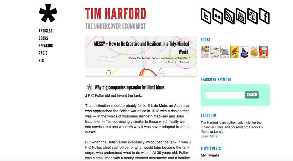
Tim Harford has also utilized whitespace to bring some aspects of the website into more light. You can easily see the message that he is trying to convey through the website. The site also features a subtle call to action which despite being visible, it does not prevent visitors from seeing other contents.
Quinnton Harris
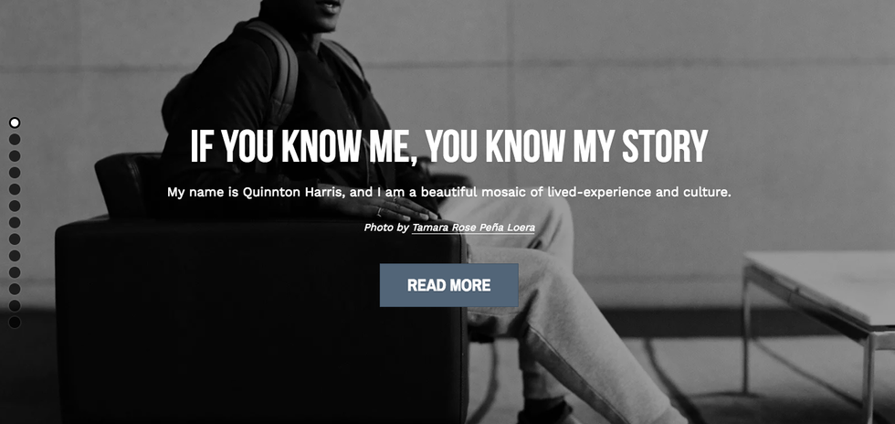
Quinton Harris uses a bunch of his photos to tell his story. His personal details starting from the educational background to his career are conveyed in the form of photos. Despite the numerous photos, Harris has tried to keep the website clean and organized
Sean Halpin
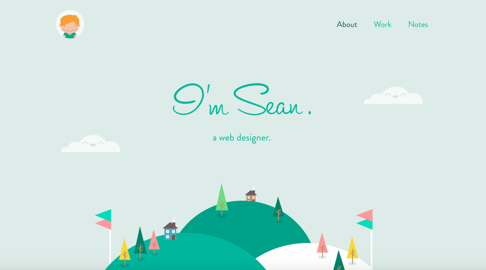
Short and charming are two features that stand out on Sean Halpin's personal website. He has properly utilized the whitespace to capture a visitor's attention. This makes the website friendly and readable on all devices.
Seth Godin
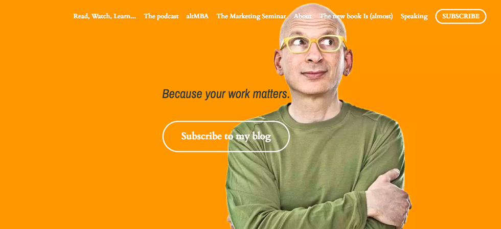
The most conspicuous feature on Seth Godin's personal website is the subscribe button. It is sizable enough to be easily noticed. He has also included a unique color pattern on the site giving it a unique visual appearance.
Ana Santos
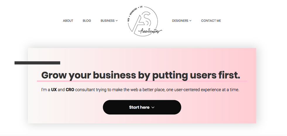
This website is quite friendly as it tries to reveal the warm side of Ana Santos. It features user-friendly graphics hence load faster on all the devices. It also features some pop-ups which are not annoying or conceal some content of the site.
Tim Ferriss

Tim knows how to get visitors on his site do what he wants. He uses his convincing attitude to get visitors to listen to his podcasts. It has a very conspicuous header that state "Click to Read."The site also has a gigantic overlay that instructs visitors on what to do. The site looks quite aggressive and convincing.
Walter Cruz
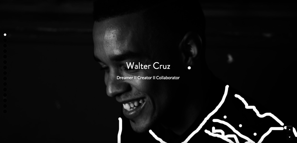
Instead of littering the homepage with endless texts, Walter Cruze uses a simple text to explain what he does. He then goes ahead to show us a list of his clients. The simplicity of the site is powerful enough to drive the message home.
Theo Karsenty
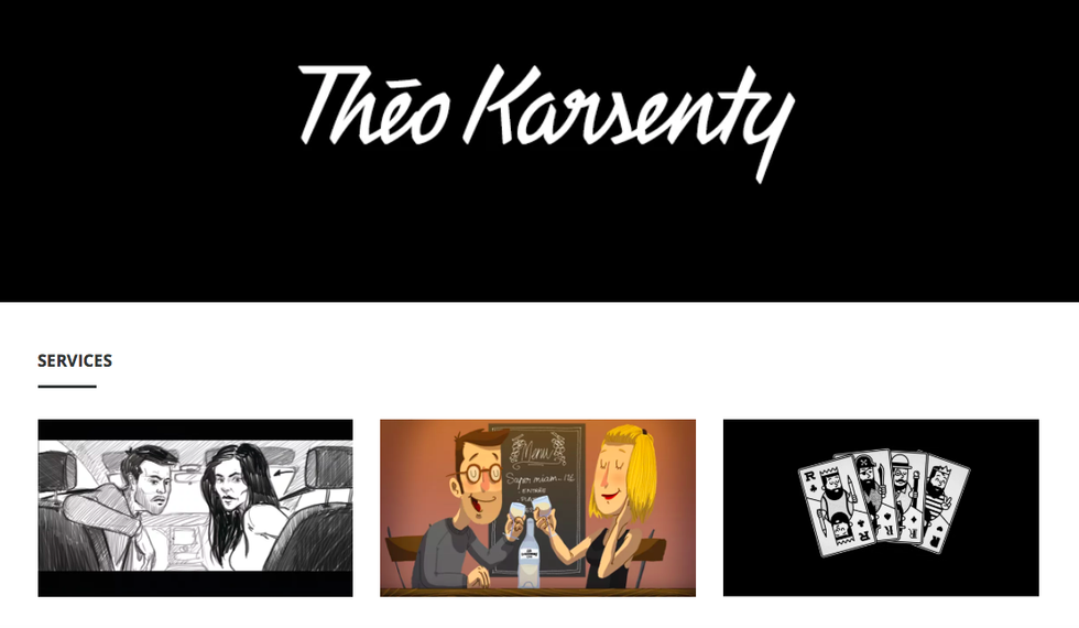
Through the site, Theo Karsenty leaves no room for guesswork. He simply starts by highlighting his services then splashing the homepage with lots of his work. Just by looking at the site, visitors will know what to expect.
Kevin Koeshartono
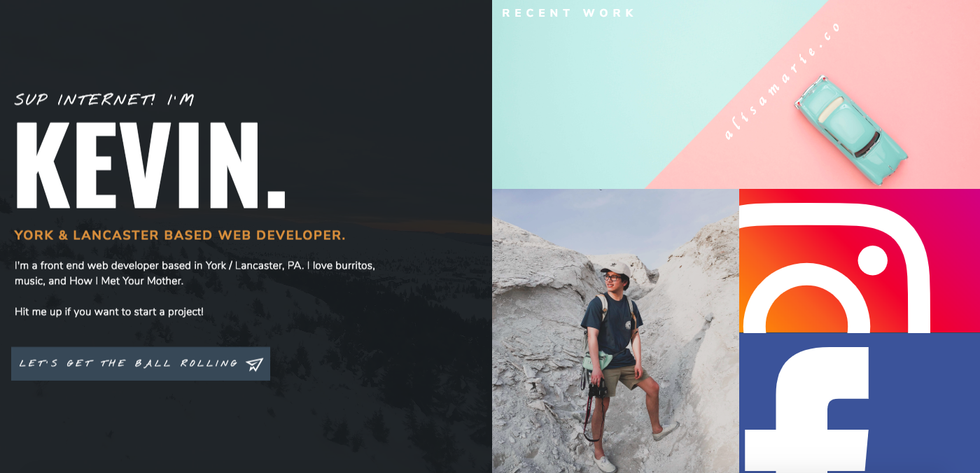
This website is designed to be accessed by people from all walks of life regardless of their knowledge in the matters of technology. It is quite simple and straight to the point. The contact button is strategically positioned near the top of the website.
Joe Mcnally
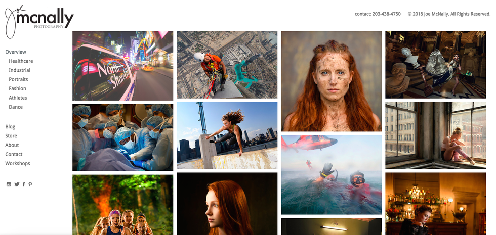
As a professional photographer, Joe Mcnally knew a way of capturing the attention of visitors on his site. He simply uses some of his best photos. In fact, his homepage is dominated with photos. He has also placed his contact strategically on the webpage
These are some of the best examples that can inspire you to create your personal website. Keep in mind that you don't have to copy every feature of these websites, but use them to find your own brand, create a design which merges a few of the best of the features of these sites and then, go forth and create your own personal brand!


