Think about the products you buy, the stores you visit, and the advertisements you see. Oftentimes, you will see bold colors in the logos and packaging. Color in advertising isn't really something that we think much of, but it can really have an effect on your decision to buy something.
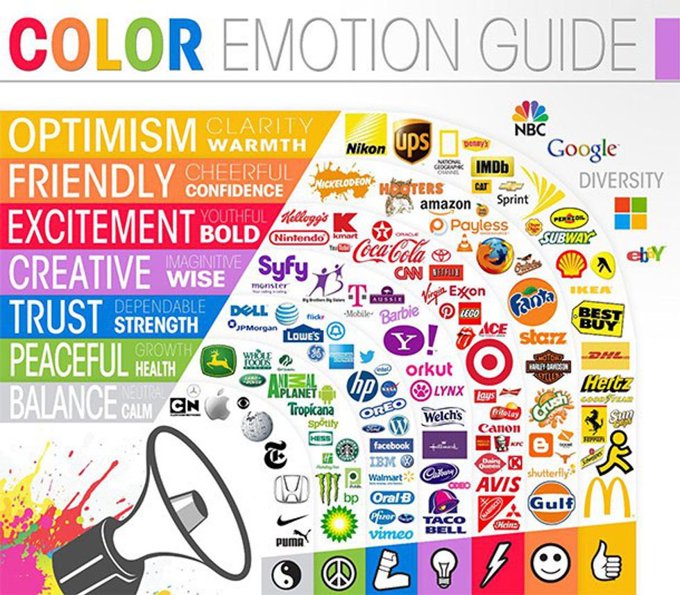
Companies use certain colors in their products to convey a specific message about their product, and this is accomplished by something called color psychology. We tend to think of colors as certain moods or feelings, and color psychology studies which emotions are related to certain colors. For example, in color psychology, yellow is often used to convey warmth and happiness, red can convey passion and love and blue can convey trust and calmness.
Most brands use bright, lively colors like reds, oranges, yellows, greens, blues and purples in their logos and packaging because people are more drawn to them. Studies show that as much as 90 percent of a consumer's decision to buy is based on color.
Colors you'll see less often are the darker colors, like brown and darker mixed colors. Buying something when the packaging is completely "ugly" or "dull" is not exciting at all. For example, when you order something online and it comes in a brown box, you're not really excited about it when you first see it (unless you already know what's inside). It's once you open the box and see the bold colors that the product really comes to life. There aren't many products sold in colors like this, and it's for a reason.
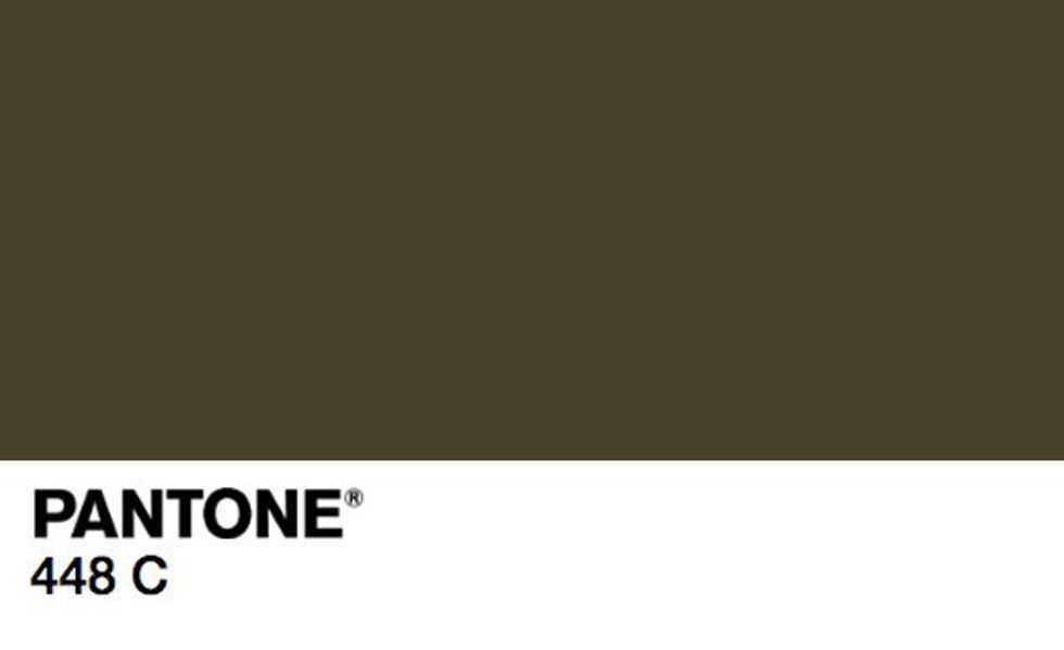
Pantone's 448 C (or opaque couché) has been declared the ugliest color in the world for its association with things like tar, dirt and death. It's a color you'd never expect to see on a product's packaging. But, countries like Australia and the UK are making it a legal requirement for cigarette packaging to be this color and display graphic health warnings.
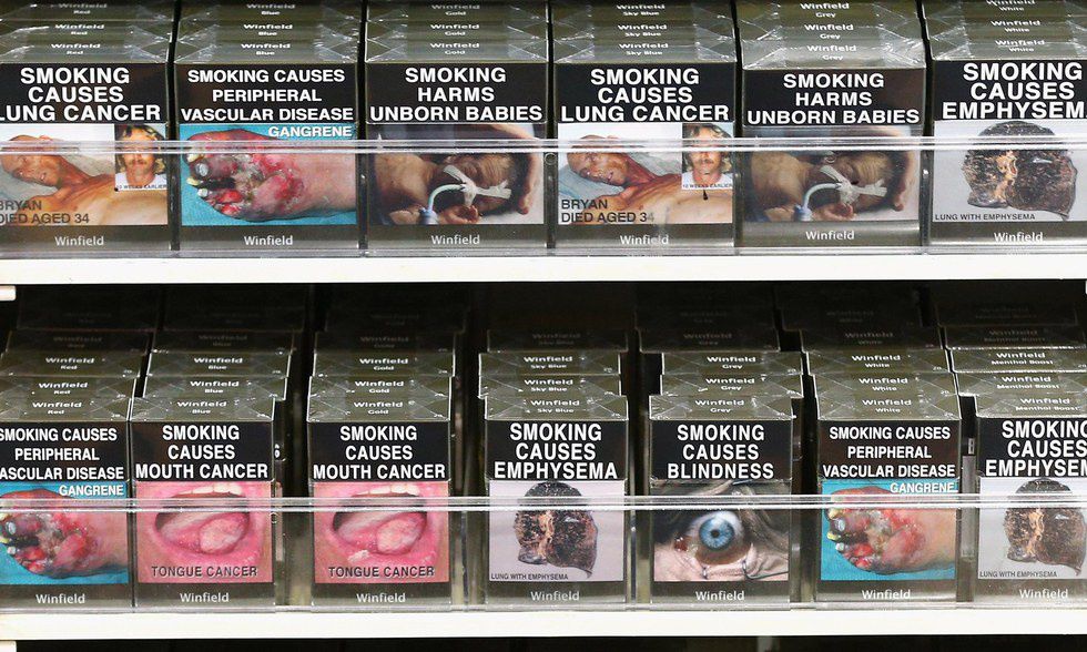
Yes, by law in these countries, bright colors, brand logos and graphics, cannot be used on cigarette packaging. Only this dull, "dirty" color. They're doing this to reduce the appeal of cigarettes.
This is what the new packaging looks like (and this is not a joke).
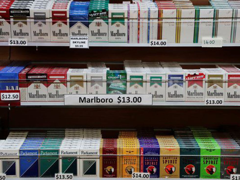
Compare the new packaging to any cigarette pack you've ever seen. You'd never expect to see what cigarettes can do to your health displayed so blatantly across the packaging. Companies typically want to advertise the good things about their products, not the bad. Some might think that this tactic is ridiculous. They might think that if people want to smoke their cigarettes they are going to, regardless of what the packaging looks like. But with this packaging, cigarettes become almost undesirable. Who would want to be seen walking around with this product? It's not attractive, and it's not subtle.Here's a photo of how cigarettes are sold in the United States, for a comparison. They're much more colorful (some of the colors are even bright), they have brand logos and graphics and, most noticeably, they don't have photos displaying the harmful effects that smoking can have. The only safety warning you'll find on these cigarettes is a small portion of text that can easily be overlooked. As for cigarettes in the U.K., there's no avoiding it.
It will be interesting to see how this tactic plays out. It's very likely that it will be a successful one, since we are usually unaware of how much packaging affects our decision to buy things. This will be the true test.


