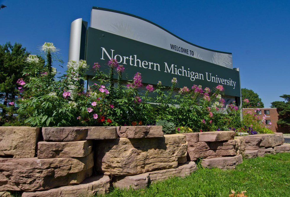
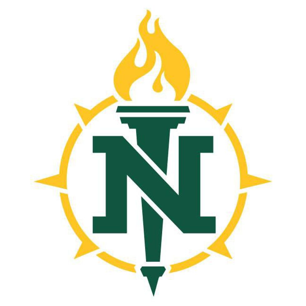
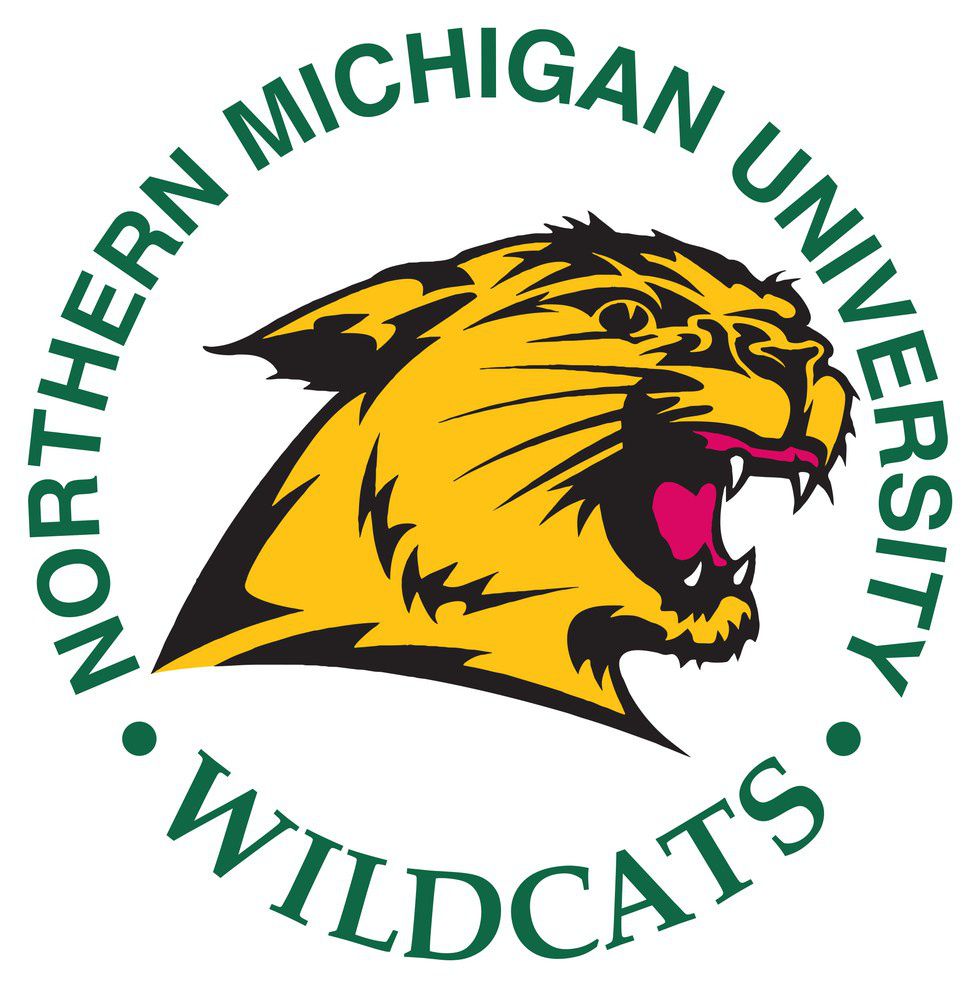
On April 6, 2016, Northern Michigan University released their new logos - academic and athletic - to the public, receiving praise and hate for the designs.
I have to say, I was never really a fan of the tree-and-wave design of the previous academic logo. Maybe it's because I was never a student during "Northern Naturally," and I've only been around for "Fearless Minds." I do agree that the tree-and-wave logo had elements that really represented NMU, especially the nature around us and how much we embrace it, but it didn't stand out to me as a university logo. I think that the new torch logo, with the N in the middle, specifically stands out as Northern, but also for a variety of other things that we represent.
The compass that surrounds the torch and N can represent multiple things: the distance many students travel to come to school here, the adventures that we have in and outside of class, being fearless in the face of all of the nature around you ... honestly, there are many different metaphors that a compass can stand for.
The torch represents something entirely unique to our campus: the fact that we have an Olympic Training Center where athletes can train and get an education at the same time (I'm drawing this from the connection of a torch to the Olympic Torch).
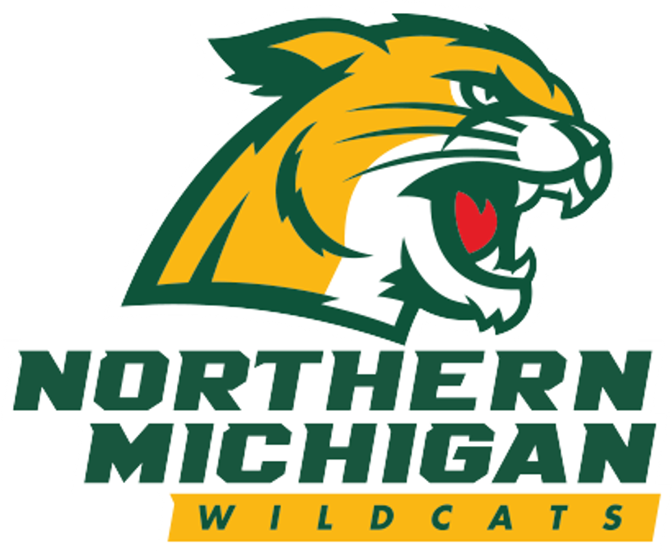
I think that the athletic logo didn't change that much, honestly. Yes, it's a little less detailed and a tad more colorful, to quote The North Wind. I think it looks kind of retro, which I totally love! I also think that the colors and lack of detail make Willy look more friendly, if you will. It seems like this new logo will be more marketable because of all of this.
One thing that I don't understand, though, is why Northern chose to go to a company in Ohio rather than bring the idea of changing the logo to the students. I know that they explained their reasoning in The North Wind, but there was a variety of different ways that they could have involved the student body in this decision.
I think that the administration should have made it into a competition for students -whoever wanted to could have submitted a design. It could have been narrowed down to the top ten and campus could have voted on their favorite, picking a winner. That way, the new designs would be even closer to campus, especially when, in the new commercial to promote the new designs, they say "we empower [the students] who continue to move us forward." It does make sense, from the standpoint of the athletic jerseys, though, to go through another company.
All-in-all, I like the new designs.


