Although there are some critics who claim that photography is an application of science rather than creativity, most art professionals consider some photography to be a form of art. Throughout all art eras, each period contained regulations for its respective art and artistic photography is not an exception. Thankfully, artists have been breaking such regulations, legal and artistic, especially during the modern art period which has brought Impressionism, Cubism, Surrealism, and many other art movements that sought to create and think about art in various different ways. The art of today, contemporary art, exists to allow artists the freedom to create any type of art how they see fit. Rules are now seen as merely guidelines and artists know when it is best to break any rule in order to accomplish whatever goal their art is supposed to complete. Following is an examination of common compositional rules of photography and ways to think about them differently.
1. The Rule of Thirds
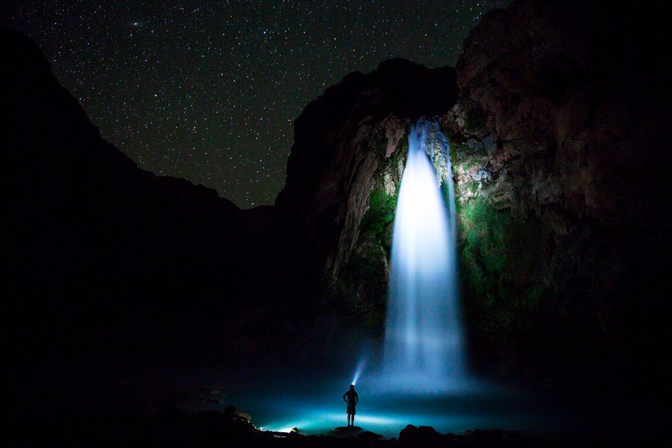
Perhaps the most common rule of photography is the rule of thirds, which is also considered in other types of 2-D art. The goal is to visualize a 9-by-9 grid on the image and place the important subject matter on any of the intersections or any of the lines in order to create more visual interest compared to centering the image. Jes Stockhausen’s “Havasu Falls By Night” is a prime example of the rule of thirds as the waterfall lies in the right-third of the photograph, the pool of water is in the bottom-third, and the waterfall meets the pool at the bottom-right intersection.
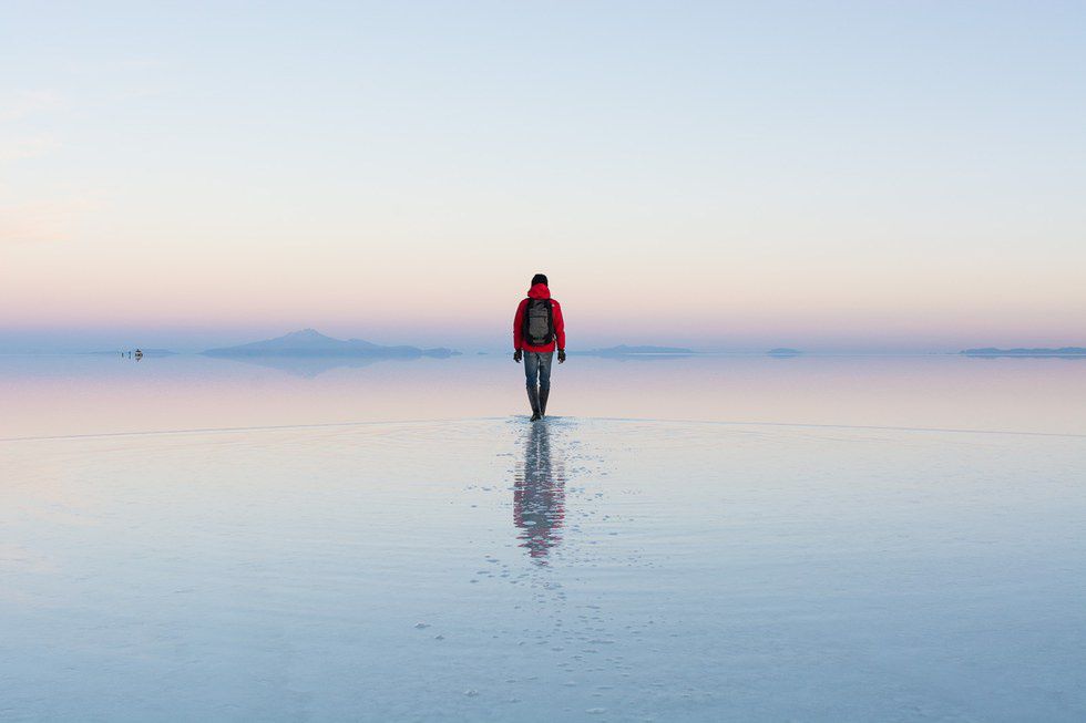
The rule of thirds is usually advised toward those who tend to place their subject matter in the center. However, the rule can be quite limiting to some who abide by it in all of their photographs. When creating an image that evokes a sense of harmony and symmetry, it may be best to place the subject matter in the direct center, as in Hideki Mizuta’s “Salar de Uyuni Sunrise.”
Instead of advising a photographer about the rule of thirds, it is best to question the artist about their positioning of the subject matter and see if they can defend their choice in regard to their photograph’s purpose. If the photographer tends to use the same compositional placement in all of their photographs in a way that is nonessential to their theme, then ask the photographer to experiment outside of their comfort zone. The subject matter can be placed anywhere in the images and in inventive ways utilizing the edges and the corners of the image, not just the rule of thirds or center placement.
2. Eliminate Negative Space
Negative space in a photograph is the area that surrounds the main subject of the image. Some photographers and critics consider negative space to be a waste, especially when used in excess, as it is not “active” like the subject matter. In David Guttenfelder’s “Bangkok at Night,” there is hardly any negative space except for the small bit of sky. This heightens the intensity and energy of the image as the viewer’s eyes are not allowed a break from the bright lights and many objects. Almost all of the photograph can be considered as “active.”
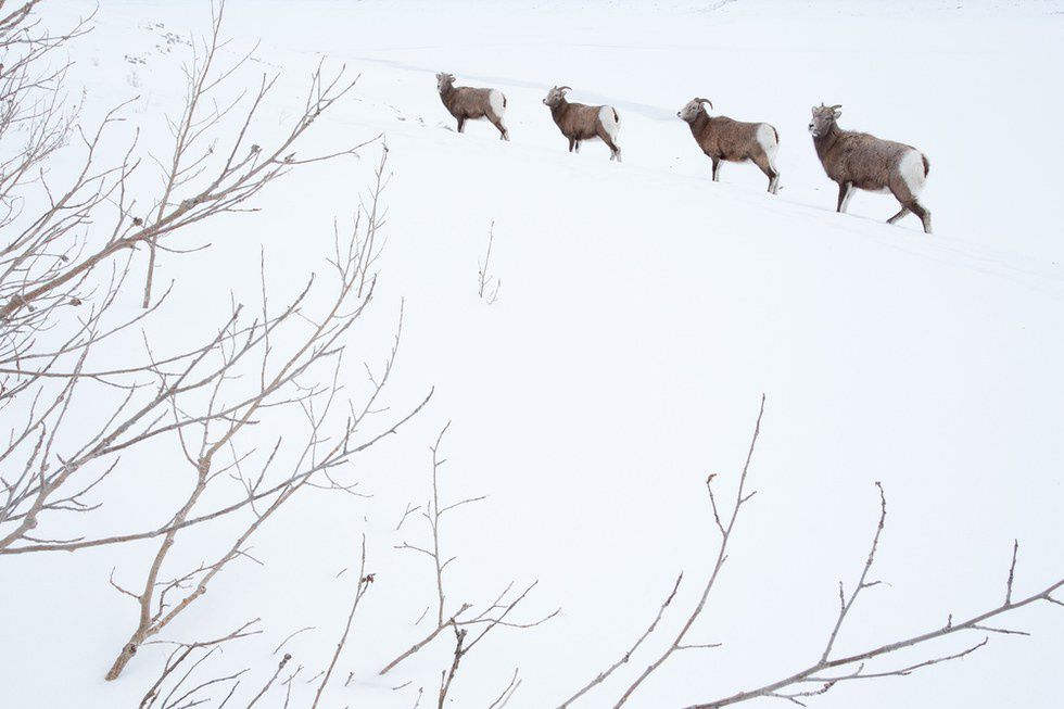
Using negative space gives the viewer’s eyes a break and can sometimes help them focus on the main subject matter better. Utilizing a lot of negative space can not only make the subject matter stand out, but help alienate it and creates a sense of loneliness or serenity. Jess Findlay’s “Winter Queue” exemplifies both feelings as the stark white emptiness filled with blurs and shadows contrasts with the defined brown of the Bighorn Sheep.
Negative space can be quite useful in regard to the purpose of the image. If an image has too much negative space that cannot be purposed and cannot be defended, then a reshoot is most likely the best option as cropping decreases the amount of pixels in an image and therefore decreases the quality. If an image needs more negative space, then a reshoot is the only option unless digital measures are taken, such as Adobe Photoshop. However, negative space of any amount can be useful to an image and it is never just wasted space when used correctly.
3. Shoot with the Light Behind
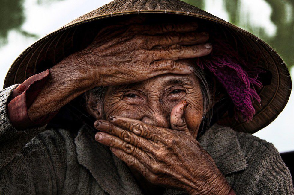
When first learning and experimenting with photography, it is often learned that shooting with the light behind you, the photographer, is best because the subject matter in front of the lens is illuminated to the fullest. It is common sense since light in other places, especially behind the subject matter, creates unnecessary shadows and makes it hard to view the subject matter in the image. Réhahn’s “Eyes of Hoi An” is an example of direct lighting on the subject matter.
This rule in particular holds back many photographers because what a photographer should be doing is experimenting with different types of lighting on the subject matter. Professional photographers in studios and directors of photography in the film industry usually have access to multiple light sources by owning lighting kits. However, that is not the case often with outdoor photographers and other photographers who cannot afford such equipment. In order to experiment with lighting, the photographer must move around the subject matter and decide where the lighting is best for the image. In “Lofoten Sunrise,” Konsta Linkola decided that having the sunlight directly in froqAnt of the camera was best, which added the elements of a silhouette and sun rays to the image.
Experimenting with different angles of one light source or adding and removing multiple light sources can change an image immensely due to the adjustment of the highlights and shadows. Natural light, artificial light, colored light, soft light, hard light are just a few examples of the different types of lighting a photographer can chose for their image. If natural light is the only option, shooting at different times of day can change an image significantly due to the differences in angle and intensity. Shooting with the light behind the photographer is definitely a rule that was made to be broken.
4. The Rule of Active Space
Active space is a photograph is the space in front of a moving object. The viewer will follow the trail of the moving object in anticipation, which aids with the sense of movement of the object. The rule of active space declares that it is better to have the subject matter move into the image, toward the viewer, rather than not facing the viewer and moving out of the image. Thomas Ingersoll’s untitled work is an example of the former.
However, in Mike Korostelev’s “Salt water crocodile,” the subject matter, the crocodile, is leaving the image, therefore breaking the rule of active space. Occasionally not following the rule of active space creates as much, if not more, movement than following it. Breaking the rule of active space encourages interest in what the subject matter is leaving behind, in this case the photographer, assuming that Mike Korostelev was in the water with the crocodile.
Increasing or decreasing the active space, placing it in the foreground of the image or the background, is up to the photographer in order to influence both the mood and motion of the image. Having almost zero active space can create tension while having a lot of active space can signify a journey. Whether the subject matter is facing the viewer or not, the questions to be asked are the same: Where is the subject matter going? What is the subject matter leaving? There can exist too much or too little active space to fit the mood of the purpose of the image, so it is best to consider all types of motion and how to convey the proper one in the photograph.
5. Balance Your Photograph
Humans take pleasure in symmetry, harmony, and balance both spiritually and visually in art. In photography, many artistic photographs are balanced because it is what humans, and therefore many artists, seek. Balance in photography is not just created through symmetry, known as formal balance, but also through informal balance, which is achieved by the juxtaposition of objects within the image. Balance can not only be achieved compositionally, but also by the color and tone of a photograph. Liz Barney’s “Summit” is compositionally and formally balanced by the two mountains in the foreground and informally balanced due to the contrast between valley foreground and the mountains in the distance. Balance can be achieved through both similar and contrasting elements.
It is very hard to encounter an imbalanced image as most photographers seek balance within their work. Christian Aslund’s untitled work is an example of imbalanced composition due to the man’s placement in the right-third of the image and the lack of any object in the left-third to informally balance him. If the image had been cropped to only the man, the photograph would be balanced. However, the negative space and the non-centered placement of the man indicates wonder and loneliness that would also be lost if an object was placed to balance the man.
Balance is one of the greatest and most common comfort zones of a photographer and that is reason enough to encourage the experimentation of imbalanced images. Photographs that sometimes need to be imbalanced are those whose purpose includes tension and movement. If an image contains a lot of imbalance, to the point of being uncomfortable, consider why the image is that why and whether the goal of the photograph is to make you, the viewer, feel that way. However, in most cases, only subtle imbalance in an image is enough to evoke the proper feelings.
Although this article is about breaking the rules of photographic composition, it is perfectly acceptable to follow any rule that will aid a certain image best. These rules have been around long enough to have transformed from mere guidelines to comfort zones. Even if you find your personal style that is formed by following and breaking any rules, it is always best to occasionally step outside your comfort zone because that is where learning begins and that is the purpose of this article. Get out there and experiment, following and breaking any and every rule, and learn more about photography and photographic composition by experience.


