We've all had to do a slideshow presentation for a class at some point or another, whether that involved standing in front of a class and presenting your content or simply turning in your presentation to your professor. However, it's very easy for your presentation to blend in with everyone else's in a blur of black Arial text on a plain white background. Here are some ways you can make your next presentation stand out from the crowd and just maybe give you that extra point on your grade.
1. Choose a theme that's not the default

Example of a slide with a standalone image and limited text.
If you just pick the first theme that pops up on Google Slides (or none at all), your professor and anyone you present to will see that you didn't make an attempt to make your presentation visually pleasing. Instead, try importing a theme or creating your own. It only takes a few minutes and will make your presentation immediately look ten times better. A site I like to use is SlidesCarnival, where you can find free, creative themes for a variety of presentations to export to Google Slides or Powerpoint. You can also use the themes provided on Google Slides, but I suggest that you tweak the colors and fonts slightly, as multiple other people will be using Modern Writer or Marina as well (as I, and likely you, know from experience).
2. Don't overload your slides with text (or images)

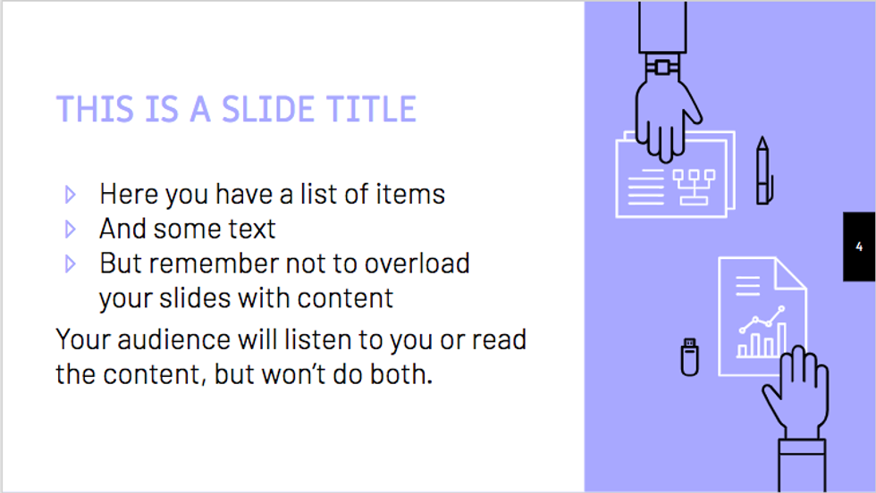
Example of slide with a balanced amount of text and imagery.
Ensure that your slides have little text, mainly in bullet points or short (1-3) sentence paragraphs. If your presentation is one that you will be giving to an audience, put only the most important points on your slides, and elaborate about those points outside of the slide. A slideshow is meant to be a visual summary for your audience, not a standalone element. If you're reading directly off your slides and not adding any new input, you're doing it wrong.
If your presentation is not being given to an audience, this is more tricky, but limit your slides to one or two main points and elaborate on those ideas in bulleted points. Add an image to offset the text.
Similarly, don't overload your slides with images. One or two images is more than enough. Additionally, the image should speak for itself and add to the content already on the slide, not add additional material to be explained and to distract your audience.
3. Make the elements of your slides visually appealing

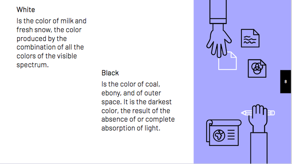
Example of a slide with offset chunks of text to make the content more visually appealing.
This can be done in multiple ways, such as offsetting chunks of text, using bullet points, or adding images or graphics. If your slide consists of only a continuous chunk of text, your audience will become overwhelmed and won't bother to read it. Remember, your slideshow is a visual aid to your presentation and should be appealing to look at.
4. Utilize graphs and charts

Example of a slide with a graph to present numerical data in a more appealing and easy-to-understand way.
If your presentation uses numbers and/or statistics in any way, it is a good idea to incorporate your numbers into charts or graphs. Not only will this be more visually appealing, but it will make it easier for your audience to comprehend your data than if you just stuck your numbers into bullet points.
Those are all of the quick tips I have for making your next presentation stand out from the rest!


