For an assignment in my theatre class, I had to watch a play and observe its lighting and how it enhances the motions of the play. I bought tickets to "A Guide for the Homesick" by Ken Urban not really understanding the emotional journey I was about to embark on.
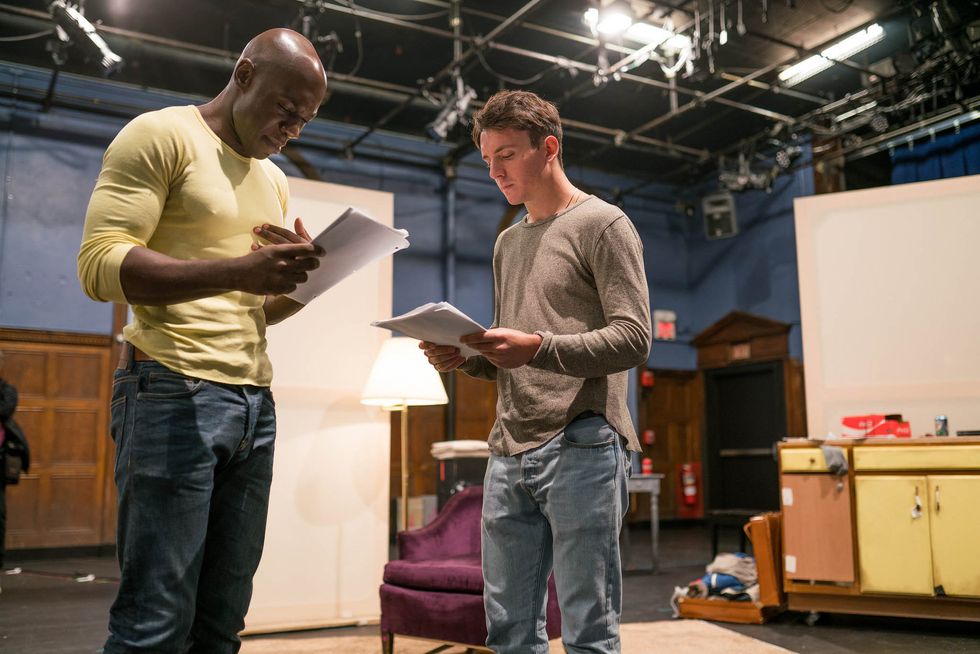
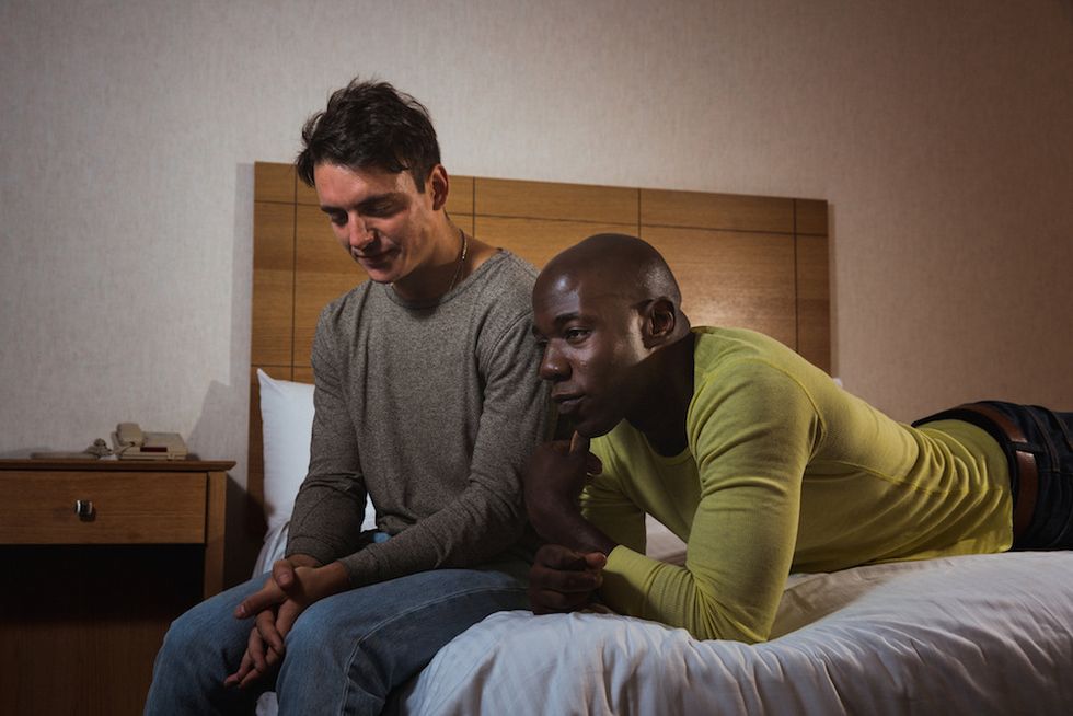
The play, "A Guide for the Homesick", was an emotionally demanding performance by McKinley Belcher III and Samuel H. Levine. It focused on consequential issues like LGBTQ rights, mental health and the loss of a loved one. The play starts off quite ‘normal’, the set was a small room, and the actors were not in amazing costumes. But, as the plot goes along, and the two characters begin to settle down and be more comfortable with one another, the set explodes into a million different sets.
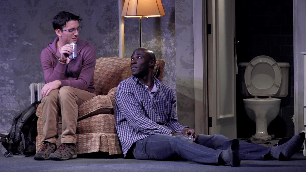
There was a very interesting use of a scrim. I did not notice it in the first place because there was very intricate detailing on it, making it look like an ordinary wall, but at the heat of the dialogue, lights burst out from behind, illuminating a completely different set behind the hotel room. This was the method used to indicate past from present. Every time one of the characters had a flashback, the lights would dim and change colours. It was purple for Jeremy and reddish for Teddy. I believe the lights used were LEDs due to the vibrancy and range of colours used - they would be difficult to replicate with gels. The lights used really livened up the show, it produced colourful shadows. They contrasted the very difficult topics that the characters were discussing in the dialogue. For instance, the purple felt very happy and bright, almost like a contradiction to the fact that the actors were talking about homophobia and violence against LGBTQ people in Uganda.
While the set was not very large, there was a surprising amount of Source 4’s and theatre lights used. On the set itself, there were basically 5 components: the lights from the toilet, the window, a standing lamp, a lamp on the side table, and a hanging light. The 3 conventional lights were very orange, they were more orange than conventional light bulbs, which gave the room a strange glow. Other than these lights on stage, there were about 20 to 30 more lights used, all hung from the sides of the theatre, and the bottom of the balcony. So much of the orange was cancelled out as the lights used was a mix of fluorescent, warm-toned lights, and blue-tinted lights. The blue lights were aimed very specifically at the scrim, most likely to intensify the blue wallpaper and make it more vibrant. The other lights were used to fill in shadows and illuminate the set more clearly for the viewers.
The light from the window was the most innovative. In the beginning, the first light we see is the light from the window, it was very bright - like street lights. Then the audience hears thunder, and the lighting designer was able to somehow make the light from the window translate onto the adjacent wall with the illusion of raindrops in the shadows. The window was also an indication of the passage of time. The light very gradually changed from the more artificial light of street lamps to daylight.
Overall, I feel like the play was able to address these issues head-on while juxtaposing them with the lights, making them feel less confrontational to the audience. The beauty of the play is its directness. There is no beating around the bush, and their implications are not really implications, for they are so detailed that we know exactly what happens. The message of the play is to be more involved and to help when help is needed. While the show was intense, there is a sense of raw reality behind it. I will never forget this show, and I can never forget the message it instilled in me.


