As a millennial, we are groomed to be technologically advanced. We type an average of 200 characters per minute which rounds out to be around 40 words per minute. On average, we awaken our devices from a not so peaceful and deep sleep 80-110 times a day. We average at about 67 texts per day for an individual and around 10 billion phone calls a day around the world. With that being said, it's pretty obvious how important modern technology is and the software that comes with it. It's pretty self explanatory that accessibility and appeal is just as important. So now let me say, Apple, you dropped the ball on this one. You took about 2 steps forward and 10 steps back. You made the process not only more complicated but unappealing and just annoying. I understand this is not everyones opinion but there is some angry people out there, like abnormally angry people. Here's a few reasons why I think they messed up or things that could have been changed.
1. Press to unlock / No more slide
After countless years of sliding to unlock the iPhone, it's a routine, tradition, familiar task. Where's the satisfaction. Real innovation apple, you just confused me even more. Every time I wake my phone, I swipe and beings me to some foreign screen and I remember to press the button. Not a big deal, such a minor change but why, there is no need to fix something that's not broken, it's just throwing me out of whack.
Recommended for you
2. Emojis
Really, emojis? Why. They now are similar to android emojis, not that its that big of a problem but why are you focusing on minor cosmetic changes rather then something bigger. Just seems to me that slapping some new color schemes on them is a way to stuff the consumer with temporary eye candy.
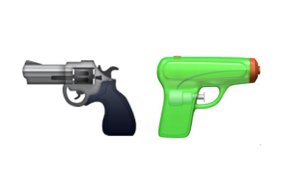
3. The Gun Emoji
I'm guessing this is Apple taking a stance on gun control and it's views. How is removing the gun emoji going to encourage gun control. Yeah, but lets keep the bomb!
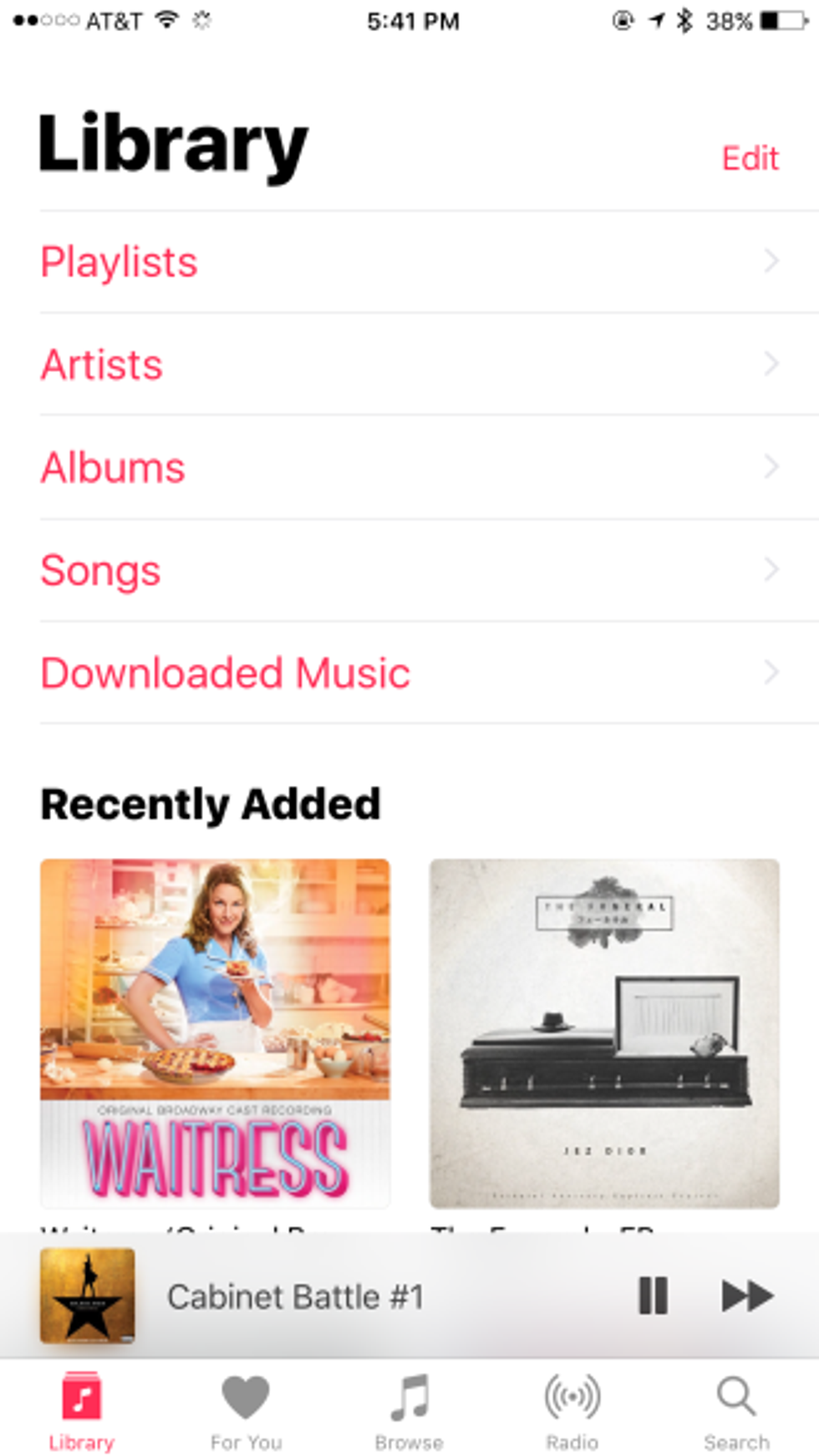
4. Music App Design
Opening the music app now looks like your flipping through a seven year olds drawing book. How is this more modern and appealing?
5. iMessages
This is the most confusing part, I can turn my phone without a sketch pad popping up. I can't hit send like previously, changing unnecessary things again. Although it is pretty cool gifs were added, it still irritates me that they alter things that have no need to be.
This being said, there is still a lot I love about the update with addition of gifs, and customization of your shortcut tabs. You can even delete those pointless stock apps from your home screen. They did a few things right but my main advice is to avoid changing the unnecessary and work on real innovation.


