After circling the internet for a few hours, I managed to create a list of what’s in and what’s out for 2017 interior design trends from three different sources, those being House Beautiful, Elle Decor, and Country Living.
Just like anything else, interior design is always changing and evolving based on society’s preferences. For an interior design trend follower like me, it’s always interesting to see what’s in and out for the year and it’s fascinating to watch how fads can affect even the way that we decorate our homes.
Here is the list of what’s in and what’s out and my opinions on each:
What's IN?
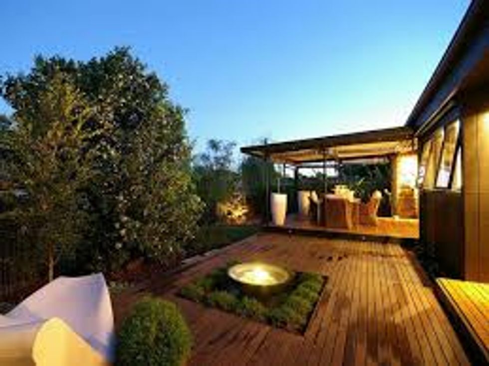
1. Extending the outdoor season
Who doesn’t love sitting on a back porch that’s thoughtfully decorated with decorative pillows, furniture with character, and string lights? It’s great to see that there are so many people taking the time to put as much thought into their outdoor spaces as their indoor.
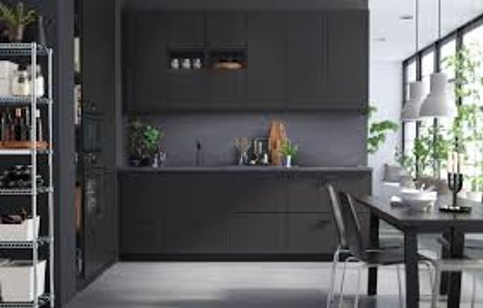
2. Matte black accessories/appliances
I like matte black here and there, but a house that only uses matte black and not a variety will end up being pretty dull. And I don’t really know how I feel about matte black appliances…
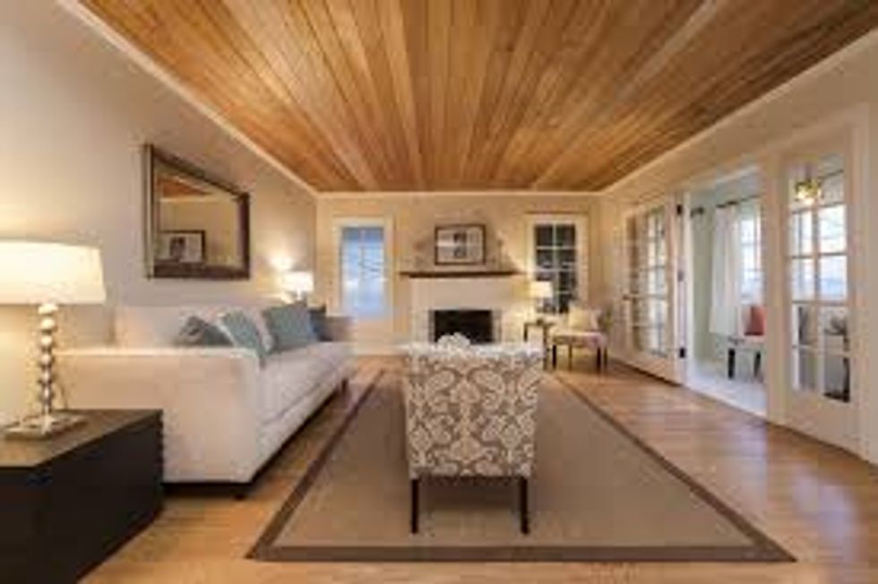
3. Statement ceilings
Statement ceilings, such as a ceiling of planks of wood can be cool in a boring room, but they can easily become overwhelming.
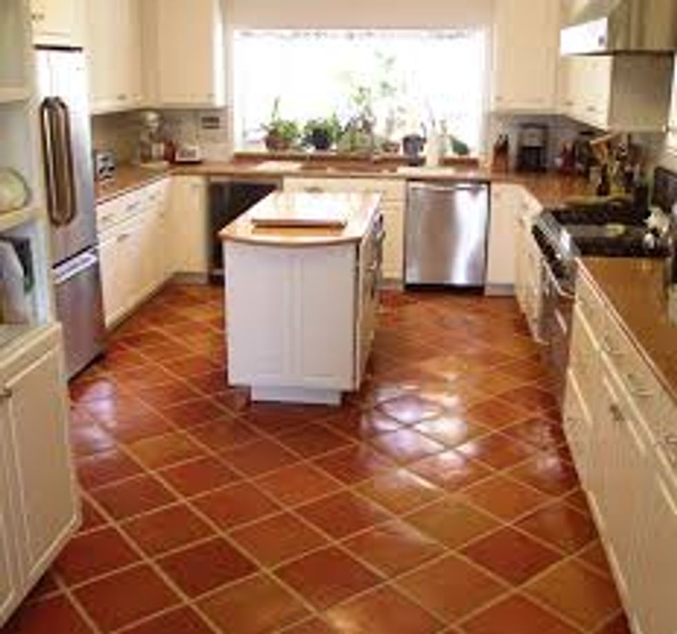
4. Terra cotta tile
Terra cotta tile is something that I would have never thought would be popular, but it’s unique and can give a room an interesting character.
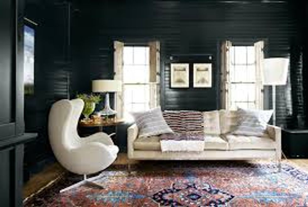
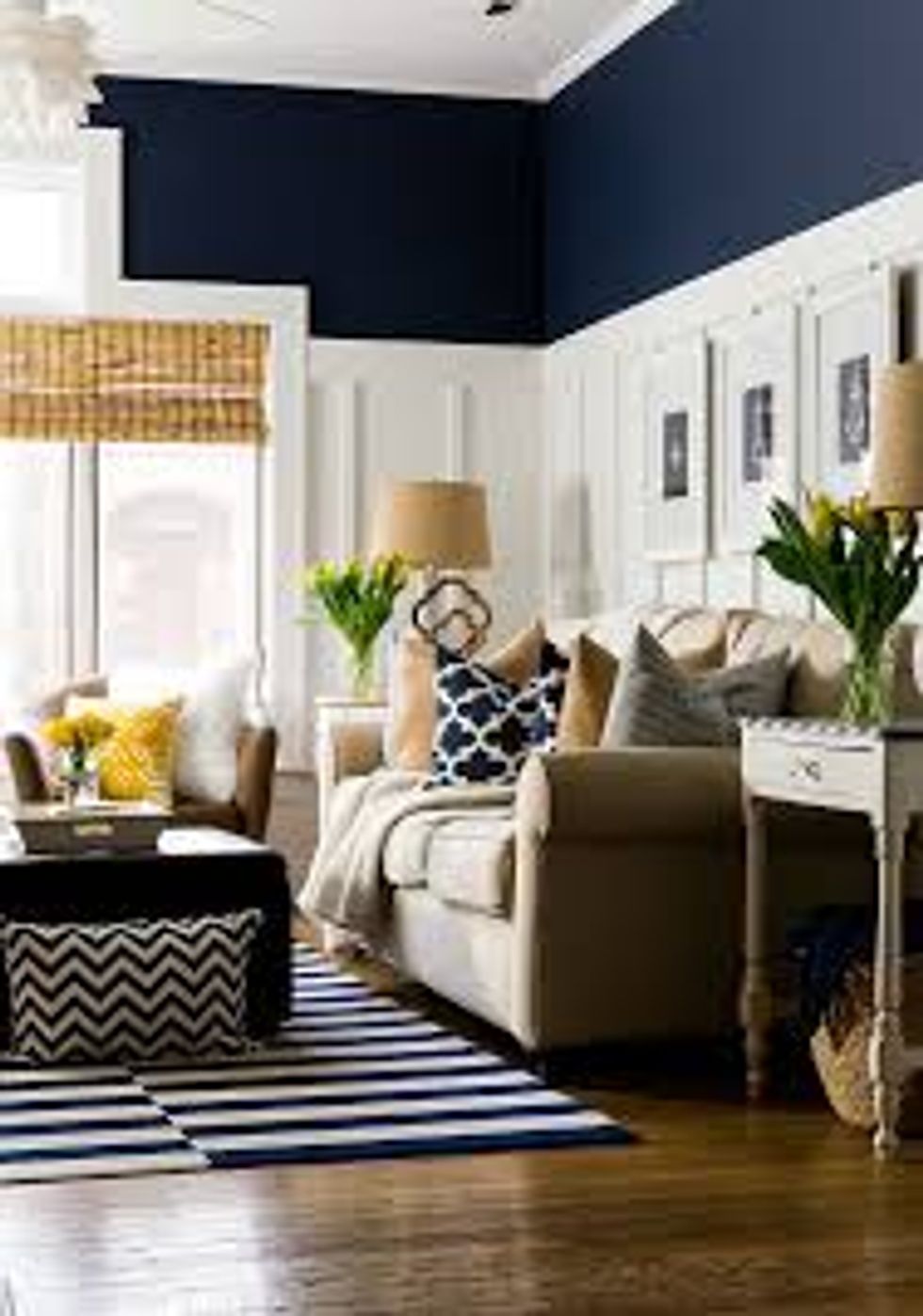
5. Dark paint
One really dark room with light furniture can create a bold statement in a house, but too much dark paint will make the house feel very small and closed.
6. Brass
Brass will always remind me of my Grandma's house.
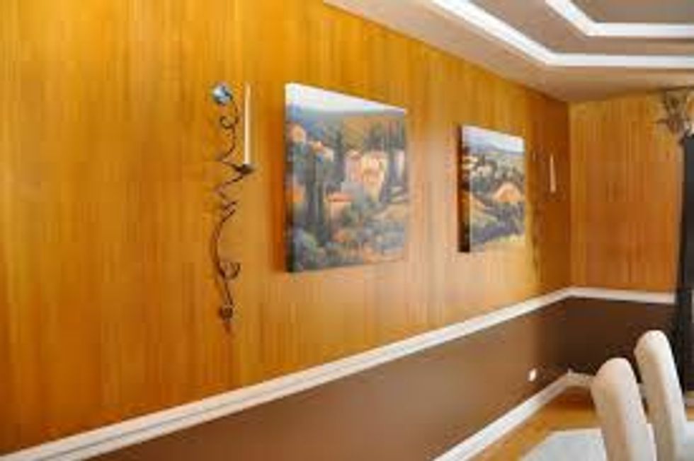
7. Faux finishes
While faux finishes may be significantly cheaper, I don’t believe that they’re really saving you money if they look super fake.
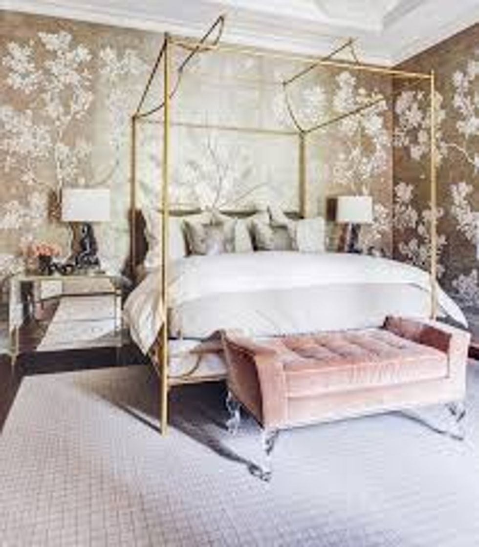
8. Blush
I believe that whether or not you go for blush or millennial pink depends on the look you are trying to achieve, but blush is a more mature color than millennial pink (still love it, though).
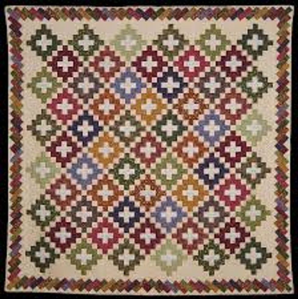
9. Quilts
When I see a quilt, it leads me to think of a log cabin somewhere in the woods. I just believe that duvets and comforters have so much more versatility and personality.
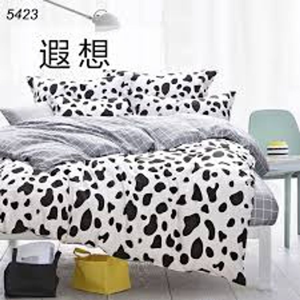
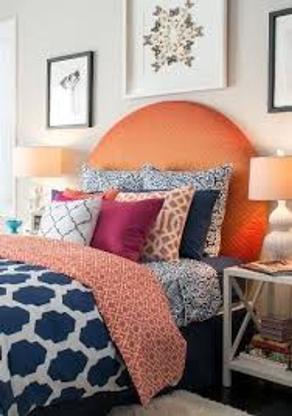
10. Interesting bedding
I’m always one to go for simple bedding, but if the room is simple, then I am all for interesting bedding.
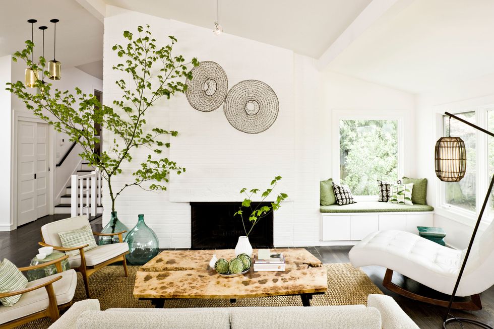
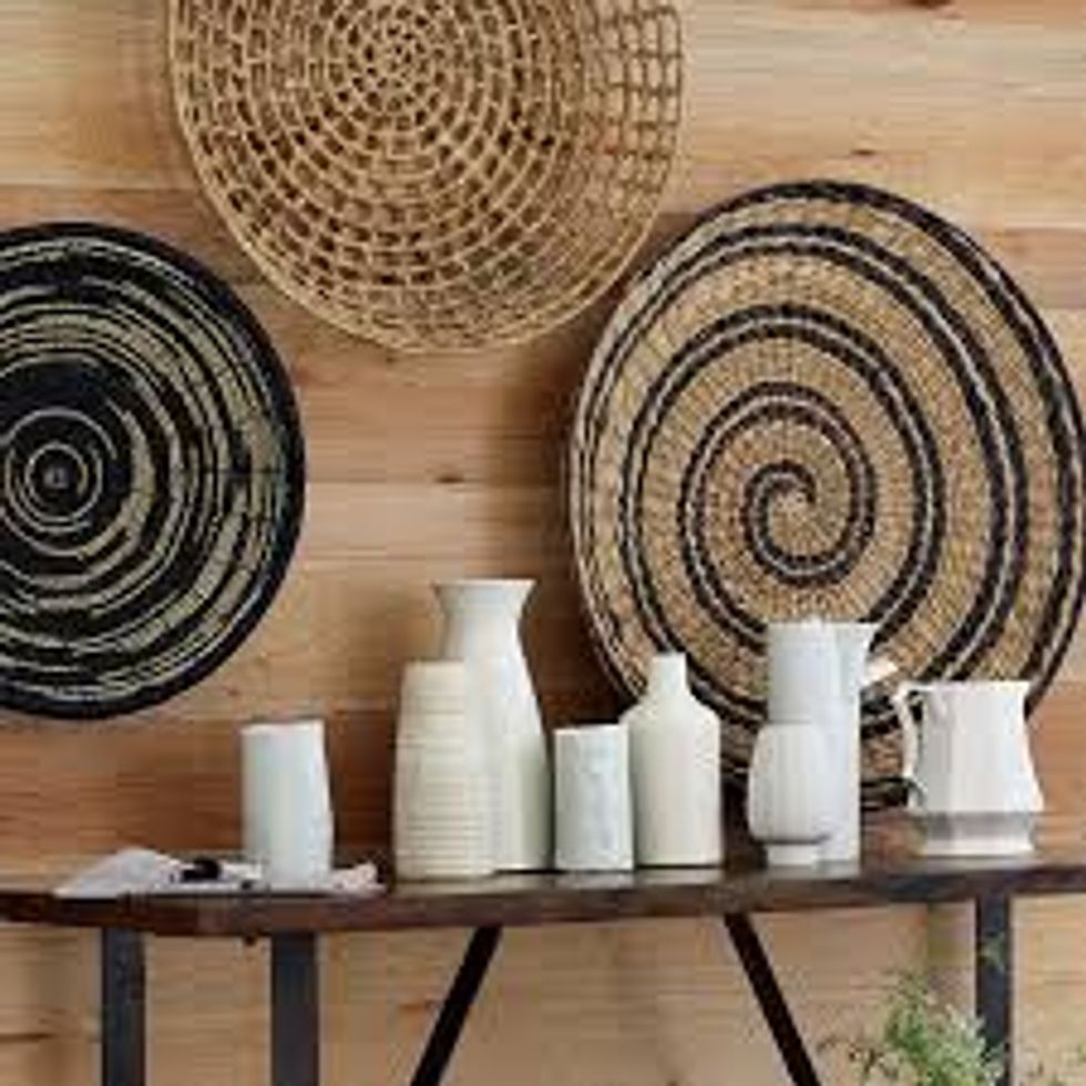
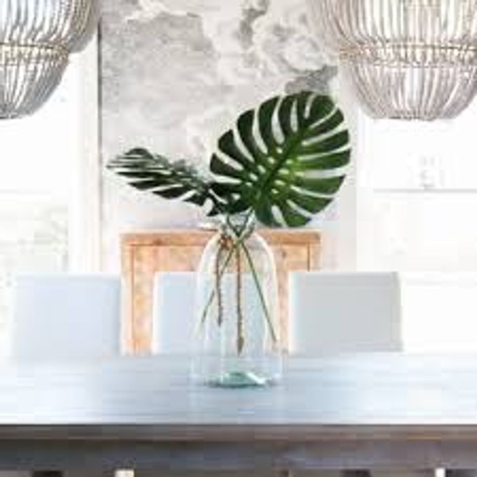
11. Woven textures
I LOVE this one. Woven textures are so fun and unique and add such an interesting character to a house.
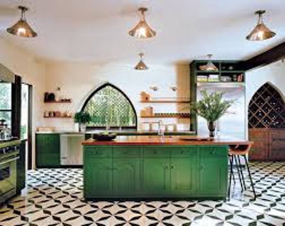
12. Dark green
I am in love with dark green cabinets and furniture and decor, but I thought that I was the only one and I am kind of disappointed that this is now trending because it’s no longer unique.
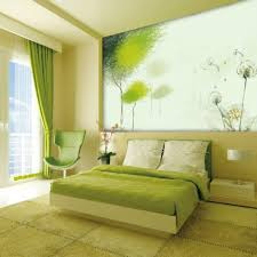
13. Light green
This is only a trend because light green is the Pantone Color of the Year. Why would you want to use bright green paint? And it’ll quickly be pushed out by whatever the next color of the year is.
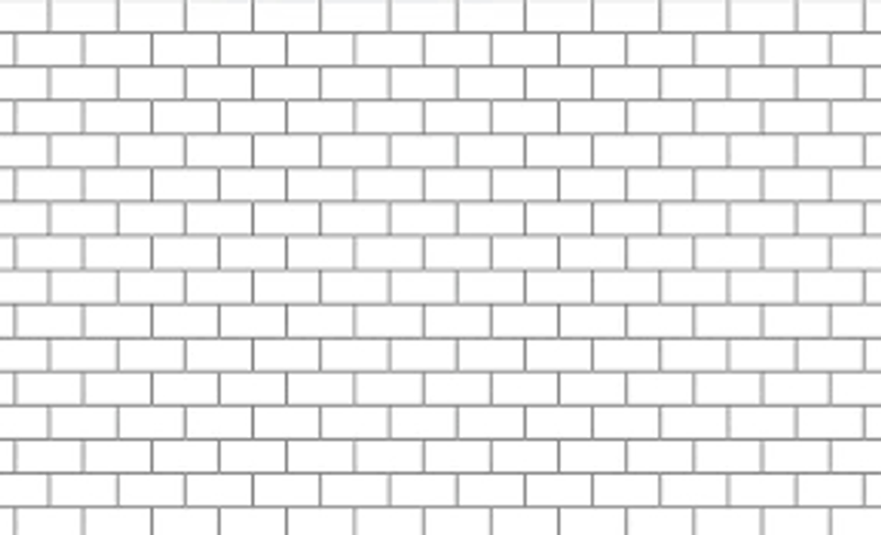
14. Subway tiles
Subway tiles will always be a classic (especially with black grout).
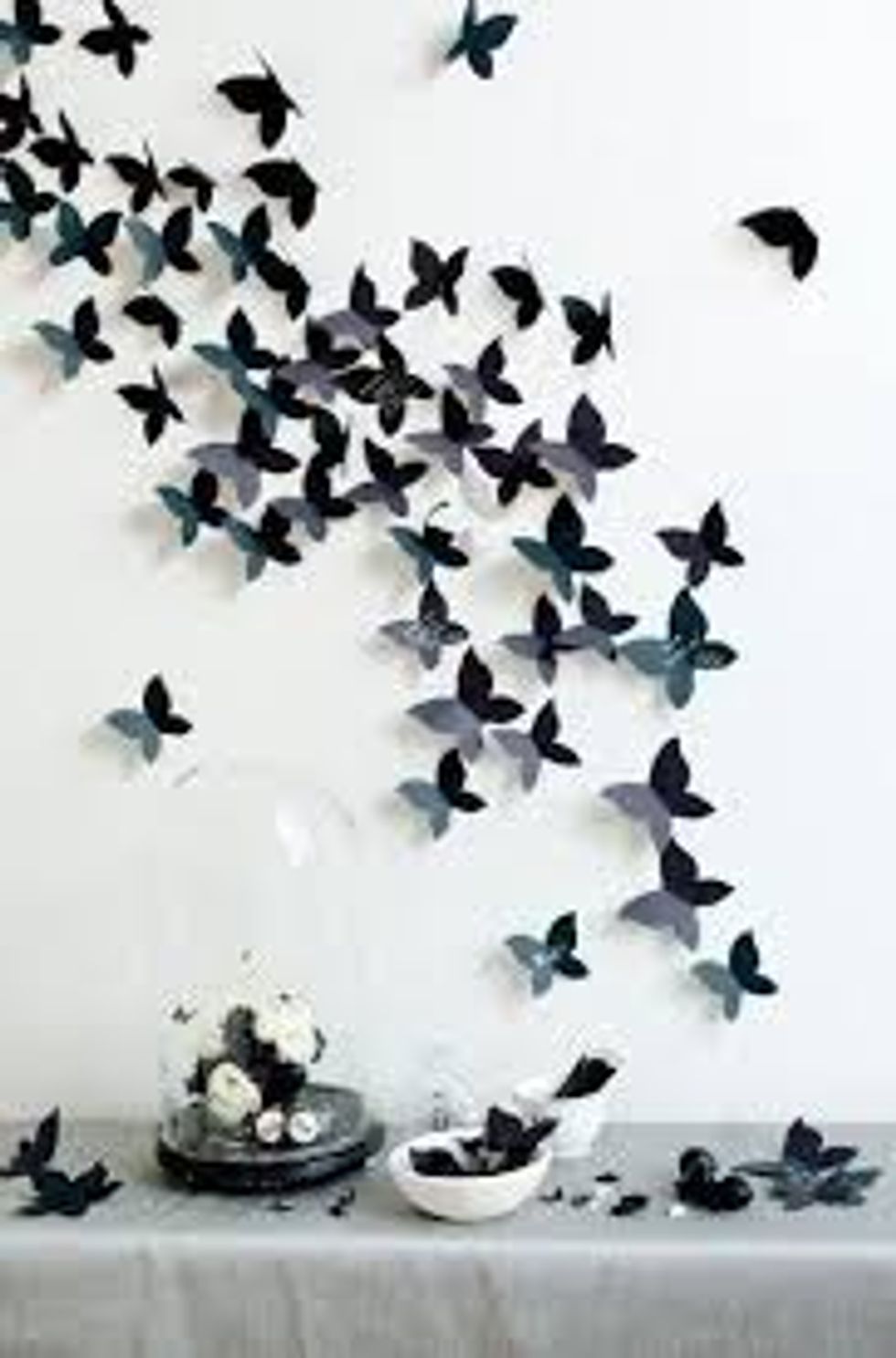
15. Butterflies
...why?
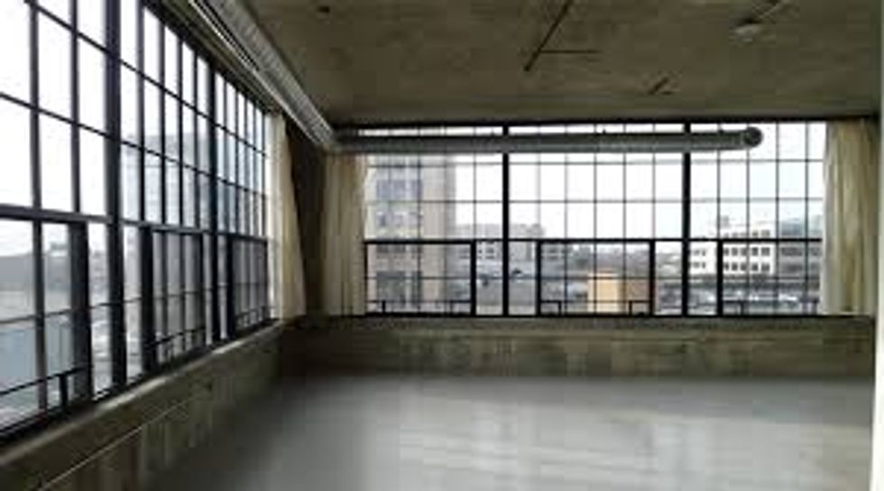
16. Detroit
You may be wondering why there is a city on here, but Detroit is where all of the hip designers are flocking to for its plethora of brick, industrial lofts just waiting to be flipped.
17. Mixed patterns
When mixed patterns work, they really work. But for the most part, they always look terrible.
18. Navy, not black
I’m biased because I just do not like the color navy. I will always prefer black.
19. Artisanal instead of DIY
Finally! The DIY craze is over. DIY decor is always so easy to point out whereas artisanal pieces just look so much better.
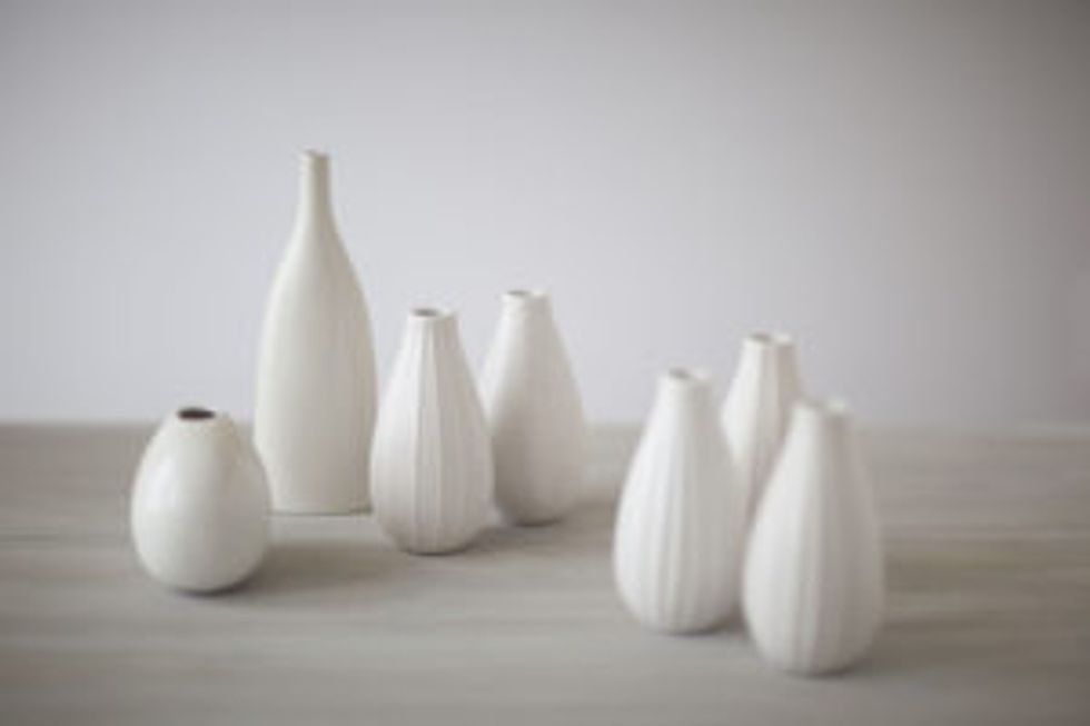
20. Raw white
White decor pieces will always be classy, but raw white adds a nice edge to what would normally be pretty dull and generic pieces.
What's OUT?
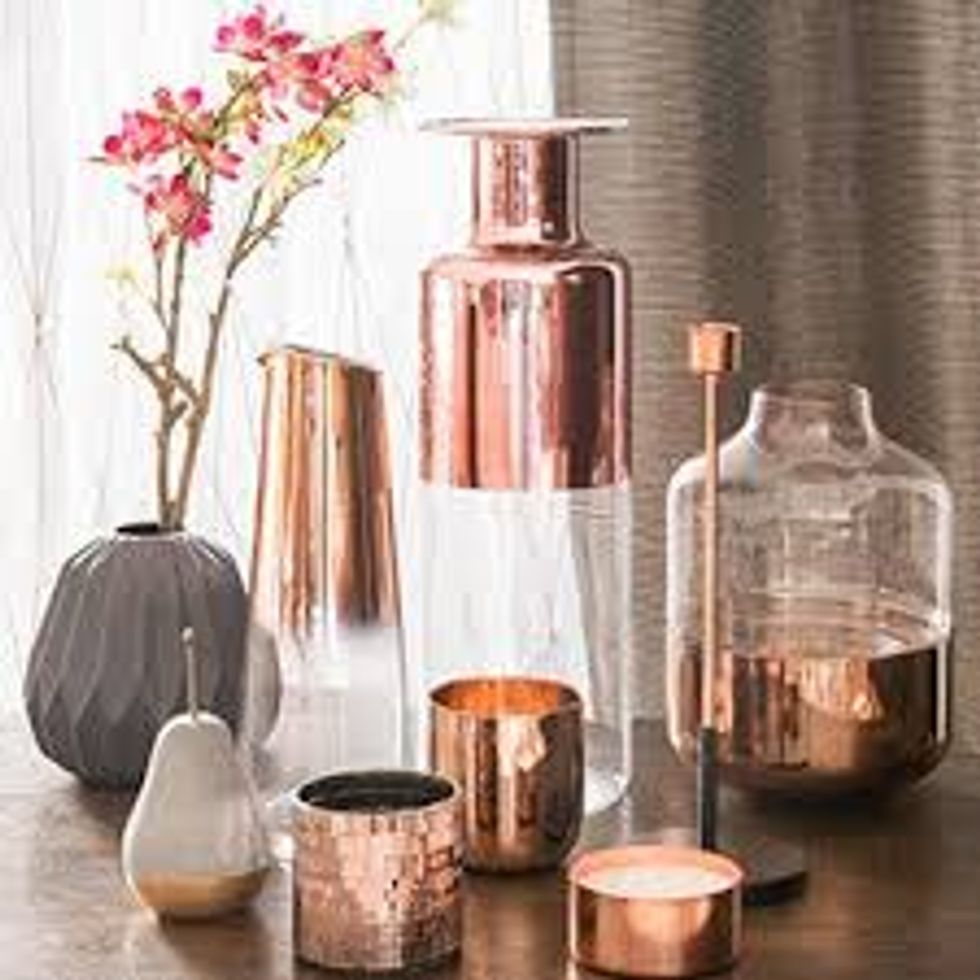
1. Copper
Copper is cool here and there, but it was waaayyyy overused, so overused that it just became ugly in a lot of cases.
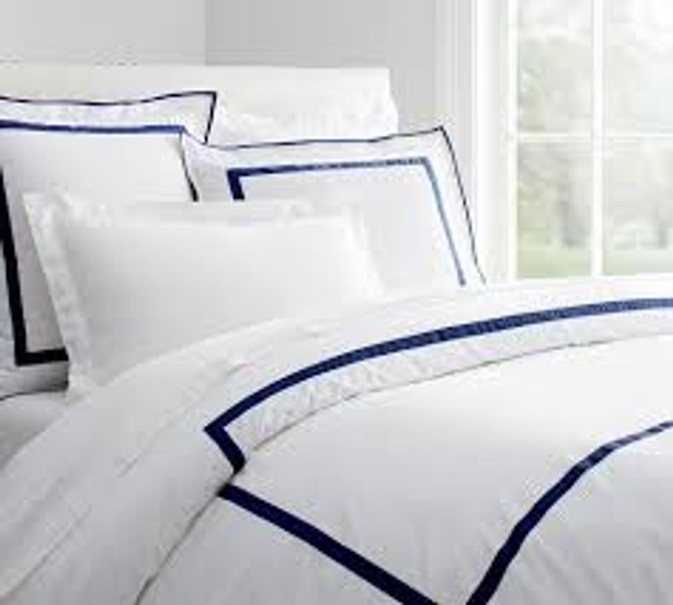
2. Boring bedding
I like boring bedding when paired with a bunch of unique decorative pillows, but that’s just me.
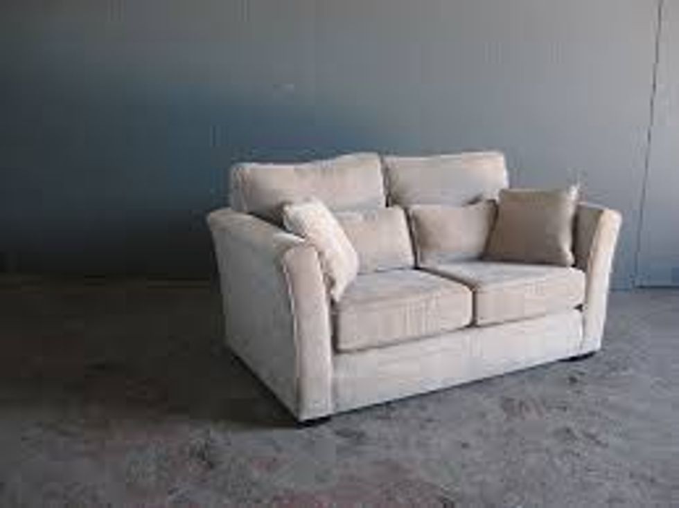
3. Generic/oversized furniture
Jumping onto a huge sofa will always be fun, but smaller pieces with more character are thankfully being used more and more in design. The couch that you buy can make or break the design that you're going for.
4. Marble
I’ve actually read that marble is both in and out, but I’m going with out because it’s just so boring. Lots of people dream of having marble countertops, but what fun is it when every single person dreams of it? It can look amazing and classy, but there are so many other options out there.
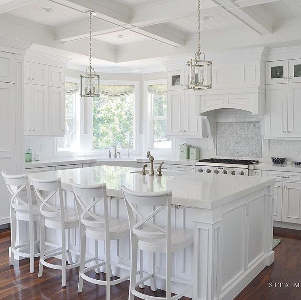
5. All-white interiors
For a while, I wanted to have an all white house, but then I began to fall more and more in love with kitchens that had more colors and textures, and same goes for other rooms. I’ll always prefer white walls, though.
6. Brushed metal
I kind of like brushed metal but what’s out is out I suppose.

