You know when you go on Instagram and someone's feed looks incredible because all their pictures have either the same filter or symmetry? Do you ever wonder what it takes to achieve that?
Okay. Probably not, but I know some of you are wanting to maybe clean up your feed or pretend to be a professional photographer! So, what exactly does one have to do to have a feed that screams "tumblr aesthetic?"
First of all, I highly recommend that you download the app on iTunes store (I don't know if GooglePlay has it but I suggest taking a look) called VSCO. It is a great camera app that not only let's you take pictures, but you can also edit them. These are the filters that a majority of Instagram junkies like using for their feed. My personal favorite is C5. Now, some of these filters you do have to buy, but a good majority of them are free so try them all out!
The picture above is using the C5 VSCO filter. The exposure is at +1 and the contrast +2 and temperature +0.5. WOAH ALE WHAT IS THIS TALK?
Filters are filters with set vibrance, brightness, and contrast levels. Sometimes, I like to give my picture more light or saturation. You don't have to be studying photography to know what makes your picture the most beautiful. TIPS: don't over saturate or over exposure or over sharpen the picture.
Another important thing to note is symmetry. Why do you think Oscar winning films won? Not only because of the amazing acting, but how the work was captured. When looking at photography, you have to do the same thing. You can either always capture solid background or capture a scene that is showing everything.
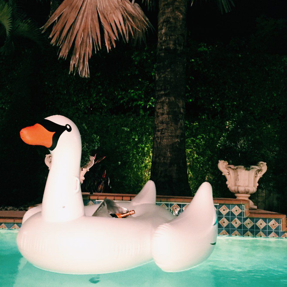
As you can see, one picture captures the green background and the swan, while the second captures a more detailed look at the swan and gears the attention to the champagne glasses. Putting a solid background reduces the noise of the picture. If you want your audience to look at whatever it is you are exhibiting, try a solid background. With landscape, you can do the same, but this time, instead of capturing solid, we are going to capture the landscape.
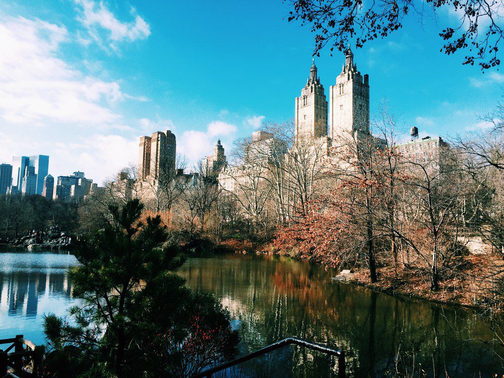
Central Park has been one of my favorite places (and most complimented) to take pictures of landscape. In the picture above, I was looking to not only capture the city skyline, but also the pond and evergreen around the cold water. One of the most important things I did was look for the right lighting. Once I had a nice, natural light, I saw my 3/4th's frame and decided to make the portrait.
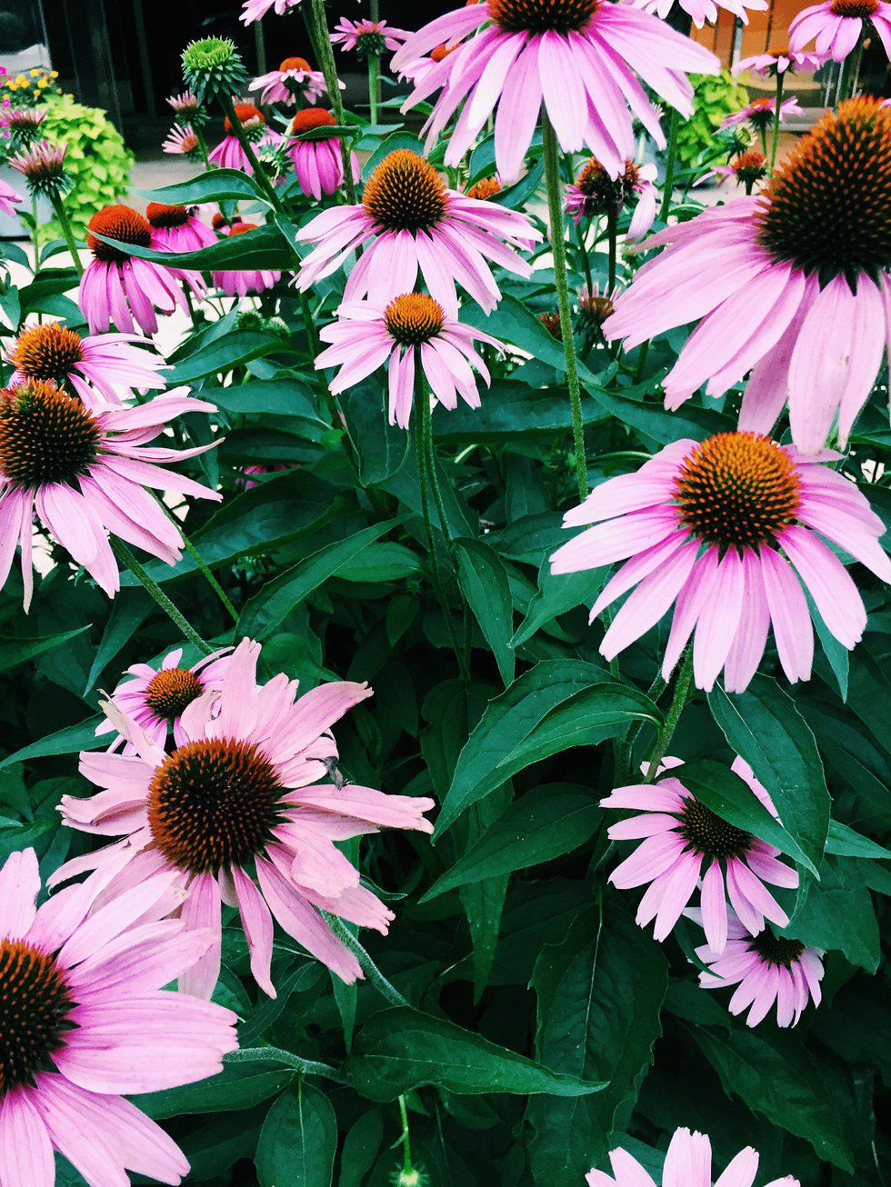
Another example of landscape is close up of nature. Instead of taking a picture of this beautiful garden of pink flowers in Washington D.C., I decided to capture the individual beauty of a small bunch. There is a color palette and I really enjoyed that orange, green, and pink were the only colors getting a chance to be vibrant.
One cool picture effect I like to use sometimes is fading and focus (please be cautious I am not a expert photographer so I don't know much jargon).
I find this effect to be captivating to detail. Sometimes, you want to just focus on one thing, but other times that thing has to be in the center.
My last tip would be lighting. It is so important to have a good natural light. If you don't have, make your own. Use white light and when you have nothing left, use that iPhone flashlight.
I used two iPhone flashlights to take this picture. Now, the background was actually grey. Would you have noticed? It is also essential to focus on your object. If it is a face, focus on that beautiful face.
Now, this is by no means a way to fake a lifestyle. This is a way to be creative and have fun. If I have the gift of having a great camera, I will use it to my own advantage. Each single one of the pictures shown were actually taken with an iPhone 6 camera, so use it to your advantage. It is a nice hobby and great way to let out your creative side.
Hope to see all your feeds filled up with pretty pictures.


