As an advertising student who is still grasping and observing the field I'm majoring in and hope to have a career in within the next year, I'm always looking at campaigns produced by brands. When I see them, I like to take note of them.
I like to analyze what I like, what I don't like, what I would do differently if I had the chance, and what I aspire to parallel some day. Here are a couple campaigns that I've seen in the last few years that have inspired me.
1. Dove's Campaign for Real Beauty
I've completed a couple of projects over this campaign in past advertising classes, and it still peaks my interest every time I come across it
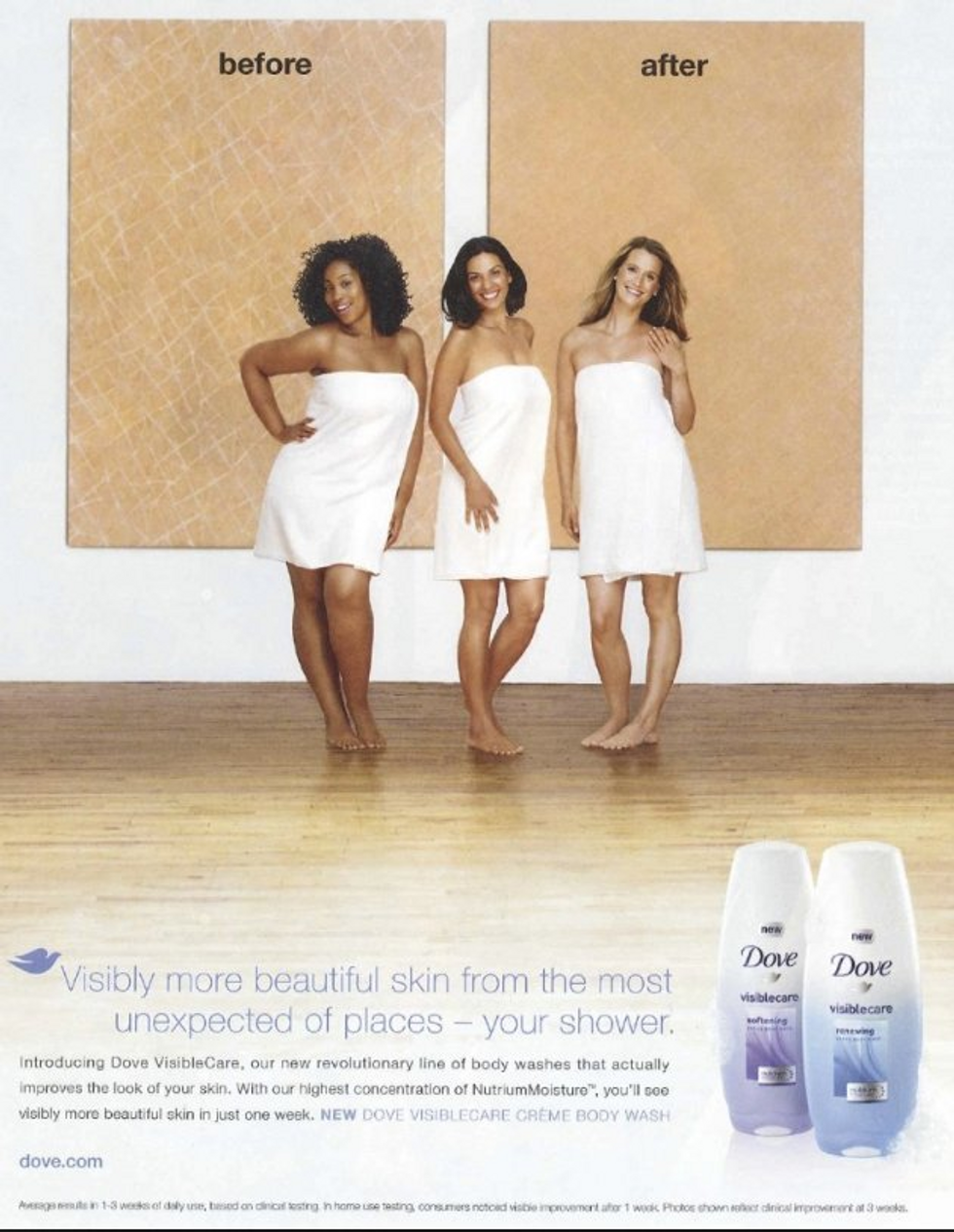
Dove really capitalized on a social issue that not many other brands were gutsy enough to talk about. They wanted their brand to reflect "real beauty" by using real people, not models, and promoting the idea that everyone is beautiful despite what society says is "ideal."
It was a risk, and Dove was successful in this for several years. In the last few though, Dove received backlash on some videos they published that made them look hypocritical regarding their values.
The backlash on these ads said Dove was trying to say lighter skin tones are better and healthier. It was a pretty big PR crisis for the brand, and they should have thought harder about what these ads were saying on a deeper level.
What I take away from this, is to get comfortable with taking risks, and thinking outside of the box where no one else wants to go. I want to take a look at society, think back on how it correlates with whatever brand or product I'm working with, and make something out of it.
At the same time, I hope I will realize when it's time to let things go. All good things don't last forever, and I think Dove should have ended that campaign while they were still on top.
Either that or they should have done more research on how society has evolved since the start of this campaign over 10 years ago. In which case, I hope I remember how important research is no matter what stage my campaign is in.
2. Burger King's Bullying Jr. Experiment
Another brand taking on social issues, but more unexpectedly, is Burger King. This advertisement first popped up on my Twitter feed, and it went viral because of regular people taking it to heart. I took it to heart as well.
Burger King saw their target audience, saw this issue in society, and correlated it to their brand and products. How cool is it that they "bullied" their whoppers and gave it back to the customers who were bystanders to an actual kid being bullied?
It's such a genius idea, and I have so much more respect for BK's brand now more than ever. It reflects back on Burger King's brand, their personality, and what kind of values they want to exude.
Similarly to Dove's Campaign for Real Beauty, I'm impressed with their stance on a societal issue. It shows that they are paying attention to current society and are going to say something about it. I believe Burger King did it better though. They had a perfect crossover of problem to product and didn't overkill the idea.
3. Oreo's 100th Birthday
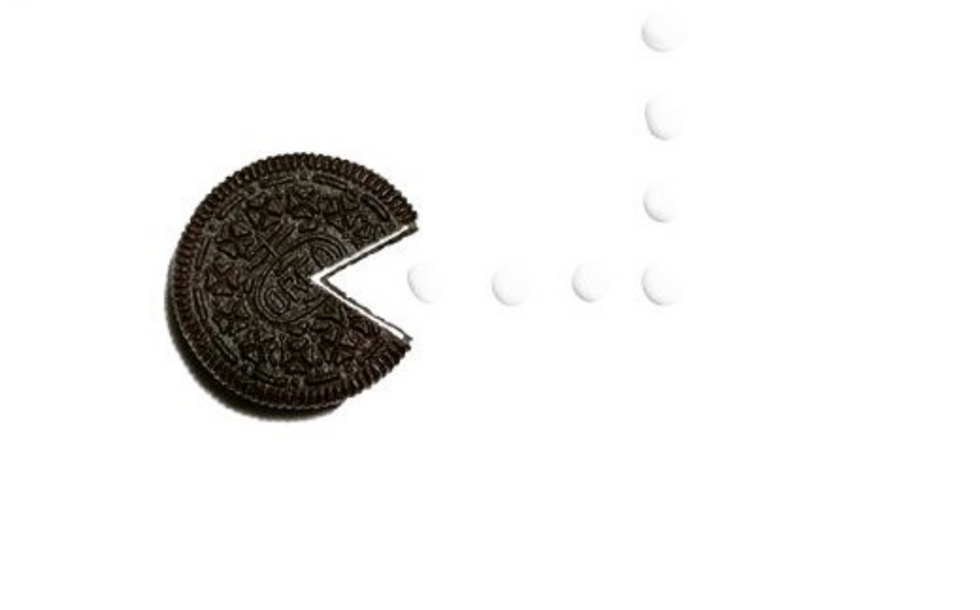
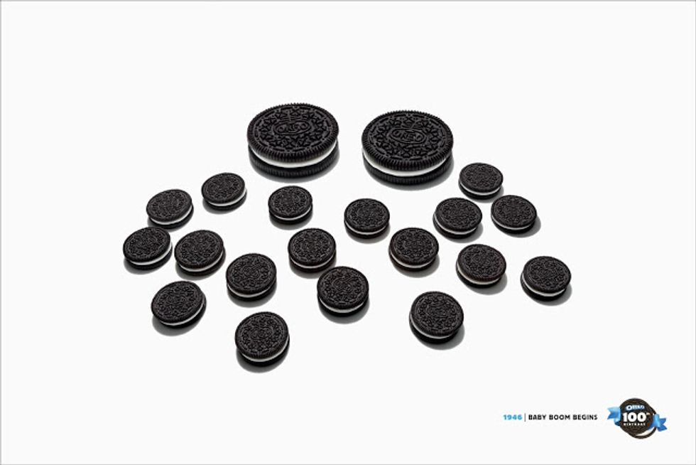
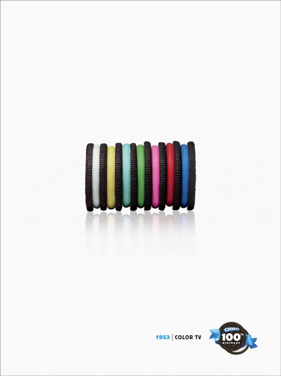
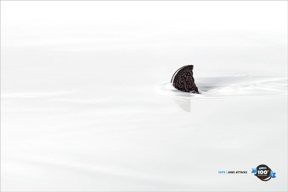
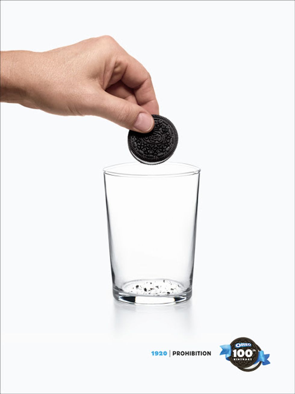
A woman named Megan Williams found my Instagram and direct messaged (DM) me to compliment my work. In this DM, she told me she was in the advertising industry as a Creative Director in New York City who just wanted to commend photography. Then she showed me her website/portfolio, where I dawned on Oreo's recent ads regarding their 100th birthday.
I thought it was amazing that the creative director for these ads, Megan Williams, found little ole me on Instagram, complimented my photography, and was the one responsible for these ads.
Oreo was turning 100 years old and wanted to put their twist on some iconic moments in the last 100 years.
First of all, what a fun brand to work with. Second of all, these ads are cute, funny, and appealing to any demographic. Check out Megan's portfolio of these ads to see some of the videos they produced as well.
I would absolutely love to work with a brand someday that is so fun and naturally light-hearted because there's so much creative free-reign. This campaign inspires me to have fun and to remind myself that my job is fun.
4. Nivea's Night Cream
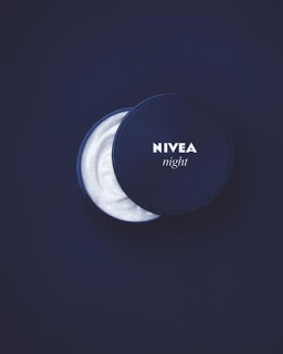
On a smaller-scale, the simplicity of this advert is inspiring to me. It's an easy concept to understand, and beautifully displays Nivea's product. I hope to have an eye like this that notices little things that could totally make the whole concept.
The white cream of the product makes a crescent moon with the lid placed on top and to the side, so viewers can easily determine it's a night time cream based on that visual cue. Having an image speak for itself is ultimate creativity, and so much work goes behind a simple picture.
5. FDA The Real Cost Creatures
Another find on Megan William's website was a series of videos for FDA The Real Cost anti-smoking campaign. These concepts are shocking and definitely make the viewer watch all the way through. Watch more on Megan William's site.
What I take away from these videos is how appealing they are to watch. In current times, it's hard to get people to sit and actually watch a video all the way through. A video has to be compelling from start to finish, or else the viewer will click away.
Everyone is compelled by suspense. You want to know what's happening next, so you're going to sit and find out. These ads are short and sweet as well, which helps with keeping the viewer engaged.
By watching these videos, I have another technique to stow away in my back pocket for the future. Depending on what brands my future career will have me working on, I may want to use this tactic to get viewers watching, keep them interested, and get my brand's message across succinctly.

