On a whim, I went to see Illumination's newest film "Sing." It was honestly everything I expected it to be; nothing more and nothing less than what was advertised. Despite its predictability, and how it did not take as much advantage of the funny animal world as "Zootopia" did, it was still good and I had fun watching it. And the music was great!
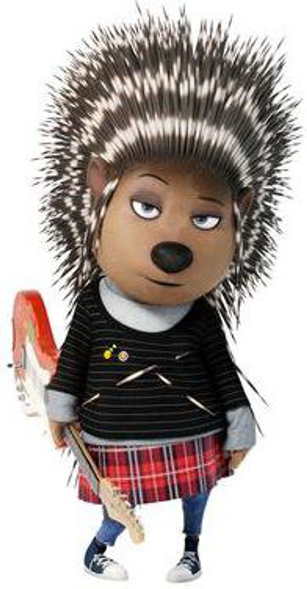
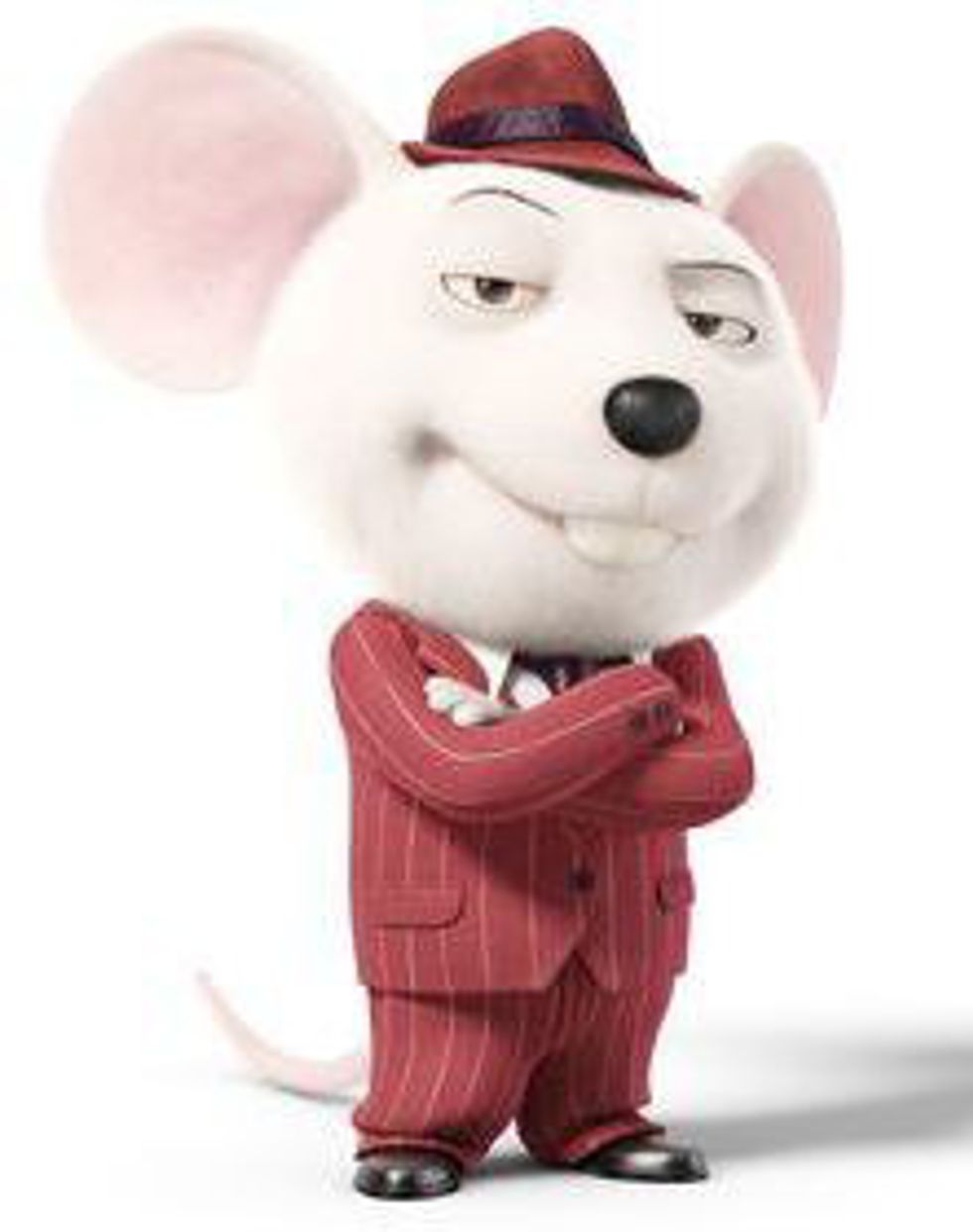
My only major beef were the characters Ash the porcupine and Mike the mouse. They had great personality, and voice acted perfectly. My biggest criticism comes from their designs:
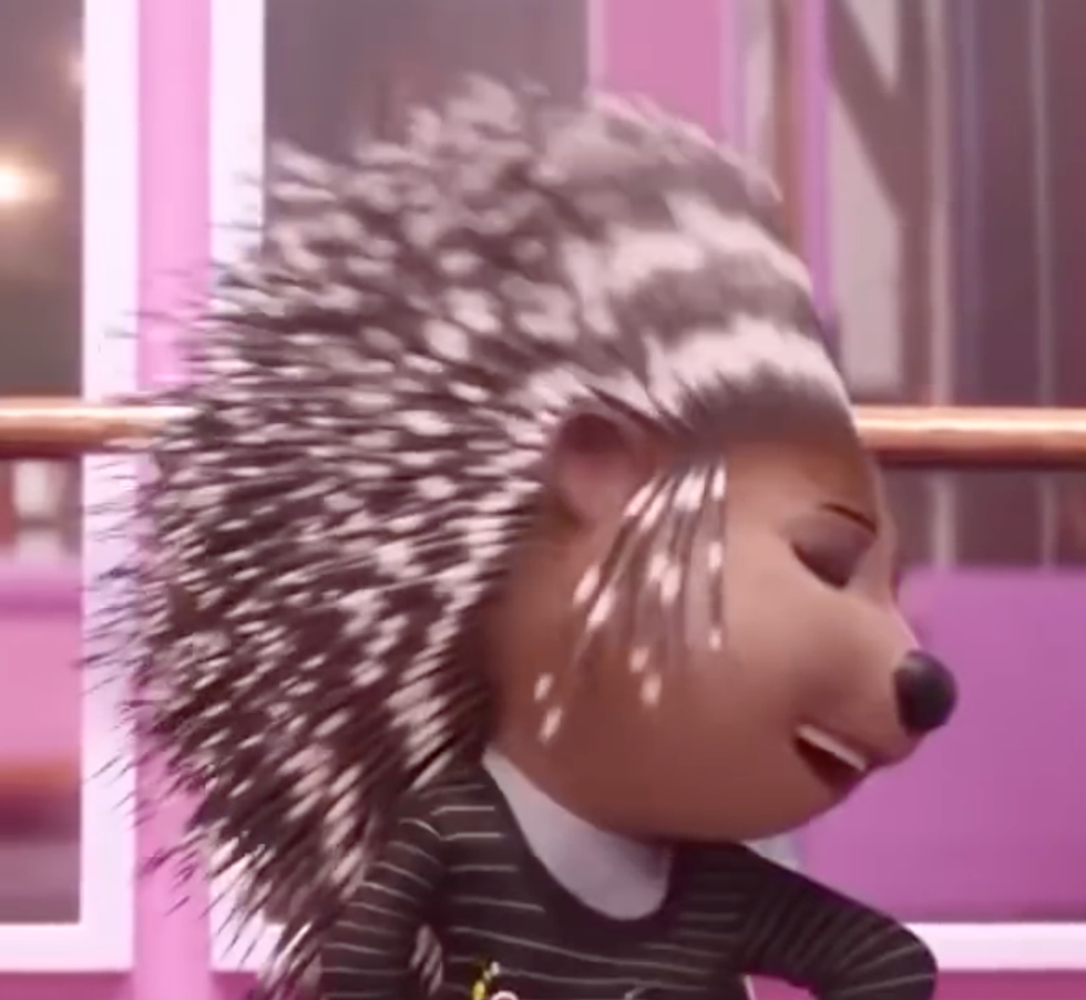
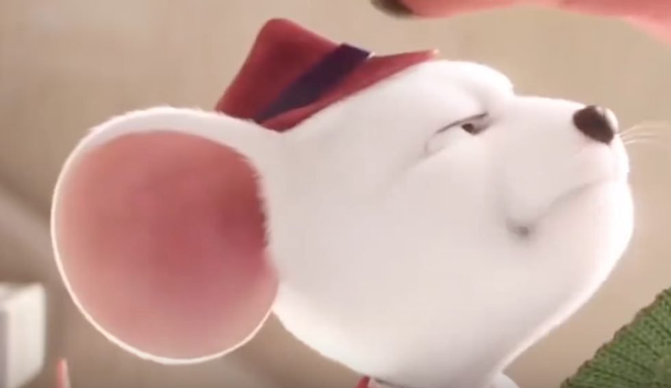
Throughout the whole movie, it was really distracting how similar these two looked, especially in their facial design. Both of them have round faces, round snouts, and round noses. It's especially obvious when they are shown from the side.
I know they are both rodents, but their real-life counterparts have obvious differences that could have been taken advantage of in their designs to make them unique. In "Sing," the only real difference they have are their heights, their color, and Ash's quills.
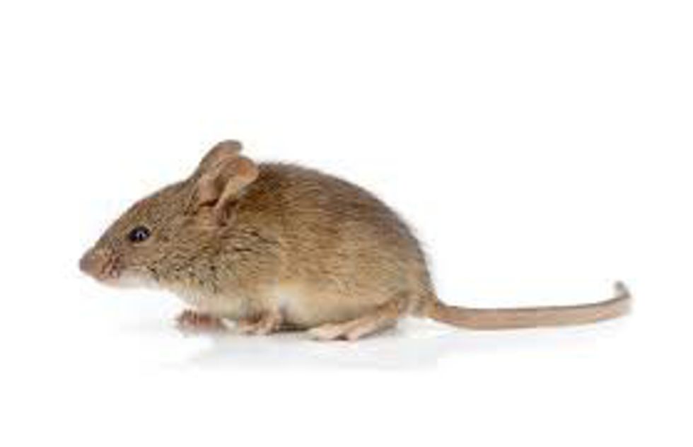
Real mouse heads are more elongated and pointy, like a triangle:
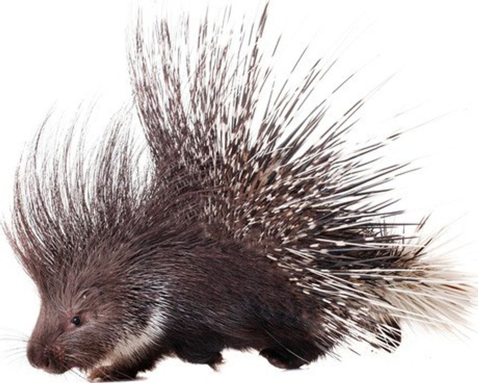
While real porcupine heads are more thick and stubby, like a rectangle:
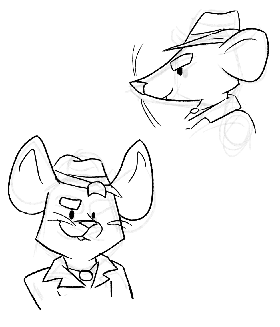
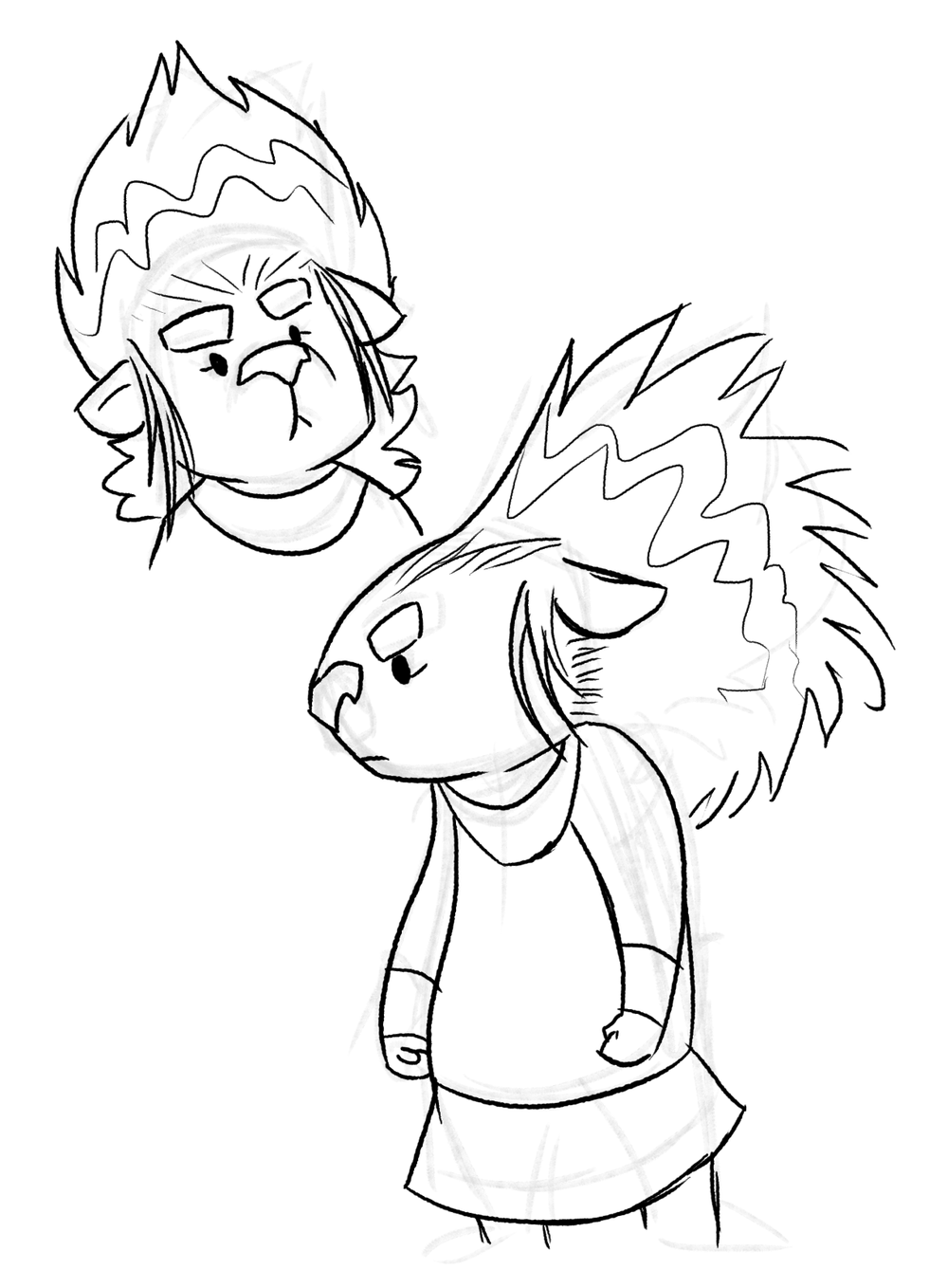
So, using those photographs as a reference, here are a few quick sketches of Ash and Mike I've done, trying to emphasize these differences:
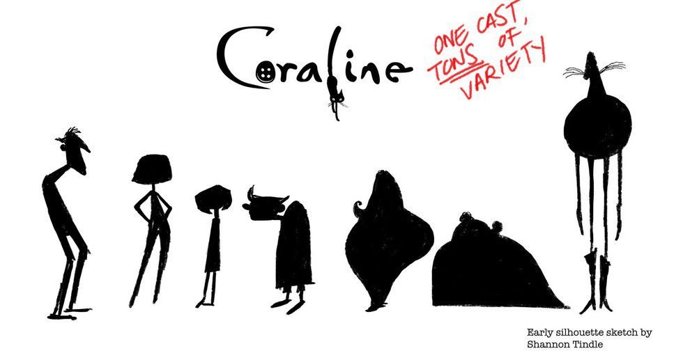
Obviously these are not perfect designs, but the different shapes in their heads makes it easier to tell that they are different characters. It also makes them a lot more interesting to look at. In animation, it is key to design characters so even at a distance, or in the dark, characters are distinctly recognizable to the audience. This is why the silhouette test is so important:
Like the image says, one cast can and should have a lot of variety. That is one of the things that makes animation such a fun medium to work with. Nothing you work with is the same!
So while "Sing" was a well-done movie, some of the designs left a little to be desired. I have faith that their future projects will have more variation!


