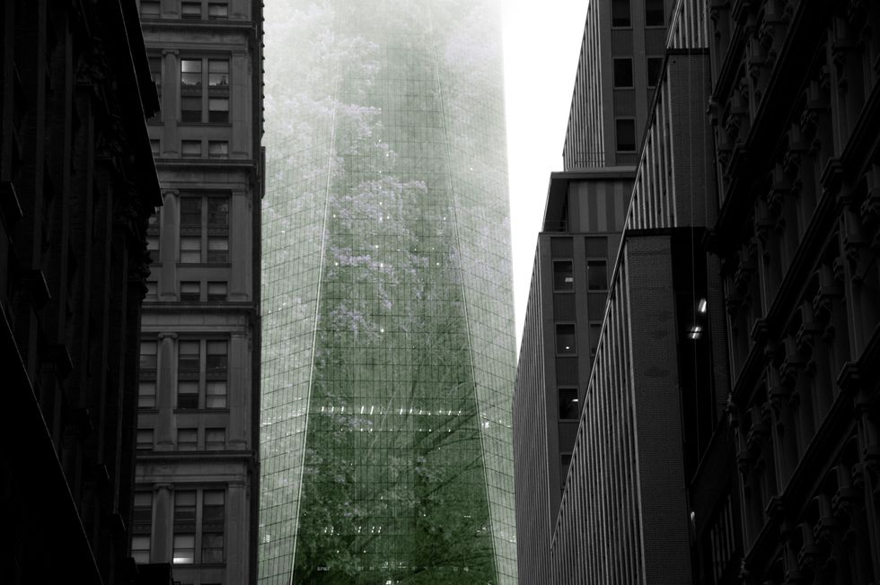
In this city of grey concrete, vibrant and meaningful color can be hard to come by. The light of the buildings and the lack of contrast can lead photographers, myself included, to lean towards black and white photography. While there is nothing inherently wrong with black and white photography, it’s important for photographers to expand and work outside of our comfort zones. This is where a conscious use of color can be useful. There are infinite ways to group and combine colors, so they can provide endless possibilities of composition.
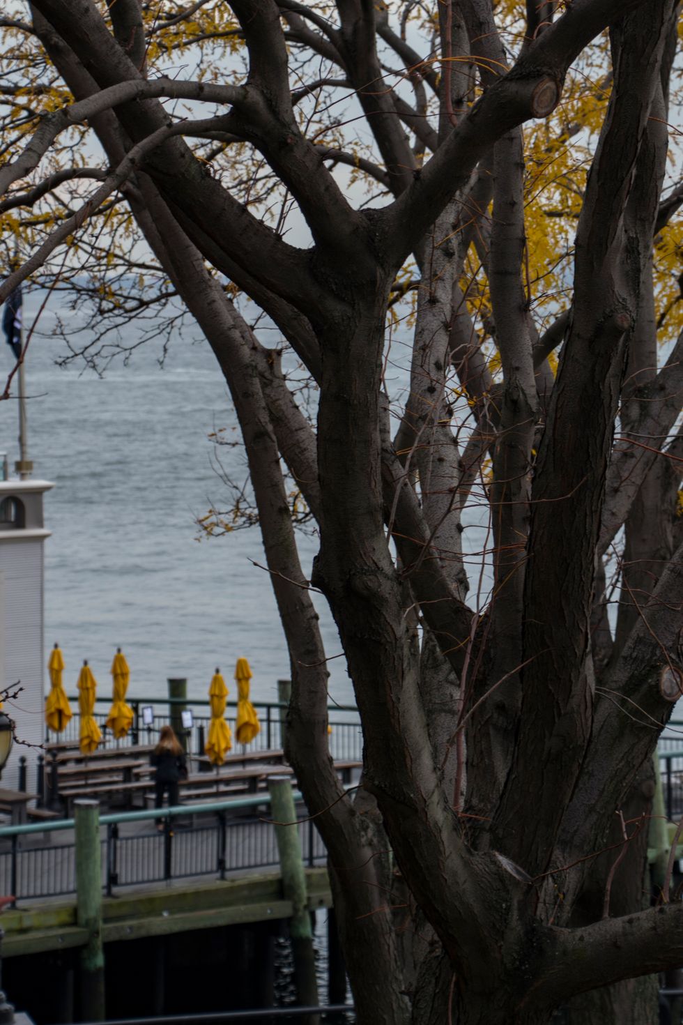
Yellow leaves and yellow umbrellas are framed as two sides of the same picture.
The color of the bark of a tree in the background is reflected in the foreground in the color of a closed umbrella.
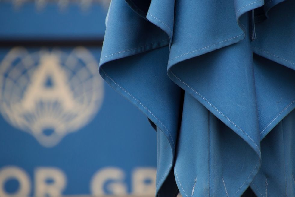
The folds of a blue umbrella, set against a restaurant banner, highlight the texture of the fabric.
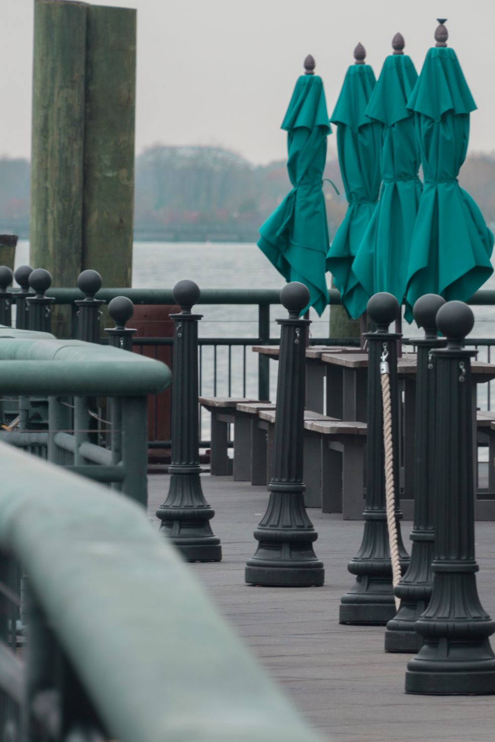
Umbrellas the same shade as oxidized copper stand mirroring the bollards of a restaurant.
In pictures 72-75, I tried to create a very simple relationship between the color of umbrellas and their background/foreground. This is a very simple relationship of colors, that’s easy for anybody to see in pictures but is much harder to notice in real life. The matching of colors between discrete entities can be applied in any number of scenarios alongside other methods of composition.I’ve found that by focusing specifically on color in one study, has led to a more conscious use of it in other instances.
The main gear of a bicycle is seen through the frames of several other identical bicycles.
Colors don’t always have to match. In this photo, I combine elements like the lines of the bicycle frames to create a smooth, current like impression. Although Orange and Blue fall on opposite sides of the color wheel (an important tool for all artists that I’ll expand on in another article) the shades of each here help to sooth the viewer.
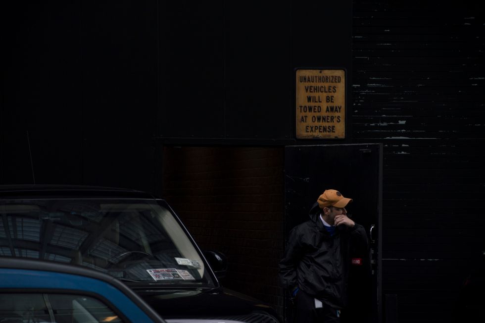
A loading dock worker looks to his left
Although the color black is a large part of the photograph, it’s not the focus. The focus is on the yellow of the sign, and the yellow of the man's hat. Sometimes by isolating a color, you can create the different tones of a piece that would not come out if the color you want to emphasize is drowned out by other colors.
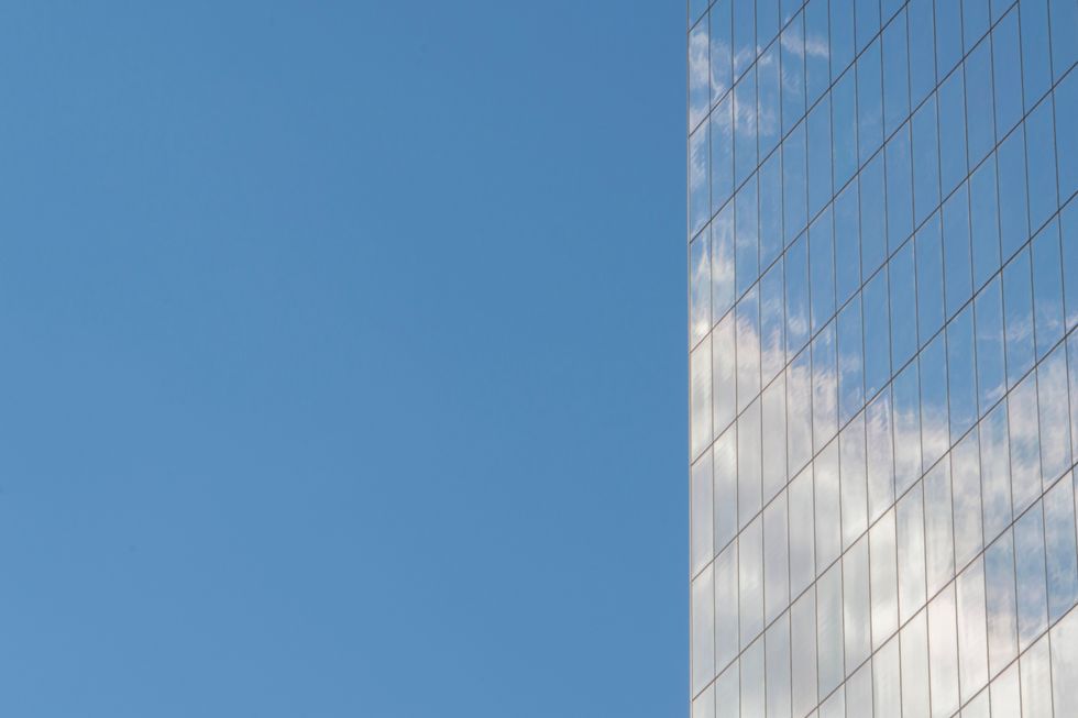
The clouds and sky are reflected in the windows of a building
Monochromatic doesn’t always mean black or white. By definition, it means one color. In this photograph, the viewer is meant to think about the relationship between the reflection and the sky, and that is facilitated by a literally mirrored color.
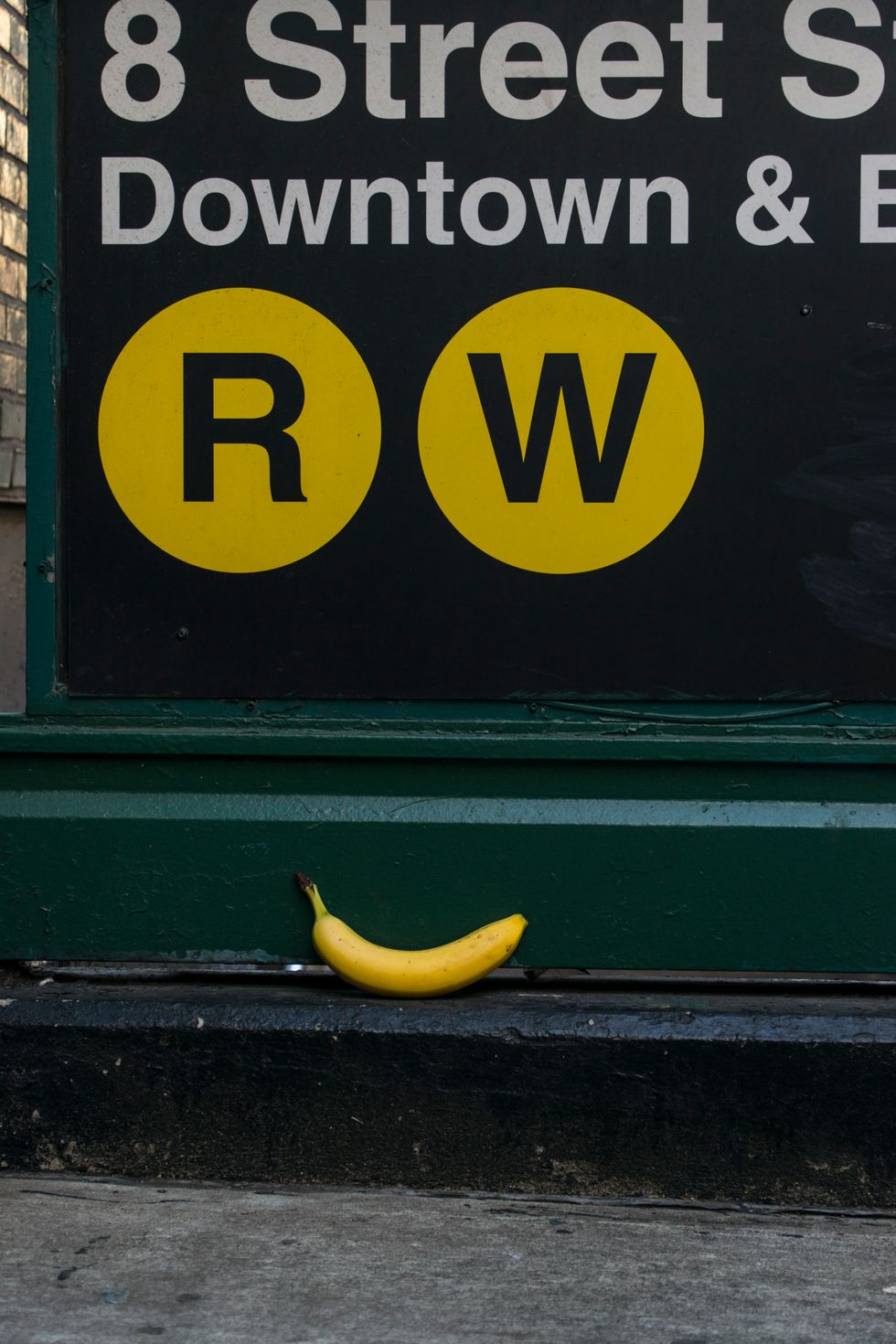
The symbols for the R and W trains overlook a found banana
One of the joys of living in New York is that odd things tend to happen. This banana was one of them. Color doesn’t always have to be representative of a larger, more grand theme. Sometimes, it can just be a link between two elements in a photograph that adds another layer of interest.
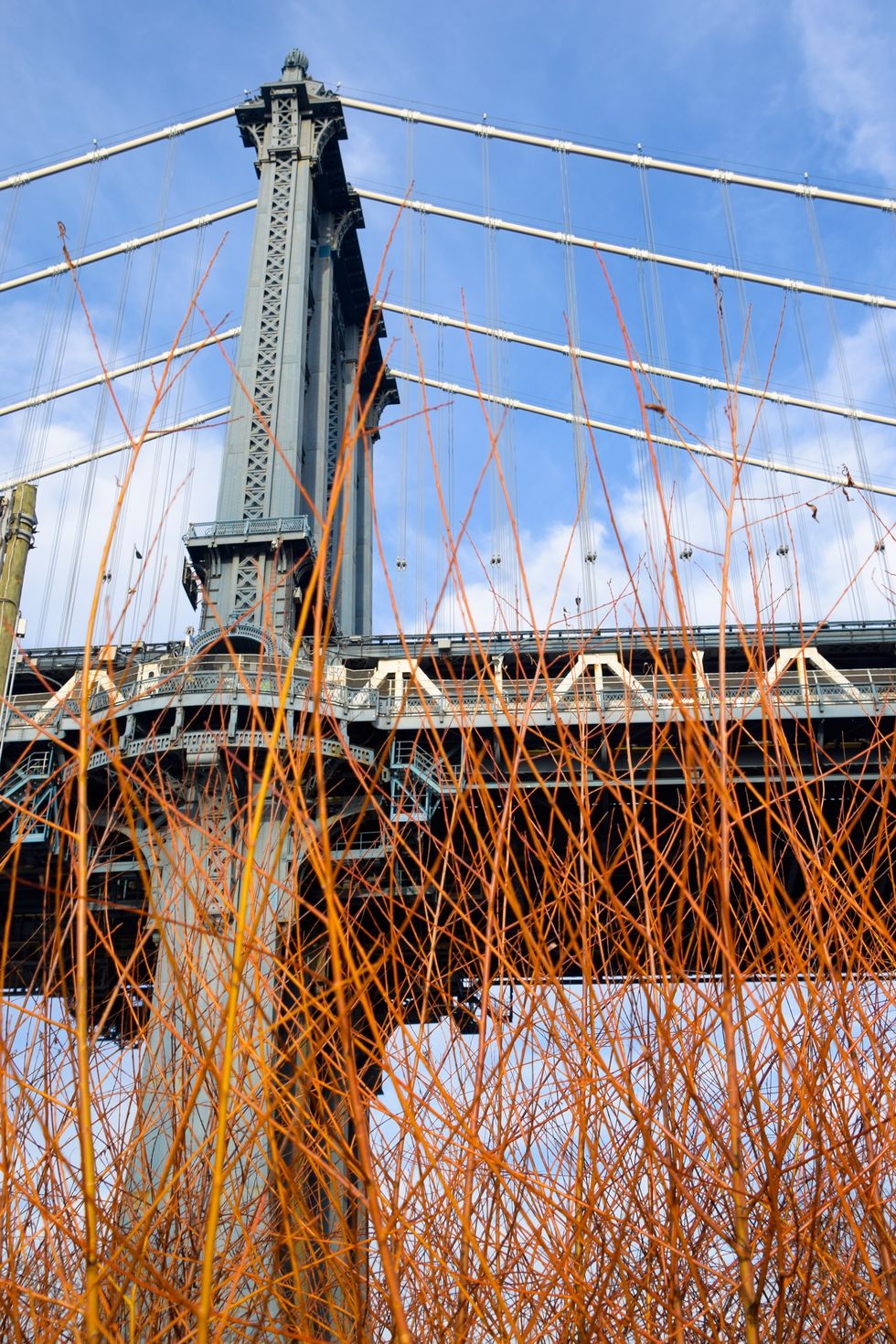
Dogwood branches obscure the support and underside of the Manhattan bridge
Just as there are endless color possibilities and combinations, the ideas and themes that they may inspire are also endless. This image can be seen as an emphasis on color, conflicting orange and blue, or it can be seen as nature overtaking society. The orange dogwood could even be seen as representing fire, burning down a bridge. In the end, it is up to the artist (and interpretation).

