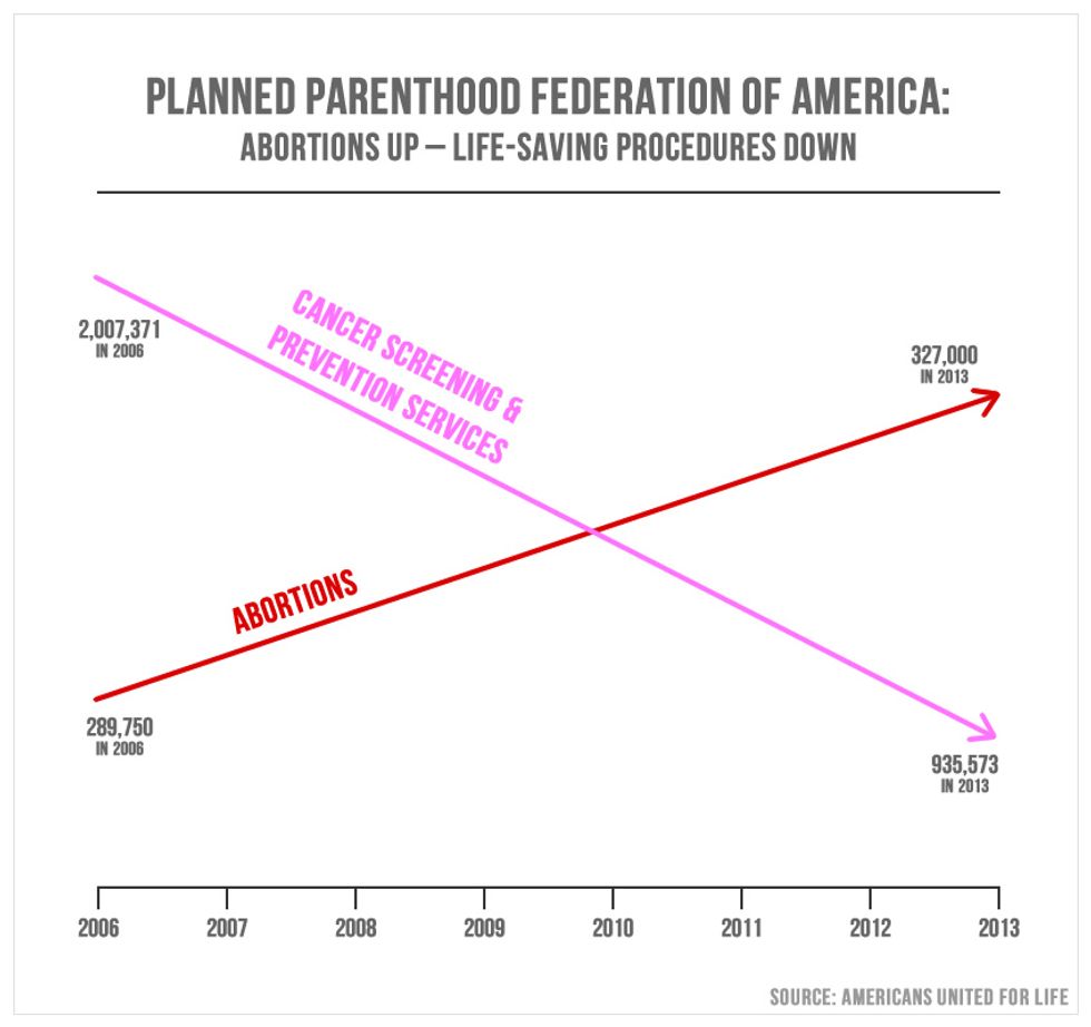
Unless you've been living under a rock (or struggling through college midterms season), you are probably up-to-date on the events of last weeks' congressional Planned Parenthood meeting. And if you have been watching the fallout from that meeting, you may have heard about the scandal surrounding a certain graph, produced by Utah's Republican representative Jason Chaffetz as definitive "proof" of the organization's pernicious activity. For those of you who have not yet seen said graph, I'll just leave this here:
Behold, a striking display of mathematical genius! Note the absence of a y-axis, a clearly ingenious and incredibly subtle maneuver by the graphic artists to prove to us that everything we learned in grade school math class was actually a lie.
Children of America put your pencils down. Save yourself the trouble of writing that meaningless second axial label. The number 327,000 is, in fact, greater than 935,573, and y-intercepts are a thing of the past. Forget everything your calculus professor taught you--this is politics.
*For a bonus chuckle, note the source (bottom right-hand corner), and watch this video of Cecile Richards schooling Jason Chaffetz on the importance of reliable reference materials.
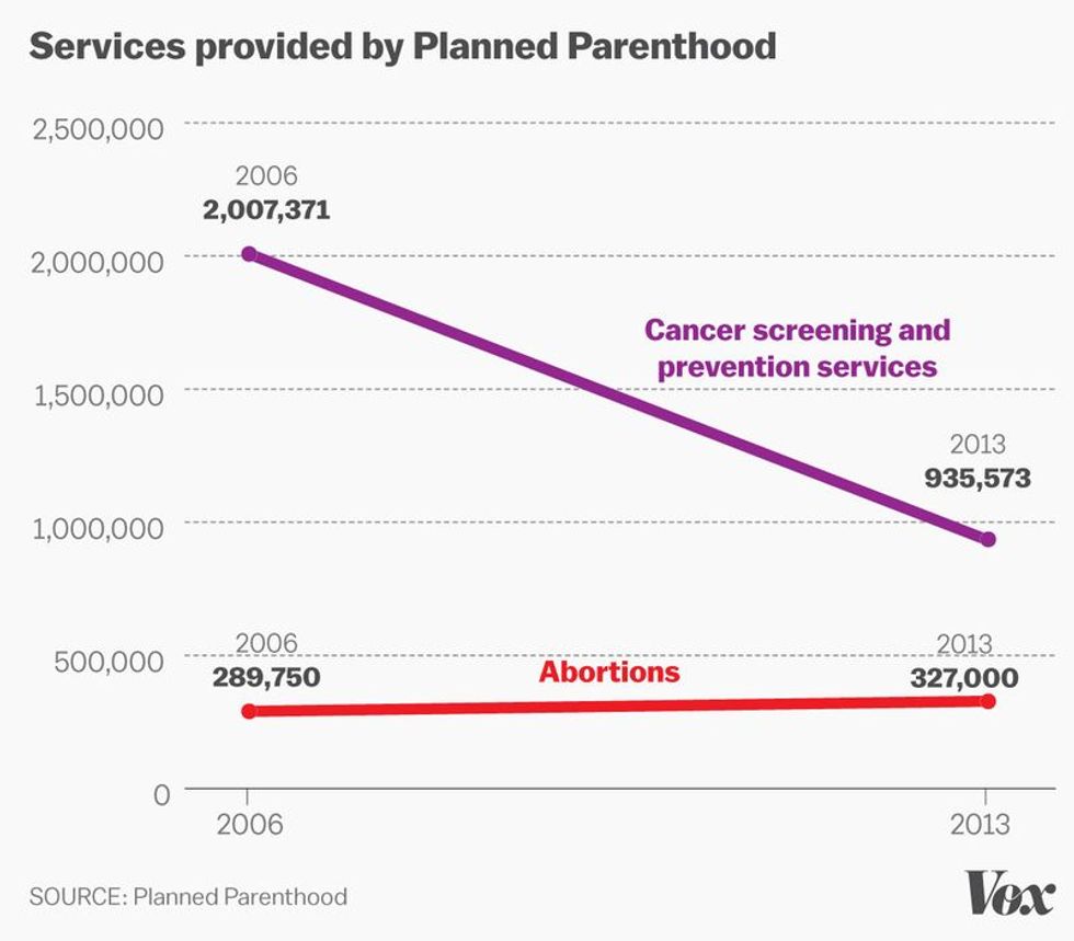
In all seriousness, though, the construction of this plot is abominably misleading. For a bit of perspective, this is what that same graph would have looked like in accordance with the rules of simple algebra:
Through the simple addition of a second axis, the graph provided by Chaffetz loses much of its visual significance. The sky-rocketing red slope of abortion services presented on the original graph evens out to a nearly-horizontal slant in Vox's mathematically-accurate plot.
But wait--it gets better! Vox takes its graphical analysis to yet another level of accurate representation by incorporating statistics for STI/STD treatment, and well as contraceptive services, into this completely comprehensive chart:
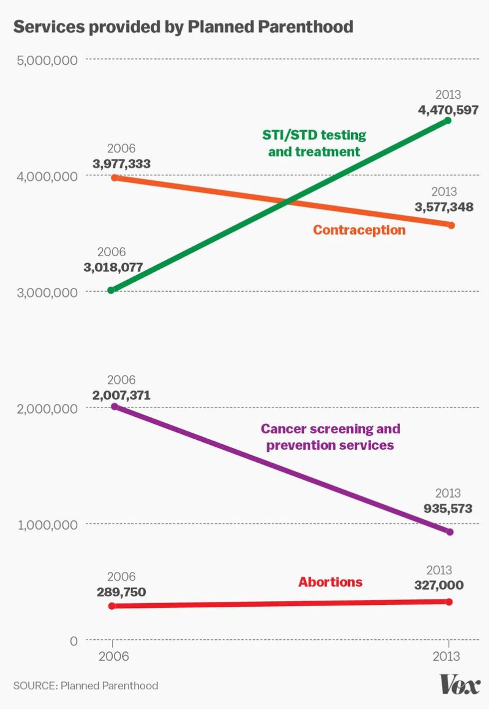
For those of you wondering: no, that is not an image depicting two different graphs. That's one plot, representing a massive amount of beneficial, potentially lifesaving health services performed by an organization that many Americans rely on in order to stay happy and well. It's just big because, well, it's actually drawn to scale.
By no means is the now-infamous Anti- Planned Parenthood graph the only instance of laughably manipulated "graphs" in the media. Actually, they're everywhere. To underscore the irrelevance of incorrectly-rendered graphs, take a look at these and play "Spot the Deceptive Graphical Inaccuracies," (my new favorite game).
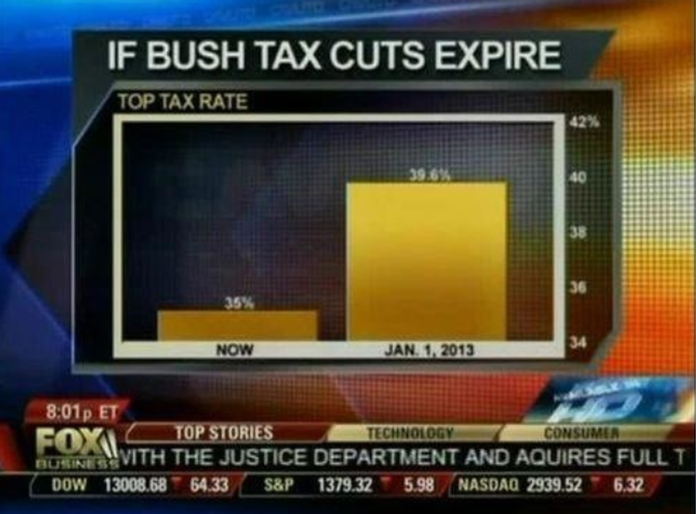
The "Difference-is-strangely-larger-than-expected" Graph
When did 35 percent get so much smaller compared to 39.6 percent? Oh right, when Fox started the origin at a value of 34 percent...
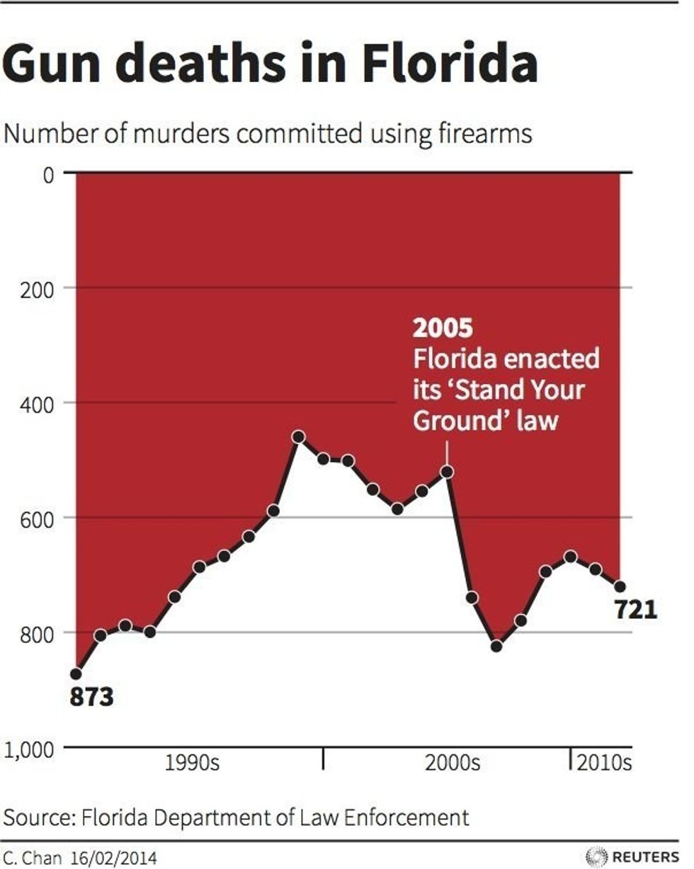
The "Oops-we-inverted-the-y-axis-but-this-serves-our-purpose-better" Graph
"Hey boss, I have an idea-- let's just start the graph at a y-axis value of one thousand and slowly build up to zero. Nobody will ever notice, trust me..."
The "This-is-why-we-check-our-math" Graph
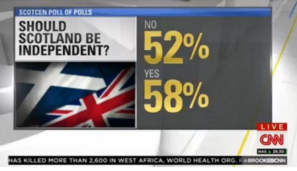
Scotland really gave 110 percent in this election. Literally.
All in all, this past Tuesdays' Planned Parenthood debates taught us about a lot more than mere federal funding-- it proved once and for all that sleeping through math class is never a good idea. Long live y=mx+b!


