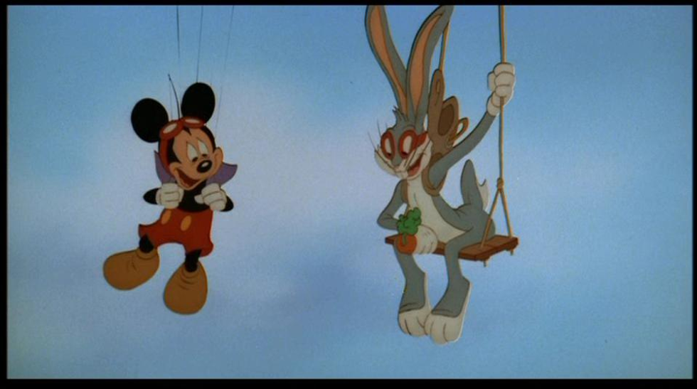
In 1928, the world was introduced to Mickey Mouse, Disney’s iconic mascot and one of the hallmark characters of animation. In 1940, Bugs Bunny came along and became another staple of cartoon stardom. For the entirety of animation’s existence, studios have been trying to create characters as beloved as these two titans of toonery. But what makes them so iconic? There’s been several characters before and since, but very few of them have reached such status as Mickey and Bugs. Of course, marketing obviously has a lot do with it, but even the best marketing can’t save an ultimately uninteresting character. Which leads me to what makes or break a cartoon character: design.
I touched on the design of Mickey in my first article, and I think a lot of what makes his and Bugs’ designs work so well is their simplicity. They’re entirely simple shapes that are easy to identify them at a glance, thanks to their silhouette. But to chalking it up entirely to just simplicity could possibly be underselling the construction of their designs. So I began to wonder what set these two apart from so many other, similar characters. They definitely weren’t the first; before Mickey or Bugs there was Popeye in 1919, Koko the Clown (also in 1919), and Mickey’s snubbed brother Oswald the Lucky Rabbit in 1927. Yet many of these characters failed to have lasting appeal with audiences, making me wonder what exactly makes a successful character design in the first place.
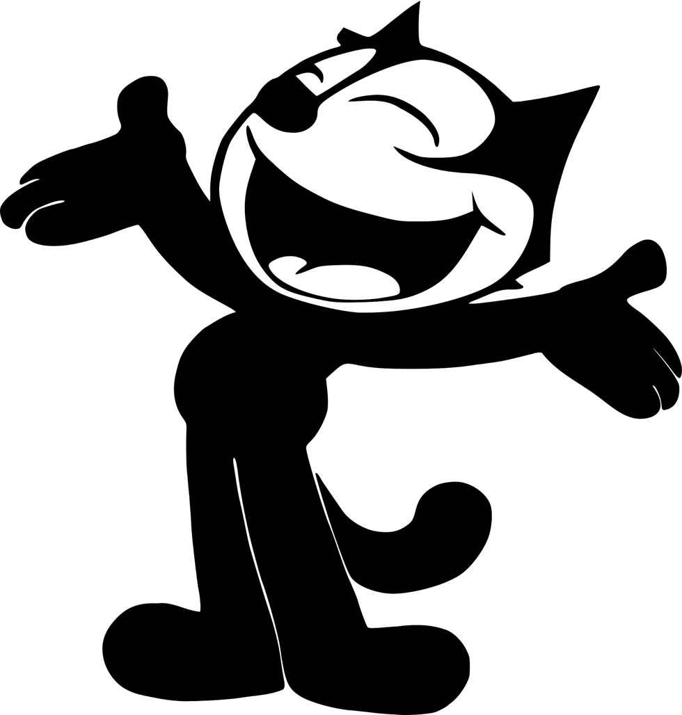
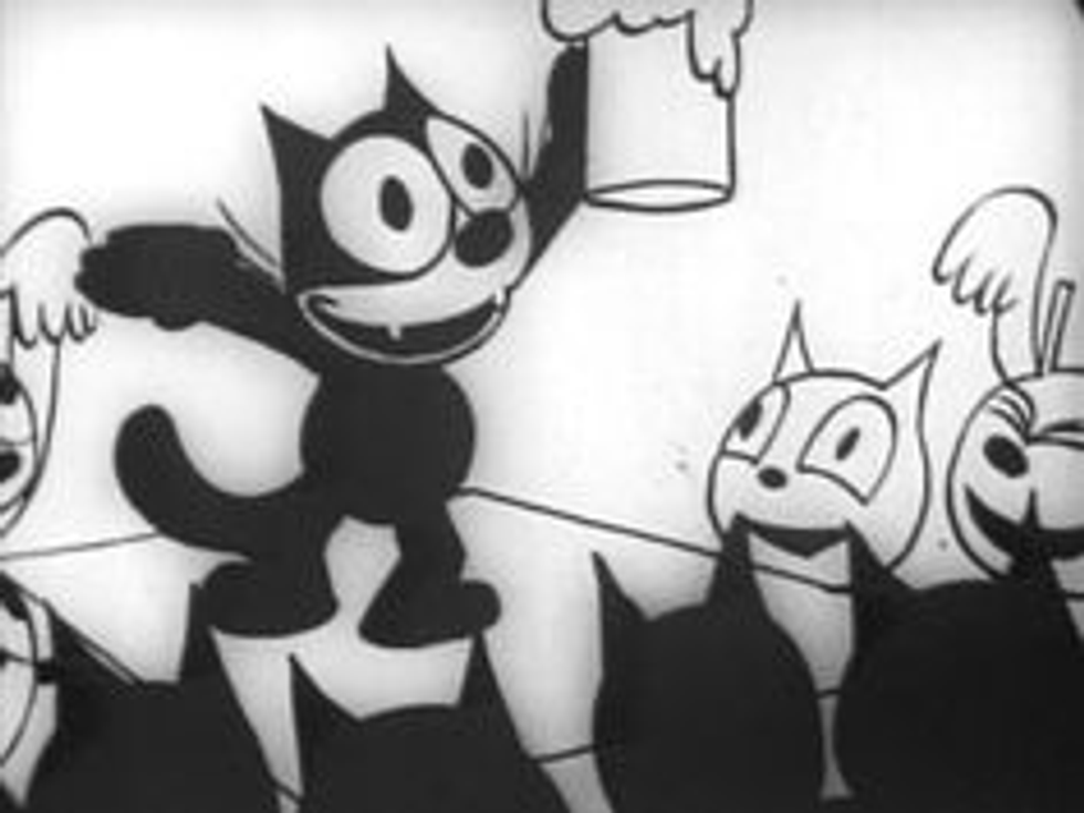
What IS good character design, to begin with? I suppose that’s rooted in the idea of function, as in, what purpose is this character meant to serve? Back in the days of black-and-white cartoons, characters were designed to be easily recognizable without the aid of color. Let’s use Felix the Cat as an example.
He’s a black cat in order to separate him from the often white backgrounds that were used in those old shorts. His eyes and mouth are large and white, so you can easily read his expressions and tell his face apart from the rest of his head.
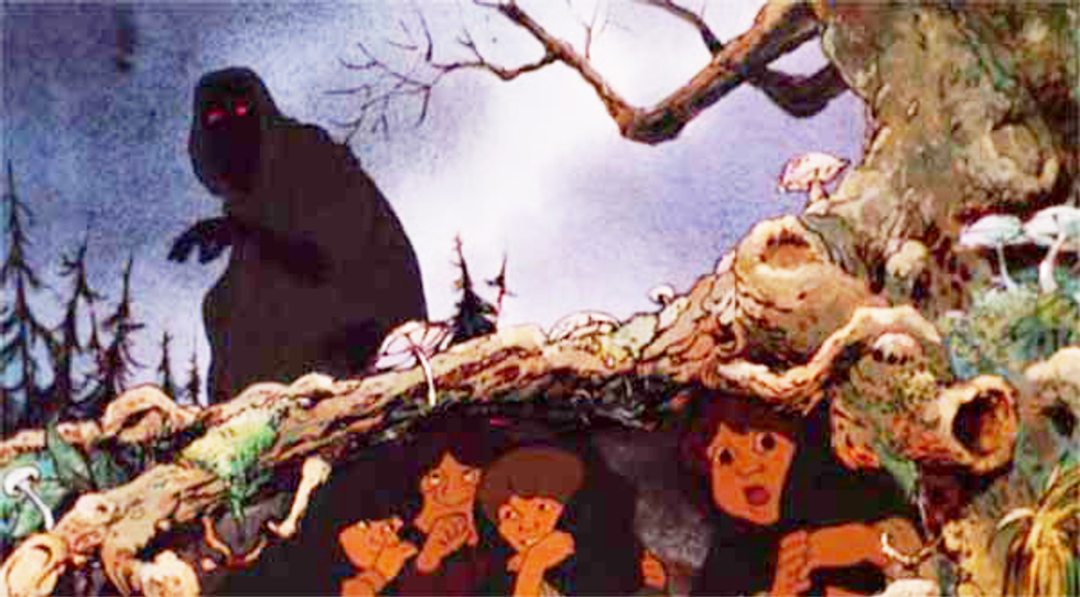
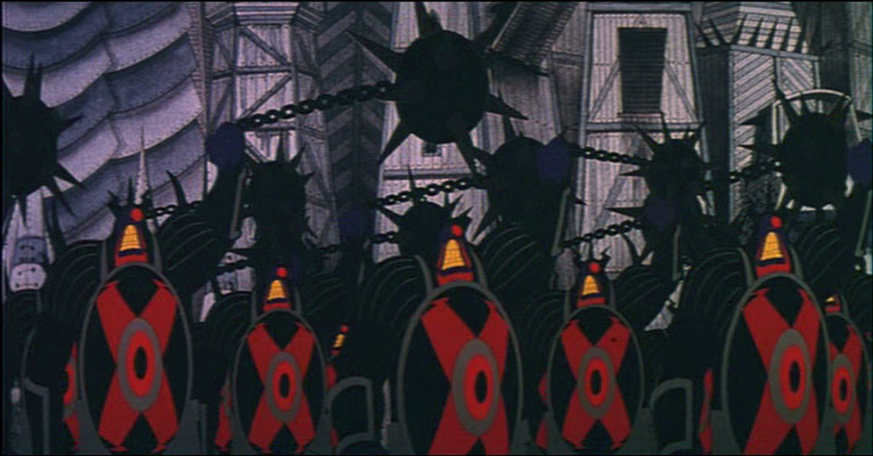
His design is very much one of function. Function can also refer to how easy it is for the character to be drawn by the animators. Most cartoons tends to break characters down into simpler shapes so they’re easier and more cost-effective to animate. Of course there are exceptions to this, but rarely do heavily-detailed characters work in animation. A famous example of that was Ralph Bakshi’s 1977 “Lord of the Rings” adaptation.
The characters were heavily detailed, some would even argue overly so, and the smaller budget of the film meant a lot of the animation was rotoscoped (rotoscoping is an animation process where the animators trace over live-action footage, frame by frame). This led to a lot of the animation in the film being strange and floaty, and these problems may have been circumvented had they gone with character designs that better suited the budget they had.
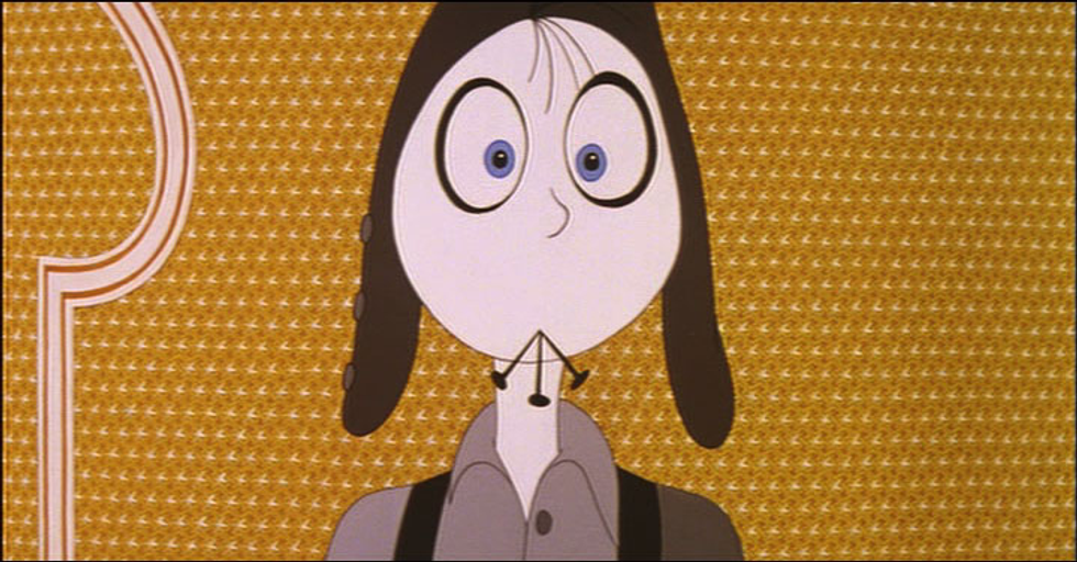
Another famous example was esteemed animator Richard Williams’ “The Thief and the Cobbler,” a film famous for its thirty-one year production period (1964-1992) that ultimately resulted in an inferior film that was crushed by Disney’s “Aladdin,” which came out the same year.
Part of the reason for the incredibly long production was Williams’ desire to use complex designs for the characters.
It was a bold stylistic decision, but perhaps not the smartest one, considering the film was mostly funded out of Williams’ own pocket and much of the animation was done by himself. Of course, even if the designs were much simpler, Williams’ incredibly tight and fluid animation would have caused the film to have taken a long time, anyway, but less complicated designs may have alleviated some of these issues in the first place.
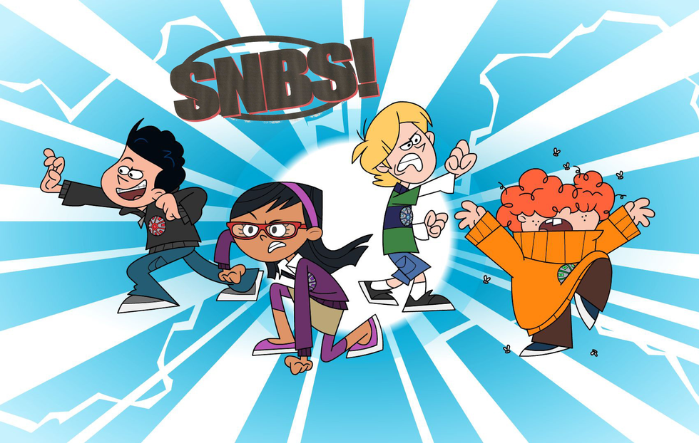
That isn’t to say simpler is always better. Some character designs may be easy to animate but lack recognizability. Take characters from tween-heavy cartoons like “Total Drama Island” or “Super Noobs”.
These characters lend themselves well to puppet animation thanks to their basic shapes, but they lack lasting appeal. Of course, that’s entirely subjective, but a lot of the money in animation is made through merchandising. Mickey, Bugs and more recently Finn from Cartoon Network’s “Adventure Time” lend themselves well to merchandise because of their recognizability, whereas I doubt we’ll be seeing toys and T-shirts of characters from “Super Noobs” any time soon.
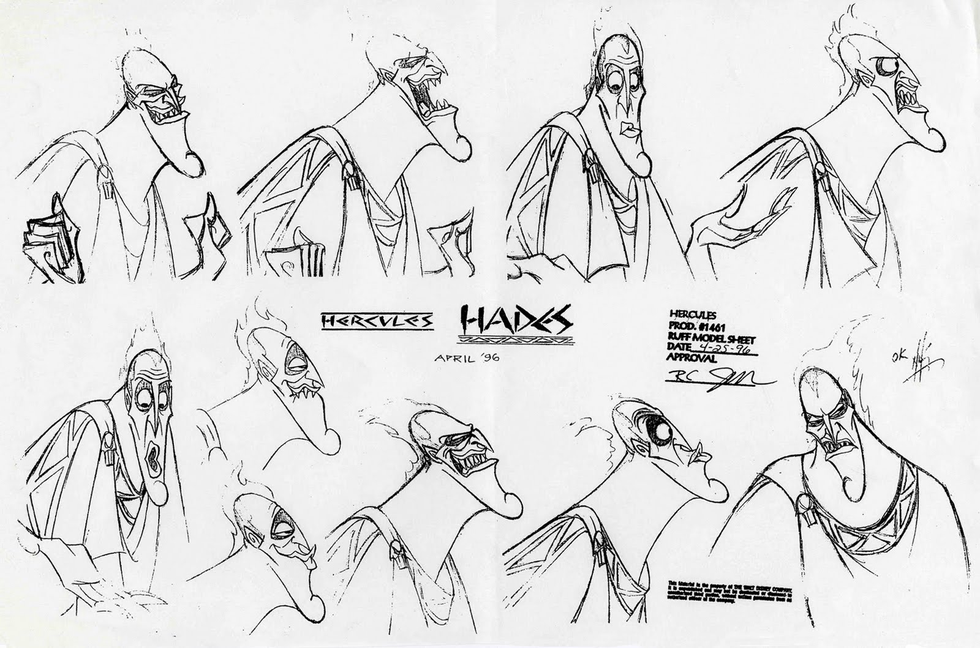
Function is one part of character design, though. The other question that should be asked in the character design process is who the character actually is. What is their personality like, what is their occupation, what sort of skills do they possess, and so on. Fleshing a character out makes them more relatable to the audience, which leads to them being more likeable. I don’t necessarily prescribe to the idea that a character needs to be relatable to be likeable, but it can certainly help. Often when designing characters on animated feature films, character designers will meet with the writers to try and get a feel for the film’s characters. They come up with concept sketches until they find one that works.
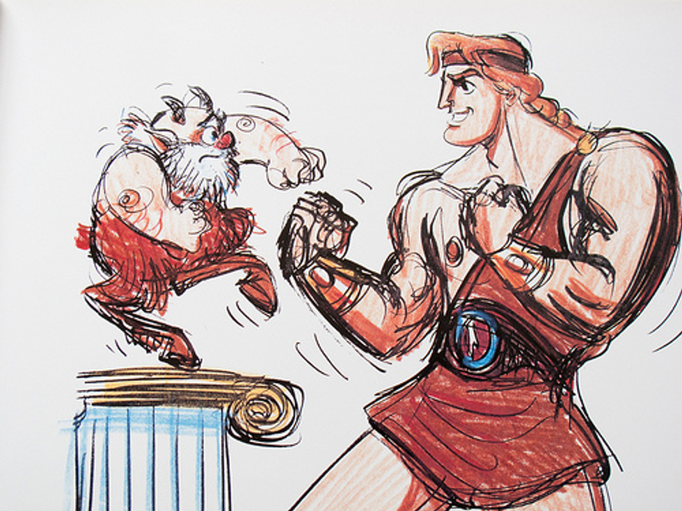
Then they’ll often draw the character doing something that exemplifies their personality, to better get an understanding of them.
A lot of character’s personality can be apparent just in their design rather than what they’re doing at the moment.
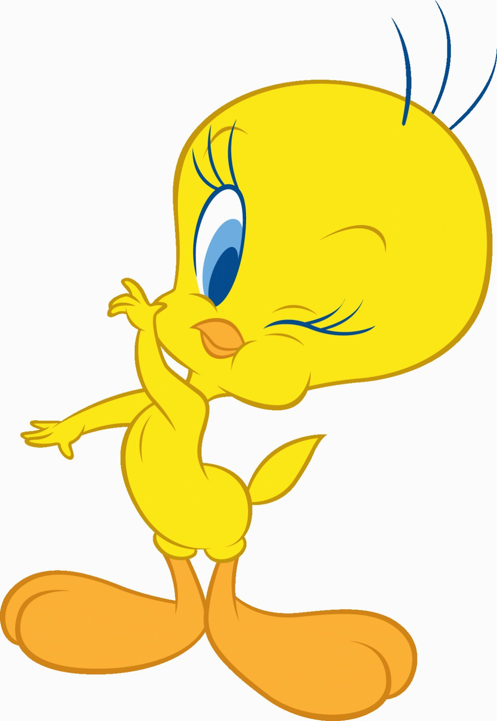
Are they a happy character?
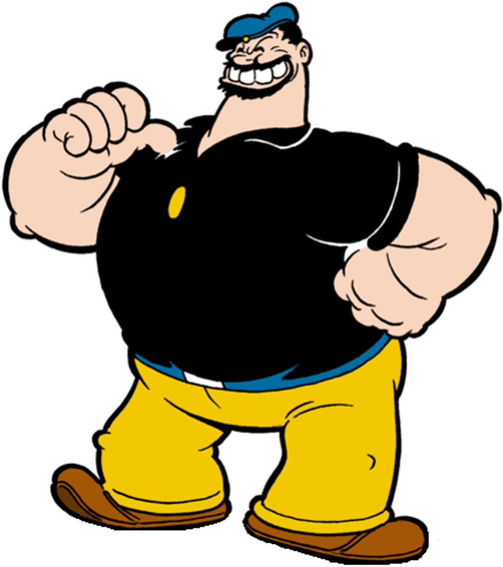
Maybe they’re a tough guy.
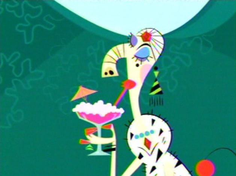
Or maybe they’re a bit stuck up.
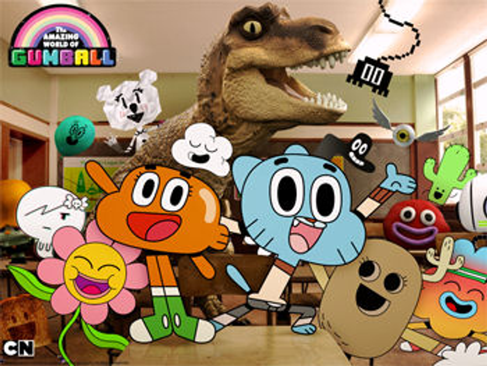
Understand how your character acts can go a long way to creating a unique, believable design. Of course there are many other factors, such as art style, that can affect the look of a character. As well as the other characters you’ve created within the setting. How well do these characters all fit together? Is it consistent? Or is it intentionally inconsistent, like “The Amazing World of Gumball”?
Obviously everything I’ve discussed here is subjective. When I began this article I actually wanted to just talk about character designs I liked, but I realized I wasn’t exactly sure how to explain what I liked to see in a character. Which made me think about what is a character in the first place. I feel I’ve come to look at a character design in an animated show or movie differently now: not just what I like about the design, but what others might like in the design, and how well the design works on its own. I hope I got you to think differently about character design, too, and how to approach designing your own characters in the long run.


