A Day At The SF MOMA
If you’re anything like me, you’ve probably been through a couple of feelings at any given art museum. The first is a sense of quiet pride in yourself, that you are so cultured that you would spend your free time looking Art for pleasure. “Oh yes, mhm, I am in deep contemplation,” you say to yourself standing in front of a de Kooning with your hand on your chin stroking an imaginary goatee.
The second is a sense of self-conscious confusion as you quickly realize that while all of the art is very… pretty, you don’t really understand the meaning behind it. What artistic merit does a piece of bent up metal in the shape of a pentagon even have? Why is there so much Jesus? Are we sure this is a woman or should the painting really be called “Person Of Ambiguous Gender Identity?”
And if you’re anything like me, you would ask in a dramatic monologue kind of voice, “Why art? What is the point of it all?” Good thing you’ve also taken an art history course, and you remind yourself that most art created before modern times served relatively straightforward purposes, whether it be religious, decorative, or political. There’s a reason why, for example, we have a huge load of Jesus-related art from the Middle Ages until the late renaissance: since only the affluent classes of society (ie nobility and the clergy) could commission art, the content did not change much even as form and technique evolved into what we are familiar with today. Without their money, artists simply could not survive, so they did what they were told to do.
But in the past couple of centuries, artists started to actually make enough money to create what they wanted as they relied less on commissions and had more freedom to “make first, sell later.” New generations of artists expanded beyond previous boundaries of what was considered “real art,” from the impressionists to the Dadaists to the abstract expressionists, each more “out there” than the previous. So what are we left with today? Where do we go from here, and what other boundaries are there left to break? What is the purpose that art serves in the 21st century?
It’s with these questions in mind that I perused the collections at the San Francisco MOMA. I can’t say that I really know what I’m doing, but perhaps the readers of this article might come to some interesting conclusions. The following are some thoughts on my personal favorites.
Dachau 1974 - Beryl Korot, pictographic video score
You need to be there to hear the audio - quite creepy, quite unsettling video loops of a former Nazi concentration camp in Dachau. Atmosphere accurately represents the memories pain and death that pervades this site, a reminder of the atrocities that were committed there.
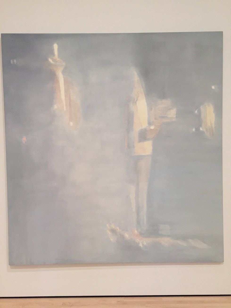
Muwana Kitoko: Beautiful White Man - Luc Tuymons, oil on canvas
The canvas depicts an anecdote by a police officer who pulled two teeth from the body of Patrice Lumumba, the Congo's first democratically elected prime minister. The artist is Belgian, and he reflects on the violent legacy of Belgian colonialism in the region through his art. While the subject matter sounds quite painful, the painting has a hazy, dreamlike quality, an odd contrast.
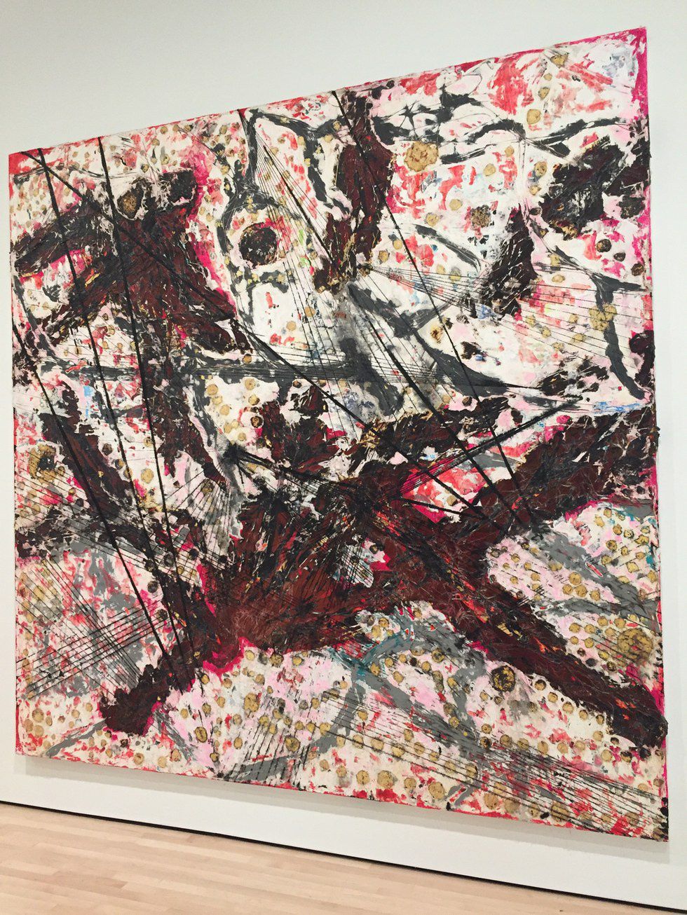
Killing the Goodbye - Mark Bradford, 2015, mixed media on canvas
At first glance, the painting is very loud, very direct, and very chaotic. MOMA's plaque tells us that this painting is meant to show a distressed piece of tissue under microscope, full of lesions, bruises and other injuries. Perhaps it is a signal for help, a plea for treatment - especially in the context of the many broken communities across the United States that must deal with heavy violence everyday.
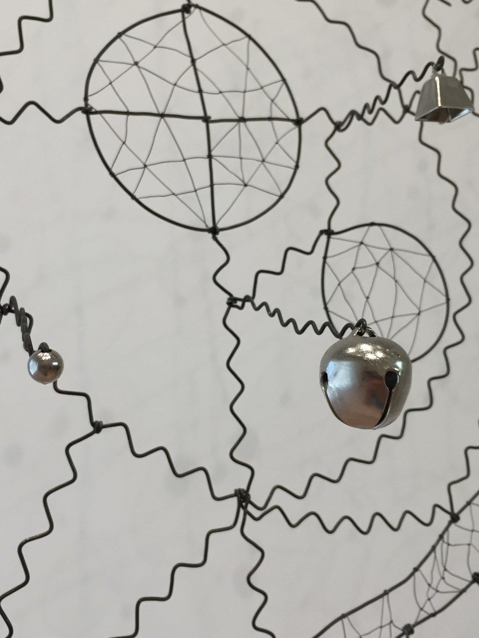
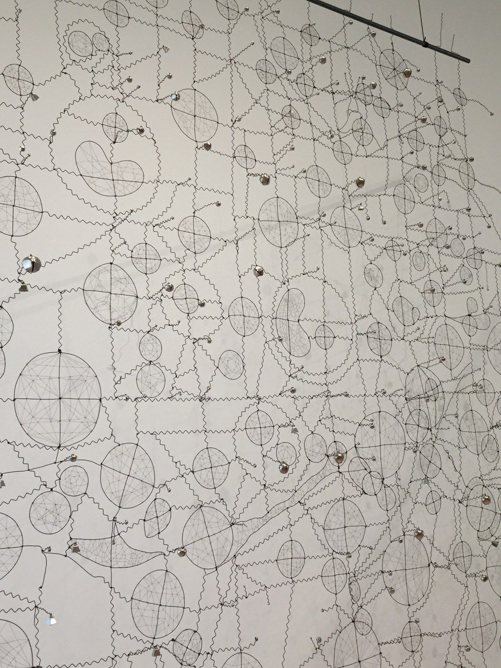
Super Catcher - Brad Kalhamer, 2014, wire and bells
The artist is of Native American ancestry, though he was brought up by German Americans. This dreamcatcher may represent the confluence of these two parts of his identity, a traditional implement made with untraditional materials. It's kind of like a "family-size" dreamcatcher, comprised of many small individual ones that make up the whole.
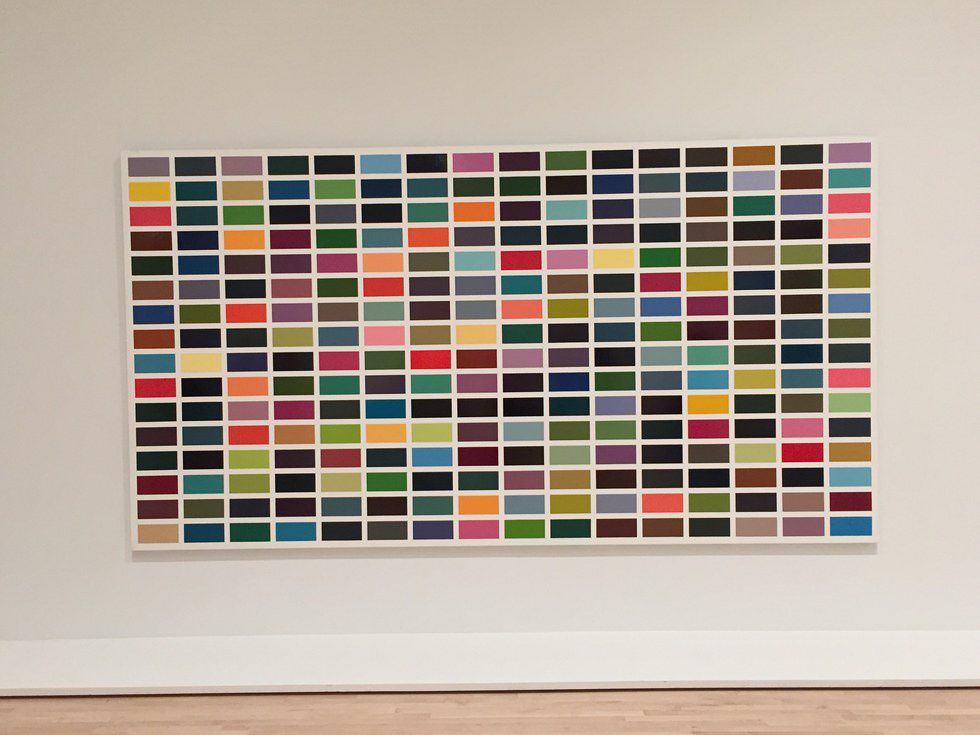
It's a 16x16 grid of random colors. Well maybe not random, but can you make out a pattern? I can't. Theres a bit of tension between this randomness and the strict ordering of the squares. Overall it doesn't even look that "aesthetic" because many colors are next colors that they clash with. Maybe that's just me. I don't know. But I love it anyway.
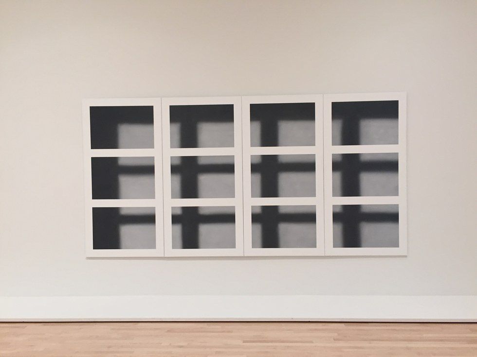
Looks like a window that's casting a shadow, but it's really just a painting. The depth is just an illusion. Reminds of me "Ceci n'est pas un pipe" - similar concept in the question of art versus reality. Can you trust your own sense of perception?
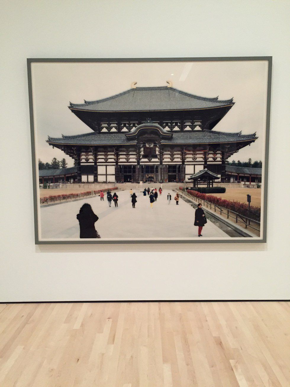
Todai-ji, Daibutsu-den, Nara - Thomas Struth, 1996, Chromogenic print mount-faced to acrylic
Asian architecture is pretty cool. But why is this picture of a random building in Japan art? It's a nice picture, but what is the significance to it? It's certainly majestic in its own right, but what makes this building more worthy of the artist's attention than other buildings in Japan?
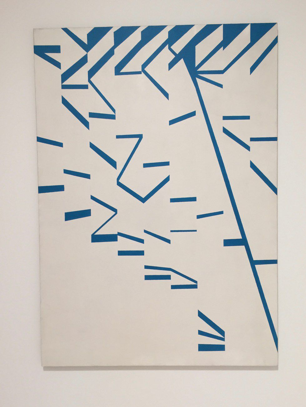
There are some staircase-like motifs scattered around the canvas, and it's interesting to see how the artist only needed two colors to make this motif clear. The stairs don't seem to lead in any particular direction and the steps themselves are falling out of place in a loose keyboard sort of manner.
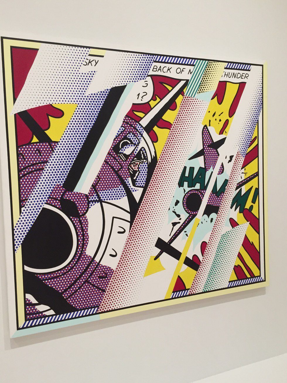
Lichtenstein is a fairly well known pop artist from around the same era as Andy Warhol, and his signature "benday dots," comic-book like style is very present in this particular work. This painting is a continuation of another of his earlier paintings, "Whaaam", and while "Whaaam" shows a fighter plane shooting down a target from a detached perspective, Lichtenstien goes up right next to the target being shot at to immerse the viewer in the action. The chaotic composition of the painting represents the experience of being in such a dangerous and high-stakes situation.
Besides that, it's such a great example of what I love about pop art with its dots and the bright colors and the simple comic book-like shapes.
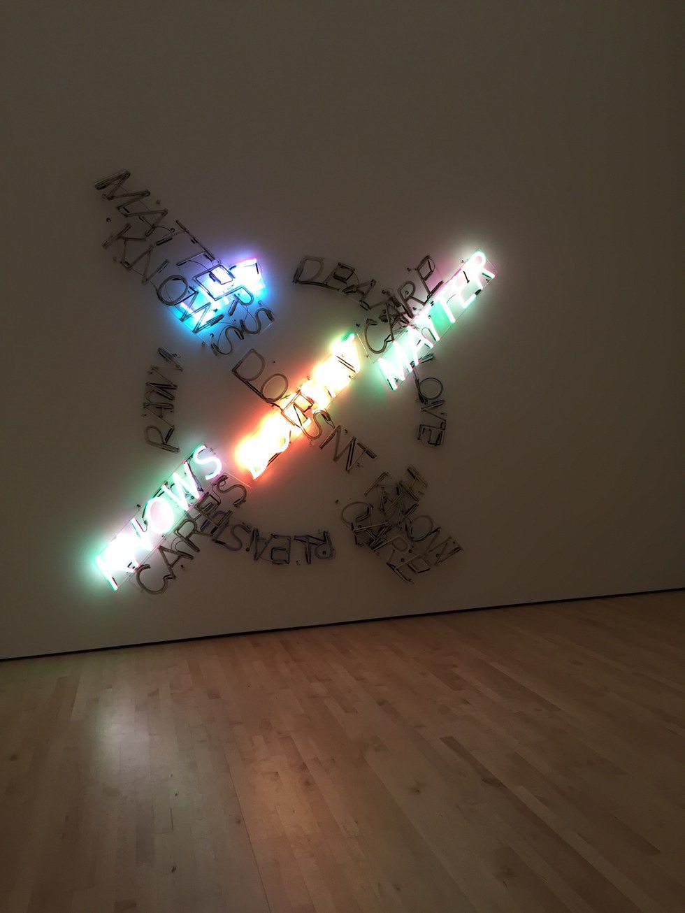
Life Death/Knows Doesn't Know - Bruce Nauman, 1983, Neon tubing with clear glass tubing suspension frames
It cycles through lighting up the different phrases that comprise the sculpture. Some of it is a bit depressing, if I remember correctly, but it makes for an interesting light show. The seemingly random lighting of the various words is reminiscent of a run-down diner or downtown shop where the neon signs sometimes work and sometimes don't.
---
So there you have it! The galleries of the new MOMA are much bigger than they were previously, and it took us a good two hours to go through about 80% of the museum (we skipped out on some exhibits that seemed boring to us). I highly recommend everyone to go and check out the amazing art they have on display, and try to figure out some answers for yourself about what each of these works have to say about not only what they depict, but the concept of art in general.


