When you watch television, you might take your remote and scroll through the thousands of channels your cable company has subscribed to you and notice multiple different news outlets. Fox, CNN, ABC, or even your local news channel provides you with different coverage of events depending on the channel of your choosing.
CNN, for the most part, covers political affiliations, debates, and the presidency. Fox has multiple different branches across the country, covering sports, local news, and even the weather. Fox 5 News (WNYW), for example, covers the New York and New Jersey Area, while Fox 5 News (WTTW), covers the Washington DC area.
Many American citizens rely on these outlets for quick information and weather patterns to prepare for the day. However, some pieces of information, especially graphically, can be warped to influence the minds of Americans. Here are a couple of examples of incorrect graphical during two different presidencies, the Bush and Obama administrations.
1. Fox News, cost of gas (national average)
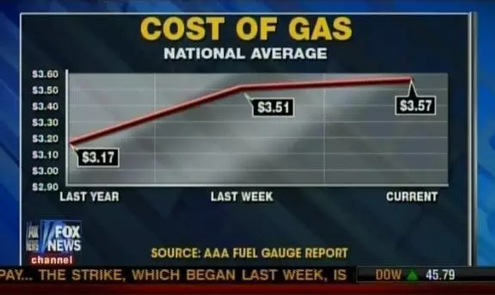
On February 20th, 2012, Fox News displayed a graph that used three random data points to show the national average cost of gasoline over a year: one point was the national average of the price of gas from the day the graph aired, while the other two were chosen from the previous week and the previous year.
The graphs state that over a period of one year (From February 2011 - February 2012), The national average of gas cost had a constant, linear increase from one year to the next. Now, here’s the big catch.
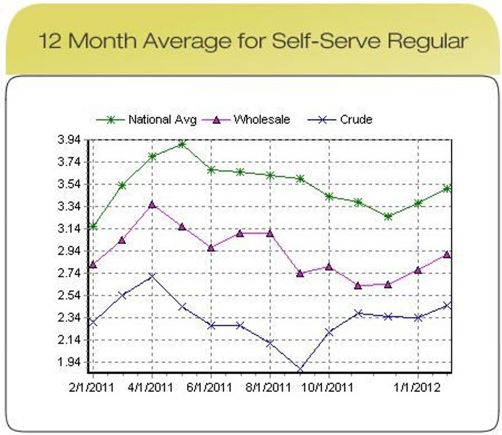
This is what the data calculated actually represents:
The plots in green show the national average cost of gas over a period of one year. Instead of showing a constant increase, the national cost of gas actually fluctuated several times, reaching a high of around $3.93/gallon before dropping to below $3.34/gallon. So although the overall increase of the national cost of gas was apparent, it was certainly not constant.
2. Fox News: tax cuts
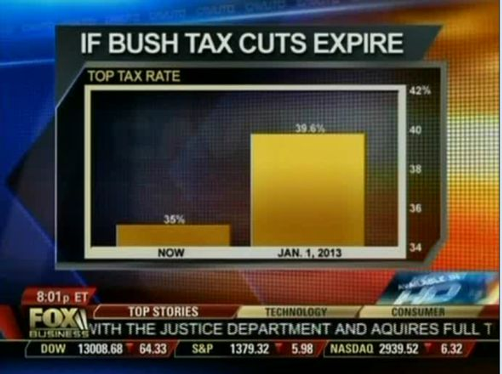
Fox Business' Cavuto displayed a graphic showing what the wealthiest Americans in the top marginal income tax bracket would pay if the Bush tax cuts were allowed to expire. The chart exaggerated the increase, which would go from 35 percent, the current top rate, to 39.6 percent – less than 5 percentage points:
However, the y-axis seemed to be distorted, making such a small percentage change seem gargantuan.
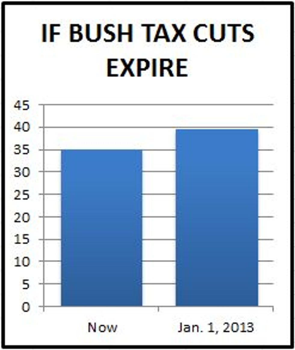
Displaying the change in tax rates with the vertical axis starting at zero instead of 34, as the Fox Business chart did, shows that the proposed change in the tax rate for the wealthy is much less significant than Fox Business presented it:
Although these changes were slight, it is important to understand that the knowledge of the data you're given and how it's graphed does matter in the long run.


