I was introduced to Instagram themes back in 2015 when I watched Meghan Rienk's YouTube video about how she edits her Instagram pictures. My take away from her video wasn't about her theme. While her theme was inspiring and aesthetically pleasing, I didn't feel as though the pictures I took throughout my life could be edited and posted in a way that resembled her feed. Simply put, I believed that Meghan Rienks lived a far more interesting life than me, and because of that, an Instagram theme was impossible.
I came to find that only part of that statement is true.
Meghan definitely does live a more interesting life than I do. In the past few months, she's been to Coachella, road-tripped to San Francisco, attended the Victoria Secret Fashion Show, went to New Orleans and so much more. Her Instagram game has been inspiring, but I have since figured out that even without all of those events in my life, I am still capable of creating an Instagram theme. And if I can do it, then you can, too.
We'll start with the basics.
What is an Instagram theme?
An Instagram theme coherently ties all of your posts together. The pictures aren't necessarily taken on the same day or at the same time, but they are edited in a way that highlights similar elements in each shot.
What are some examples of themes people do?
Instagram themes are chosen based on the user's preference. Are you a minimalist who prefers blacks and whites? Do you have a favorite color or two that you want to more exaggerated than the rest? Perhaps you prefer photos with high saturation.
Meghan prefers a mainly white theme. You can see how she edits her pictures here.
Lauren Conrad's posts all have a slightly gray undertone, likely created by a common filter on a photo editing app.
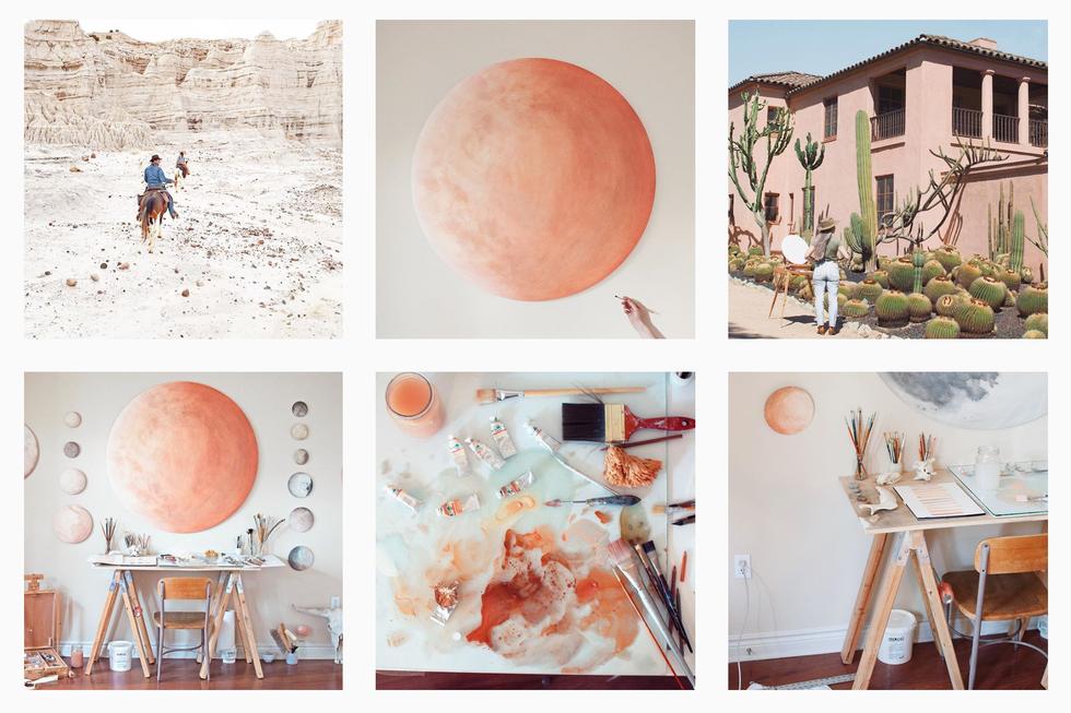
Stella Maria Baer's photos have similar shades and tones of whites, grays and oranges.
White these three themes are very easy to spot, other themes are less obvious.
All of Meredith Foster's pictures are edited in the same way. The darks have been darkened, the blues have been enhanced, and it appears as though she has altered the temperature of images to appear more blue than yellow.
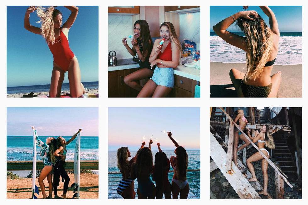
Alisha Marie's feed is primarily made up of blues, pinks and greens. All of her images have been highly, if not over, exposed, and her vibrance levels are high.
Lastly, Kalyn Nicholson has slightly more muted colors in her feed which flow together beautifully. Her editing gives each picture a neutral twists in order to make them all appear similar in some way.
Where do I start?
On Pinterest. Before you do anything, you have to decide on a theme you like, and Pinterest is the best place to start. I currently have 20+ themes pinned on a board, but there are so many more to be found by just searching for "Instagram Themes."
Once you've found a theme you like, you just have to download a few editing apps to begin.
What apps do I need?
VSCO is the most common editing app used for Instagram themes. You are able to buy collections of filters to use on your photos.
For example, the theme I found on Pinterest that I started to follow required the C1 filter on VSCO. The C filters are know as the "Vibrant Classics," which is exactly what drew me to them.
I use C1 (+4-6), up the brightness by one, saturation by one or two, decrease the temperature by one or two, and occasionally add a purple tint to the image.
I choose it because I wanted very vibrant blues, greens, purples and pinks.
Another app you can use to create your theme is A Color Story.
The app also has a number of filters that you can buy, and they tend to be a bit cheaper than VSCO.
Now you're ready.
But don't forget to be patient. A perfect theme doesn't happen over night. It takes time, editing and a little stress if you take it as seriously as I did.

