Color in photography can elevate it from mediocre to professional. It can draw in viewers, set a tone of a photo, accentuate the form of a subject, and display the skill of a photographer. We see the world in color. Color photography and film, upon their inception, were heralded as vast improvements, and "black and white" can connote a limited, prejudiced worldview.
Given all of this, why would anyone choose to seemingly reduce a photo to something less, something without color?
Despite all the seeming drawbacks of B&W photography, it does have advantages, although these can be situational.
PROS
Sharpness, contrast, exposure, clarity can be pushed further than they could be with color photographs without looking misplaced or odd.
Helps to compensate for when a photo doesn't have much color, or if boosting the saturation would make it look unnatural.
Shapes and lines are much easier to follow.
Simplifies a composition, giving a viewer fewer things to distract them from what you want them to see.
CONS
No color means that the composition should be a source of any emotions/feelings that color would normally convey.
Things that are similarly exposed but different colors may become indistinguishable from one another.
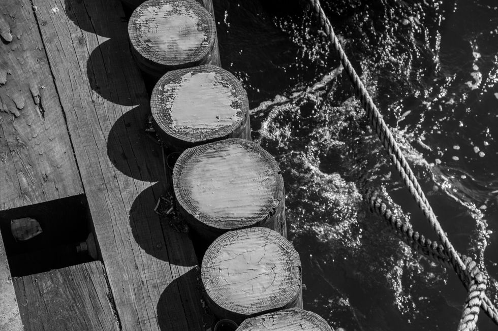
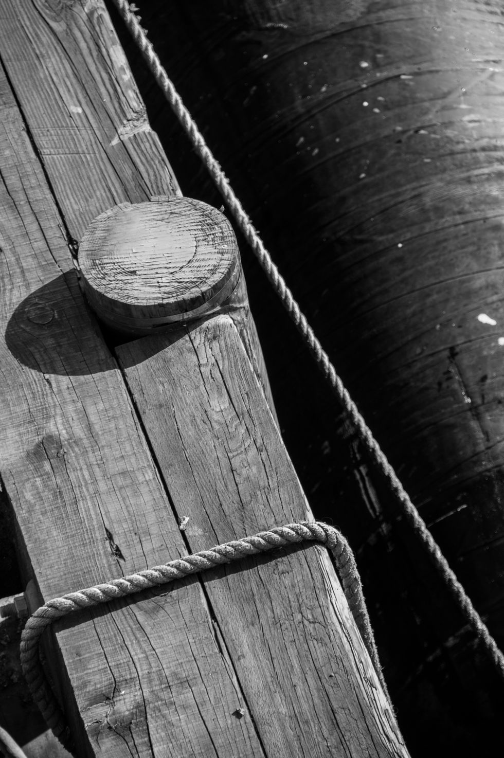
This photograph was actually slightly overexposed, but by using B&W, extremes can be used effectively to balance it out. The texture of the wood grain and rope are much easier to see and don't look out of place because there isn't any color to distract from their roughness.
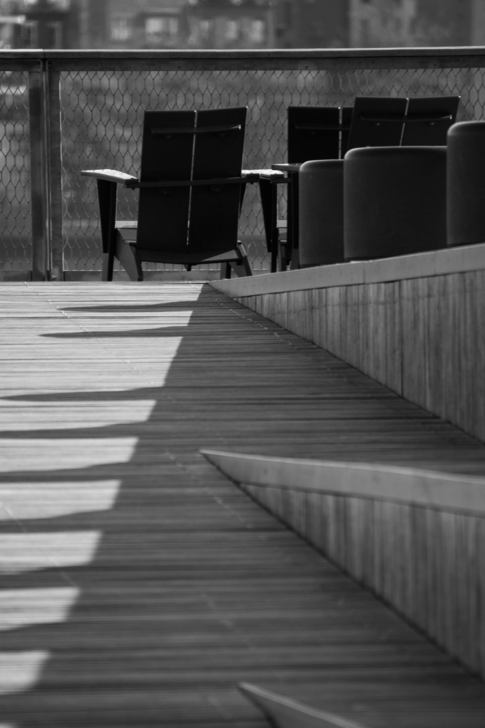
The lack of color in the picture originally is what prompted me to switch to B&W, but it still is a good example of how a lack of color can highlight lines and shape. The separation between light and shadow becomes sharp and distinct.
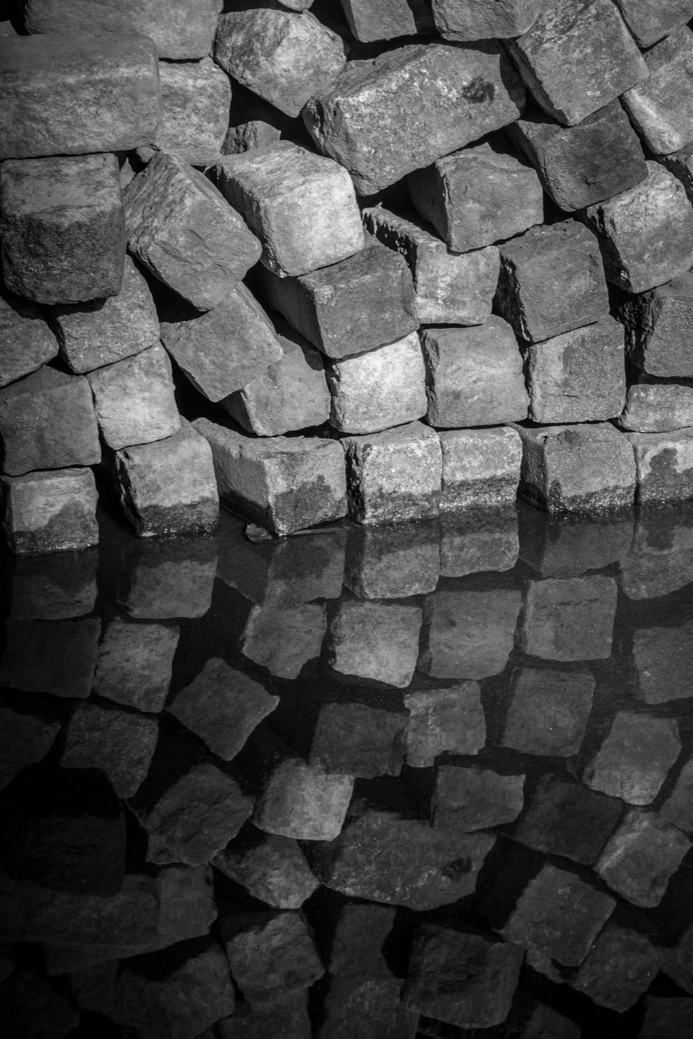
Black and white can sometimes reveal the true potential of a photo. The sandy color of the cobblestones didn't mix well with the overcast day and brown, muddy water, but by removing the color and boosting the sharpness and contrast, the texture of the cobblestones pops out, and you look more at how they're stacked and how the reflection shows small ripples in the water. Details that would be overlooked otherwise. If you're editing a photo, and it just doesn't seem right, try switching it into B&W.
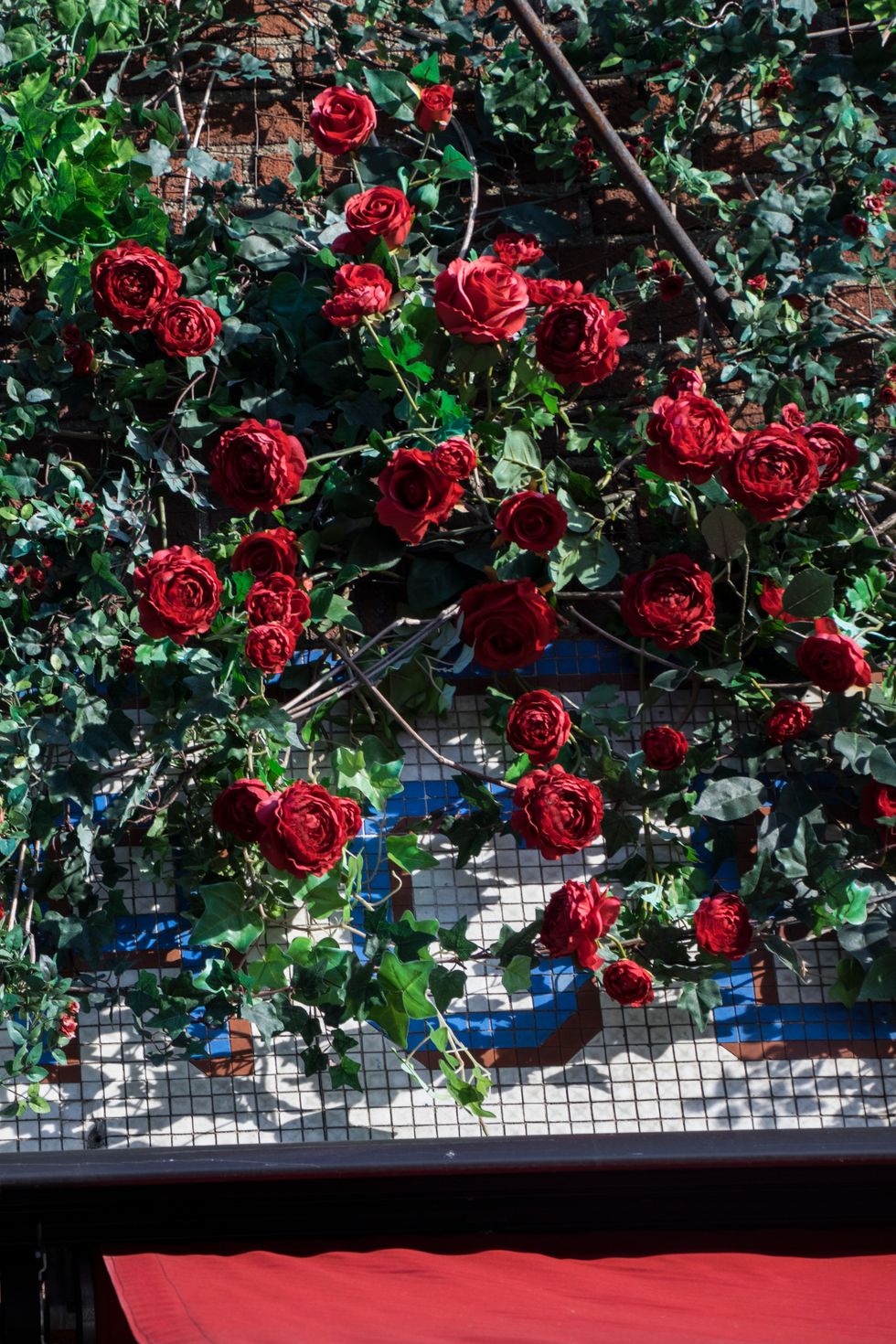
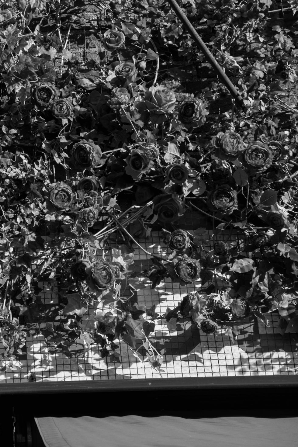
Bad examples can oftentimes be more informative than good ones, and mistakes give you an opportunity to reflect and improve. This photo relies on color for its depth, and without color, it becomes flat and busy. Nothing other than color highlights the roses, so without it, they blend into the leaves. For this example, all I did was desaturate the original. It's entirely possible that through more intensive editing, a good black and white photo could be created from the original.
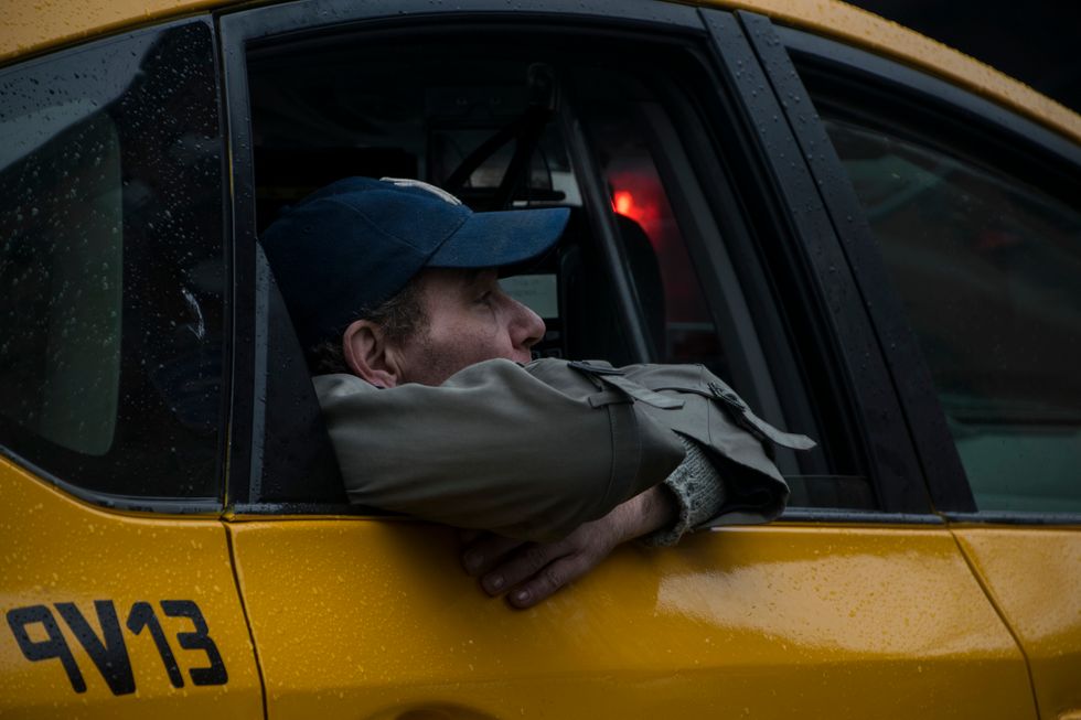
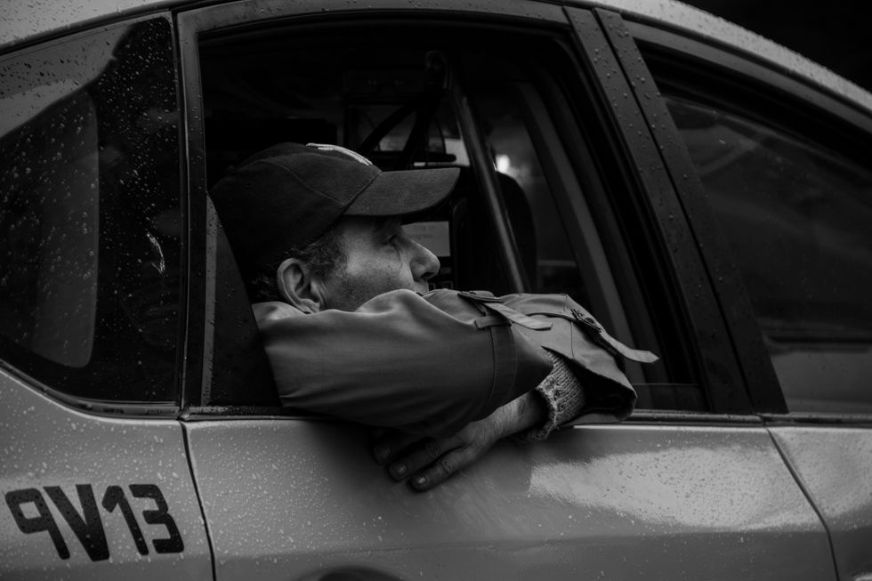
These examples are two separate edits of the same original photo, and in my opinion, are both acceptable. In the first, the colors blend and combine in an interesting way, and although it does lessen your attention on the fare, that's not necessarily a bad thing if you didn't want him to be the complete and utter subject of the photo. In the second, the outline around the man is darker, so he stands out more against a flatter cab window and side.

