Arby's has been playing with their food in their latest posts on social media, and it's lead to new territory, especially for fast-food chains.
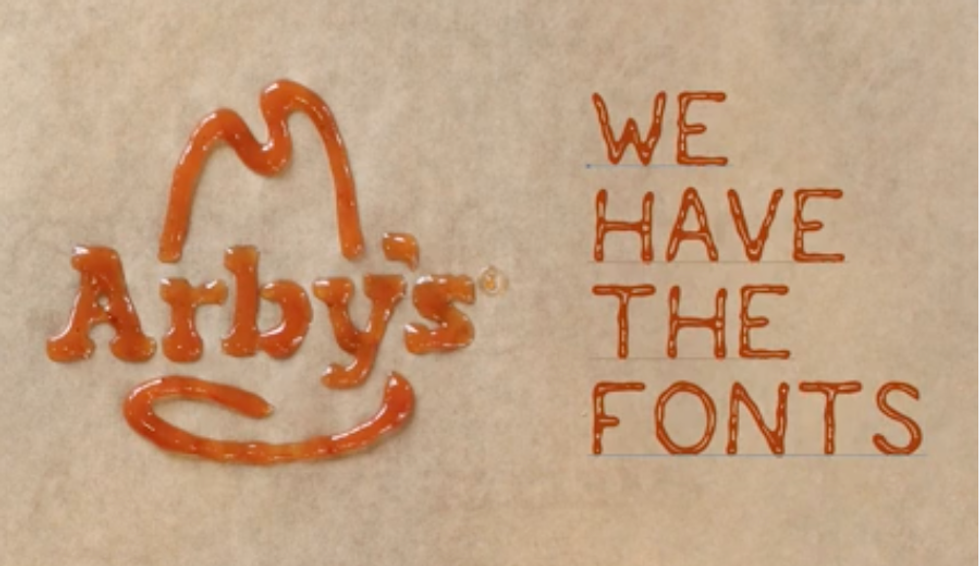
On May 16, Arby's released a video on their Facebook debuting the new font they created for their brand. This instantly caught my eye because I guess you could say I'm a font enthusiast.
What I mean by font enthusiast is that I can call out poor font choices and have a decent eye for knowing what looks good in the context it dwells in.
How fun is this idea, though? Arby's has got to be the first fast-food brand to create their own font with their own food, and play it up in a way that is still appetizing to the audience.
What's even cooler is that they're not keeping the font all to themselves. They put the link on their website, Facebook, Twitter, and Instagram bio so anyone at all can download their font and use it for themselves. Guess what I've already done?
Yep. It's in my downloads file now.
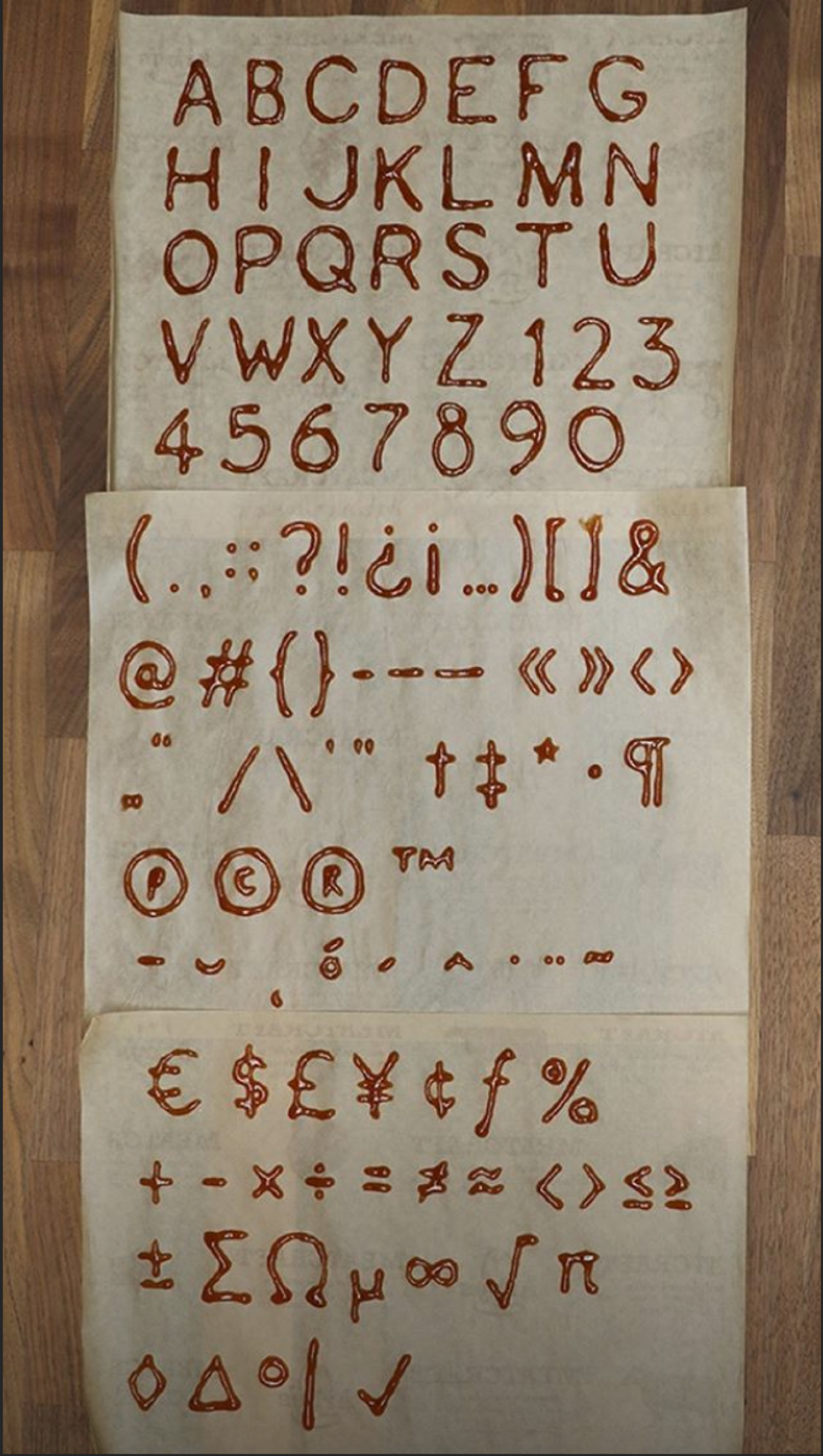
I'm sure the creative team at Fallon's agency had a lot of fun with this one. I can only imagine all of the saucy packets used and thrown trying to get just the perfect letterform for the video, let alone for the style guide so the font can be shared with the rest of the world.
I do wonder how much time it took to get the perfect letterforms, though. They really went all out including the symbols, too. I'm sure more will come from AdAge or Ad Week once this story expands some more.
Arby's has already implemented their saucy logo to all of their social sites, so it'll be interesting to see if they use it in future commercials and campaigns. I hope they hold onto this new font because I believe it gives them a leg up on their competitors. Everyone loves a brand that has something that makes them stand out, and I think Arby's new Saucy AF™ font will get them there. This surely won't be forgotten.


