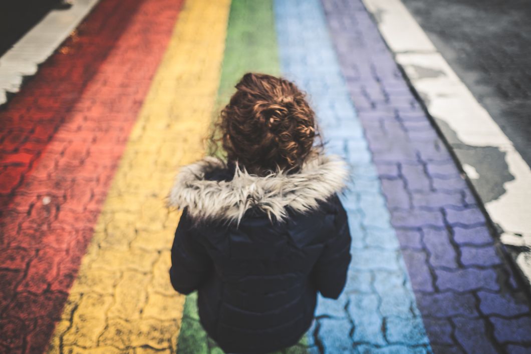
With June being Pride Month and last week marking two years since the Pulse tragedy, I find myself thinking about how beautiful people are no matter their differences. Art is a vital method of expressing feelings so I thought it might be fun to look into the psychology of colors particularly the colors of the rainbow, the most common symbol of the LGBTQ community.
1. Red.
Red is the color of extreme emotion, passion, and drama. Ironic that it's used in such juxtaposing ways. Red is used to show love and hatred. Having a strong opinion is a good thing; we should all care about how we feel. However, it's how willing you are to listen to opposing ideas to have a conversation that shows your open-hearted character. This is a fault on every side of every problem in our country. People aren't necessarily good or bad guys based on their stance; they are more open-minded or close-minded for their willingness to listen and compromise.
2. Orange.
Orange is the color of encouragement. That makes sense for it being such a warm and joyful color. It can also represent insincerity and self-indulgence. My response to that is to encourage yourself and others not to be insincere. When people feel different politically or socially, they tend to label that person as generally bad or wrong and allow themselves to hate. Let's encourage each other not to do this. I know it's infuriating to be okay with how someone can think down upon certain groups of people but blasting them with fury won't convince them. It just won't. Let's try to lead by example and show them the beautiful benefit in the way we feel rather than the difference.
3. Yellow.
Yellow is the color of optimism, often exuding youth and confidence. Ah, sunshine! Apparently it stimulates the left side of the brain and assists in clear thinking and quick decision making. Maybe I should paint my walls yellow… On the other hand, it can also symbolize anxiety and cowardice. This is a beautiful example of our power to choose how we react to situations. When life hands you yellow lemons, make deliciously zippy lemonade!
4. Green.
Green is the color of growth and health. Mother Nature demonstrates the constant cycle of life and death, often able to rejuvenate feelings of security and focused energy. I think we could all use some more security and focus. We get so caught up in what people are posting and how glamorous we set our lives up to be on social media. When someone doesn't post often it almost seems like they aren't doing anything all that important when really they are probably living life more presently and to the fullest. I challenge you to sit under a tree and run your fingers through the dirt. Feel the ground and we may start to feel grounded.
5. Blue.
Another vital color to our planet is blue: the color of trust. 'Tis the sea and sky and all the beauty and terrors of nature. Blue happens to be my favorite color because it feels calm and rich with purpose. Appropriately it tends to represent tranquility and responsibility. Something I'm sure others also experience on a daily basis is employers or leaders expecting us to give 100% into our work. We've become accustomed to communication being so accessible that while we may leave the building or desk, we never actually stop working. I think that's the biggest fault of technology advancement because we don't feel we deserve time to simply "be" because if that ringtone dings, there's such an urgency to respond. Let's motivate each other to let go a bit and allow life outside of our work. Artists especially lose sight of this. If we spend every moment preparing and executing our work, we'll eventually run out of "life" to express.
6. Indigo.
Indigo is the color of integrity and sincerity. Intriguing that shades of orange and indigo are opposite (or complementary) to each other on the color wheel since orange can symbolize insincerity and self-indulgence. A combination of blue and violet, it represents devotion, wisdom, justice, and fairness. While we will never all be able to agree on our devotion to what we think is fair, we can at least strive to devote ourselves to love and understanding because those are more universal than we think.
7. Violet.
The final color of the rainbow is violet: the color of spirituality. I love that this is the bottom of the rainbow because it aesthetically carries the entire thing. Accordingly our sense of spirituality, or our sense of self, carries us through the ride that is life. Violet is a combination of blue and red. Fitting that together they inspire reflection of past decisions and self-awareness. Traditionally purple has stood for royalty and luxury, aiming to provide compassionate, intuitive, and level-headed reign of a kingdom. Let's shed some violet light on our lives and offer more compassion to others. If you feel your heartbeat yearning, take the initiative and make a difference towards a better future.
This began as a fun exercise and pleasantly inspired me to work towards a future of more colors, light, and beauty. The rain may be rough but the glimpses of rainbows are always worth the storm.


