With all the cameras around us today, there are a plethora of amazing pictures. Sometimes, it can be discouraging to see these photos everywhere, that seem to stand out and grab your attention more than your own. These 6 tips can be very useful at promoting your photography and making your pictures pop on an Instagram explore page.
Although these alone will not be enough to make your award-winning photograph (and in fact some of them can be seen as over-editing) they can be useful at promoting your photography and spreading it to a further audience.
Low Angles

Tourists and Locals watch a fireworks parade in Barcelona, Spain
As I've said before, angles can have a powerful subconscious effect on viewers, and can influence how they perceive a photo. Used sparingly, a low angle can make a viewer believe a subject is more powerful and imposing, and when done to an extreme, the same effect is amplified many times, meaning subjects shot from a low angle will have a more impactful presence on viewers, making them more inclined to look at a photo longer.
Reflections

A building reflects the sky in downtown Manhattan
Understanding how light works is hardwired into the human mind, because it contributes so much to how we see the world. This is why seeing a face lit from below looks scary; people are almost always lit from above. By using reflections and light, we can interest people by doing things that stand out and are different from how they normally perceive the world.
Vignettes

Young woman smells cherry blossoms
When most people think 'vignette' they think of sepia toned old photos. This is mostly because the shadow of the lens on old cameras affected the photo itself. In modern cameras, the effect is avoided because the sensor that captures the photo cuts off the edges. Vignettes can be useful to draw a viewers attention to the center of a photo, and normally I only use black vignettes on photos that are already dark and empty around the edges. But, if your goal is to stand out, adding a good amount of white vignette to a photo both highlights the center, but also gives it a very different feel that makes viewers more interested, and more likely to stick around.
Bright Colors

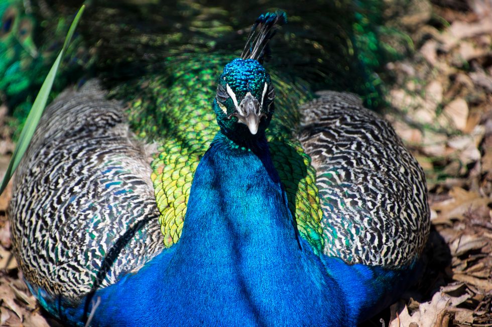
A peacock basks in the sun
As with normal photos, color is an important tool to composition, and is unique in that it can be a large part of a photo while still looking pleasing. Personally, I've struggled with making color stand out more, because I tend not to focus on it when taking a photo. When you do choose to make color a main part of a composition, especially bright, vibrant colors, the resulting picture is very effective at catching the eye of any viewers.
Sharp Lines

Bird on a roof
Any photo that has straight, bold lines will stand out more than ones with softer, less distinct shapes. This is not always good, but when done right it can be useful. All of the methods require a photo to be made with them in mind, but alone they can boost the impact of a photo. In order to have bold, distinct lines however, you must look for them and seek to emphasize them in a photo. In my photo above, the red outline of the awning stands out much more than the top because of both its bold color, contrast with the background, AND its distinct, sharp lines.


