1.) The Genderqueer Flag
This flag was designed by Marilyn Roxie in 2011 and was updated in 2012. Here is an explanation of the colors:
Lavender (#b57edc): The mixture of blue and pink (traditional colors associated with men and women, present on the transgender pride flag) as lavender is meant to represent androgynes and androgyny. Also represents the “queer” in genderqueer, as lavender is a color that has long been associated with “queerness,” including gay, lesbian, and bisexual communities.
White (#ffffff): Meant to represent a gender identity, congruent with the gender neutral white on the transgender pride flag.
Dark chartreuse green (#4A8123): The inverse of lavender; meant to represent those whose identities which are defined outside of and without reference to the binary. Formerly (#498022), the color is now the true inverse of lavender (#b57edc).
The three colors are not meant to indicate that any of these identities are entirely separate or opposites of one another conceptually; they are all interrelated as well as key concepts in their own right, and there are more concepts and variation of gender and sexuality present that tie into genderqueer identities than can be listed here. The purpose of the flag is to help create visibility for the genderqueer community and related identities.
2.) The Trans Flag
The Transgender Pride flag was developed by a trans woman in 1999 for Phoenix Pride in 2000. The blue on each side is representative of the traditional "boys" color, the pink is for the traditional "girls" color, and the white is for those who identify outside of those. The flag is designed so that it flies correctly no matter which way you hang it, which represents trans people's true self no matter which way they identify. In 2014, Monica Helms (the creator) donated the original Transgender Pride Flag to the Smithsonian National Museum of American History.
3.) The Bisexual Flag
The Bisexual pride flag was designed by Michael Page in 1998 so that the Bisexual Community could have its own flag and also to raise visibility for bisexual identities. Page took the colors from existing bisexual symbols and put it in the flag.
4.) The Pansexual Flag
The Pansexual Pride flag was developed sometime in 2009 or 2010 and has appeared on various internet websites since 2010. It was developed to create a distinguished identity and community from bisexuality. The pink represents attraction to femininity, blue represents attraction to masculinity, and yellow represents attraction to people who identify as non-binary.
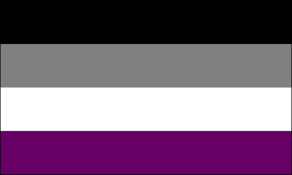
5.) The Asexual Flag
The Asexual Flag design was voted on and elected to increase visibility for asexual people in August of 2010. The flag was designed based on input from asexual community members in and outside of the U.S.
The colors symbolize the following according to AVEN
- Black: Asexuality
- Grey: Gray-A and demisexuality
- White: Sexuality
- Purple: Community
These flags are important to distinguish from the LGBT Pride Rainbow flag. It is important to distinguish these communities and identities as separate from the Gay & Lesbian community.


