If you're at all like me, then you absolutely detest the idea of presenting in front of a class. A lot of this anxiety stems from having to design the actual presentation in the first place. Believe me, I understand the kind of questions you ask yourself. How much information should I include per slide? What kind of visuals do I use? What kind of fonts? How should I present it?
Lucky for you, my friend, I am going to answer every one of those questions with things I've learned over the years in not only my studies as a technical communications student but also as someone who's had to create presentation materials professionally for jobs and internships. In that time, I've gotten feedback from peers, instructors, professors, managers and even a CEO about various slide presentations I've made.
I'll share with you the core of the feedback I've gotten so that you can learn to make great impressions the very first time around. All of the example slides you'll see here are screen caps of my own work. Let's get started.
1. How much information should I include per slide?
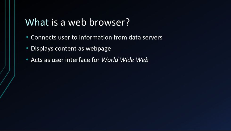
University of Minnesota academic technologist, Ann Fandrey, once came into my Visual Rhetoric class to lecture us about the importance of content control when creating a set of presentation slides. The simple fact is: your audience will have a hard time splitting their attention between what you are saying and what you've written on your slide. Make sure that your points are concise and direct. If you can, have each bullet appear as you work your way through the slide's information so that no one reads ahead and misses out on your wisdom.
2. What kind of visuals should I use?
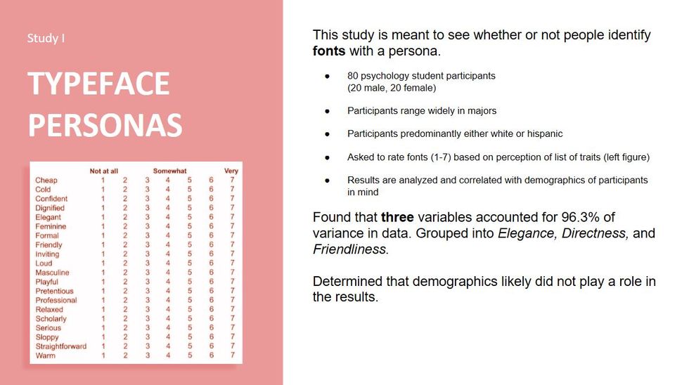
Above is an example of what you should not do when it comes to visuals. Obviously, I am trying to draw the reader's attention to the chart so that I can drive home the point of the text to the audience, but it's not so effective.
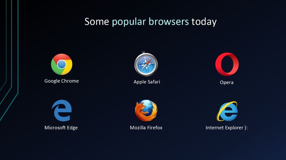
What you want to do with visuals is commit to showing your audience what you want them to see. Fill that page up with one coherent artifact of information and then talk about it. That way you don't violate my first rule above. Check out a different slide below where I use visuals a lot more efficiently to aid my presentation.
Much better. Good job, me.
3. What kind of fonts should I use?
There are only two conditions that I can impose upon you for this particular subject: make sure you only use two fonts and make sure they are readable. The first rule is flexible, but the second one is not. The reason for the first rule is consistency in making everything look the same. All of your headers should be one font and your body text could be another. This will really take your presentation to the next level.
The second rule is non-negotiable. There's nothing less counterintuitive than presenting information as important, but your audience can't even read what you've written. I suggest that you stay away from custom or cursive type fonts, like this one called "Segoe Script."
Instead, leave your audience at ease and without question by picking one of the renowned fonts you hear about in your class essay stipulations. Stick with fonts like Times New Roman, Calibri, Arial, Georgia and, of course, the famous Helvetica.
4. How should I present my presentation?
Google Slides and PowerPoint both give you the ability to write notes for each slide. You should absolutely use this. I can't stress enough how much it will help you present if you have an idea of what to say, and when to say your key points.
If you are connecting your laptop to a projection device for class or a work meeting, have your presentation projecting on the big screen and your notes open on your personal laptop. If you are presenting straight from your device, then print out notes ahead of time and study them well.
Practice, practice, practice.
Presentations in school or work don't have to be hard. You just need to be prepared and confident that you have an awesome product that people will want to see. Follow this guide and really take those slides to another level. Practice in front of a mock audience and ask for feedback as much as possible. Before you know it, you'll be able to nail that presentation, no problem at all.


