I've been making a ton of typographic posters lately and have been spending so much time working with the text. You could slap some words on there and get the job done, but it won't look that great. It takes time to make it look professional. Here are some typography tricks to help you make something cool.
1. Combine a sans-serif font with a serif font
2. Try to stick to two fonts 
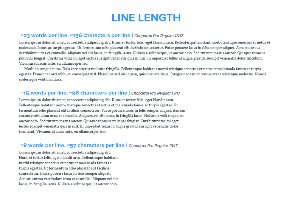
3. Think about line length
If you're using a small font, the line length should be short to make it easier to read. Long line lengths are fine with big fonts. The ideal line length in inches is twice font point size divided by six.
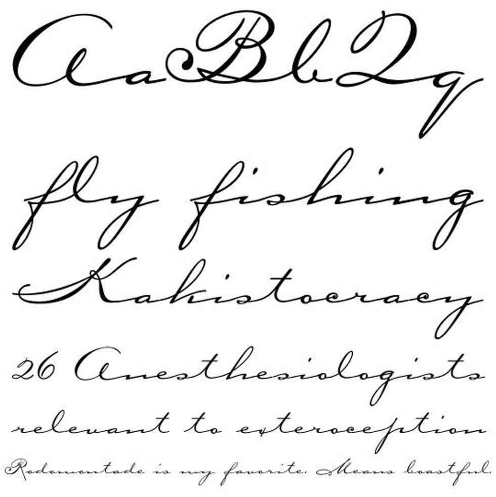
4. Make sure it's readable
Script fonts are cool, but they can be hard to read.
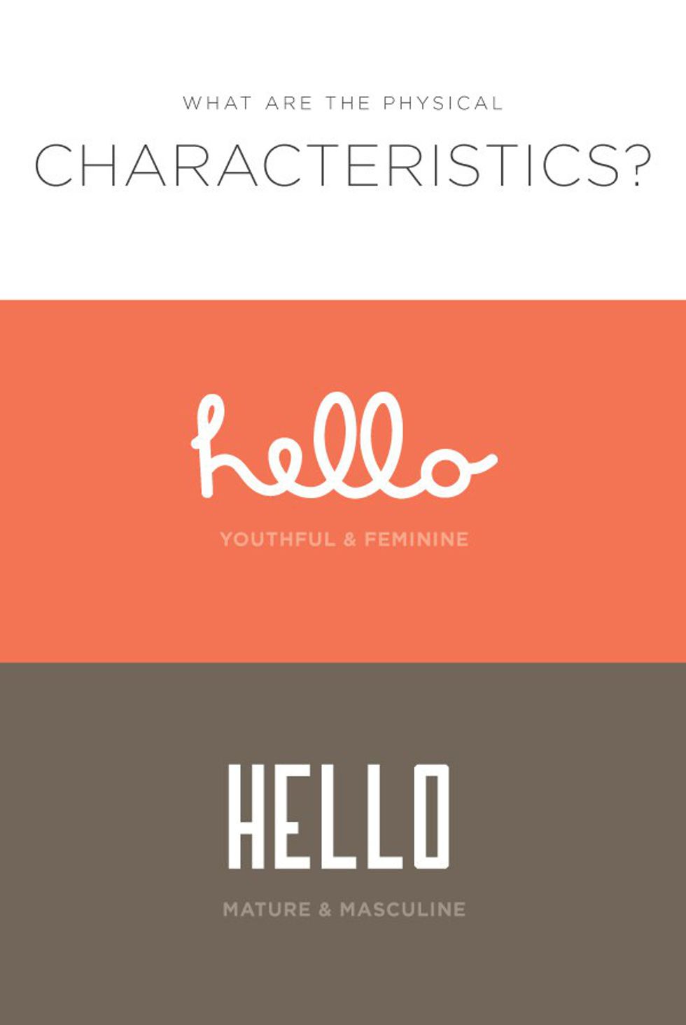
5. What is the personality of your font?
Does the personality of your font match the personality of your brand? There is so much info out there about the psychology of reading different fonts. You may think your font is fun and playful, but someone else may think it's ignorant and flamboyant.
6. Know the anatomy of the font
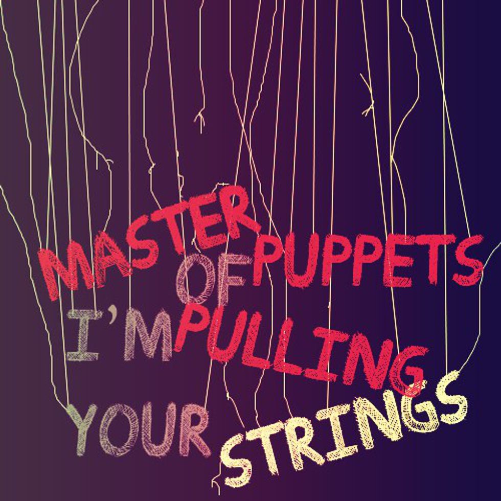
7. Where should you look first?
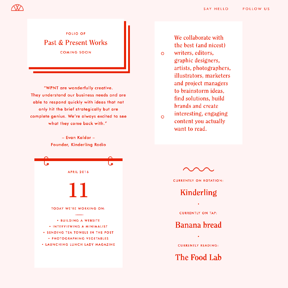
Your text doesn't need to be in a straight line, but should still flow. This graphic used different colors and placements to make the text still make sense.
8. Contrast!
9. Leading, tracking, and kerning matter
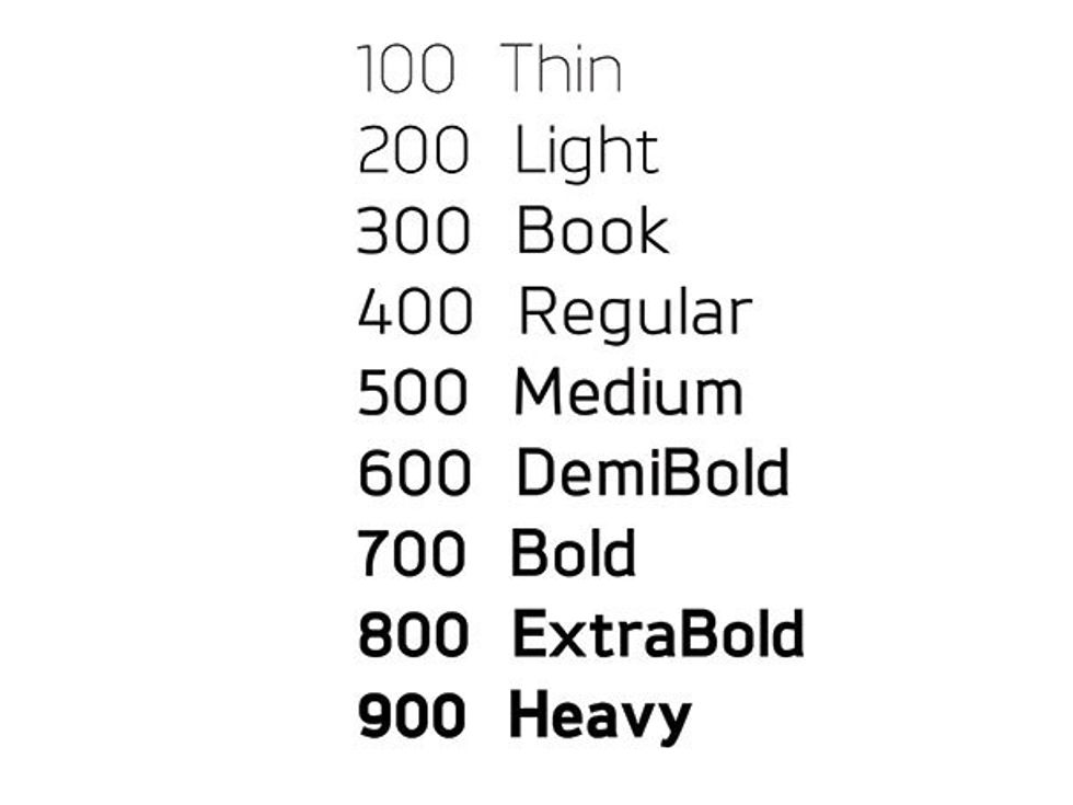
10. Use different weights of the same font
This is a good way to make your text look interesting without using too many different fonts.
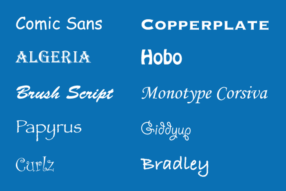
11. Never use these fonts
Hell no. Avoid fonts like these. You can occasionally use Comic Sans and Papyrus ironically, but never for a real project.


