We’re just under two weeks away from the start of the 2016-17 NBA season. With it comes the promise of another season of everything we’ve come to love about the world’s top flight of professional basketball, from jaw-dropping shots and dunks to the drama of trash talk, coach firings, and down-to-the-wire playoff series. But as someone who spends way too much time analyzing sports logos and jerseys, this season will be a little bittersweet for me. Starting after this season, the NBA will allow teams to put advertisements on their jerseys. The Philadelphia 76ers already have a sponsor in StubHub, and over the next few years, more teams are certain to follow. While the league claims they’re only doing a three-season “pilot program,” it’s pretty easy to figure that the NBA will see dollar signs in the idea and, much like with the god-awful sleeved jerseys that never seem to go away, the advertisements will be here to stay.
So before we step into a future where I’m too annoyed at a little tag that says a corporation’s name to buy any current player’s jersey, let’s take a look into the National Basketball Association’s past. Here are 10 of my favorite throwback NBA jerseys from over the years.
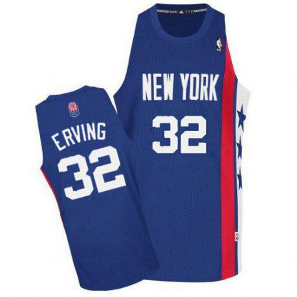
New York Nets 1972-77 Road Jersey
While the Nets only wore this jersey for one season in the NBA before they moved to New Jersey, it made quite an impact. Most of its playing time came not in the NBA, but in the rival ABA, where the Nets, led by all-time great Julius Erving, won two of that league’s last three championships. In many ways, this jersey represents the franchise’s all-time peak--and 40 years later, its asymmetric design is as fresh as ever. In fact, the Brooklyn Nets have been drawing on it for inspiration lately, with this season’s new “Remix” alternate jersey, which looks pretty sweet, and last season’s sleeved “Pride” alternate, which...doesn’t. While the original might never see NBA action again, at least its legacy carries on at the Barclays Center.
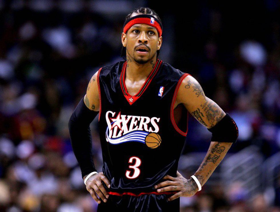
Philadelphia 76ers 2000-2007 Road Jersey
Maybe it’s because this is the Sixers look I grew up with, even if I wasn’t a Sixers fan. Maybe it’s because Allen Iverson is one of my all-time favorite NBA players, and this was the jersey he wore the year he led Philly to the Finals. Maybe it’s the way the red and gold accents contrast with, but don’t distract from the intimidating black main body. I’m still not exactly sure why I love this jersey. Whatever the reason may be, though, this is by far my favorite 76ers look of all time. I know the Sixers are traditionally a red-white-and-blue team, and I know that the royal blue alternate from this jersey’s era is a favorite to this day--hell, I just saw a girl rocking A.I.’s last Friday--but if a team is going to throw tradition out the window and do something totally new with their look, the 76ers are a capsule of that done right.
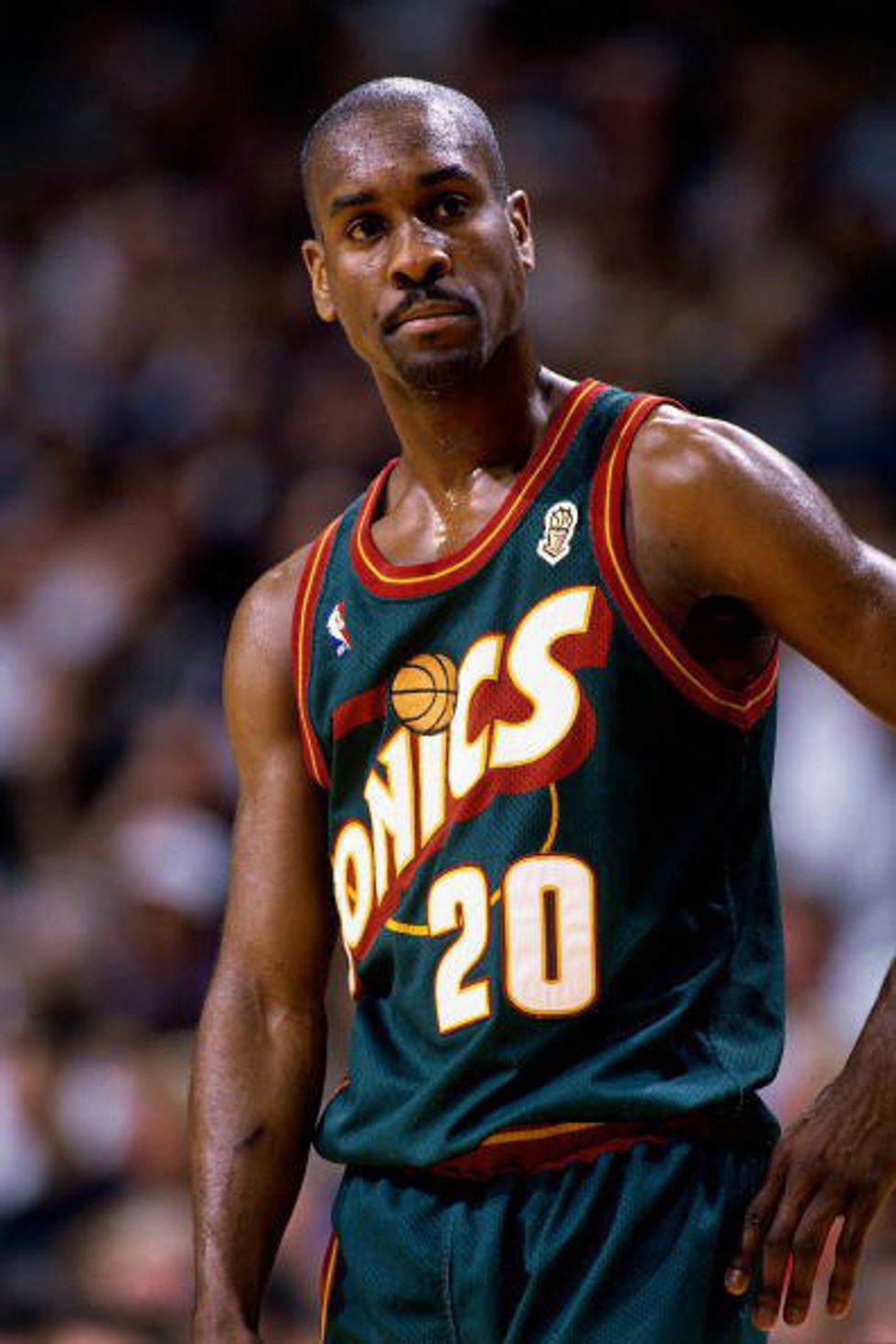
Seattle SuperSonics 1995-2001 Road Jersey
I know, I know, the uniforms Seattle wore before this are iconic, but the first time I saw this jersey--not in an actual game, mind you, but on a CGI Gary Payton in the intro to the original NBA Street for PlayStation 2--it absolutely blew my mind. The cartoony block font and the gradient on the trail behind the basketball both scream ‘90’s design, but they don’t go so totally overboard as to be full-on camp. Is it coming back any time soon? Probably not, especially since the NBA doesn’t seem to want any expansion teams. Is it the Sonics’ most iconic look? Definitely not. The green and gold, as a color scheme, is hard to beat. But compared to this, do the Oklahoma City Thunder’s unbelievably generic uniforms look like trash? Absolutely.
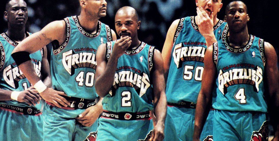
Vancouver Grizzlies 1995-2000 Road Jersey
Gee, another ‘90’s away jersey! This is a throwback I’m too young to actually remember well from when it was in use, and it doesn’t have nearly the history of any of the other jerseys on this list. The Nets had the Doctor, the 76ers had the Answer, the SuperSonics had the Glove, and the Vancouver Grizzlies had...78 total wins across all five seasons with these jerseys in their rotation. But for me, the appeal isn’t in the history or the star players. It’s in the details. It’s in the scratch marks all over the word “Grizzlies,” no doubt left there by the aggressive bear in their logo. It’s in the tribal designs on the lining of the jersey, providing a unique tie to the Vancouver area and its history. It’s in the exact shade of teal, a relic of an era in logo design that was on its way out in favor of more conservative looks by the time I started paying attention to logo and jersey aesthetics as a little kid, that’s bright enough to be eye-catching, but not so obnoxious as to clash with the red of the word “Vancouver.” If the Grizzlies would ditch their painfully 2000’s blue-on-darker-blue jerseys for one night and break out an update of these--with “Memphis” instead of “Vancouver” on the front, of course--I’d probably watch that game just to finally see this design in action.
New York Knicks 1997-2001 Home Jersey
I’m not a Knicks fan by any stretch of the imagination. In fact, my ideal NBA Finals matchup would be the Golden State Warriors vs. the Brooklyn Nets. But when the first currently-active NBA team to ever take the court has uniforms like this, I can’t really hate them. Apart from a slight change in the design around the neck and arm holes, this jersey and its successor, which the Knicks wore for over a decade before switching to their current look, aren’t much different from each other. I gave this one the edge primarily for its association with the epic postseason battles the Knicks waged in their war against Reggie Miller’s Indiana Pacers, but both jerseys have a sense of dimension that you don’t really get from the looks the Knicks have worn before and since. The blue sections on the sides of the jersey are a subtle detail, but without them, the Knicks’ look just feels incomplete to me.
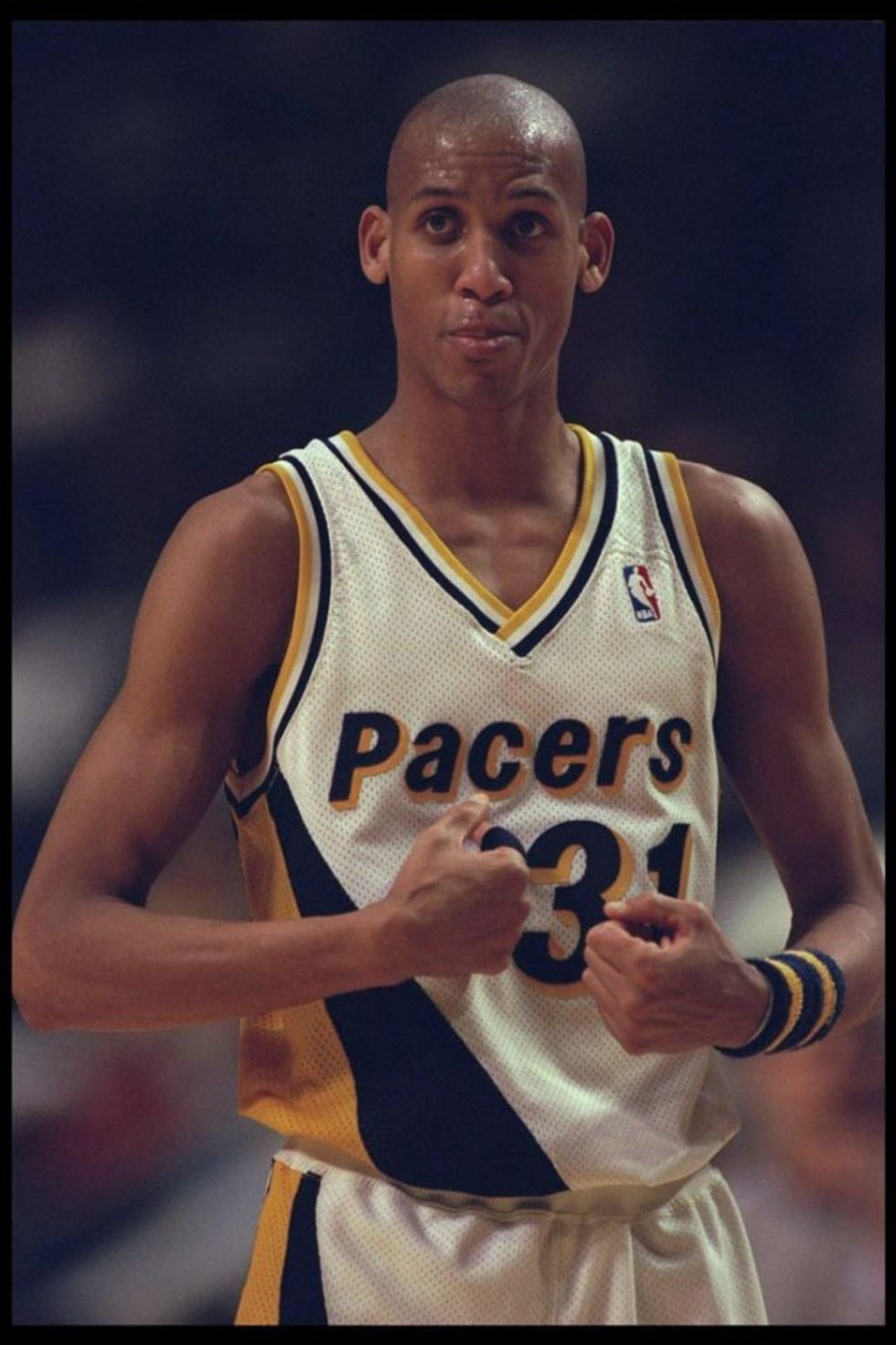
Indiana Pacers 1990-1997 Home Jersey
Speaking of the Pacers, their looks have been consistently sharp for the last 30 years or so, and while I’m partial to pinstripes, the FloJo years have always held a special appeal for me. The dual stripes on one side are a bold choice, especially since this was only two seasons after the Charlotte Hornets debuted the iconic teal-and-purple uniforms that launched the ‘90’s obsession with out-there sports designs. The yellow shadowing on blue letters and Helvetica-esque font help everything pop with pseudo-3D-ness, but without going overboard. There are still traces of ‘80’s cheese, as with pretty much everything that hit in the ‘90’s prior to “Smells Like Teen Spirit,” but this was a forward-thinking look for its time, and one that still holds up to this day.
Utah Jazz 1996-2004 Road Jersey
As you might have figured out, I have a bit of a ‘90’s sports jersey problem. By now, the Utah Jazz have completely dropped purple from their color scheme, which is a shame, because all their best looks have involved the color in some way. Nowhere is that more prominent than on the jersey Karl Malone and John Stockton wore during their run as undisputed masters of the pick and roll. Between purple as the main color, random-ass colors like copper and teal on the number outlines, and, of course, the gradient mountain that takes up a huge portion of the front, this jersey is ‘90’s insanity personified, but not only does it work, it comes together like one of the Mailman’s free throws. In fact, when I didn’t really have a favorite team for about a season, I leaned towards the Jazz purely because of this, even though by then they were on that ugly compromise logo with their current color scheme. Yeesh.
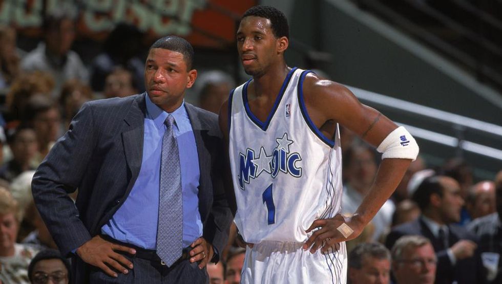
Orlando Magic 2000-2003 Home Jersey
Look, I know the Magic’s pinstriped era with Shaq and Penny was absolutely iconic, but personally, I think their actual logo was somewhat lacking back when they had that jersey. By the time this jersey, a hallmark of the T-Mac (“never the wack”) era in Orlando, came around, the Magic had tightened their logo up and made some subtle adjustments, as reflected in the font on this jersey. But for me, what makes this jersey is the sublimation. Believe it or not, the pinstripes are still there--they’re just cleverly hidden, turned white and covered in matching stars. The look is a bit of an acquired taste, but it certainly outclasses the two jerseys--a bland follow-up and a pale imitation of the glory days, respectively--that followed. In fact, with sublimated designs so popular right now, it’s a surprise the Magic haven’t brought something like this back.
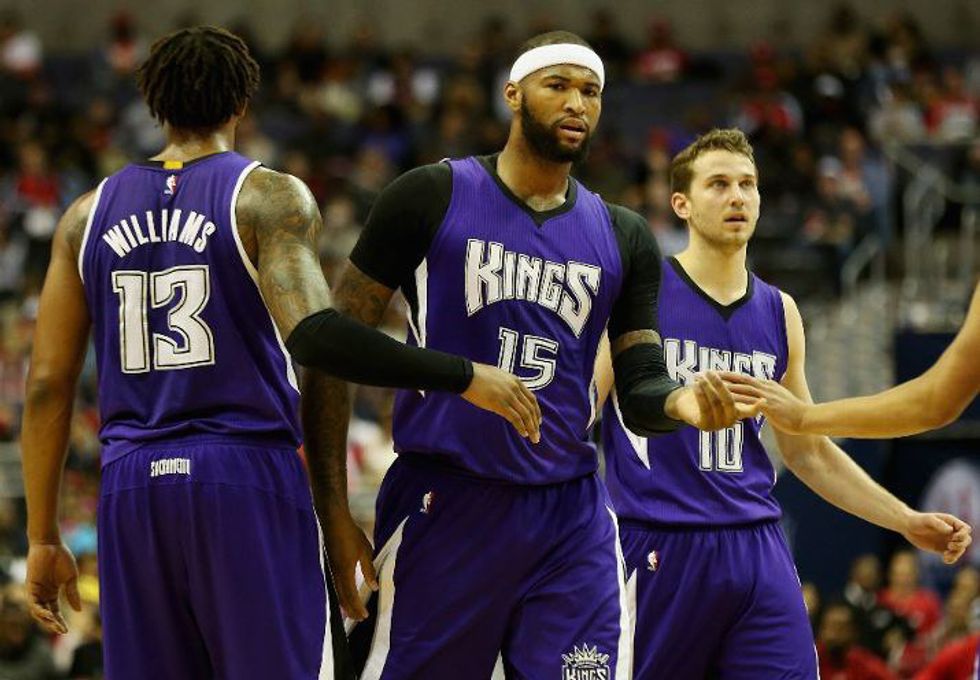
Sacramento Kings 2014-2016 Road Jersey
This jersey just barely counts as a throwback, but Sacramento’s old-meets-new rebrand for this season meant this one got shoved aside. And don’t get me wrong, the Kings have a nice new set of uniforms, even if the gray replacing black feels a little off to me. But what makes this jersey is its context. For twelve long seasons, the Kings avoided using the font that was actually in their logo on their jerseys, instead using a more diagonally-reliant rendition of “Kings”, which looked particularly bad in black on purple jerseys, a “Sacramento” with thin letters all smushed together that looked like they barely fit on the jersey, and a cursive script that, while a nice nod to the pre-purple days, never really felt like it worked on any of the alternate jerseys it got stuffed into. The idea of putting their primary design for their own name on their primary color had somehow only occurred for two alternates in the ‘90’s, one of which was the opinion-splitting split-color jersey. And yes, the lance-like additions to the sides of the jersey are a little forced, but there’s something so simple about the concept of this look that it’s kind of a shock the Kings never made it a main jersey until right before they dropped the whole thing. So finally getting to see it happen is satisfying, in its own weird way.


