After the 2016-17 season, Adidas will watch their NBA uniform contract slip away into the hands of Nike’s swoosh-clad evil empire.
Two years before the Nike deal begins, five teams in the Association are breaking out fresh threads to debut next season. The Milwaukee Bucks, Los Angeles Clippers, Philadelphia 76ers and Atlanta Hawks have all revealed their new get-ups (with wildly varying success), while only mock-ups of the Toronto Raptors jerseys exist to the public thus far. We'll remove ourselves from speculation and wait to judge the Raptors Drake-inspired uniforms until they are released. No word on whether lint rollers will be included in all jersey purchases.
Los Angeles Clippers
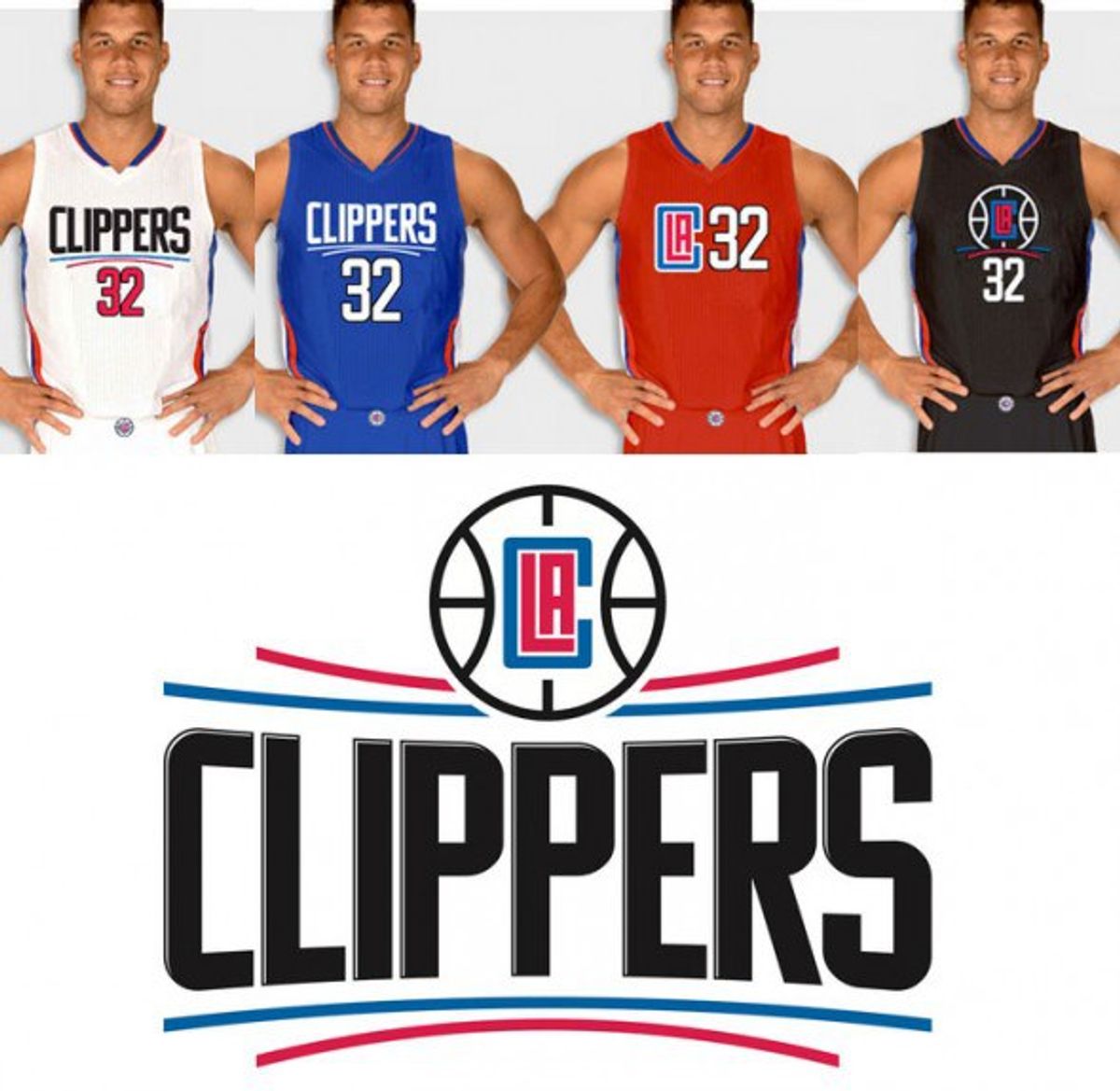
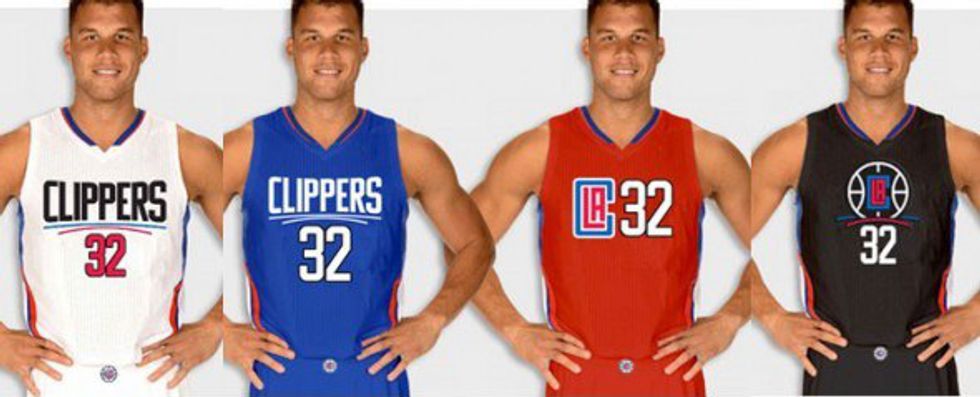
We begin in Tinseltown where the Clippers desperately try to usher in the Steve Ballmer era and cleanse their fans’ collective palettes of Donald Sterling. Their new uniforms maintain their red, white and blue color scheme. Why emphasize the color scheme? Because it’s the only thing they got right. Seriously. They’re hideous.
First, the logos. Lord. The boxy, red ‘LA’ (shaped like a basketball court...c'mon people, seriously?) enclosed in a blue ‘C’ (to symbolize the Clippers encompassing the entire city) looks like a kindergartener got confused while drawing the Cubs logo.
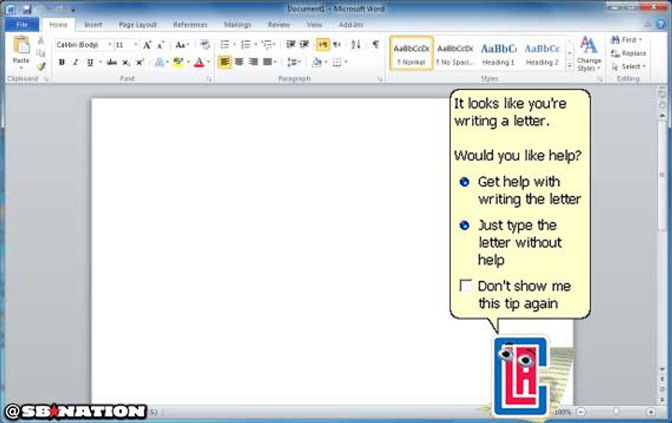
Could it be a nod to Ballmer’s days as Microsoft CEO that, if you slap on a pair of googly eyes and throw it in a Word document, it’s a spitting image of Clippy? (Image courtesy of SBNation.)
Just let that irony sink in for a minute.
It’s a travesty that the LAC logo made it onto the front of a uniform. Setting it in a row next to the players' numbers only dumped grease on the fire. The team’s primary logo also draws staggering resemblance to the mid-2000 NBA Live video games. It’s honestly sad.
When chosen correctly, a team name, logo and uniform set blend together to present a unified front for fans to get behind and relate to. But when done incorrectly, the results are disastrous. When relocating to L.A. in 1984, the San Diego Clippers name and logo stuck. Upon their original move to San Diego, the name Clippers was chosen as the city is “known for the great sailing ships that passed through the San Diego Bay.”
Bottom line: The Clippers are a team named after ships that sailed into a city 120 miles south of Los Angeles. With that in mind, their new logo and uniform set are equally, but maybe not surprisingly, puzzling.
Milwaukee Bucks
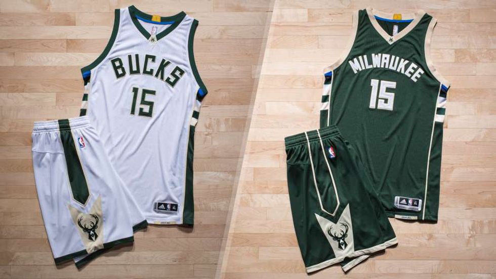
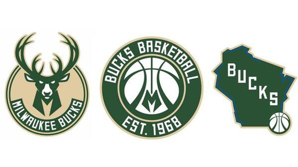
I had to do a hard reset on my brain after looking at that L.A. catastrophe (yes, that was a paper clip pun). Where better to go next then the best looking set revealed this offseason. The Bucks will don uniforms with a new, incredibly classy green and cream logo set. The cream is taken from the yellow-ish clay found near Milwaukee that highlights much of the city’s architecture, and gives it the name the “Cream City.” Dropping red from their identity completely, royal blue and black will be used as accents under the sleeves, an homage to historical Bucks uniforms featuring the Irish Rainbow.
A clean new logo set equally balances a modern, edgy feel with the classic look of Kareem Abdul-Jabar’s Bucks from the early 70's. Had the Bucks stopped with pristine uniforms and a good primary logo, Milwaukee’s visual identity would have sufficed. They didn’t, however, also producing the second-best alternate logo any team has revealed this summer. Now this is truly a gorgeous logo.
Bottom line: Total opposite of the Clippers fiasco. Delicious old school color scheme, fantastic logos top to bottom, plus bonus points for drawing legitimate meaning from the city of Milwaukee and its uniqueness.
Philadelphia 76ers
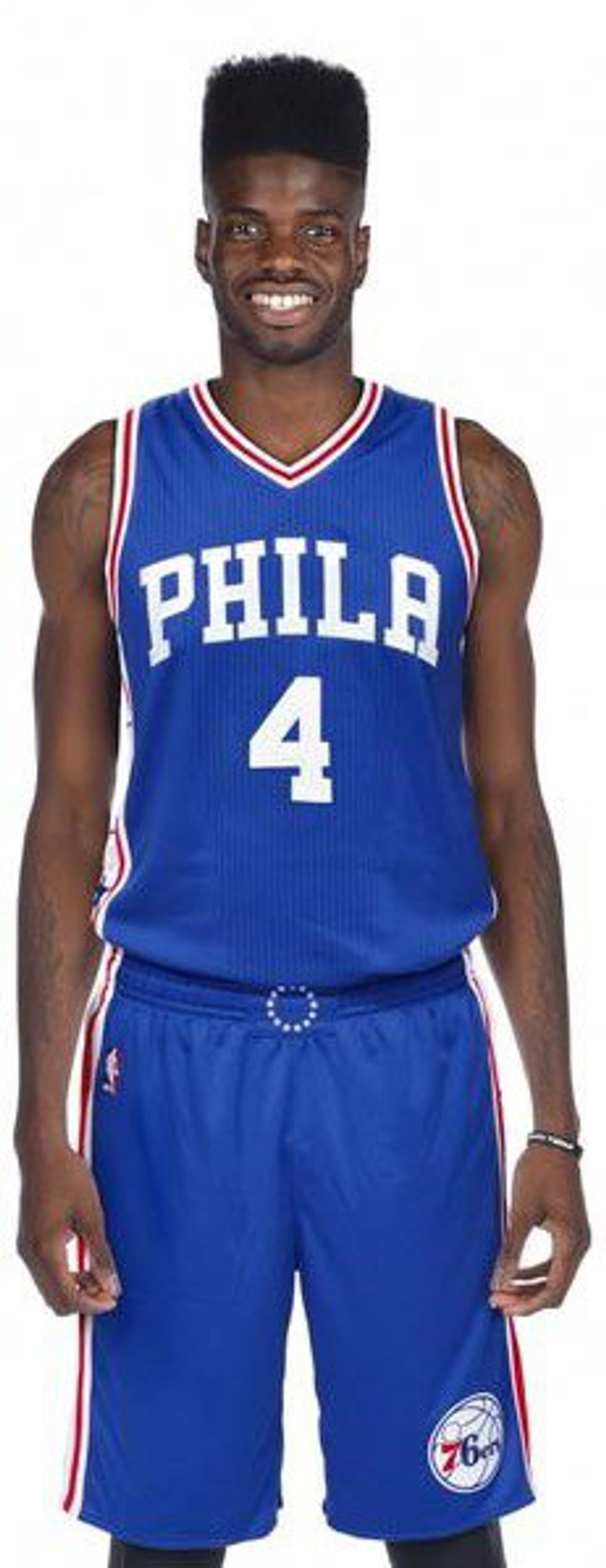
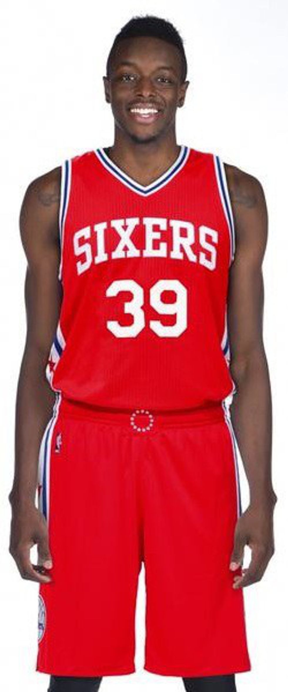
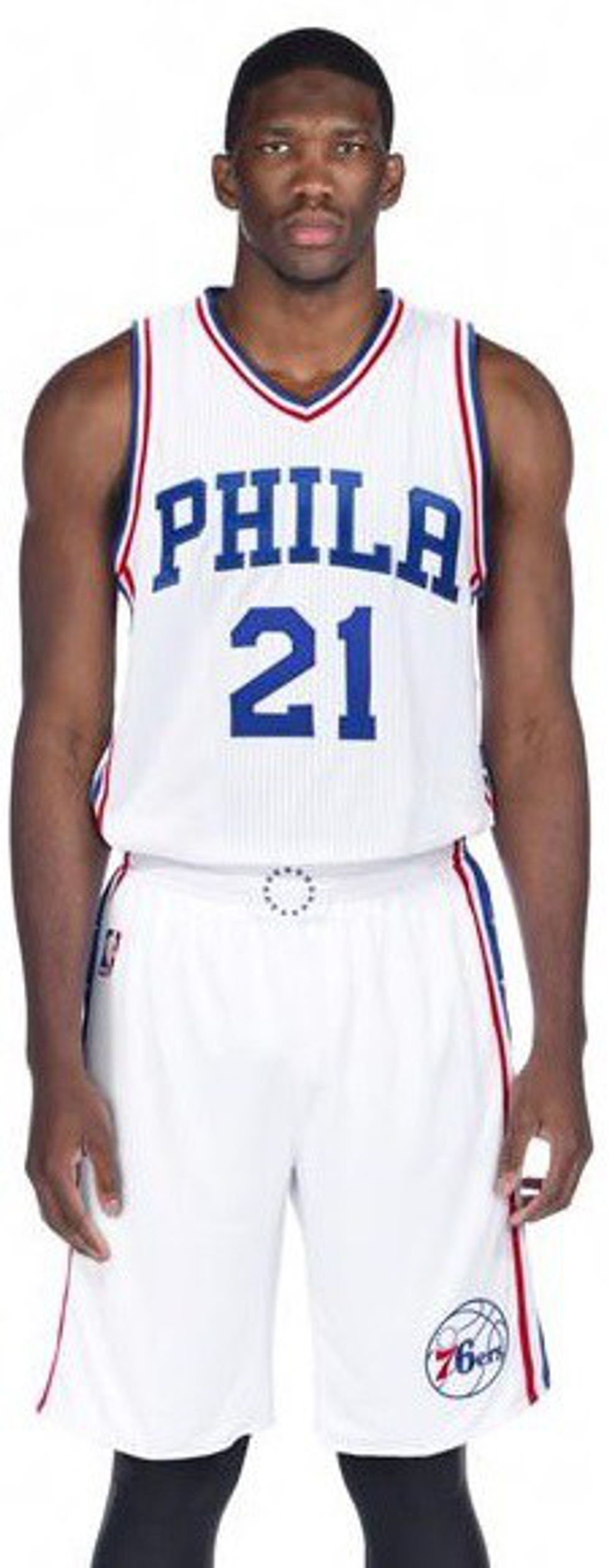
I’ll try to check my hometown bias at the door. I promise. Prior to the 2009-10 season, the Sixers ditched the logo and uniforms that had become synonymous with the Iverson-era. Gone was the flying basketball underlining the Sixers word mark, and in came a clean, simple, retro look. Harkening back to the days of Dr. J soaring through The Spectrum’s rafters, the Sixers home (white) and road (blue) uniforms now feature ‘PHILA’ prominently across the chest, something Nerlens Noel revealed on the inside of his suit at the NBA Draft Lottery. ‘SIXERS’ only finds the front of the new red alternate uniforms (the previous blue, white, and red uniforms all sported the team name).
Included in the rebrand was a full set of primary and secondary logos. When going retro in 2009, the team set the old-school word mark on a basketball in a red square. The new change rounds the edges, slightly alters the basketball, and, with the addition of stars on the circular border, looks a bit like the Wizards' updated logo.
Remember when I said the Bucks' secondary logo came in, well, second? Voila. I present, a tenacious Benjamin Franklin pounding the ball down the floor, ready to stiff arm every powdered wig-wearing defender in his way. That’s a beauty of an image, although it likely won’t make its way onto a uniform.
Bottom line: Lightning struck for Ben Franklin and the Sixers. The clean retro jerseys, a consensus upgrade across the city, encompass the perfect mix of history, tradition and style.
Atlanta Hawks
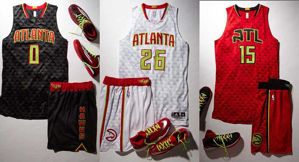
This, to me, looks like a failed attempt by Atlanta to ride the wake of their recent on-court success and become the Seattle Seahawks of the NBA. Everything from the sublimated patters on the uniform to the neon accents just screams Seahawks. Just wait till Nike gets their hands on these.
Let’s start with what they did right. After adding their old “Pac-man” logo back into the fold during the 2014 playoffs, the Hawks, like the Sixers, threw that image in a circle and made it their new primary logo. For now, this list stops here.
I was a hater of the Seahawks' new digs when originally revealed, but have since been converted. I am also a hater of these off the bat. The neon seems cheap and is wholly absent from their primary logo. It’s almost as if they paneled a group of elementary school boys to determine the color scheme’s final addition. Atlanta experimented with bright green in the past before sticking primarily with red for the last 43 years. I’d take that over today’s cliché neon yellow (its official name is Volt, excuse me), yet I do applaud them for using neon sparingly, something rarely done these days.
Bottom line: I will reserve some judgment until I can see them on the court, but these uniforms look fit for an AAU team filled with high school hotshots, not the Eastern Conference runners up.


 Going to the cinema alone is good for your mental health, says science




 women in street dancing
Photo by
  man and woman standing in front of louver door
Photo by
  man in black t-shirt holding coca cola bottle
Photo by
  red and white coca cola signage
Photo by
  man holding luggage photo
Photo by
  topless boy in blue denim jeans riding red bicycle during daytime
Photo by
  trust spelled with wooden letter blocks on a table
Photo by
  Everyone is Welcome signage
Photo by
  man with cap and background with red and pink wall l
Photo by
  difficult roads lead to beautiful destinations desk decor
Photo by
  photography of woman pointing her finger near an man
Photo by
  closeup photography of woman smiling
Photo by
  a man doing a trick on a skateboard
Photo by
  two men
  running man on bridge
Photo by
  orange white and black bag
Photo by
  girl sitting on gray rocks
Photo by
  assorted-color painted wall with painting materials
Photo by
  three women sitting on brown wooden bench
Photo by
 Photo by
  Photo by
  Photo by
  Photo by


 people sitting on chair in front of computer

 all stars lol GIF by Lifetime
 two women talking while looking at laptop computerPhoto by
  shallow focus photography of two boys doing wacky facesPhoto by
  happy birthday balloons with happy birthday textPhoto by
  itty-bitty living space." | The Genie shows Aladdin how… | Flickr
 shallow focus photography of dog and catPhoto by
  yellow Volkswagen van on roadPhoto by
  orange i have a crush on you neon light signagePhoto by
  5 Tattoos Artist That Will Make You Want A Tattoo
 woman biting pencil while sitting on chair in front of computer during daytimePhoto by
  a scrabbled wooden block spelling the word prizePhoto by


